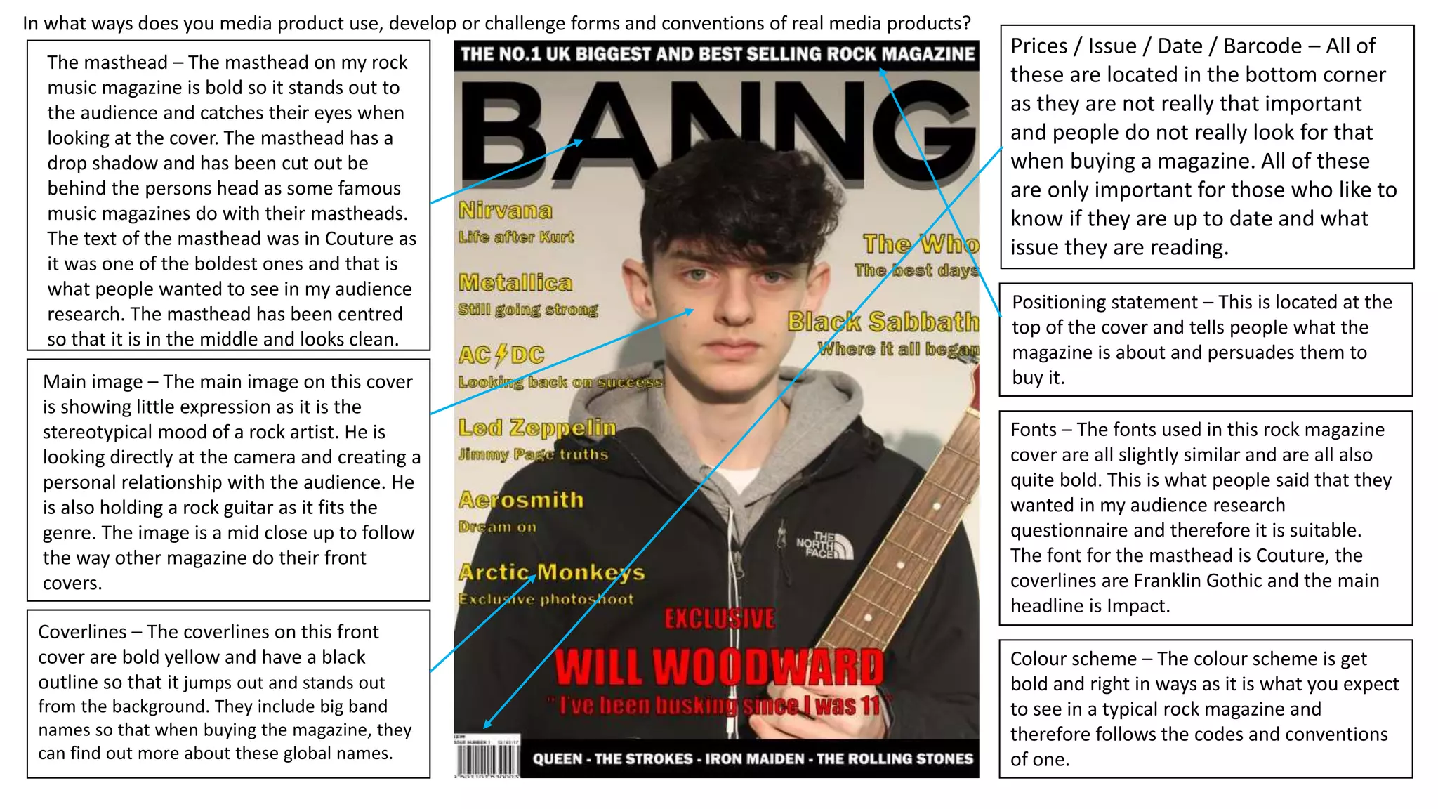
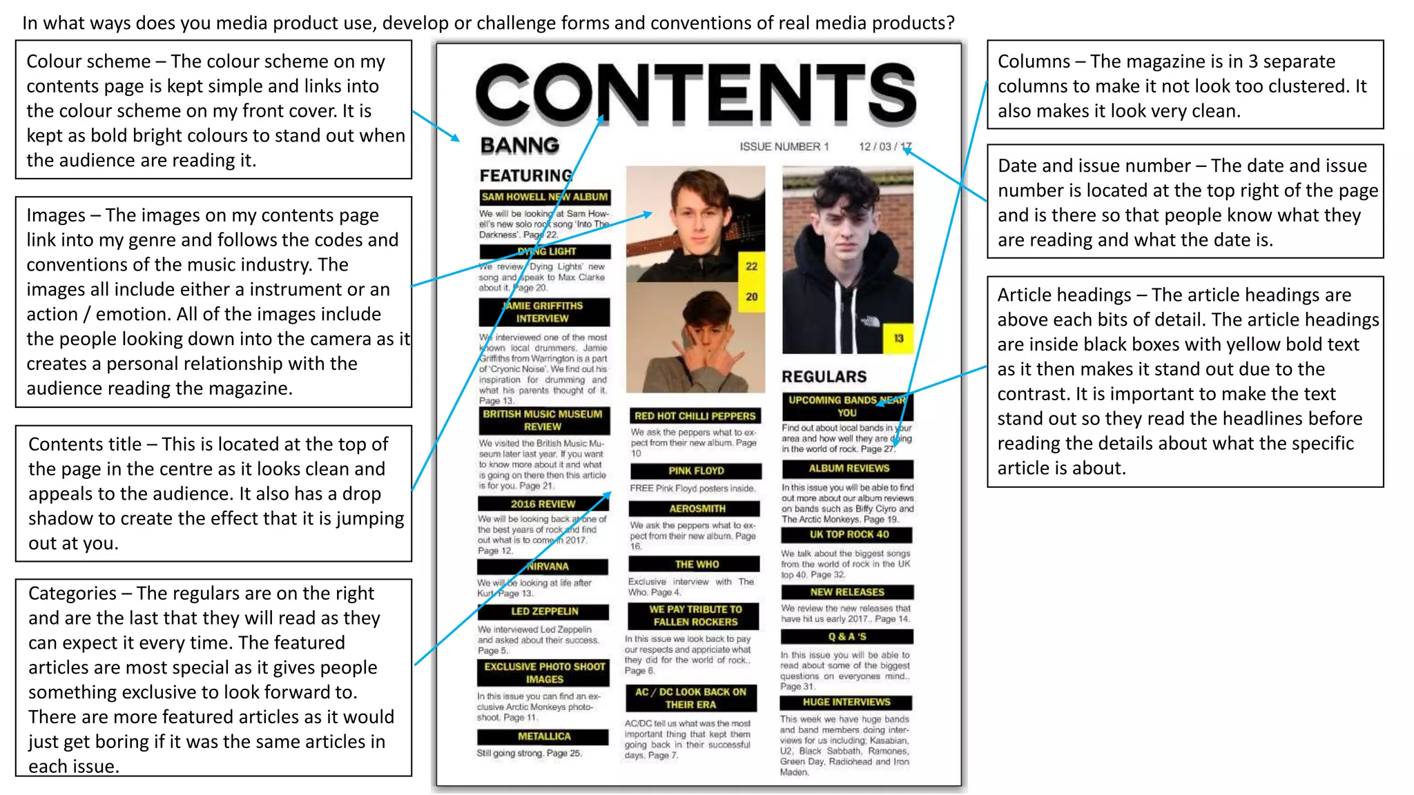
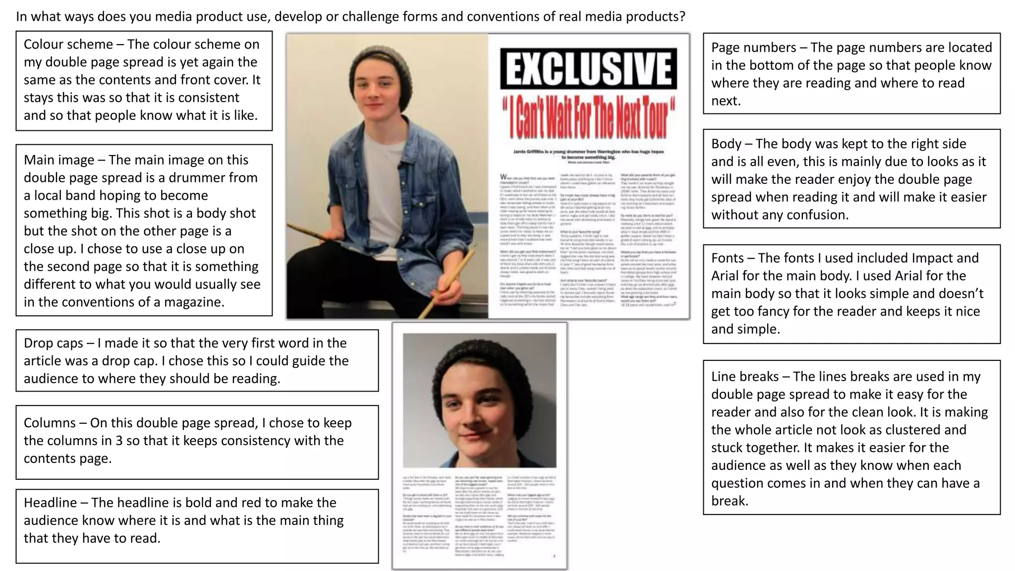
The masthead – The masthead on my rock
music magazine is bold so it stands out to
the audience and catches their eyes when
looking at the cover. The masthead has a
drop shadow and has been cut out be
behind the persons head as some famous
music magazines do with their mastheads.
The text of the masthead was in Couture as
it was one of the boldest ones and that is
what people wanted to see in my audience
research. The masthead has been centred
so that it is in the middle and looks clean.
Main image – The main image on this cover
is showing little expression as it is the
stereotypical mood of a rock artist. He is
looking directly at the camera and creating a
personal relationship with the audience. He
is also holding a rock guitar as it fits the
genre. The image is a mid close up to follow
the way other magazine do their front
covers.
Coverlines – The coverlines on this front
cover are bold yellow and have a black
outline so that it jumps out and stands out
from the background. They include big band
names so that when buying the magazine, they
can find out more about these global names.
Prices / Issue / Date / Barcode – All of
these are located in the bottom corner
as they are not really that important
and people do not really look for that
when buying a magazine. All of these
are only important for those who like to
know if they are up to date and what
issue they are reading.
Positioning statement – This is located at the
top of the cover and tells people what the
magazine is about and persuades them to
buy it.
Fonts – The fonts used in this rock magazine
cover are all slightly similar and are all also
quite bold. This is what people said that they
wanted in my audience research
questionnaire and therefore it is suitable.
The font for the masthead is Couture, the
coverlines are Franklin Gothic and the main
headline is Impact.
Colour scheme – The colour scheme is get
bold and right in ways as it is what you expect
to see in a typical rock magazine and
therefore follows the codes and conventions
of one.
In what ways does you media product use, develop or challenge forms and conventions of real media products?
Colour scheme – The colour scheme on my
contents page is kept simple and links into
the colour scheme on my front cover. It is
kept as bold bright colours to stand out when
the audience are reading it.
Images – The images on my contents page
link into my genre and follows the codes and
conventions of the music industry. The
images all include either a instrument or an
action / emotion. All of the images include
the people looking down into the camera as it
creates a personal relationship with the
audience reading the magazine.
Contents title – This is located at the top of
the page in the centre as it looks clean and
appeals to the audience. It also has a drop
shadow to create the effect that it is jumping
out at you.
Categories – The regulars are on the right
and are the last that they will read as they
can expect it every time. The featured
articles are most special as it gives people
something exclusive to look forward to.
There are more featured articles as it would
just get boring if it was the same articles in
each issue.
Columns – The magazine is in 3 separate
columns to make it not look too clustered. It
also makes it look very clean.
Date and issue number – The date and issue
number is located at the top right of the page
and is there so that people know what they
are reading and what the date is.
Article headings – The article headings are
above each bits of detail. The article headings
are inside black boxes with yellow bold text
as it then makes it stand out due to the
contrast. It is important to make the text
stand out so they read the headlines before
reading the details about what the specific
article is about.
In what ways does you media product use, develop or challenge forms and conventions of real media products?
Colour scheme – The colour scheme on
my double page spread is yet again the
same as the contents and front cover. It
stays this was so that it is consistent
and so that people know what it is like.
Main image – The main image on this
double page spread is a drummer from
a local band hoping to become
something big. This shot is a body shot
but the shot on the other page is a
close up. I chose to use a close up on
the second page so that it is something
different to what you would usually see
in the conventions of a magazine.
Drop caps – I made it so that the very first word in the
article was a drop cap. I chose this so I could guide the
audience to where they should be reading.
Columns – On this double page spread, I chose to keep
the columns in 3 so that it keeps consistency with the
contents page.
Headline – The headline is bold and red to make the
audience know where it is and what is the main thing
that they have to read.
Page numbers – The page numbers are located
in the bottom of the page so that people know
where they are reading and where to read
next.
Body – The body was kept to the right side
and is all even, this is mainly due to looks as it
will make the reader enjoy the double page
spread when reading it and will make it easier
without any confusion.
Fonts – The fonts I used included Impact and
Arial for the main body. I used Arial for the
main body so that it looks simple and doesn’t
get too fancy for the reader and keeps it nice
and simple.
Line breaks – The lines breaks are used in my
double page spread to make it easy for the
reader and also for the clean look. It is making
the whole article not look as clustered and
stuck together. It makes it easier for the
audience as well as they know when each
question comes in and when they can have a
break.

.

  • 1.
    The masthead –The masthead on my rock music magazine is bold so it stands out to the audience and catches their eyes when looking at the cover. The masthead has a drop shadow and has been cut out be behind the persons head as some famous music magazines do with their mastheads. The text of the masthead was in Couture as it was one of the boldest ones and that is what people wanted to see in my audience research. The masthead has been centred so that it is in the middle and looks clean. Main image – The main image on this cover is showing little expression as it is the stereotypical mood of a rock artist. He is looking directly at the camera and creating a personal relationship with the audience. He is also holding a rock guitar as it fits the genre. The image is a mid close up to follow the way other magazine do their front covers. Coverlines – The coverlines on this front cover are bold yellow and have a black outline so that it jumps out and stands out from the background. They include big band names so that when buying the magazine, they can find out more about these global names. Prices / Issue / Date / Barcode – All of these are located in the bottom corner as they are not really that important and people do not really look for that when buying a magazine. All of these are only important for those who like to know if they are up to date and what issue they are reading. Positioning statement – This is located at the top of the cover and tells people what the magazine is about and persuades them to buy it. Fonts – The fonts used in this rock magazine cover are all slightly similar and are all also quite bold. This is what people said that they wanted in my audience research questionnaire and therefore it is suitable. The font for the masthead is Couture, the coverlines are Franklin Gothic and the main headline is Impact. Colour scheme – The colour scheme is get bold and right in ways as it is what you expect to see in a typical rock magazine and therefore follows the codes and conventions of one. In what ways does you media product use, develop or challenge forms and conventions of real media products?
  • 2.
    In what waysdoes you media product use, develop or challenge forms and conventions of real media products? Colour scheme – The colour scheme on my contents page is kept simple and links into the colour scheme on my front cover. It is kept as bold bright colours to stand out when the audience are reading it. Images – The images on my contents page link into my genre and follows the codes and conventions of the music industry. The images all include either a instrument or an action / emotion. All of the images include the people looking down into the camera as it creates a personal relationship with the audience reading the magazine. Contents title – This is located at the top of the page in the centre as it looks clean and appeals to the audience. It also has a drop shadow to create the effect that it is jumping out at you. Categories – The regulars are on the right and are the last that they will read as they can expect it every time. The featured articles are most special as it gives people something exclusive to look forward to. There are more featured articles as it would just get boring if it was the same articles in each issue. Columns – The magazine is in 3 separate columns to make it not look too clustered. It also makes it look very clean. Date and issue number – The date and issue number is located at the top right of the page and is there so that people know what they are reading and what the date is. Article headings – The article headings are above each bits of detail. The article headings are inside black boxes with yellow bold text as it then makes it stand out due to the contrast. It is important to make the text stand out so they read the headlines before reading the details about what the specific article is about.
  • 3.
    In what waysdoes you media product use, develop or challenge forms and conventions of real media products? Colour scheme – The colour scheme on my double page spread is yet again the same as the contents and front cover. It stays this was so that it is consistent and so that people know what it is like. Main image – The main image on this double page spread is a drummer from a local band hoping to become something big. This shot is a body shot but the shot on the other page is a close up. I chose to use a close up on the second page so that it is something different to what you would usually see in the conventions of a magazine. Drop caps – I made it so that the very first word in the article was a drop cap. I chose this so I could guide the audience to where they should be reading. Columns – On this double page spread, I chose to keep the columns in 3 so that it keeps consistency with the contents page. Headline – The headline is bold and red to make the audience know where it is and what is the main thing that they have to read. Page numbers – The page numbers are located in the bottom of the page so that people know where they are reading and where to read next. Body – The body was kept to the right side and is all even, this is mainly due to looks as it will make the reader enjoy the double page spread when reading it and will make it easier without any confusion. Fonts – The fonts I used included Impact and Arial for the main body. I used Arial for the main body so that it looks simple and doesn’t get too fancy for the reader and keeps it nice and simple. Line breaks – The lines breaks are used in my double page spread to make it easy for the reader and also for the clean look. It is making the whole article not look as clustered and stuck together. It makes it easier for the audience as well as they know when each question comes in and when they can have a break.