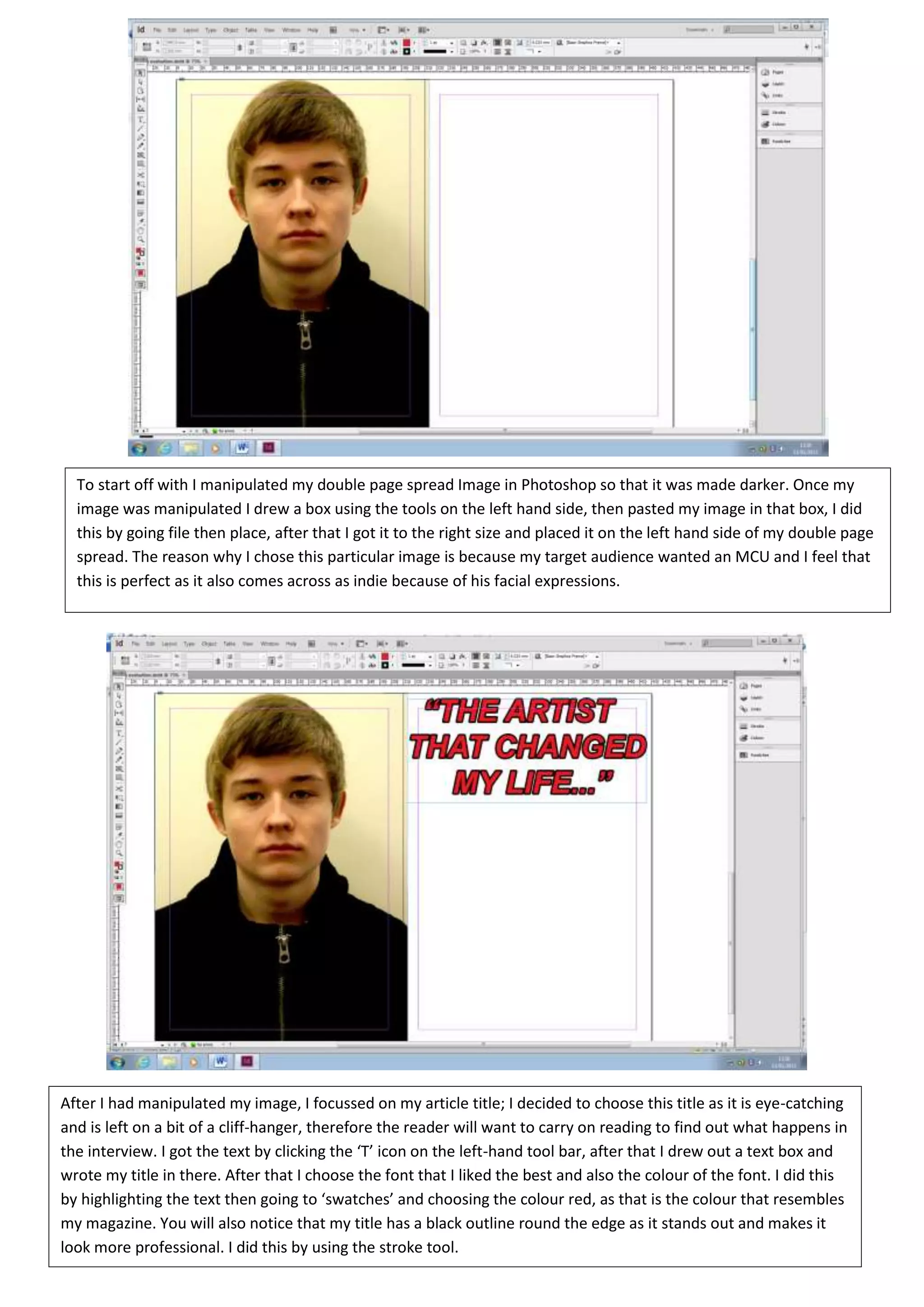
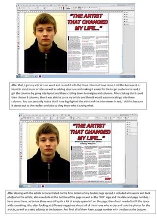
The document summarizes the steps taken to design a double page magazine spread in Photoshop. It describes manipulating an image, placing it on the left side, and adding an eye-catching title in red font. Text from a word document was copied into three columns for structure. Artist and interviewee names were highlighted red for clarity. Additional details like author names and a website address were added to fill empty space. Finally, a bright blue background was selected as the target audience preferred bright colors, and the text was moved forward so it was readable over the color.


![Final%20 magazine%20–%20double%20page%20spread[2]](https://cdn.slidesharecdn.com/ss_thumbnails/final20magazine2020double20page20spread2-120511045804-phpapp02-thumbnail.jpg?width=640&height=640&fit=bounds)


