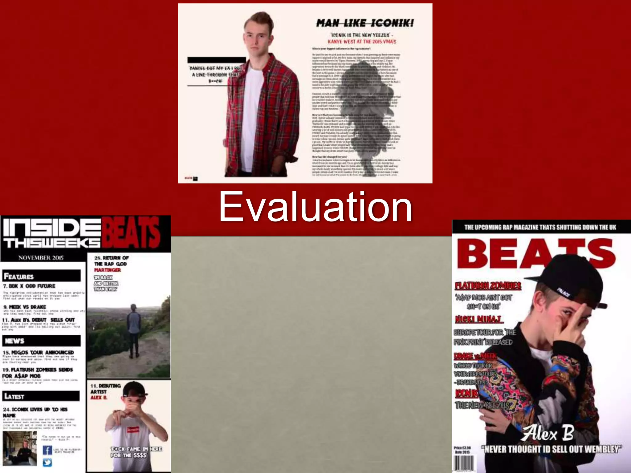
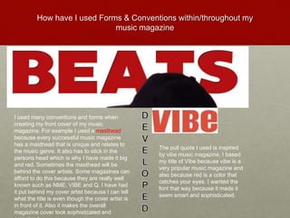
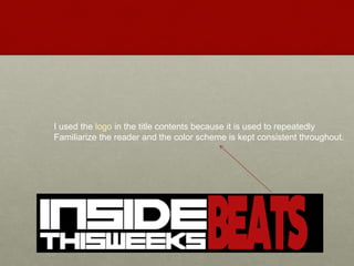
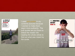
2. How have I used Forms & Conventions within/throughout my
music magazine
I used many conventions and forms when
creating my front cover of my music
magazine. For example I used a masthead
because every successful music magazine
has a masthead that is unique and relates to
the music genre. It also has to stick in the
persons head which is why I have made it big
and red. Sometimes the masthead will be
behind the cover artists. Some magazines can
afford to do this because they are really well
known such as NME, VIBE and Q. I have had
it put behind my cover artist because I can tell
what the title is even though the cover artist is
in front of it. Also it makes the overall
magazine cover look sophisticated and
The pull quote I used is inspired
by vibe music magazine, I based
my title of Vibe because vibe is a
very popular music magazine and
also because red is a color that
catches your eyes. I wanted the
font that way because it made it
seem smart and sophisticated.
3. Another convention I used is that I had a cover artist on
my front cover. I had a cover artist on the front because
every music magazine has a cover artist on the front
that is very well known in the field of genre that they are
representing. Also another convention of the music
magazine that I have used is the eye contact that the
cover artist has. They do this because it helps engage
the reader and make them pick up the magazine and
read it because it looks as if they are looking at you.
I have developed this fader front cover to fit my music
magazine in many ways. For example I had it changed
from a close up to a medium close up because I
wanted the patterns on the jacket to be seen. The
jacket is baroque styled which is common with
Versace. Versace is commonly worn by rappers. Also
instead of a gold watch I made my cover artist wear a
palace cap because they are also very stylish and
trending in places all over the world. I also kept the
eye contact because I feel that it is the most important
convention that a front cover should have.
4. Another common convention I have used
is the Pull Quote. This is another
common convention that most music
magazine conventions have. These are
used to give the reader an over view of
what the article will be about and are
also used to grab they attention of the
reader as they may be about another
celebrity. My pull quote is there to
intrigue the fans of Alex B and
encourage them to read the magazine to
find out more about why Alex B never
thought he would sell out wembley.
I have developed this by
using my own artists name
and making up my own
quote
5. I used cover lines because this is a common convention
That is used in all music magazines of all music genres.
It gives a reader a sense of what each article is about. It is
Worded in a way that gives off a hint as to the purpose of
The article. For example drake Vs. Meek ‘world tour or
your girls tour?’ The main aim of a cover line is to get it
Entice the reader to pick up the magazine and read it.
Usually there is a big cover line and then a few smaller one
I developed the cover lines by making up my own
6. The Date, Price and Barcode are very
essential yet small elements of a music
magazine because they are used to give
basic information such as the price of the
magazine and the date the magazine
was issued.
7. The main image is of the artist ‘Martinger’ staring
out into the horizon with the captions ‘I'm back
and better than ever’ implying that he is making
some sort comeback. It is also the biggest image
out of all the other ones on the contents page
which implies to the reader that this is the main
article or the biggest feature in the magazine. I
have used images all throughout my magazine.
I used my own pictures and different people to
show how my music magazine covers the most
hyped rap artists of their time.
8. The contents are split into sections for example: Features,
News, Latest. This is to make it easier to navigate and find
What you need. Also the white font stands out against the
Black border. The numbers on each sub heading is so that
The reader knows what page the desired article is on so that
They can find it easier.
9. I used the logo in the title contents because it is used to repeatedly
Familiarize the reader and the color scheme is kept consistent throughout.
10. I used pull quotes in my
contents pictures because
I wanted to make them
seem more authentic. The
pull quotes are put there to
entice the reader into
reading the whole article to
find out what was meant by
the quote.