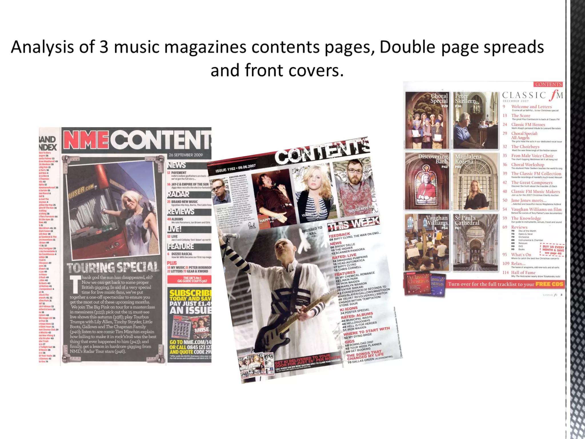
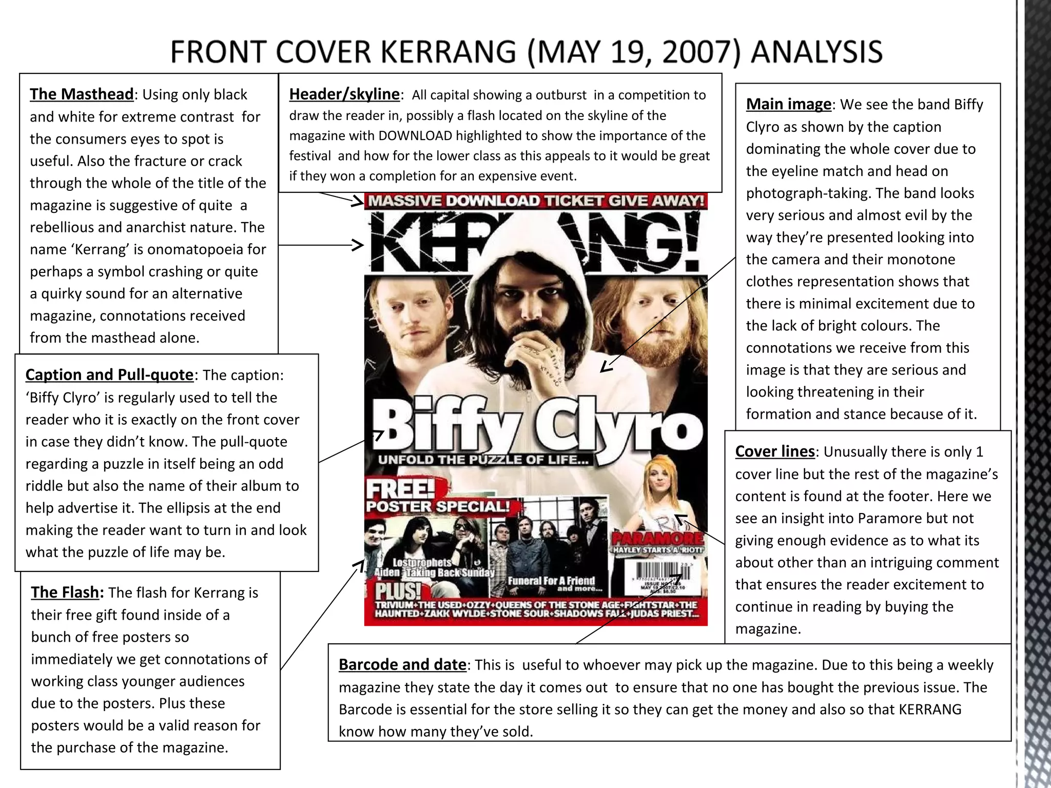
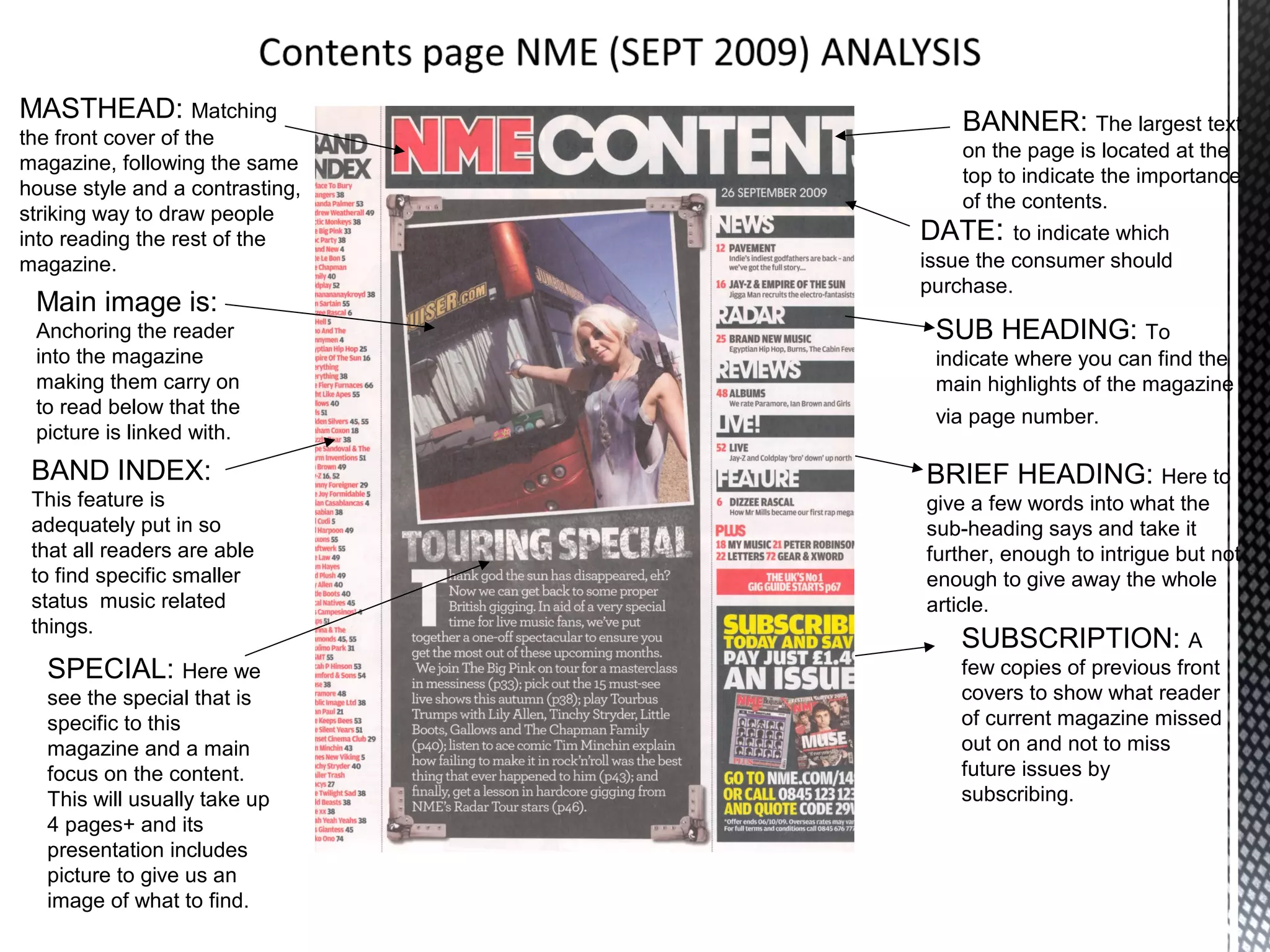
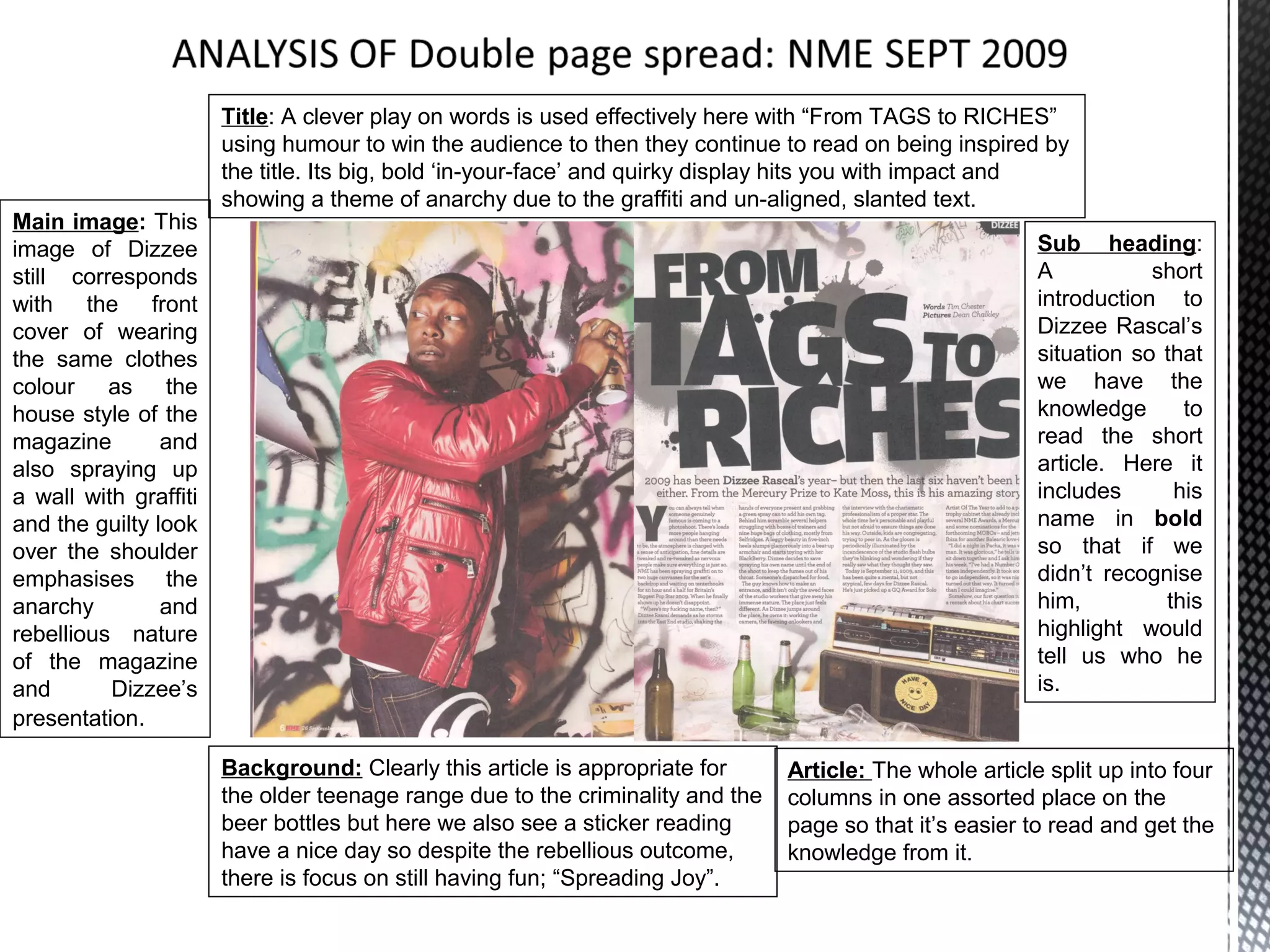
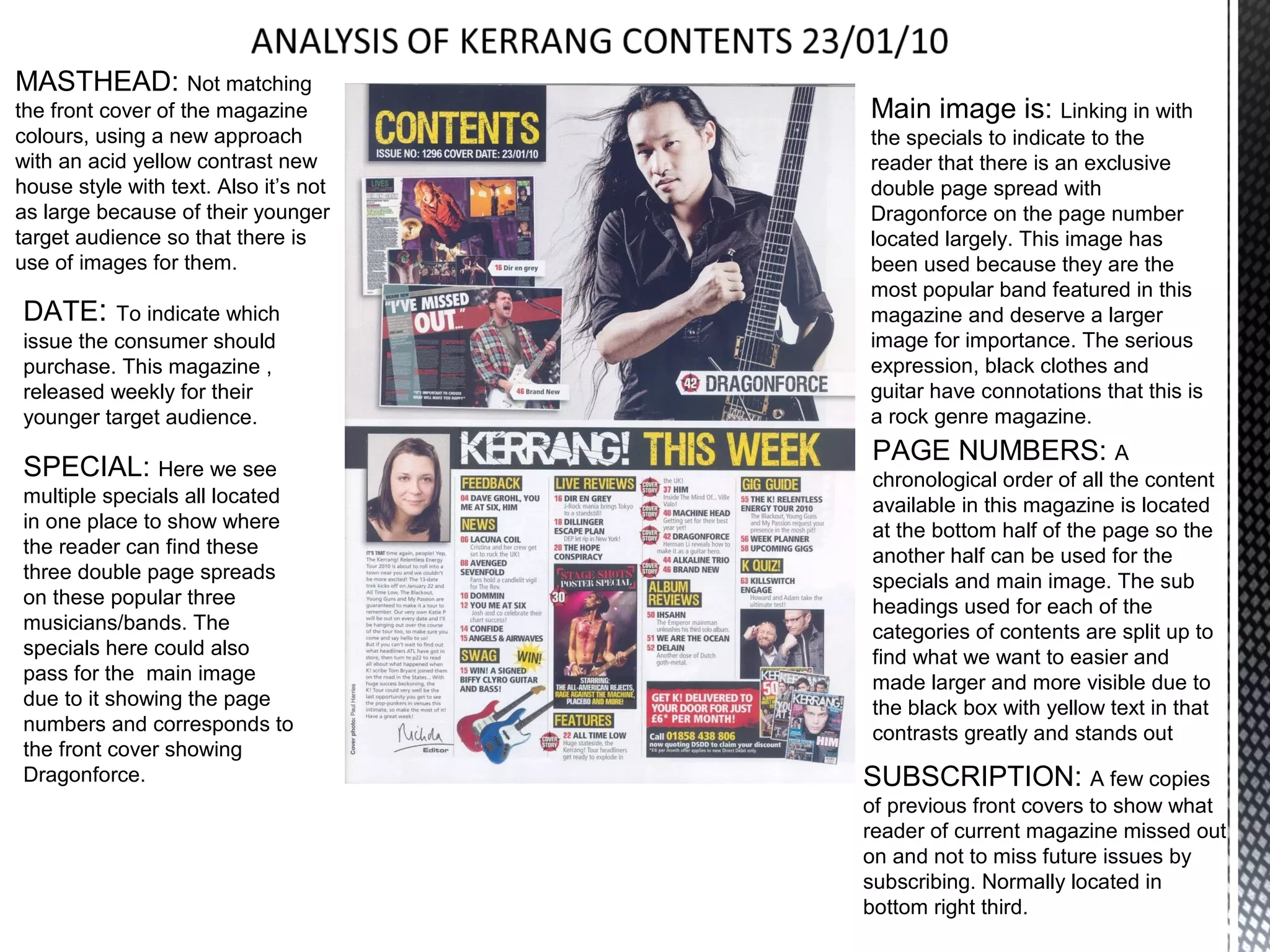
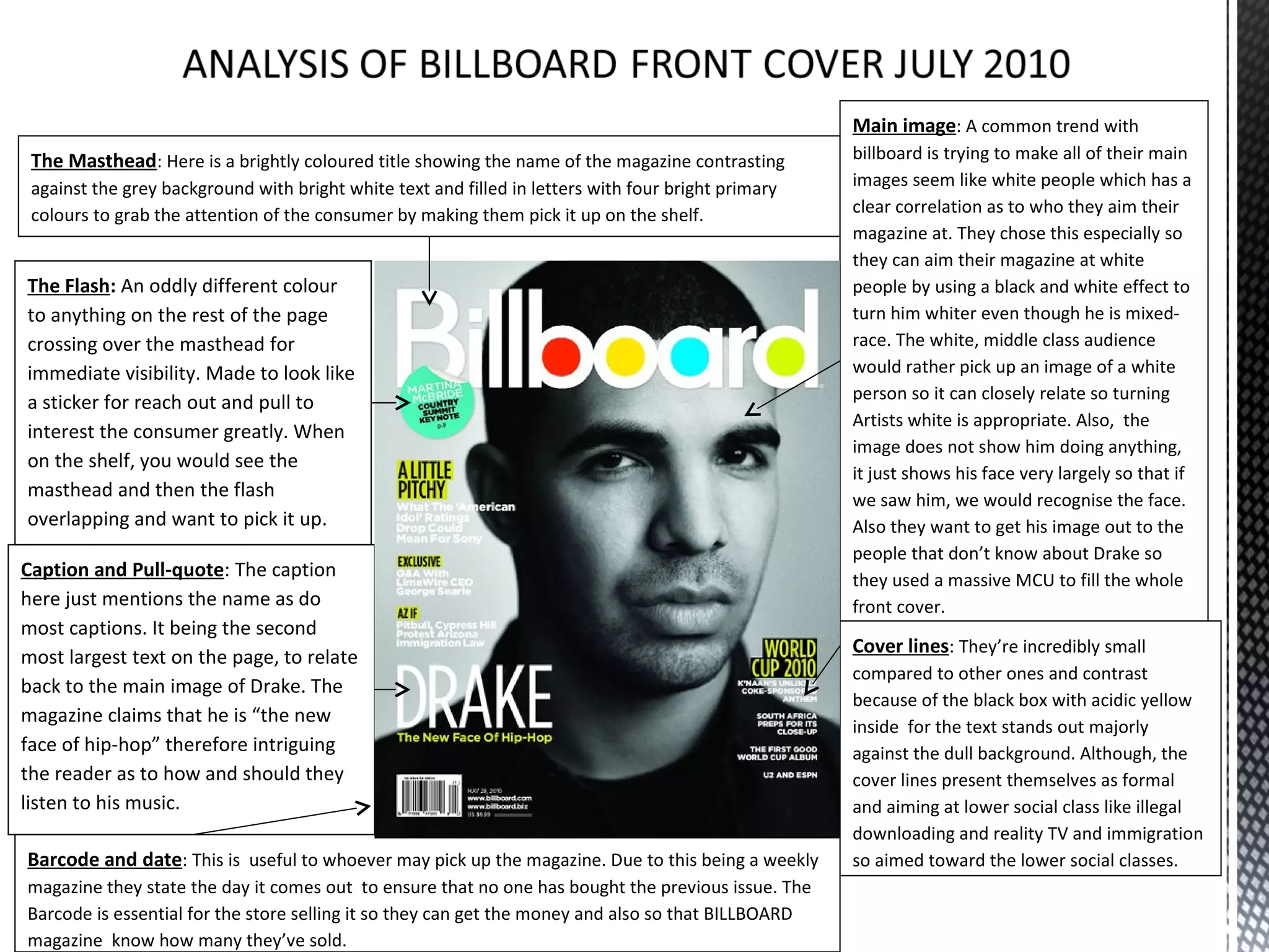
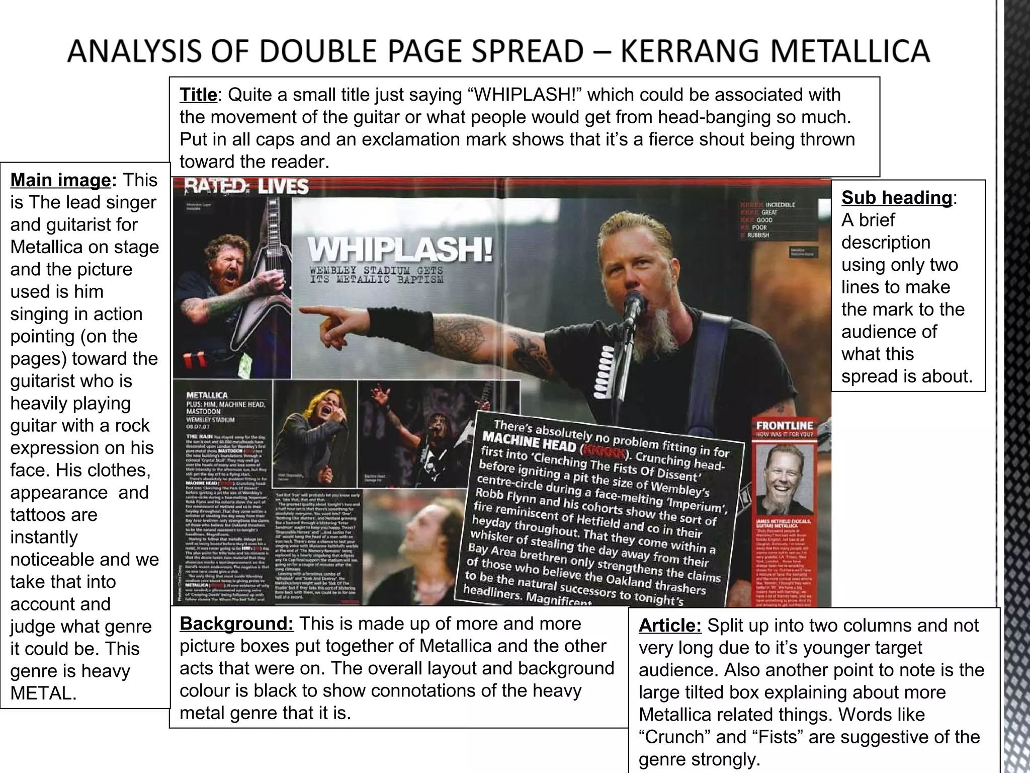
The document provides details on the layout and design elements of various magazine covers. It analyzes aspects like the masthead, date, images, captions, pull quotes, flashes, cover lines, and backgrounds. Elements are examined for the connotations they provide about the magazine's target audience and content. Key details are highlighted to intrigue readers and draw them into the issues.
2. The Masthead: Using only black Header/skyline: All capital showing a outburst in a competition to
Main image: We see the band Biffy
and white for extreme contrast for draw the reader in, possibly a flash located on the skyline of the
Clyro as shown by the caption
the consumers eyes to spot is magazine with DOWNLOAD highlighted to show the importance of the
festival and how for the lower class as this appeals to it would be great dominating the whole cover due to
useful. Also the fracture or crack
if they won a completion for an expensive event. the eyeline match and head on
through the whole of the title of the
photograph-taking. The band looks
magazine is suggestive of quite a
very serious and almost evil by the
rebellious and anarchist nature. The
way they’re presented looking into
name ‘Kerrang’ is onomatopoeia for
the camera and their monotone
perhaps a symbol crashing or quite
clothes representation shows that
a quirky sound for an alternative
there is minimal excitement due to
magazine, connotations received
the lack of bright colours. The
from the masthead alone.
connotations we receive from this
Caption and Pull-quote: The caption: image is that they are serious and
‘Biffy Clyro’ is regularly used to tell the looking threatening in their
reader who it is exactly on the front cover formation and stance because of it.
in case they didn’t know. The pull-quote
Cover lines: Unusually there is only 1
regarding a puzzle in itself being an odd
cover line but the rest of the magazine’s
riddle but also the name of their album to
content is found at the footer. Here we
help advertise it. The ellipsis at the end
see an insight into Paramore but not
making the reader want to turn in and look
giving enough evidence as to what its
what the puzzle of life may be.
about other than an intriguing comment
that ensures the reader excitement to
The Flash: The flash for Kerrang is
continue in reading by buying the
their free gift found inside of a
magazine.
bunch of free posters so
immediately we get connotations of Barcode and date: This is useful to whoever may pick up the magazine. Due to this being a weekly
working class younger audiences magazine they state the day it comes out to ensure that no one has bought the previous issue. The
due to the posters. Plus these Barcode is essential for the store selling it so they can get the money and also so that KERRANG
posters would be a valid reason for know how many they’ve sold.
the purchase of the magazine.
3. MASTHEAD: Matching BANNER: The largest text
the front cover of the
on the page is located at the
magazine, following the same
top to indicate the importance
house style and a contrasting,
of the contents.
striking way to draw people
into reading the rest of the DATE: to indicate which
magazine. issue the consumer should
purchase.
Main image is:
Anchoring the reader SUB HEADING: To
into the magazine indicate where you can find the
making them carry on main highlights of the magazine
to read below that the via page number.
picture is linked with.
BAND INDEX: BRIEF HEADING: Here to
This feature is give a few words into what the
adequately put in so sub-heading says and take it
that all readers are able further, enough to intrigue but not
to find specific smaller enough to give away the whole
status music related article.
things.
SUBSCRIPTION: A
SPECIAL: Here we few copies of previous front
see the special that is covers to show what reader
specific to this of current magazine missed
magazine and a main out on and not to miss
focus on the content. future issues by
This will usually take up subscribing.
4 pages+ and its
presentation includes
picture to give us an
image of what to find.
4. Title: A clever play on words is used effectively here with “From TAGS to RICHES”
using humour to win the audience to then they continue to read on being inspired by
the title. Its big, bold ‘in-your-face’ and quirky display hits you with impact and
showing a theme of anarchy due to the graffiti and un-aligned, slanted text.
Main image: This
image of Dizzee Sub heading:
still corresponds A short
with the front introduction to
cover of wearing Dizzee Rascal’s
the same clothes situation so that
colour as the we have the
house style of the knowledge to
magazine and read the short
also spraying up article. Here it
a wall with graffiti includes his
and the guilty look name in bold
over the shoulder so that if we
emphasises the didn’t recognise
anarchy and him, this
rebellious nature highlight would
of the magazine tell us who he
and Dizzee’s is.
presentation.
Background: Clearly this article is appropriate for Article: The whole article split up into four
the older teenage range due to the criminality and the columns in one assorted place on the
beer bottles but here we also see a sticker reading page so that it’s easier to read and get the
have a nice day so despite the rebellious outcome, knowledge from it.
there is focus on still having fun; “Spreading Joy”.
5. MASTHEAD: Not matching
the front cover of the magazine Main image is: Linking in with
colours, using a new approach the specials to indicate to the
with an acid yellow contrast new reader that there is an exclusive
house style with text. Also it’s not double page spread with
as large because of their younger Dragonforce on the page number
target audience so that there is located largely. This image has
use of images for them. been used because they are the
most popular band featured in this
DATE: To indicate which magazine and deserve a larger
issue the consumer should image for importance. The serious
purchase. This magazine , expression, black clothes and
released weekly for their guitar have connotations that this is
younger target audience. a rock genre magazine.
PAGE NUMBERS: A
SPECIAL: Here we see chronological order of all the content
multiple specials all located available in this magazine is located
in one place to show where at the bottom half of the page so the
the reader can find these another half can be used for the
three double page spreads specials and main image. The sub
on these popular three headings used for each of the
musicians/bands. The categories of contents are split up to
specials here could also find what we want to easier and
pass for the main image made larger and more visible due to
due to it showing the page the black box with yellow text in that
numbers and corresponds to contrasts greatly and stands out
the front cover showing
Dragonforce. SUBSCRIPTION: A few copies
of previous front covers to show what
reader of current magazine missed out
on and not to miss future issues by
subscribing. Normally located in
bottom right third.
6. Main image: A common trend with
The Masthead: Here is a brightly coloured title showing the name of the magazine contrasting billboard is trying to make all of their main
against the grey background with bright white text and filled in letters with four bright primary images seem like white people which has a
colours to grab the attention of the consumer by making them pick it up on the shelf. clear correlation as to who they aim their
magazine at. They chose this especially so
they can aim their magazine at white
The Flash: An oddly different colour people by using a black and white effect to
to anything on the rest of the page turn him whiter even though he is mixed-
crossing over the masthead for race. The white, middle class audience
immediate visibility. Made to look like would rather pick up an image of a white
a sticker for reach out and pull to person so it can closely relate so turning
Artists white is appropriate. Also, the
interest the consumer greatly. When
image does not show him doing anything,
on the shelf, you would see the
it just shows his face very largely so that if
masthead and then the flash we saw him, we would recognise the face.
overlapping and want to pick it up. Also they want to get his image out to the
people that don’t know about Drake so
Caption and Pull-quote: The caption they used a massive MCU to fill the whole
here just mentions the name as do front cover.
most captions. It being the second
Cover lines: They’re incredibly small
most largest text on the page, to relate
compared to other ones and contrast
back to the main image of Drake. The
because of the black box with acidic yellow
magazine claims that he is “the new
inside for the text stands out majorly
face of hip-hop” therefore intriguing against the dull background. Although, the
the reader as to how and should they cover lines present themselves as formal
listen to his music. and aiming at lower social class like illegal
downloading and reality TV and immigration
Barcode and date: This is useful to whoever may pick up the magazine. Due to this being a weekly so aimed toward the lower social classes.
magazine they state the day it comes out to ensure that no one has bought the previous issue. The
Barcode is essential for the store selling it so they can get the money and also so that BILLBOARD
magazine know how many they’ve sold.
7. Title: Quite a small title just saying “WHIPLASH!” which could be associated with
the movement of the guitar or what people would get from head-banging so much.
Put in all caps and an exclamation mark shows that it’s a fierce shout being thrown
toward the reader.
Main image: This
is The lead singer Sub heading:
and guitarist for A brief
Metallica on stage description
and the picture using only two
used is him lines to make
singing in action the mark to the
pointing (on the audience of
pages) toward the what this
guitarist who is spread is about.
heavily playing
guitar with a rock
expression on his
face. His clothes,
appearance and
tattoos are
instantly
noticeable and we
take that into
account and
judge what genre Background: This is made up of more and more Article: Split up into two columns and not
it could be. This picture boxes put together of Metallica and the other very long due to it’s younger target
genre is heavy acts that were on. The overall layout and background audience. Also another point to note is the
METAL. colour is black to show connotations of the heavy large tilted box explaining about more
metal genre that it is. Metallica related things. Words like
“Crunch” and “Fists” are suggestive of the
genre strongly.