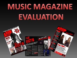
MUSIC MAGAZINE EVALUATION
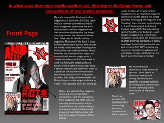
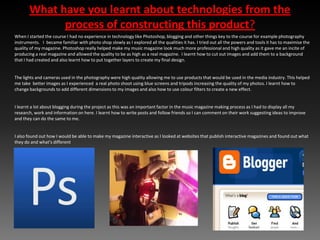
In what ways does your media product use, develop or challenge forms and conventions of real media products? I used freebees to try and  sell my magazine as its an important magazine convention used to attract  my target audience into buying the magazine and “hooking” them into carrying on buying it. A well designed and well placed freebee that suits the target audience can be the difference between  a well bought  magazine and a shelf wore magazine. I used a boy out which is used to often advertise freebees as it adds a new layer that almost pops out at you and screams “BUY ME” as during my research I found out magazines with well places freebees sell better as lets face it everyone loves a freebee!My main image is the focal point of my magazine as it dominates the front cover. This is a common convention used by music magazines as they use the world famous stars to sell the magazine and their dominance is shown by the image covering some of the title which shows how I have used to band to sell my magazine. The name of the band is large and would be known by rock fans all over the world so this would sell the magazine and is often used in the same way I have. However the masthead is an important convention of a music magazine as it creates consistency and is there week in week out letting the target audience exactly what magazine it is straight away. It almost jumps out the shelves at them so is places at the top where most visible hence why most successful magazines include a bold, large and memorable title. The artists portray the target audience as it’s the type of people who I am aiming at.Front PageMy secondary lead dominates a large amount of space as I have used it to promote a new up and coming band to try and appeal to my target audience as my magazine concentrates on new promising bands which is one of my house styles. Kickers are essential to a magazine cover and are an important convention. I took the convention from magazines like NME  who use more big band names to sell the magazine that my target audience and even a broader audience will know and hopefully be lured in to buy the magazine because of these names.There’s an example of a secondary lead dominating space as a convention to sell a magazine
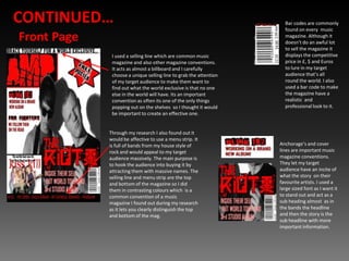
CONTINUED…Bar codes are commonly found on every  music magazine. Although it doesn’t do an awful lot to sell the magazine it displays the competitive price in £, $ and Euros  to lure in my target audience that’s all round the world. I also used a bar code to make the magazine have a realistic  and professional look to it.Front PageI used a selling line which are common music magazine and also other magazine conventions. It acts as almost a billboard and I carefully choose a unique selling line to grab the attention of my target audience to make them want to find out what the world exclusive is that no one else in the world will have. Its an important convention as often its one of the only things popping out on the shelves  so I thought it would be important to create an effective one. Through my research I also found out it would be affective to use a menu strip. It is full of bands from my house style of rock and would appeal to my target audience massively. The main purpose is to hook the audience into buying it by attracting them with massive names. The selling line and menu strip are the top and bottom of the magazine so I did them in contrasting colours which  is a common convention of a music magazine I found out during my research as it lets you clearly distinguish the top and bottom of the mag.Anchorage’s and cover lines are important music magazine conventions. They let my target audience have an incite of what the story  on their favourite artists. I used a large sized font as I want it to stand out and act as a sub heading almost  as in the bands the headline and then the story is the sub headline with more important information.
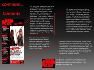
CONTINUED…The main image of a contents page is not usually of the main band on the cover. I found this out from my research of music magazines and applied it in my own piece.  The artists I used in my editorial show the variation of my magazine as  I tried to variate the artists from male and female which is  what is happening in the rock genre at the moment with stars such as Hayley Williams.  This would increase the audience of my magazine as girl rock stars are popular at the moment which could mean more potential sales of the magazine. The artists portray the target audience as it’s the type of people who I am aiming at.My features section contained kickers, cover lines and page numbers. My kickers were of “news”, “reviews”, “interviews” and “features”. I chose these headings because  during my research I conducted I found out in my questionnaire that my target audience wanted these things in a music magazine so I made sure my content fit my target audiences needs to maximise potential sales. I believe this part of my contents is my own individual stamp on the music magazine industry. I constructed the lay out independently and tried to give the magazine its own personality and look. ContentsI included a regulars section in my magazine which is done often by  successful magazines in my genre. It creates consistency in the magazine as you know what your going to get week in week out which keeps the regular buyers happy. I followed many successful magazines ideas of creating a subscription offer in a subscription banner.  Doing this will hopefully give me regular customers  as by offering exclusive offers it would increase the chance of this. This is found in all forms of magazine as they advertise subscriptions often to keep pushing for regular buyers.I really emphasised the % being saved so it stands out and grabs the audiences attention.Just like in the front cover the masthead adds to the identity of the magazine creating consistency and letting people know exactly what magazine it is as it’s a bold and memorable title.
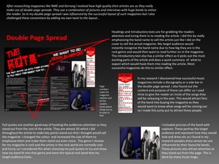
After researching magazines like NME and Kerrang I realised how high quality their articles are as they really make use of double page spreads. They use a combination of pictures and interviews with huge bands to entice the reader. So in my double page spread I was influenced by the successful layout of such magazines but I also challenged these conventions by adding my own twist to the layout…  Headings and introductory texts are for grabbing the readers attention and luring them in to reading the article. I did this by really emphasising the band name to sell the article just like I did on the cover to sell the actual magazine. My target audience would instantly recognise the band name due to how big they are in the rock genre and would then want to read further on in the magazine. The introductory text also has a similar effect as it picks out the most exciting parts of the article and does a quick summary  of  what to expect which would hook them into reading the article. Most successful magazines do this to similar effect.Double Page SpreadIn my research I discovered how successful music magazines include a discography or a side bar in the double page spread. I also found out the content and purpose of these can differ so I used mine to give the reader an incite of the songs they will be releasing in the year. This would attract fans of the band into buying the magazine as they would want to know what songs will be coming out so I made this jump put to attract these people.Page numbers make the magazine realistic and let the readers know where things are so its easy to findPull quotes are another good way of hooking the audiences attention as they stand out from the rest of the article. They are almost 3D which I did throughout the article to make key points stand out that I thought would sell the magazine. I changed the colour  and increased the size of them to emphasise them and make them stand out even more.  The genre I choose for my magazine is rock and the artists in the rock world are normally cool and funny so I considered this when choosing my pull quotes to try and show how my band fit into that genre and were the typical rock band that my target audience loves.I included pictures of the band with captions. These portray the target audience and represent how they would look and dress etc as I found in my research peoples dress senses etc are influenced by their favourite bands. These pictures also attract attention as they stand out from the page. This is done by many music mags.
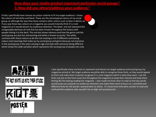
How does your media product represent particular social groups?& How did you attract/address your audience? Firstly I specifically have choose my colour scheme to fit my target audience. I chose the colours of red white and black. These are the stereotypical colours of my social group, as although the way they dress contains other colours such as blue in denim, as if you saw these two colours on a magazine you would instantly think it’s a rock magazine so it would attract my audiences attention. The black  and red represent the recognisable darkness of rock that has been known throughout the history with people linking it to the devil. The red also shows vibrancy and how the genre and the social group are also fun and exciting and white is known as purity. The white contrasts with these colours as do the red creating a mix of different contrasting colours and meanings that make up my social group and genre because not everyone in the social group is the same varying in age and style with everyone being different which shows the wide variation which represents the social group of people into rock.I also specifically chose my fonts to represent and attract my target audience and social group my magazines aimed at. My target audience would be able to recognise these fonts  as they would appeal to them and make them instantly recognise it’s a rock magazine which is what they want. I use the fonts not just on the front cover but throughout the magazine to keep their interest and keep them feeling like the belong reading the magazine.  I also made my fonts clear to read so that key words would jump out and grab my audiences attention and make them want to buy it as I used bold and different fonts for the words I wanted them to notice.  If I chose fonts that were unclear to read and confused the audience sales wouldn’t be as high and would plumit.
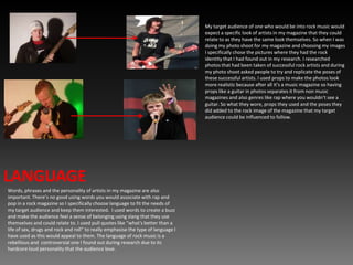
My target audience of one who would be into rock music would expect a specific look of artists in my magazine that they could relate to as they have the same look themselves. So when I was doing my photo shoot for my magazine and choosing my images I specifically chose the pictures where they had the rock identity that I had found out in my research. I researched photos that had been taken of successful rock artists and during my photo shoot asked people to try and replicate the poses of these successful artists. I used props to make the photos look more realistic because after all it’s a music magazine so having props like a guitar in photos separates it from non music magazines and also genres like rap where you wouldn’t see a guitar. So what they wore, props they used and the poses they did added to the rock image of the magazine that my target audience could be influenced to follow.LANGUAGEWords, phrases and the personality of artists in my magazine are also important. There’s no good using words you would associate with rap and pop in a rock magazine so I specifically choose language to fit the needs of my target audience and keep them interested.  I used words to create a buzz and make the audience feel a sense of belonging using slang that they use themselves and could relate to. I used pull quotes like “what's better than a life of sex, drugs and rock and roll” to really emphasise the type of language I have used as this would appeal to them. The language of rock music is a rebellious and  controversial one I found out during research due to its hardcore loud personality that the audience love.
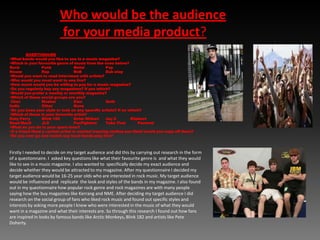
Who would be the audience for your media product? QUESTIONAIREWhat bands would you like to see in a music magazine?
Which is your favourite genre of music from the ones below?Rock	Punk	Metal	Pop	House	Rap 	RnB	Dub step Would you want to read interviews with artists?
Who would you most want to see live?
How much would you be willing to pay for a music magazine?

Music mag evaluation

  • 1.
  • 2.
    In what waysdoes your media product use, develop or challenge forms and conventions of real media products? I used freebees to try and sell my magazine as its an important magazine convention used to attract my target audience into buying the magazine and “hooking” them into carrying on buying it. A well designed and well placed freebee that suits the target audience can be the difference between a well bought magazine and a shelf wore magazine. I used a boy out which is used to often advertise freebees as it adds a new layer that almost pops out at you and screams “BUY ME” as during my research I found out magazines with well places freebees sell better as lets face it everyone loves a freebee!My main image is the focal point of my magazine as it dominates the front cover. This is a common convention used by music magazines as they use the world famous stars to sell the magazine and their dominance is shown by the image covering some of the title which shows how I have used to band to sell my magazine. The name of the band is large and would be known by rock fans all over the world so this would sell the magazine and is often used in the same way I have. However the masthead is an important convention of a music magazine as it creates consistency and is there week in week out letting the target audience exactly what magazine it is straight away. It almost jumps out the shelves at them so is places at the top where most visible hence why most successful magazines include a bold, large and memorable title. The artists portray the target audience as it’s the type of people who I am aiming at.Front PageMy secondary lead dominates a large amount of space as I have used it to promote a new up and coming band to try and appeal to my target audience as my magazine concentrates on new promising bands which is one of my house styles. Kickers are essential to a magazine cover and are an important convention. I took the convention from magazines like NME who use more big band names to sell the magazine that my target audience and even a broader audience will know and hopefully be lured in to buy the magazine because of these names.There’s an example of a secondary lead dominating space as a convention to sell a magazine
  • 3.
    CONTINUED…Bar codes arecommonly found on every music magazine. Although it doesn’t do an awful lot to sell the magazine it displays the competitive price in £, $ and Euros to lure in my target audience that’s all round the world. I also used a bar code to make the magazine have a realistic and professional look to it.Front PageI used a selling line which are common music magazine and also other magazine conventions. It acts as almost a billboard and I carefully choose a unique selling line to grab the attention of my target audience to make them want to find out what the world exclusive is that no one else in the world will have. Its an important convention as often its one of the only things popping out on the shelves so I thought it would be important to create an effective one. Through my research I also found out it would be affective to use a menu strip. It is full of bands from my house style of rock and would appeal to my target audience massively. The main purpose is to hook the audience into buying it by attracting them with massive names. The selling line and menu strip are the top and bottom of the magazine so I did them in contrasting colours which is a common convention of a music magazine I found out during my research as it lets you clearly distinguish the top and bottom of the mag.Anchorage’s and cover lines are important music magazine conventions. They let my target audience have an incite of what the story on their favourite artists. I used a large sized font as I want it to stand out and act as a sub heading almost as in the bands the headline and then the story is the sub headline with more important information.
  • 4.
    CONTINUED…The main imageof a contents page is not usually of the main band on the cover. I found this out from my research of music magazines and applied it in my own piece. The artists I used in my editorial show the variation of my magazine as I tried to variate the artists from male and female which is what is happening in the rock genre at the moment with stars such as Hayley Williams. This would increase the audience of my magazine as girl rock stars are popular at the moment which could mean more potential sales of the magazine. The artists portray the target audience as it’s the type of people who I am aiming at.My features section contained kickers, cover lines and page numbers. My kickers were of “news”, “reviews”, “interviews” and “features”. I chose these headings because during my research I conducted I found out in my questionnaire that my target audience wanted these things in a music magazine so I made sure my content fit my target audiences needs to maximise potential sales. I believe this part of my contents is my own individual stamp on the music magazine industry. I constructed the lay out independently and tried to give the magazine its own personality and look. ContentsI included a regulars section in my magazine which is done often by successful magazines in my genre. It creates consistency in the magazine as you know what your going to get week in week out which keeps the regular buyers happy. I followed many successful magazines ideas of creating a subscription offer in a subscription banner. Doing this will hopefully give me regular customers as by offering exclusive offers it would increase the chance of this. This is found in all forms of magazine as they advertise subscriptions often to keep pushing for regular buyers.I really emphasised the % being saved so it stands out and grabs the audiences attention.Just like in the front cover the masthead adds to the identity of the magazine creating consistency and letting people know exactly what magazine it is as it’s a bold and memorable title.
  • 5.
    After researching magazineslike NME and Kerrang I realised how high quality their articles are as they really make use of double page spreads. They use a combination of pictures and interviews with huge bands to entice the reader. So in my double page spread I was influenced by the successful layout of such magazines but I also challenged these conventions by adding my own twist to the layout… Headings and introductory texts are for grabbing the readers attention and luring them in to reading the article. I did this by really emphasising the band name to sell the article just like I did on the cover to sell the actual magazine. My target audience would instantly recognise the band name due to how big they are in the rock genre and would then want to read further on in the magazine. The introductory text also has a similar effect as it picks out the most exciting parts of the article and does a quick summary of what to expect which would hook them into reading the article. Most successful magazines do this to similar effect.Double Page SpreadIn my research I discovered how successful music magazines include a discography or a side bar in the double page spread. I also found out the content and purpose of these can differ so I used mine to give the reader an incite of the songs they will be releasing in the year. This would attract fans of the band into buying the magazine as they would want to know what songs will be coming out so I made this jump put to attract these people.Page numbers make the magazine realistic and let the readers know where things are so its easy to findPull quotes are another good way of hooking the audiences attention as they stand out from the rest of the article. They are almost 3D which I did throughout the article to make key points stand out that I thought would sell the magazine. I changed the colour and increased the size of them to emphasise them and make them stand out even more. The genre I choose for my magazine is rock and the artists in the rock world are normally cool and funny so I considered this when choosing my pull quotes to try and show how my band fit into that genre and were the typical rock band that my target audience loves.I included pictures of the band with captions. These portray the target audience and represent how they would look and dress etc as I found in my research peoples dress senses etc are influenced by their favourite bands. These pictures also attract attention as they stand out from the page. This is done by many music mags.
  • 6.
    How does yourmedia product represent particular social groups?& How did you attract/address your audience? Firstly I specifically have choose my colour scheme to fit my target audience. I chose the colours of red white and black. These are the stereotypical colours of my social group, as although the way they dress contains other colours such as blue in denim, as if you saw these two colours on a magazine you would instantly think it’s a rock magazine so it would attract my audiences attention. The black and red represent the recognisable darkness of rock that has been known throughout the history with people linking it to the devil. The red also shows vibrancy and how the genre and the social group are also fun and exciting and white is known as purity. The white contrasts with these colours as do the red creating a mix of different contrasting colours and meanings that make up my social group and genre because not everyone in the social group is the same varying in age and style with everyone being different which shows the wide variation which represents the social group of people into rock.I also specifically chose my fonts to represent and attract my target audience and social group my magazines aimed at. My target audience would be able to recognise these fonts as they would appeal to them and make them instantly recognise it’s a rock magazine which is what they want. I use the fonts not just on the front cover but throughout the magazine to keep their interest and keep them feeling like the belong reading the magazine. I also made my fonts clear to read so that key words would jump out and grab my audiences attention and make them want to buy it as I used bold and different fonts for the words I wanted them to notice. If I chose fonts that were unclear to read and confused the audience sales wouldn’t be as high and would plumit.
  • 7.
    My target audienceof one who would be into rock music would expect a specific look of artists in my magazine that they could relate to as they have the same look themselves. So when I was doing my photo shoot for my magazine and choosing my images I specifically chose the pictures where they had the rock identity that I had found out in my research. I researched photos that had been taken of successful rock artists and during my photo shoot asked people to try and replicate the poses of these successful artists. I used props to make the photos look more realistic because after all it’s a music magazine so having props like a guitar in photos separates it from non music magazines and also genres like rap where you wouldn’t see a guitar. So what they wore, props they used and the poses they did added to the rock image of the magazine that my target audience could be influenced to follow.LANGUAGEWords, phrases and the personality of artists in my magazine are also important. There’s no good using words you would associate with rap and pop in a rock magazine so I specifically choose language to fit the needs of my target audience and keep them interested. I used words to create a buzz and make the audience feel a sense of belonging using slang that they use themselves and could relate to. I used pull quotes like “what's better than a life of sex, drugs and rock and roll” to really emphasise the type of language I have used as this would appeal to them. The language of rock music is a rebellious and controversial one I found out during research due to its hardcore loud personality that the audience love.
  • 8.
    Who would bethe audience for your media product? QUESTIONAIREWhat bands would you like to see in a music magazine?
  • 9.
    Which is yourfavourite genre of music from the ones below?Rock Punk Metal Pop House Rap RnB Dub step Would you want to read interviews with artists?
  • 10.
    Who would youmost want to see live?
  • 11.
    How much wouldyou be willing to pay for a music magazine?