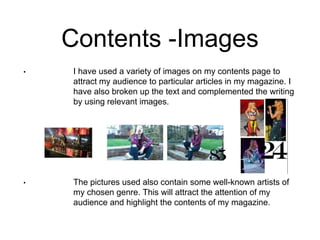
The document discusses how the magazine cover and contents page attract and address the intended audience. On the cover, the slang title, bold text, model photo reflecting the genre, and names of popular artists in large font grab attention. The contents page uses sub-headings to summarize key features, images of well-known artists to highlight articles, and a layout with many images and little text to appeal to a younger audience. The double-page spread enlarges artist names and uses a single large image to condense writing and attract readers while maintaining a tidy look.