Introduction to Statistics
Originand Development of Statistical Thought
• Ancient Roots: Statistical methods date back to
ancient civilizations such as Egypt and Babylon,
where data was recorded for tax and census
purposes.
• Formalization in the 17th Century: Modern
statistics emerged with the work of John Graunt and
William Petty in demographic and economic data
analysis.
• Mathematical Foundations: The 18th and 19th
centuries saw the integration of probability theory
with statistics, driven by thinkers like Laplace and
Gauss.
• Statistics as a Discipline: By the 20th century,
statistics became a core academic and applied
science, essential across domains including biology,
economics, and politics.
2.
Scope and Applicationsof Statistics
Cross-Disciplinary Relevance and Utility
• Economic Analysis: Statistics is vital for
macroeconomic modeling, forecasting, and
market research.
• Healthcare & Epidemiology: Used in clinical
trials, patient data analysis, and predicting
disease outbreaks.
• Natural & Social Sciences: Facilitates
hypothesis testing, data interpretation, and
theory development.
• Policy and Decision-Making: Governments and
organizations use statistics for evidence-based
policies.
3.
Limitations and Misuseof Statistics
Understanding Biases, Errors, and Ethical Risks
Data Bias
Non-representative samples and selective data
collection can skew results.
Misleading Visualizations
Graphs and charts can be manipulated to distort
interpretation.
Overgeneralization
Statistical conclusions may be improperly extended
beyond valid scope.
Ethical Misconduct
Intentional misuse to deceive or support biased
agendas.
4.
Types of Data:Overview
Classification of Data in Statistical Analysis
• Primary Data: Collected firsthand for a specific
research purpose; original and unprocessed.
• Secondary Data: Previously collected data used
for analysis; often sourced from reports or
databases.
• Quantitative Data: Numerical data
representing counts or measurements;
amenable to statistical computation.
• Qualitative Data: Descriptive data capturing
attributes, categories, or labels.
5.
Primary vs. SecondaryData
Key Differences in Source, Accuracy, and Application
• Source of Collection: Primary data is collected
directly by the researcher; secondary data
originates from existing sources.
• Cost and Time: Primary data collection is
expensive and time-consuming; secondary data
is quicker and cost-effective.
• Relevance and Control: Primary data is highly
relevant and under full researcher control;
secondary data may lack relevance or be
outdated.
• Accuracy and Reliability: Primary data is
potentially more accurate but may be limited in
scope; secondary data varies in quality and
reliability.
6.
Quantitative vs. QualitativeData
Nature, Characteristics, and Research Implications
Nature of Data
Quantitative data involves numeric values; qualitative
data involves descriptive attributes.
Measurement and Analysis
Quantitative data supports statistical and
mathematical analysis; qualitative data is analyzed
thematically.
Data Collection Methods
Surveys and instruments for quantitative; interviews
and observations for qualitative.
Research Applications
Quantitative is used for hypothesis testing; qualitative
for understanding experiences and meanings.
7.
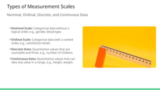
Types of MeasurementScales
Nominal, Ordinal, Discrete, and Continuous Data
• Nominal Scale: Categorical data without a
logical order, e.g., gender, blood type.
• Ordinal Scale: Categorical data with a ranked
order, e.g., satisfaction levels.
• Discrete Data: Quantitative values that are
countable and finite, e.g., number of children.
• Continuous Data: Quantitative values that can
take any value in a range, e.g., height, weight.
8.
Tabular Presentation ofData
Constructing Frequency Distributions for Discrete and Continuous Data
Frequency Table for Discrete Data
Lists distinct values of a variable and their
corresponding frequencies.
Frequency Table for Continuous Data
Groups data into intervals and records the frequency
of values within each interval.
Class Intervals and Boundaries
Defines range for continuous data classes, including
lower and upper boundaries.
Tally and Cumulative Count
Supports quick frequency counting and cumulative
total calculation.
9.
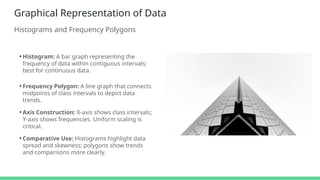
Graphical Representation ofData
Histograms and Frequency Polygons
• Histogram: A bar graph representing the
frequency of data within contiguous intervals;
best for continuous data.
• Frequency Polygon: A line graph that connects
midpoints of class intervals to depict data
trends.
• Axis Construction: X-axis shows class intervals;
Y-axis shows frequencies. Uniform scaling is
critical.
• Comparative Use: Histograms highlight data
spread and skewness; polygons show trends
and comparisons more clearly.
10.
Cumulative Frequency Distributions
Ogivesand Their Analytical Value
• Definition and Purpose: Displays cumulative
totals to show how data accumulates across
intervals.
• Types of Ogives: Less than ogive and greater
than ogive represent cumulative frequencies in
ascending or descending order.
• Graph Construction: Plot class boundaries on
the X-axis and cumulative frequencies on the Y-
axis.
• Applications: Used to determine percentiles,
medians, and to compare distributions.
Editor's Notes
#1 Statistics has its origins deeply rooted in the administrative systems of ancient civilizations. Egyptians recorded crop yields and populations; Babylonians collected tax data. However, the formalization of statistics began in the 17th century when John Graunt analyzed mortality data, laying the foundation for demographic analysis. William Petty further developed the field by applying these methods to economics, forming what we now consider political arithmetic.
The 18th century marked a significant leap with the integration of probability theory by Laplace and Gauss. These developments allowed for more robust inferences and error analysis. By the 20th century, statistics had evolved into a rigorous scientific discipline, impacting diverse fields from public health to market analysis. Understanding this evolution is crucial as it shapes how statistics is applied and interpreted today.
This historical perspective not only highlights the importance of statistics but also frames the context for its current use and future potential. The progression from basic record-keeping to advanced predictive analytics reflects a dynamic and continually evolving science.
#2 Statistics permeates virtually every field of human knowledge. In economics, it allows for modeling economic phenomena, understanding consumer behavior, and making informed fiscal policy decisions. From inflation rates to GDP forecasts, statistics helps policymakers anticipate future conditions.
In healthcare, statistics underpins everything from designing clinical trials to tracking the spread of diseases like COVID-19. Epidemiologists rely on data to identify patterns and mitigate public health crises. Natural and social sciences depend on statistical methods to test hypotheses, validate theories, and understand complex phenomena.
Importantly, data-driven decision-making is becoming the norm in policy environments. Governments and international organizations leverage statistical tools to create impactful programs and assess their effectiveness. These examples illustrate that understanding statistics is not just an academic exercise—it’s a critical skill for real-world problem-solving.
#3 While statistics is a powerful tool for understanding data, it is equally important to recognize its limitations and potential for misuse. One of the most common issues is data bias—whether due to poor sampling methods or intentional exclusion of certain data points, biased data can lead to inaccurate and misleading conclusions.
Visual representations, such as charts and graphs, can be manipulated through scale distortion or selective emphasis to promote a particular narrative. Even well-intentioned analyses can result in overgeneralization when conclusions are extended beyond what the data actually supports.
Perhaps most concerning is the ethical misuse of statistics. When data is intentionally distorted or selectively presented to mislead stakeholders or support predetermined agendas, the credibility of statistical analysis suffers. Understanding these limitations is essential for both producers and consumers of statistical information, helping to foster critical thinking and ethical practice in data analysis.
#4 Understanding the different types of data is foundational to any statistical analysis. Broadly, data can be divided into primary and secondary categories. Primary data is gathered directly from original sources through methods like surveys or experiments. It's tailored to the researcher's needs but may be resource-intensive to collect.
Secondary data, in contrast, comes from existing sources such as government reports, academic publications, or databases. It is cost-effective and convenient, but its relevance and accuracy must be critically evaluated.
From a measurement perspective, data is further classified into quantitative and qualitative types. Quantitative data involves numerical values that can be measured or counted—perfect for computation and statistical testing. Qualitative data, on the other hand, includes non-numerical information that describes qualities or characteristics, like gender, opinions, or colors. Both forms are vital, depending on the context and research objectives.
#5 When comparing primary and secondary data, several dimensions distinguish them, each with critical implications for research design. First is the source—primary data is generated firsthand, giving the researcher full control over how, when, and where the data is collected. This makes it highly tailored but also resource-intensive in terms of cost and time.
Secondary data, however, is collected by others, often for different purposes, and is readily available in the form of reports, databases, and literature. It offers convenience and broader scope, but the researcher must carefully assess its relevance, timeliness, and credibility.
The trade-off between control and convenience is central. Primary data ensures relevance and methodological rigor but may be constrained by logistical limits. Secondary data, while abundant and efficient, requires critical evaluation for appropriateness in a specific research context. Both types play essential roles, depending on the nature of the investigation.
#6 Quantitative and qualitative data are fundamental classifications in research, each with unique characteristics and applications. Quantitative data consists of measurable variables such as height, age, income, or temperature. It enables statistical testing and predictive modeling, making it suitable for studies requiring precision and generalizability.
In contrast, qualitative data captures rich, textual, or visual information. It explores subjective experiences, motivations, and meanings through open-ended interviews, observations, or content analysis. While less amenable to numerical computation, qualitative methods provide depth and context that quantitative data might miss.
The two are not mutually exclusive. Mixed-methods research combines both to leverage the strengths of each. Understanding the distinctions between quantitative and qualitative data is critical in choosing the right tools and interpretation frameworks for your research objectives.
#7 In statistics, recognizing the scale of measurement is vital to selecting appropriate analysis methods. The **nominal scale** represents data that categorizes without any order or ranking. Examples include gender or nationality. These categories are mutually exclusive and exhaustive but cannot be logically sequenced.
The **ordinal scale** adds order to categories—like survey responses rated from 'very dissatisfied' to 'very satisfied.' Although ranked, the intervals between values are not uniform or measurable.
Quantitative data is classified into **discrete** and **continuous** types. Discrete data arises from counting—such as the number of students in a class—and only includes whole values. In contrast, continuous data comes from measurement and can assume any value within a specified range, like temperature or length.
Each scale determines the statistical tools you can use—nominal data uses chi-square tests, ordinal data might use non-parametric tests, and continuous data often supports parametric analysis. Grasping these distinctions is essential for rigorous and meaningful data interpretation.
#8 Tabular presentation of data allows for a structured and clear view of large datasets. For **discrete data**, each unique value is listed along with its frequency. This format is ideal for countable variables such as the number of students receiving specific grades.
When dealing with **continuous data**, values are grouped into **class intervals** to manage the infinite variability. For instance, instead of listing every student height, heights are grouped into ranges like 150–160 cm, 160–170 cm, etc. Each range includes a **lower and upper boundary** that defines its span.
Tables also often feature **tally marks** to simplify counting frequencies and may include **cumulative frequencies**, which show the total number of observations up to each interval. This method is particularly useful in understanding data distributions before moving into visual or statistical analysis.
#9 Graphical representation is a powerful tool in statistics for making data comprehensible at a glance. Two of the most common methods are **histograms** and **frequency polygons**.
A **histogram** uses bars to represent frequency distributions of continuous data. Unlike bar charts, histograms have no gaps between bars, emphasizing the continuous nature of the data. They are excellent for visualizing distribution shapes, skewness, and central tendencies.
**Frequency polygons**, on the other hand, connect the midpoints of class intervals with a line. This makes it easier to compare multiple distributions or observe trends over time. They are especially useful when overlaying several data series for comparative analysis.
Proper **axis construction** and **scaling** are essential for accuracy. The X-axis should clearly denote class intervals while the Y-axis shows frequencies. Both histograms and polygons complement each other and are often used together for comprehensive data visualization.
#10 Cumulative frequency distributions provide a running total of frequencies through a dataset and are typically visualized using ogive charts. These tools are invaluable for understanding how data values accumulate over intervals.
There are two main types of **ogives**: the *less than ogive*, which accumulates frequencies from the lowest interval upward, and the *greater than ogive*, which does so in the opposite direction. These graphs are plotted using class boundaries on the horizontal axis and cumulative frequencies on the vertical axis.
Ogives are particularly useful in determining percentiles and medians. For instance, by identifying the value below which 50% of the data falls, you can locate the median directly from the graph. They are also effective in comparing distributions or checking for skewness. When used alongside histograms and frequency polygons, ogives provide a comprehensive view of a dataset’s distribution characteristics.


![FBS 719 and FBS 819 BIOSTATISTICS [Autosaved].pptx](https://cdn.slidesharecdn.com/ss_thumbnails/fbs719andfbs819biostatisticsautosaved-240713084256-92f19157-thumbnail.jpg?width=640&height=640&fit=bounds)