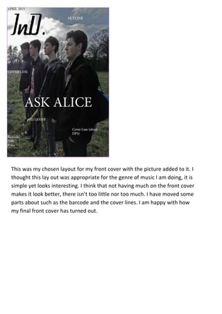
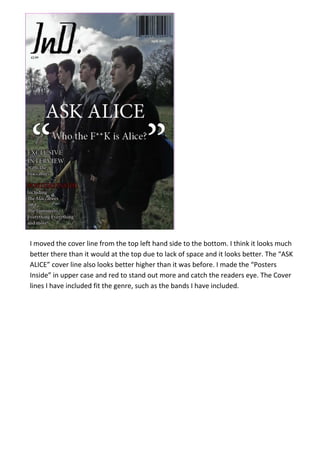
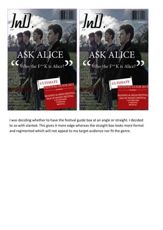
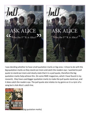
This document discusses the design choices made for a music magazine front cover layout. The layout is simple with just a picture and essential text elements. Elements like the cover lines and "Posters Inside" text were moved or styled differently to stand out more and fit the genre. A festival guide box was made slanted rather than straight to seem less formal. Large quotation marks were chosen for a pull quote to catch the reader's eye, as seen on other magazines.


![Production Phase[1]](https://cdn.slidesharecdn.com/ss_thumbnails/productionphase1-100401141413-phpapp01-thumbnail.jpg?width=640&height=640&fit=bounds)


