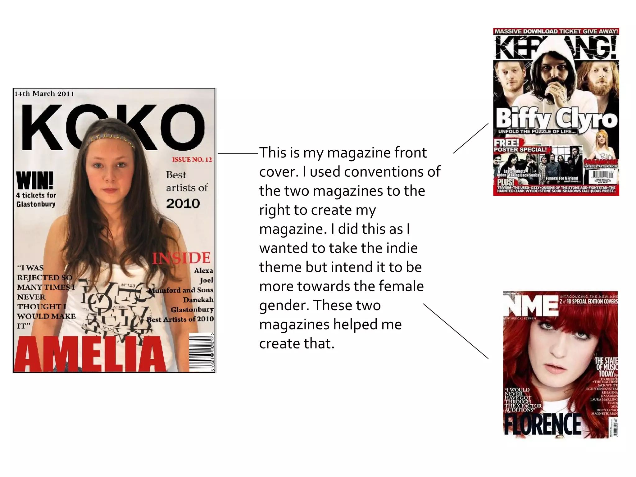
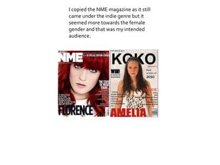
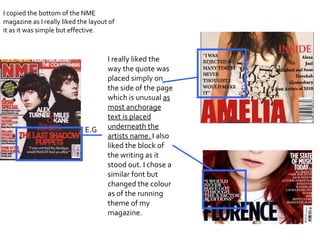
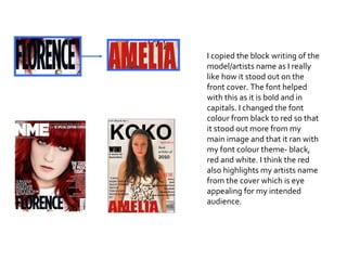
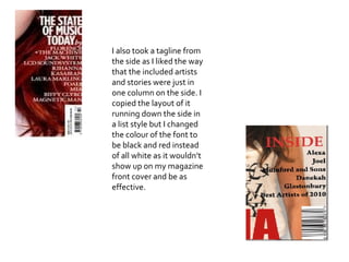
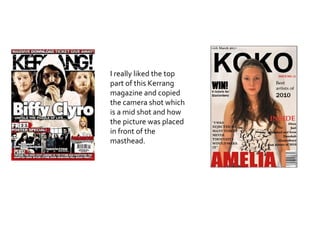
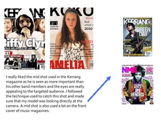
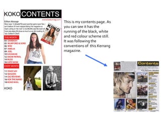
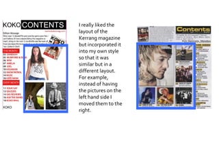
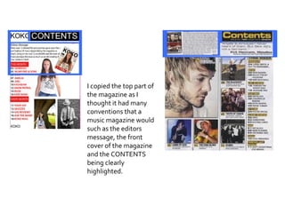
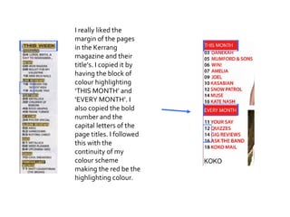
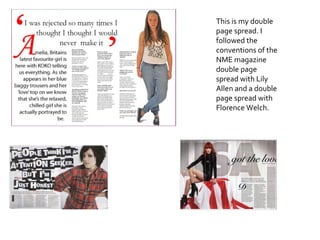
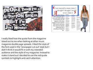
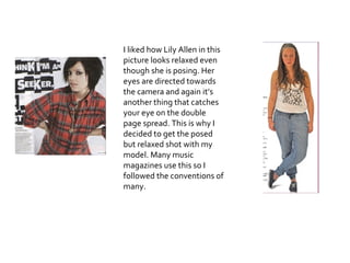
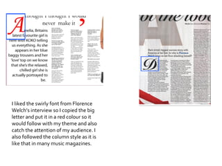
This is my magazine front cover. I used conventions of the two magazines to the right to create my magazine. I did this as I wanted to take the indie theme but intend it to be more towards the female gender. These two magazines helped me create that.
I copied the NME magazine as it still came under the indie genre but it seemed more towards the female gender and that was my intended audience.
I copied the bottom of the NME magazine as I really liked the layout of it as it was simple but effective.  I really liked the way the quote was placed simply on the side of the page which is unusual  as most anchorage text is placed underneath the artists name.   I also   liked the block of the writing as it stood out. I chose a similar font but changed the colour as of the running theme of my magazine.  E.G
I copied the block writing of the model/artists name as I really like how it stood out on the front cover. The font helped with this as it is bold and in capitals. I changed the font colour from black to red so that it stood out more from my main image and that it ran with my font colour theme- black, red and white. I think the red also highlights my artists name from the cover which is eye appealing for my intended audience.
I also took a tagline from the side as I liked the way that the included artists and stories were just in one column on the side. I copied the layout of it running down the side in a list style but  I  changed the colour of the font to be black and red instead of all white as it wouldn’t show up on my magazine front cover and be as effective.
I really liked the top part of this Kerrang magazine and copied the camera shot which is a mid shot and how the picture was placed in front of the masthead.
I really liked the mid shot used in the Kerrang magazine as he is seen as more important than his other band members and the eyes are really appealing to the targeted audience. I followed the technique used to catch this shot and made sure that my model was looking directly at the camera. A mid shot is also used a lot on the front cover of music magazines.
This is my contents page. As you can see it has the running of the black, white and red colour scheme still. It was following the conventions of  this Kerrang magazine.
I really liked the layout of the Kerrang magazine but incorporated it into my own style so that it was similar but in a different layout. For example, instead of having the pictures on the left hand side I moved them to the right.
I copied the top part of the magazine as I thought it had many conventions that a music magazine would such as the editors message, the front cover of the magazine and the CONTENTS being clearly highlighted.
I really liked the margin of the pages in the Kerrang magazine and their title’s. I copied it by having the block of colour highlighting ‘THIS MONTH’ and ‘EVERY MONTH’. I also copied the bold number and the capital letters of the page titles. I followed this with the continuity of my colour scheme making the red be the highlighting colour.
This is my double page spread. I followed the conventions of the NME magazine double page spread with Lily Allen and a double page spread with Florence Welch.
I really liked how the quote from the magazine stood out to me when looking at other music magazine double page spreads. I liked the style of the font used in the ‘newspaper cut out’ style but I didn’t think it would fit in with my intended audience and the style of my magazine. Instead to make it stand out I decided to use the red quote symbols to highlight and catch attention.
I liked how Lily Allen in this picture looks relaxed even though she is posing. Her eyes are directed towards the camera and again it’s another thing that catches your eye on the double page spread. This is why I decided to get the posed but relaxed shot with my model. Many music magazines use this so I followed the conventions of many.
I liked the swirly font from Florence Welch’s interview so I copied the big letter and put it in a red colour so it would follow with my theme and also catch the attention of my audience. I also followed the column style as it is like that in many music magazines.

Media evaluation question 1

  • 1.
    This is mymagazine front cover. I used conventions of the two magazines to the right to create my magazine. I did this as I wanted to take the indie theme but intend it to be more towards the female gender. These two magazines helped me create that.
  • 2.
    I copied theNME magazine as it still came under the indie genre but it seemed more towards the female gender and that was my intended audience.
  • 3.
    I copied thebottom of the NME magazine as I really liked the layout of it as it was simple but effective. I really liked the way the quote was placed simply on the side of the page which is unusual as most anchorage text is placed underneath the artists name. I also liked the block of the writing as it stood out. I chose a similar font but changed the colour as of the running theme of my magazine. E.G
  • 4.
    I copied theblock writing of the model/artists name as I really like how it stood out on the front cover. The font helped with this as it is bold and in capitals. I changed the font colour from black to red so that it stood out more from my main image and that it ran with my font colour theme- black, red and white. I think the red also highlights my artists name from the cover which is eye appealing for my intended audience.
  • 5.
    I also tooka tagline from the side as I liked the way that the included artists and stories were just in one column on the side. I copied the layout of it running down the side in a list style but I changed the colour of the font to be black and red instead of all white as it wouldn’t show up on my magazine front cover and be as effective.
  • 6.
    I really likedthe top part of this Kerrang magazine and copied the camera shot which is a mid shot and how the picture was placed in front of the masthead.
  • 7.
    I really likedthe mid shot used in the Kerrang magazine as he is seen as more important than his other band members and the eyes are really appealing to the targeted audience. I followed the technique used to catch this shot and made sure that my model was looking directly at the camera. A mid shot is also used a lot on the front cover of music magazines.
  • 8.
    This is mycontents page. As you can see it has the running of the black, white and red colour scheme still. It was following the conventions of this Kerrang magazine.
  • 9.
    I really likedthe layout of the Kerrang magazine but incorporated it into my own style so that it was similar but in a different layout. For example, instead of having the pictures on the left hand side I moved them to the right.
  • 10.
    I copied thetop part of the magazine as I thought it had many conventions that a music magazine would such as the editors message, the front cover of the magazine and the CONTENTS being clearly highlighted.
  • 11.
    I really likedthe margin of the pages in the Kerrang magazine and their title’s. I copied it by having the block of colour highlighting ‘THIS MONTH’ and ‘EVERY MONTH’. I also copied the bold number and the capital letters of the page titles. I followed this with the continuity of my colour scheme making the red be the highlighting colour.
  • 12.
    This is mydouble page spread. I followed the conventions of the NME magazine double page spread with Lily Allen and a double page spread with Florence Welch.
  • 13.
    I really likedhow the quote from the magazine stood out to me when looking at other music magazine double page spreads. I liked the style of the font used in the ‘newspaper cut out’ style but I didn’t think it would fit in with my intended audience and the style of my magazine. Instead to make it stand out I decided to use the red quote symbols to highlight and catch attention.
  • 14.
    I liked howLily Allen in this picture looks relaxed even though she is posing. Her eyes are directed towards the camera and again it’s another thing that catches your eye on the double page spread. This is why I decided to get the posed but relaxed shot with my model. Many music magazines use this so I followed the conventions of many.
  • 15.
    I liked theswirly font from Florence Welch’s interview so I copied the big letter and put it in a red colour so it would follow with my theme and also catch the attention of my audience. I also followed the column style as it is like that in many music magazines.