The document discusses the contents page of a magazine, praising certain design elements and critiquing others. It notes that the contents page is split into groups to make it easier to read and uses simple, unisex colors. However, it criticizes a yellow box that disrupts the color scheme and makes the page look "tacky." Overall, it appreciates the use of bold images and titles to draw the eye while keeping the text concise and readable.
These are my final flat plans for my POP music magazine. This powerpoint includes my flat plans for the cover page, chart page, contents page, and both pages of the double page spread.
These are my final decisions on the fonts I will use for my music magazine and the colour scheme I will use. There are also my final photos I will use in my magazine.
Here I have asked three people from my target audince to evaluate my magazine and pick out the good and not so good points. I used females and a male to give a fair view from both genders
Altromercato - Osservatorio del Vivere Responsabile - 2a Edizione - 2014Alberto Stracuzzi
Is the Consumer ready to be "responsible".
The report from the second edition of Osservatorio Altromercato del Vivere Responsabile (Altromercato Monitor on Responsible Living).
Altromercato is the prominent fair trade organization in Italy.
CFI Group is the leading agency in Customer Asser Studies.
Hadj Ounis's most notable work is his sculpture titled "Metamorphosis." This piece showcases Ounis's mastery of form and texture, as he seamlessly combines metal and wood to create a dynamic and visually striking composition. The juxtaposition of the two materials creates a sense of tension and harmony, inviting viewers to contemplate the relationship between nature and industry.
2137ad Merindol Colony Interiors where refugee try to build a seemengly norm...luforfor
This are the interiors of the Merindol Colony in 2137ad after the Climate Change Collapse and the Apocalipse Wars. Merindol is a small Colony in the Italian Alps where there are around 4000 humans. The Colony values mainly around meritocracy and selection by effort.
Explore the multifaceted world of Muntadher Saleh, an Iraqi polymath renowned for his expertise in visual art, writing, design, and pharmacy. This SlideShare delves into his innovative contributions across various disciplines, showcasing his unique ability to blend traditional themes with modern aesthetics. Learn about his impactful artworks, thought-provoking literary pieces, and his vision as a Neo-Pop artist dedicated to raising awareness about Iraq's cultural heritage. Discover why Muntadher Saleh is celebrated as "The Last Polymath" and how his multidisciplinary talents continue to inspire and influence.
2137ad - Characters that live in Merindol and are at the center of main storiesluforfor
Kurgan is a russian expatriate that is secretly in love with Sonia Contado. Henry is a british soldier that took refuge in Merindol Colony in 2137ad. He is the lover of Sonia Contado.
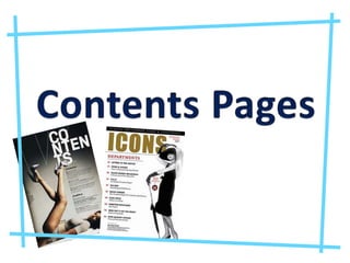
2. This magazine doesn’t have a usual title for the contents page which I like, it has NME this week which I think works really well. I like how the page is split up into different groups which make it easier for the reader. I think that the contents page should have a better picture on it because it is a little messy looking but that’s because it suits that type of music. I like the colours used in the contents because they are very simple unisex colours and the red parts stand out. I don’t like the box at in the bottom left because the yellow ruins the colour scheme and makes you focus on that bit first and it makes the page look a bit tacky. The magazine name is located on the left hand side of the page and it rather big so people know what magazine it is. I like that the magazine has an explanation of what's happening in the picture, but also it makes the page look as if there is too much going on and I think it would look better if it was more simplistic rather than clumped up.
3. I love the black and white image of Cheryl Cole because it looks really good and also the pose it really weird which looks good. The clothing she is wearing is quite like rock which I think looks really good and works with the black and white image and also is what Q magazine is normally associated with so it works well for the target market. There are also other images on the page which work well but I think it would look more professional just having the one big one, however it does work well as people will know what's happening in the magazine. The colour scheme red, black and white works really well as the colours complement each other very well. The magazine logo is placed on the left hand side of the page so people know what magazine it is. I like that the pictures show the page numbers on the side of it, so it’s easy to see what page the article with that picture is on, which makes it easier to see.
4. This contents page uses bland colours which makes the red on the heart stand out which looks good. I like the use of the standing out images because it means that you have a focus point. Having little text makes it easy for the reader to read, and having bold titles makes it easy for the reader to see what pages they want to read. The magazine logo is placed on the left hand side of the page so people know what magazine it is and is really big and bold so the reader knows what magazine it is. I really like the black and white theme that is used, as the red heart stands out against the dull colours, and it makes me think about having a focus colour and a black and white theme on my contents. I really like the pose that Kanye is doing and how he has his hands in his pockets which makes him look as if he has pride. I really like the font used on the features and fashion titles, this writing is fancy and classy. I like the unusual title as it is in three parts which I like, as it is very different and unique. The use of having unusual fonts makes it stand out as if it didn’t it would be too dull as the colours aren’t bright so the fonts need to be unusual.