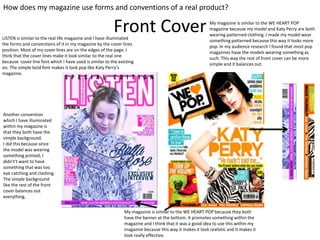
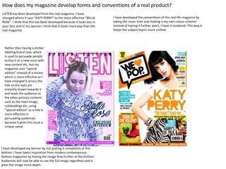
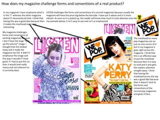
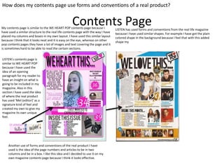
Music Magazine
Evaluation
Front Cover
How does my magazine use forms and conventions of a real product?
My magazine is similar to the WE HEART POP because they both
have the banner at the bottom. It promotes something within the
magazine and I think that it was a good idea to use this within my
magazine because this way it makes it look realistic and it makes it
look really effective.
LISTEN is similar to the real life magazine and I have illuminated
the forms and conventions of it in my magazine by the cover lines
position. Most of my cover lines are on the edges of the page. I
think that the cover lines make it look similar to the real one
because cover line font which I have used is similar to the existing
on. The simple bold font makes it look pop like Katy Perry’s
magazine.
My magazine is similar to the WE HEART POP
magazine because my model and Katy Perry are both
wearing patterned clothing. I made my model wear
something patterned because this way it looks more
pop. In my audience research I found that most pop
magazines have the models wearing something as
such. This way the rest of front cover can be more
simple and it balances out.
Another convention
which I have illuminated
within my magazine is
that they both have the
simple background.
I did this because since
the model was wearing
something printed, I
didn't’t want to have
something that was too
eye catching and clashing.
The simple background
like the rest of the front
cover balances out
everything.
How does my magazine develop forms and conventions of a real product?
LISTEN has been developed from the real magazine. I have
changed where it says “KATY PERRY” to the more effective “BELLA
ROSE”. I think that this has been developed because it looks less in
your face and in my opinion I think that it looks more pop than the
real magazine.
I have developed the conventions of the real life magazine by
taking the cover lines and making it my own colour scheme.
Instead of having it further apart, I have it clustered. This way it
keeps the subject topics more unified.
I have developed my banner by not putting it completely at this
bottom. I have taken inspiration from modern contemporary
fashion magazines by having the image flow further at the bottom.
Audiences will now be able to see the full image regardless and it
gives the image more depth.
Rather than having a sticker
labeling brand new, which
is used to persuade people
to buy it as a new issue with
new content etc, but my
magazine uses “special
edition” instead of a sticker
which is more effective as I
have enlarged it across the
title so the eyes are
instantly drawn towards it
and leads the audience to
the other primary content
such as the main image,
subheadings etc. using
“special edition” as a title is
more effective in
persuading audiences
because it gives this issue a
unique value.
How does my magazine challenge forms and conventions of a real product?
My magazine challenges
forms and conventions of
existing magazines because
I don’t have the large “turn
up the volume” image. I
thought that this looked
tacky and it made the
magazine too full. It didn't’t
emphasise the image and
this way it wouldn't’t look
good. If I had to put this on,
then it would look really
messy and not coherent as
it currently does.
LISTEN challenges the forms and conventions of a normal magazines because usually the
magazine will have the price tag below the barcode. I have put it above and it is more
vibrant. As soon as it is picked up, the reader will know how much it costs whereas ones like
my example below, it isn't easy to see and isn't as emphasised
The masthead on many
pop magazines are on
just on one corner of it
but in my magazine it
goes right across the
magazine. I think that
this is an effective way
to put the masthead
because then it is easy
to read and it also gets
the readers attention
straight away. I think
that having the
masthead across the top
was a good idea because
then it doesn’t stick to
the forms and
conventions of the
normal pop magazines
and gives it flare.
In my magazine I have emphasise what is
in the “I” whereas the other magazine
doesn't’t necessarily do that. I think that
having this was a good idea because then
it makes the masthead look more
interesting.
Contents Page
How does my contents page use forms and conventions of a real product?
My contents page is similar to the WE HEART POP contents page because I
have used a similar structure to the real life contents page with the way I have
placed my columns and boxes in my own layout. I have used this similar layout
because I think that it looks neat and it is easy on the eye, whereas on other
pop contents pages they have a lot of images and text covering the page and it
is sometimes hard to be able to read the certain sections.
LISTEN’s contents page is
similar to WE HEART POP
because I have used the
idea of an opening
paragraph for my reader to
have an insight on what is
going to be included in my
magazine. Also in this
section I have used the idea
of where the real product
has used ‘Mel (editor)’ as a
signature kind of feel and
created my own to give my
magazine its own unique
feel.
Another use of forms and conventions of the real product I have
used is the idea of the page numbers and articles to be in two
columns and be in a box. I like this idea and I decided to use it on my
own magazine contents page because I think it looks effective.
LISTEN has used forms and conventions from the real life magazine
because I have used similar shapes. For example I have got the plain
colored shape in the background because I feel that with this added
shape my

Evaluation

  • 1.
  • 2.
    Front Cover How doesmy magazine use forms and conventions of a real product? My magazine is similar to the WE HEART POP because they both have the banner at the bottom. It promotes something within the magazine and I think that it was a good idea to use this within my magazine because this way it makes it look realistic and it makes it look really effective. LISTEN is similar to the real life magazine and I have illuminated the forms and conventions of it in my magazine by the cover lines position. Most of my cover lines are on the edges of the page. I think that the cover lines make it look similar to the real one because cover line font which I have used is similar to the existing on. The simple bold font makes it look pop like Katy Perry’s magazine. My magazine is similar to the WE HEART POP magazine because my model and Katy Perry are both wearing patterned clothing. I made my model wear something patterned because this way it looks more pop. In my audience research I found that most pop magazines have the models wearing something as such. This way the rest of front cover can be more simple and it balances out. Another convention which I have illuminated within my magazine is that they both have the simple background. I did this because since the model was wearing something printed, I didn't’t want to have something that was too eye catching and clashing. The simple background like the rest of the front cover balances out everything.
  • 3.
    How does mymagazine develop forms and conventions of a real product? LISTEN has been developed from the real magazine. I have changed where it says “KATY PERRY” to the more effective “BELLA ROSE”. I think that this has been developed because it looks less in your face and in my opinion I think that it looks more pop than the real magazine. I have developed the conventions of the real life magazine by taking the cover lines and making it my own colour scheme. Instead of having it further apart, I have it clustered. This way it keeps the subject topics more unified. I have developed my banner by not putting it completely at this bottom. I have taken inspiration from modern contemporary fashion magazines by having the image flow further at the bottom. Audiences will now be able to see the full image regardless and it gives the image more depth. Rather than having a sticker labeling brand new, which is used to persuade people to buy it as a new issue with new content etc, but my magazine uses “special edition” instead of a sticker which is more effective as I have enlarged it across the title so the eyes are instantly drawn towards it and leads the audience to the other primary content such as the main image, subheadings etc. using “special edition” as a title is more effective in persuading audiences because it gives this issue a unique value.
  • 4.
    How does mymagazine challenge forms and conventions of a real product? My magazine challenges forms and conventions of existing magazines because I don’t have the large “turn up the volume” image. I thought that this looked tacky and it made the magazine too full. It didn't’t emphasise the image and this way it wouldn't’t look good. If I had to put this on, then it would look really messy and not coherent as it currently does. LISTEN challenges the forms and conventions of a normal magazines because usually the magazine will have the price tag below the barcode. I have put it above and it is more vibrant. As soon as it is picked up, the reader will know how much it costs whereas ones like my example below, it isn't easy to see and isn't as emphasised The masthead on many pop magazines are on just on one corner of it but in my magazine it goes right across the magazine. I think that this is an effective way to put the masthead because then it is easy to read and it also gets the readers attention straight away. I think that having the masthead across the top was a good idea because then it doesn’t stick to the forms and conventions of the normal pop magazines and gives it flare. In my magazine I have emphasise what is in the “I” whereas the other magazine doesn't’t necessarily do that. I think that having this was a good idea because then it makes the masthead look more interesting.
  • 5.
    Contents Page How doesmy contents page use forms and conventions of a real product? My contents page is similar to the WE HEART POP contents page because I have used a similar structure to the real life contents page with the way I have placed my columns and boxes in my own layout. I have used this similar layout because I think that it looks neat and it is easy on the eye, whereas on other pop contents pages they have a lot of images and text covering the page and it is sometimes hard to be able to read the certain sections. LISTEN’s contents page is similar to WE HEART POP because I have used the idea of an opening paragraph for my reader to have an insight on what is going to be included in my magazine. Also in this section I have used the idea of where the real product has used ‘Mel (editor)’ as a signature kind of feel and created my own to give my magazine its own unique feel. Another use of forms and conventions of the real product I have used is the idea of the page numbers and articles to be in two columns and be in a box. I like this idea and I decided to use it on my own magazine contents page because I think it looks effective. LISTEN has used forms and conventions from the real life magazine because I have used similar shapes. For example I have got the plain colored shape in the background because I feel that with this added shape my