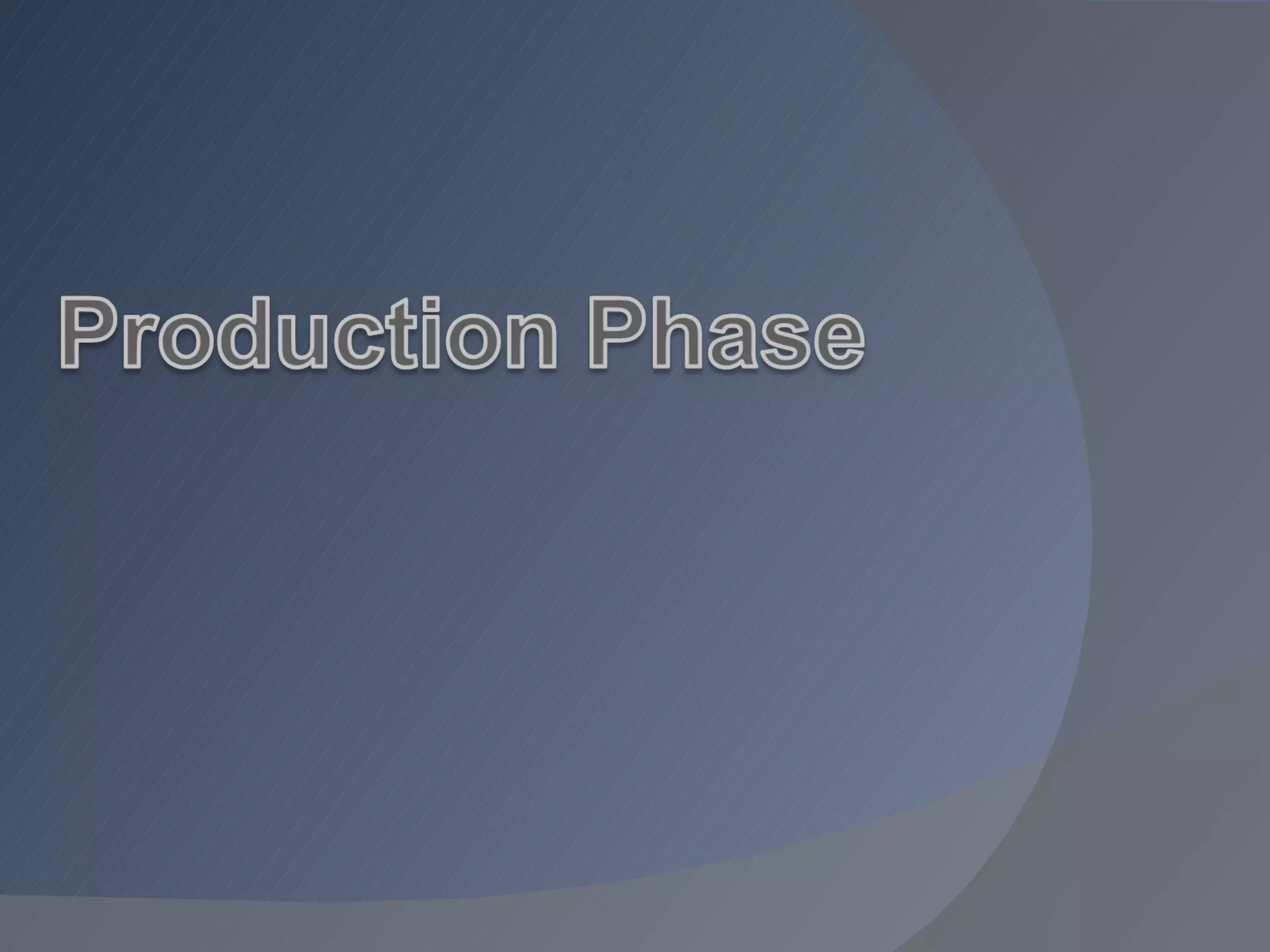
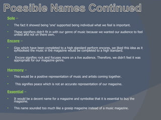
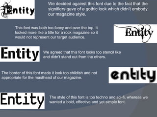
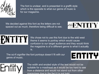
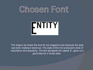
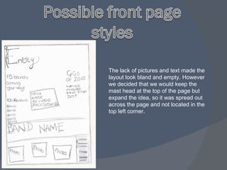
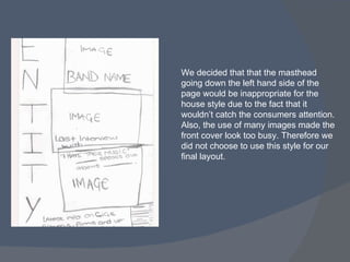
- The document discusses choosing a name, logo font, and layout for a new music magazine.
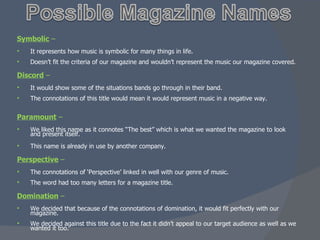
- Several potential names like "Harmony" and "Perspective" were considered but ultimately rejected for various reasons.
- Different logo fonts were also reviewed, with some seen as too fancy, childish, or not representing the target genre of music.
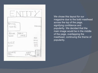
- Layout designs were debated, with a single bold masthead across the top and one large central image chosen as the best front cover design.


![Planning power point [autosaved]](https://cdn.slidesharecdn.com/ss_thumbnails/planningpowerpointautosaved-170226154859-thumbnail.jpg?width=640&height=640&fit=bounds)


