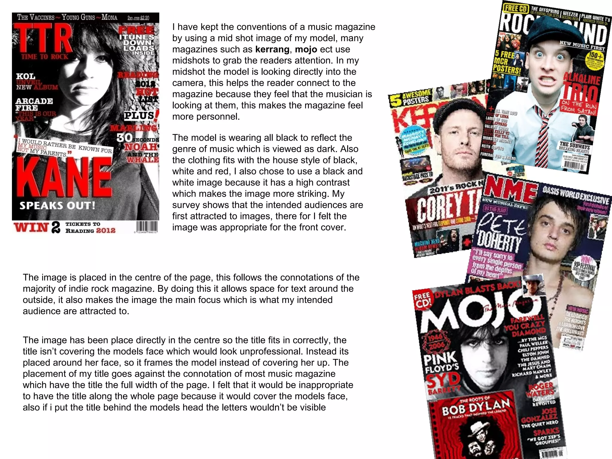
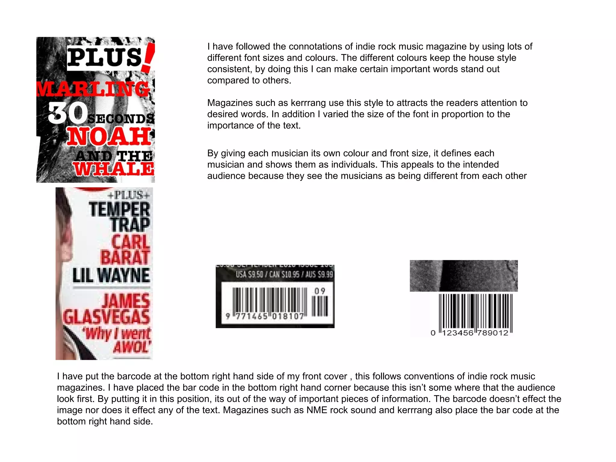
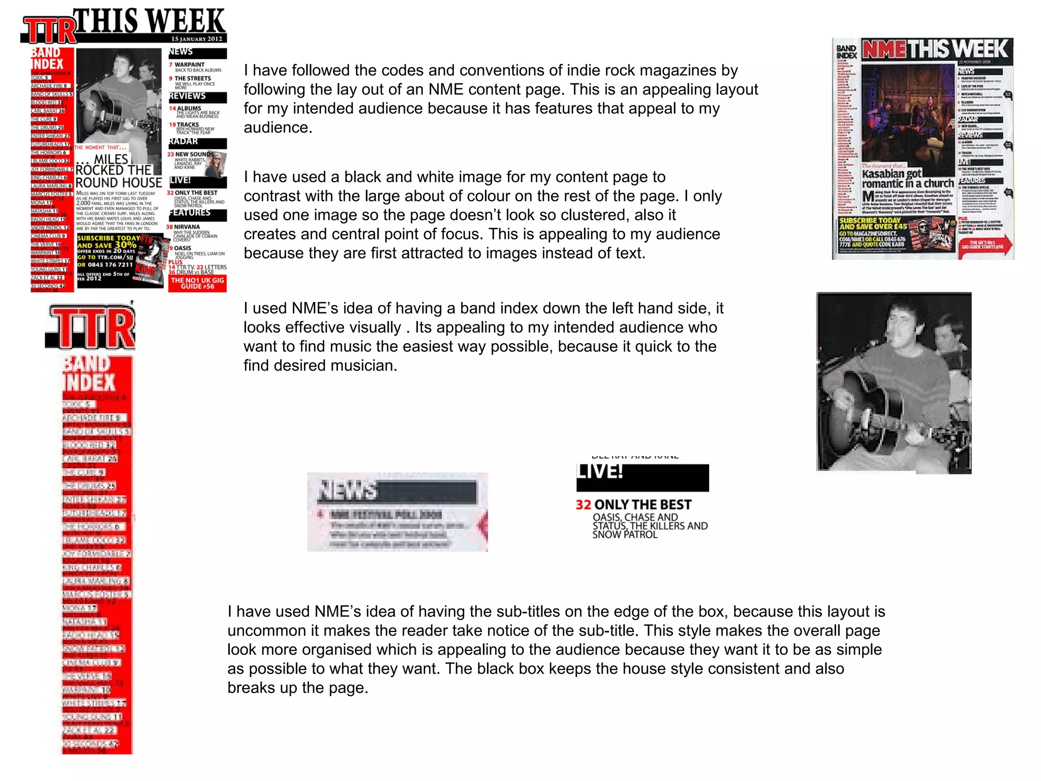
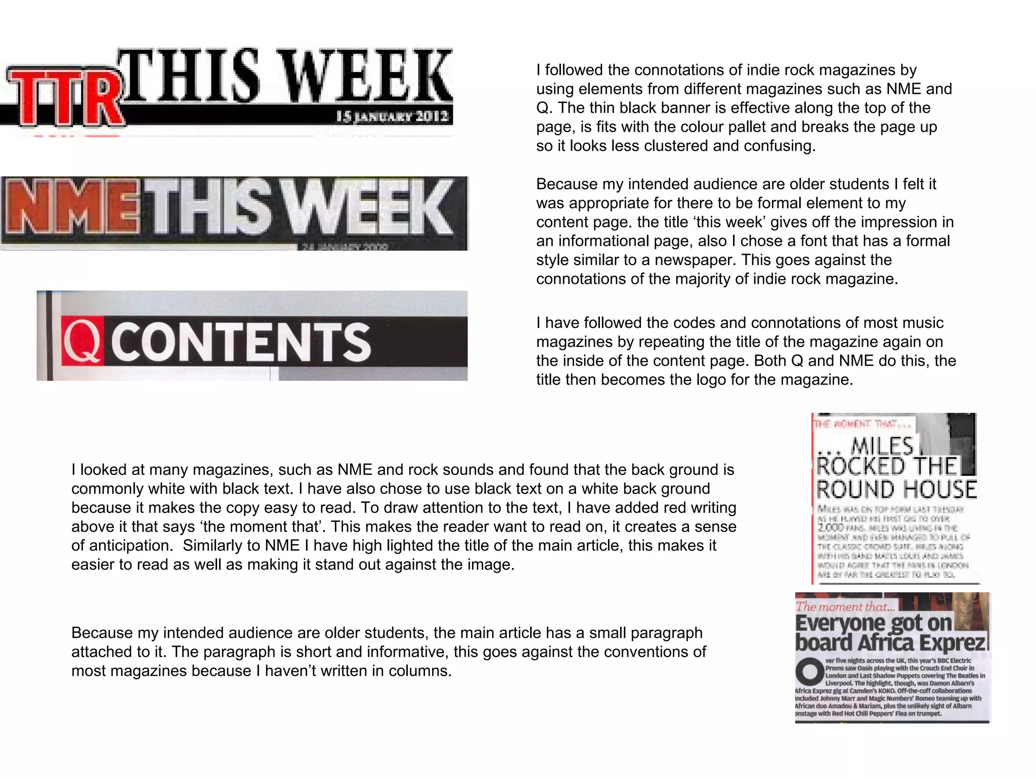
Media music magazine
     evaluation
     By Tarun Knapp
In what ways does my music magazine use, develop or challenge forms and
                  conventions of real media products

               The genre of music for my magazine is indie/ rock , so I looked at
               magazines such as NME MOJO and rock sounds. All of these
               magazine showed me the convention is indie/ rock magazines.,
               however I felt NME would appeal most to my intended audience so
               I used NME to look at the main features of a front cover.
                   For my mast head I used a large, bold font called stone
                   san, to make it stand out I increase the bevel and emboss
                   levels I felt that the font was appropriate because indie/
                   rock music is stereotypically loud and aggressive. The font
                   style is similar to that MOJO, however I chose the colour
                   red for the heading after looking at the way NME used the
                   colour to make the heading standout.


                My sell line is ‘time to rock’ this fits with the title of TTR. The sell line helps the reader understand
                what TTR means, also the sell line ‘time to rock’ links with my genre of music which is indie/rock. Its
                appealing to my intended audience because their eager fans of rock music. I placed my sell line
                directly underneath the heading, similarly to NME’s lay out. By doing this the sell line stands out,
                also to make it stand out I made it red to keep the house style fluid.
I laid out my main head line similar to the style of NME, i chose to use the colour red to keep
                the house style consistent. Also I felt red was suitable because it contrasts with the black
                and white back ground, by doing this the colour stands out drawing in the readers attention.
                Mine differs from NME because I have added depth to my main heading by adding a drop
                shadow, this adds a 3D effects and makes the word stand out against the back ground.

                I have added a pull quote from the article featured inside the magazine,
                as I have seen this done by magazines such as kerrang and rock
                sound. By adding quotes to a heading it gives the reader an insight into
                the main subject of the article, also it makes the reader what to read the
                whole article because the quotes used are typically striking and
                interesting.

                My quote differs from quotes from NME because i have used a separate back
                ground, i chose a white back ground because it stands out against the dark
                image and it allows black text to be easily visible. Also I slanted the quote so it
                crosses with the heading, this shows the link between the heading and the
                quote. Also the slanted effect makes the page look more messy which reflects
                the type of music featured in the magazine, also it appeals to my intended
                audience because its not too formal.


My magazine doesn’t follow the codes and conventions of most indie
rock magazines, most magazines have the majority of the
information on the left hand side, because this is the direction the
audience read in. However I have chosen to have the majority of text
on the right hand side because it worked best with the lighter back
ground
However I do follow the connotations of indie rock
magazines in the sense that the most important text is on
the left hand side. I placed the article head lines and news
stories on the left hand side to draw the reader in by given
them a small piece of information
I have followed conventions of a music magazine by offering free products to my
                     audience,to attract my intended audience my magazine offers free iTunes
                     downloads, i chose to offer this because my survey shows that most people listen to
                     music through their iPods. This goes against allot of other indie rock magazines that
                     offer posters because they have a different intended audience.


I followed the connotations of other indie rock magazines by having a
banner running along the top of my magazine front cover. Allot of
magazine do this to grab the readers attentions, also if lot of
magazines are in front of each other it allows the audience to easily
see what type of genre the magazine is.

To keep the house style consistent I added red symbols
between the band names, this allows the reader to define where
one name finishes and another starts. I kept the font simple so it
didn’t look to clustered, I set the back ground for the banner as
black to keep it discrete. Also rock music is perceived as being
dark, so I felt it was appropriate to the bands on a black                 However my magazine goes against the codes and
background.                                                                conventions of other indie rock music magazine
                                                                           because the majority of magazines have a band
                                                                           banner along the bottom of the page. instead I chose
                                                                           to have on top because I feel its easier for the
                                                                           audience to see.
I have kept the conventions of a music magazine
                                      by using a mid shot image of my model, many
                                      magazines such as kerrang, mojo ect use
                                      midshots to grab the readers attention. In my
                                      midshot the model is looking directly into the
                                      camera, this helps the reader connect to the
                                      magazine because they feel that the musician is
                                      looking at them, this makes the magazine feel
                                      more personnel.

                                      The model is wearing all black to reflect the
                                      genre of music which is viewed as dark. Also
                                      the clothing fits with the house style of black,
                                      white and red, I also chose to use a black and
                                      white image because it has a high contrast
                                      which makes the image more striking. My
                                      survey shows that the intended audiences are
                                      first attracted to images, there for I felt the
                                      image was appropriate for the front cover.


The image is placed in the centre of the page, this follows the connotations of the
majority of indie rock magazine. By doing this it allows space for text around the
outside, it also makes the image the main focus which is what my intended
audience are attracted to.


The image has been place directly in the centre so the title fits in correctly, the
title isn’t covering the models face which would look unprofessional. Instead its
placed around her face, so it frames the model instead of covering her up. The
placement of my title goes against the connotation of most music magazine
which have the title the full width of the page. I felt that it would be inappropriate
to have the title along the whole page because it would cover the models face,
also if i put the title behind the models head the letters wouldn’t be visible
I have followed the connotations of indie rock music magazine by using lots of
                                      different font sizes and colours. The different colours keep the house style
                                      consistent, by doing this I can make certain important words stand out
                                      compared to others.

                                      Magazines such as kerrrang use this style to attracts the readers attention to
                                      desired words. In addition I varied the size of the font in proportion to the
                                      importance of the text.

                                      By giving each musician its own colour and front size, it defines each
                                      musician and shows them as individuals. This appeals to the intended
                                      audience because they see the musicians as being different from each other


I have put the barcode at the bottom right hand side of my front cover , this follows conventions of indie rock music
magazines. I have placed the bar code in the bottom right hand corner because this isn’t some where that the audience
look first. By putting it in this position, its out of the way of important pieces of information. The barcode doesn’t effect the
image nor does it effect any of the text. Magazines such as NME rock sound and kerrrang also place the bar code at the
bottom right hand side.
I have followed the codes and conventions of indie rock magazines by
  following the lay out of an NME content page. This is an appealing layout
  for my intended audience because it has features that appeal to my
  audience.


  I have used a black and white image for my content page to
  contrast with the large about of colour on the rest of the page. I only
  used one image so the page doesn’t look so clustered, also it
  creates and central point of focus. This is appealing to my audience
  because they are first attracted to images instead of text.


  I used NME’s idea of having a band index down the left hand side, it
  looks effective visually . Its appealing to my intended audience who
  want to find music the easiest way possible, because it quick to the
  find desired musician.


I have used NME’s idea of having the sub-titles on the edge of the box, because this layout is
uncommon it makes the reader take notice of the sub-title. This style makes the overall page
look more organised which is appealing to the audience because they want it to be as simple
as possible to what they want. The black box keeps the house style consistent and also
breaks up the page.
I followed the connotations of indie rock magazines by
                                                                    using elements from different magazines such as NME and
                                                                    Q. The thin black banner is effective along the top of the
                                                                    page, is fits with the colour pallet and breaks the page up
                                                                    so it looks less clustered and confusing.

                                                                    Because my intended audience are older students I felt it
                                                                    was appropriate for there to be formal element to my
                                                                    content page. the title ‘this week’ gives off the impression in
                                                                    an informational page, also I chose a font that has a formal
                                                                    style similar to a newspaper. This goes against the
                                                                    connotations of the majority of indie rock magazine.

                                                                    I have followed the codes and connotations of most music
                                                                    magazines by repeating the title of the magazine again on
                                                                    the inside of the content page. Both Q and NME do this, the
                                                                    title then becomes the logo for the magazine.


I looked at many magazines, such as NME and rock sounds and found that the back ground is
commonly white with black text. I have also chose to use black text on a white back ground
because it makes the copy easy to read. To draw attention to the text, I have added red writing
above it that says ‘the moment that’. This makes the reader want to read on, it creates a sense
of anticipation. Similarly to NME I have high lighted the title of the main article, this makes it
easier to read as well as making it stand out against the image.


Because my intended audience are older students, the main article has a small paragraph
attached to it. The paragraph is short and informative, this goes against the conventions of
most magazines because I haven’t written in columns.
I have followed the codes and conventions of the majority of
               music magazines by adding a subscription box. After looking at
               different examples of content pages, it showed that most put the
               subscription box at the bottom of the page. I chose to place my
               subscription box at the bottom of the page because that is where
               the reader looks last. By doing this it reminds the reader to
               subscribe to the magazine.

               I have added an image of my magazine front cover to
               remind the reader of what the magazine looks like. Many
               other magazines such as NME have done this to promote
               their product.

               The house style for my magazine is red, black and white. However to make my
               subscription box stand out against the whole content page, I chose to add a odd colour
               that isn’t part of the house style. By using yellow, it grabs the readers attention and draws
               them in.


I have followed the connotations of the majority of music magazines by making
my page numbers a different colour to the text related to it. Because its
important that the reader see the page number, I made it stand out by changing
the colour to red. The red stands out on the white back ground and it sextremely
eye catching

Presentation 1

  • 1.
    Media music magazine evaluation By Tarun Knapp
  • 2.
    In what waysdoes my music magazine use, develop or challenge forms and conventions of real media products The genre of music for my magazine is indie/ rock , so I looked at magazines such as NME MOJO and rock sounds. All of these magazine showed me the convention is indie/ rock magazines., however I felt NME would appeal most to my intended audience so I used NME to look at the main features of a front cover. For my mast head I used a large, bold font called stone san, to make it stand out I increase the bevel and emboss levels I felt that the font was appropriate because indie/ rock music is stereotypically loud and aggressive. The font style is similar to that MOJO, however I chose the colour red for the heading after looking at the way NME used the colour to make the heading standout. My sell line is ‘time to rock’ this fits with the title of TTR. The sell line helps the reader understand what TTR means, also the sell line ‘time to rock’ links with my genre of music which is indie/rock. Its appealing to my intended audience because their eager fans of rock music. I placed my sell line directly underneath the heading, similarly to NME’s lay out. By doing this the sell line stands out, also to make it stand out I made it red to keep the house style fluid.
  • 3.
    I laid outmy main head line similar to the style of NME, i chose to use the colour red to keep the house style consistent. Also I felt red was suitable because it contrasts with the black and white back ground, by doing this the colour stands out drawing in the readers attention. Mine differs from NME because I have added depth to my main heading by adding a drop shadow, this adds a 3D effects and makes the word stand out against the back ground. I have added a pull quote from the article featured inside the magazine, as I have seen this done by magazines such as kerrang and rock sound. By adding quotes to a heading it gives the reader an insight into the main subject of the article, also it makes the reader what to read the whole article because the quotes used are typically striking and interesting. My quote differs from quotes from NME because i have used a separate back ground, i chose a white back ground because it stands out against the dark image and it allows black text to be easily visible. Also I slanted the quote so it crosses with the heading, this shows the link between the heading and the quote. Also the slanted effect makes the page look more messy which reflects the type of music featured in the magazine, also it appeals to my intended audience because its not too formal. My magazine doesn’t follow the codes and conventions of most indie rock magazines, most magazines have the majority of the information on the left hand side, because this is the direction the audience read in. However I have chosen to have the majority of text on the right hand side because it worked best with the lighter back ground However I do follow the connotations of indie rock magazines in the sense that the most important text is on the left hand side. I placed the article head lines and news stories on the left hand side to draw the reader in by given them a small piece of information
  • 4.
    I have followedconventions of a music magazine by offering free products to my audience,to attract my intended audience my magazine offers free iTunes downloads, i chose to offer this because my survey shows that most people listen to music through their iPods. This goes against allot of other indie rock magazines that offer posters because they have a different intended audience. I followed the connotations of other indie rock magazines by having a banner running along the top of my magazine front cover. Allot of magazine do this to grab the readers attentions, also if lot of magazines are in front of each other it allows the audience to easily see what type of genre the magazine is. To keep the house style consistent I added red symbols between the band names, this allows the reader to define where one name finishes and another starts. I kept the font simple so it didn’t look to clustered, I set the back ground for the banner as black to keep it discrete. Also rock music is perceived as being dark, so I felt it was appropriate to the bands on a black However my magazine goes against the codes and background. conventions of other indie rock music magazine because the majority of magazines have a band banner along the bottom of the page. instead I chose to have on top because I feel its easier for the audience to see.
  • 5.
    I have keptthe conventions of a music magazine by using a mid shot image of my model, many magazines such as kerrang, mojo ect use midshots to grab the readers attention. In my midshot the model is looking directly into the camera, this helps the reader connect to the magazine because they feel that the musician is looking at them, this makes the magazine feel more personnel. The model is wearing all black to reflect the genre of music which is viewed as dark. Also the clothing fits with the house style of black, white and red, I also chose to use a black and white image because it has a high contrast which makes the image more striking. My survey shows that the intended audiences are first attracted to images, there for I felt the image was appropriate for the front cover. The image is placed in the centre of the page, this follows the connotations of the majority of indie rock magazine. By doing this it allows space for text around the outside, it also makes the image the main focus which is what my intended audience are attracted to. The image has been place directly in the centre so the title fits in correctly, the title isn’t covering the models face which would look unprofessional. Instead its placed around her face, so it frames the model instead of covering her up. The placement of my title goes against the connotation of most music magazine which have the title the full width of the page. I felt that it would be inappropriate to have the title along the whole page because it would cover the models face, also if i put the title behind the models head the letters wouldn’t be visible
  • 6.
    I have followedthe connotations of indie rock music magazine by using lots of different font sizes and colours. The different colours keep the house style consistent, by doing this I can make certain important words stand out compared to others. Magazines such as kerrrang use this style to attracts the readers attention to desired words. In addition I varied the size of the font in proportion to the importance of the text. By giving each musician its own colour and front size, it defines each musician and shows them as individuals. This appeals to the intended audience because they see the musicians as being different from each other I have put the barcode at the bottom right hand side of my front cover , this follows conventions of indie rock music magazines. I have placed the bar code in the bottom right hand corner because this isn’t some where that the audience look first. By putting it in this position, its out of the way of important pieces of information. The barcode doesn’t effect the image nor does it effect any of the text. Magazines such as NME rock sound and kerrrang also place the bar code at the bottom right hand side.
  • 7.
    I have followedthe codes and conventions of indie rock magazines by following the lay out of an NME content page. This is an appealing layout for my intended audience because it has features that appeal to my audience. I have used a black and white image for my content page to contrast with the large about of colour on the rest of the page. I only used one image so the page doesn’t look so clustered, also it creates and central point of focus. This is appealing to my audience because they are first attracted to images instead of text. I used NME’s idea of having a band index down the left hand side, it looks effective visually . Its appealing to my intended audience who want to find music the easiest way possible, because it quick to the find desired musician. I have used NME’s idea of having the sub-titles on the edge of the box, because this layout is uncommon it makes the reader take notice of the sub-title. This style makes the overall page look more organised which is appealing to the audience because they want it to be as simple as possible to what they want. The black box keeps the house style consistent and also breaks up the page.
  • 8.
    I followed theconnotations of indie rock magazines by using elements from different magazines such as NME and Q. The thin black banner is effective along the top of the page, is fits with the colour pallet and breaks the page up so it looks less clustered and confusing. Because my intended audience are older students I felt it was appropriate for there to be formal element to my content page. the title ‘this week’ gives off the impression in an informational page, also I chose a font that has a formal style similar to a newspaper. This goes against the connotations of the majority of indie rock magazine. I have followed the codes and connotations of most music magazines by repeating the title of the magazine again on the inside of the content page. Both Q and NME do this, the title then becomes the logo for the magazine. I looked at many magazines, such as NME and rock sounds and found that the back ground is commonly white with black text. I have also chose to use black text on a white back ground because it makes the copy easy to read. To draw attention to the text, I have added red writing above it that says ‘the moment that’. This makes the reader want to read on, it creates a sense of anticipation. Similarly to NME I have high lighted the title of the main article, this makes it easier to read as well as making it stand out against the image. Because my intended audience are older students, the main article has a small paragraph attached to it. The paragraph is short and informative, this goes against the conventions of most magazines because I haven’t written in columns.
  • 9.
    I have followedthe codes and conventions of the majority of music magazines by adding a subscription box. After looking at different examples of content pages, it showed that most put the subscription box at the bottom of the page. I chose to place my subscription box at the bottom of the page because that is where the reader looks last. By doing this it reminds the reader to subscribe to the magazine. I have added an image of my magazine front cover to remind the reader of what the magazine looks like. Many other magazines such as NME have done this to promote their product. The house style for my magazine is red, black and white. However to make my subscription box stand out against the whole content page, I chose to add a odd colour that isn’t part of the house style. By using yellow, it grabs the readers attention and draws them in. I have followed the connotations of the majority of music magazines by making my page numbers a different colour to the text related to it. Because its important that the reader see the page number, I made it stand out by changing the colour to red. The red stands out on the white back ground and it sextremely eye catching