Download to read offline
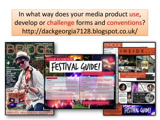
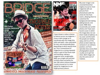
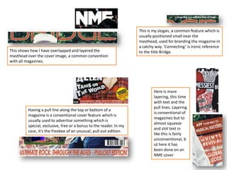
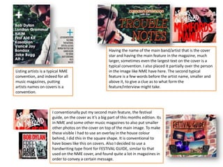
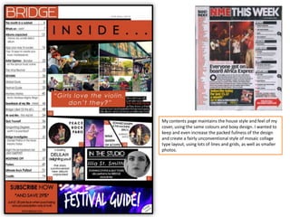
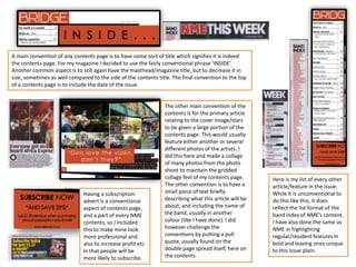
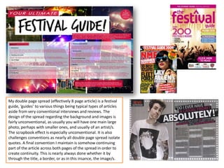
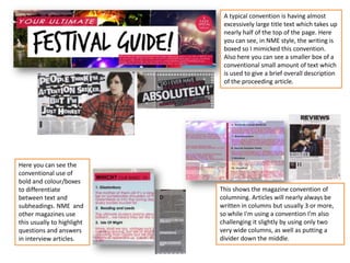

This document summarizes how the media product uses and challenges conventions of magazine design. It discusses using a dark orange color scheme which is somewhat unusual for magazines but creates branding. The cover image uses a candid photo rather than a posed shot, which is less conventional. Layout and design elements like mastheads, pull quotes, artist listings, and column formatting both follow magazine conventions and challenge them in innovative ways. The double-page festival guide spreads also take an unconventional scrapbook approach rather than typical large cover photos. Overall, the document examines the careful balance of conforming to and pushing boundaries of standard magazine formatting.


