20240429 Calibre April 2024 Investor Presentation.pdf
Screenshot
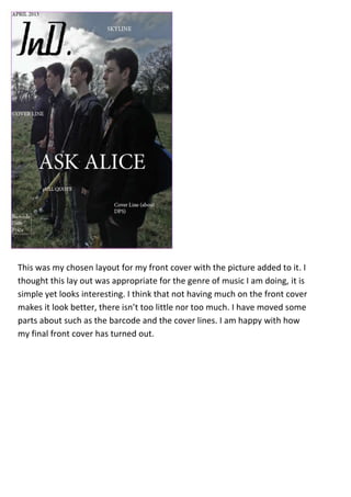
1. This was my chosen layout for my front cover with the picture added to it. I
thought this lay out was appropriate for the genre of music I am doing, it is
simple yet looks interesting. I think that not having much on the front cover
makes it look better, there isn’t too little nor too much. I have moved some
parts about such as the barcode and the cover lines. I am happy with how
my final front cover has turned out.
2. I moved the cover line from the top left hand side to the bottom. I think it looks much
better there than it would at the top due to lack of space and it looks better. The “ASK
ALICE” cover line also looks better higher than it was before. I made the “Posters
Inside” in upper case and red to stand out more and catch the readers eye. The Cover
lines I have included fit the genre, such as the bands I have included.
3. I was deciding whether to have the festival guide box at an angle or straight. I decided
to so with slanted. This gives it more edge whereas the straight box looks more formal
and regimented which will not appeal to my target audience nor fit the genre.
4. I was deciding whether to have small quotation marks or big ones. I chose to do with the
big quotation marks as they stand out more and catch the readers eye. I wanted to pull
quote to stand out more and clearly state that it is a pull quote, therefore the big
quotation marks help achieve this. On some NME magazines, which I have found in my
research, they have used bigger quotation marks to make the pull quote stand out, and
it does catch the readers eye. The pull quote also relates to my genre as it is a lyric of a
song but is Ask Alice’s catch line.
(big quotation marks)
5. I have made my barcode much
smaller than before, and put the
price under the barcode instead of
the masthead.
I have created a drop shadow on
the festival guide box which
makes it stand out more.
I have changed one of the articles
on the front cover, which I have
swapped with the posters. I have
done this as I have created a
skyline at the bottom of the page
as it looks better at the bottom;
this includes my information
about free posters inside. This will
attract my audience to it more
which may make the magazine
seem more appealing.