CORRELATION:
Bivariate Data And
Scatter Plot
SUBJECT: STATISTICS AND
PROBABILITY
TEACHER: ALMA MAE C.
PUTONG
DIVIDE THE PHRASES INTO TWO GROUPS . EXPLAIN
THE GROUP YOU CREATED.
Mean age of Grade 11 students
No. of absences and grades in 1st quarter
Average height of varsity players
Weight and Pulse Rate of women above 50 yrs. Old
Weight of SHS students
Age and height of varsity players
Grades in 1st quarter
Math score and Physics score of SHS students
Univariate Bivariate
Mean age of Grade 11 students Weight and Pulse Rate of women
above 50 yrs. old
Average height of varsity players Math score and Physics score of
SHS students
Weight of SHS students No. of absences and grades in 1st
quarter
Grades in 1st quarter Age and height of varsity players
Consists of the values of two
variables that are obtained from
the same population of interest.
Bivariate
Data
Three combinations of variable types:
1. Both variables are qualitative (attribute).
2. One variable is qualitative (attribute) and the other
is quantitative (numerical).
3. Both variables are quantitative (both numerical).
What to do
with the two
variables?
The primary purpose of bivariate
data is to compare the two sets
of data or to find a relationship
between the two variables.
• Is caffeine related to heart damage?
• Is there a relationship between a person’s age
and his or her blood pressure?
• Is the number of hours a student studies related
to the student’s score on a particular exam?
• Is the birth weight of a certain animal related to
its life span?
TWO QUANTITATIVE
VARIABLES:
EXPRESSED AS ORDERED PAIRS: (X, Y)
X: INPUT VARIABLE, INDEPENDENT
VARIABLE (EXPLANATORY).
Y: OUTPUT VARIABLE, DEPENDENT
VARIABLE(RESPONSE).
GROUP
ACTIVITY
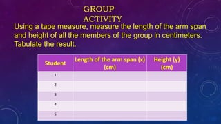
Using a tape measure, measure the length of the arm span
and height of all the members of the group in centimeters.
Tabulate the result.
Student
Length of the arm span (x)
(cm)
Height (y)
(cm)
1
2
3
4
5
INSTRUCTIONS:
1.Construct a graph out of the data you
collected. Present it on a scatterplot
using geogebra application.
2.Describe the direction where the points
are going?
Scatter Plot
• A scatter plot is a picture of the relationship
between two quantitative variables. If a linear
relationship exists between two variables the
scatter plot will exist as a swarm of points
stretched out in a generally consistent manner.
SCATTERPLOT
INTERPRETATION:
• If the data show an uphill pattern as you move from left to
right, this indicates a positive relationship between X and
Y. As the X-values increase (move right), the Y-values tend
to increase (move up).
• If the data show a downhill pattern as you move from left
to right, this indicates a negative relationship between X
and Y. As the X-values increase (move right) the Y-values
tend to decrease (move down).
• If the data don’t seem to resemble any kind of pattern
(even a vague one), then no relationship exists
between X and Y.
WHAT SHOULD YOU LOOK FOR IN A SCATTERPLOT?
Direction – which way are the points going?
positive, negative, neither.
Strength – how much scatter is there in the
plot?
Weak, moderate, strong
REMEMB
ER
scatterplot only suggests a linear
relationship between the two sets
of values. It does not suggest that
one variable causes the change of
the other variable.
For example, a doctor observes that people who take
vitamin C each day seem to have fewer colds. Does this
mean vitamin C prevents colds? Not necessarily. It
could be that people who are more health conscious
take vitamin C each day, but they also eat healthier, are
not overweight, exercise every day, and wash their
hands more often. If this doctor really wants to know if
it’s the vitamin C that’s doing it, she needs a well-
designed experiment that rules out these other factors.
APPLICAT
ION
Given the variable y ( response), what could
be the variable x (explanatory)
1. Number of cars
2. Number of tardiness among students
3. Ice cream sales
CORRELATION COEFFICIENT (r)
The correlation coefficient (r) gives us a numerical
measurement of the strength of the linear relationship
between the explanatory and response variables.
Where n is the number of
pairs.
RANGE DESCRIPTIVE EQUIVALENT
-1.00 Perfect Negative Correlation
(-0.60) – (-0.99) Strong Negative Correlation
(-0.30) – (-0.59) Moderate Negative Correlation
(-0.10) – (-0.29) Weak Negative Correlation
0.00 No Correlation
0.10 – 0.29 Weak Positive Correlation
0.30 – 0.59 Moderate Positive Correlation
0.60 – 0.99 Strong Positive Correlation
1.00 Perfect Positive Correlation
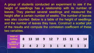
A group of students conducted an experiment to see if the
height of seedlings has a relationship with its number of
leaves. They planted several seedlings and measured the
height after a certain number of weeks. The number of leaves
was also counted. Below is a table of the height of seedlings
and the number of leaves they have. Construct a scatter plot
of the results and compute the correlation coefficient of these
two variables.
Height of
Seedlings
(mm)
8 13 10 9 12 7 15 11 6 14
Number of
leaves 2 4 2 2 3 1 4 3 1 3
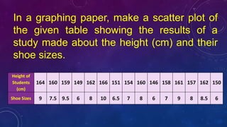
In a graphing paper, make a scatter plot of
the given table showing the results of a
study made about the height (cm) and their
shoe sizes.
Height of
Students
(cm)
164 160 159 149 162 166 151 154 160 146 158 161 157 162 150
Shoe Sizes 9 7.5 9.5 6 8 10 6.5 7 8 6 7 9 8 8.5 6
CONSTRUCT A SCATTER PLOT THAT CORRESPONDS
TO THE FOLLOWING DATA THEN INTERPRET YOUR
GRAPH.
Weight in
kg (x)
72 45 60 55 70 75 42 51 49 88
Pulse
Rate in
bpm (y)
67 80 55 105 88 110 55 65 100 65
THE FOLLOWING TABLE SHOWS DATA THAT DESCRIBE THE TEST
SCORES OF STUDENTS IN MATHEMATICS IN RELATION TO THEIR
TEST SCORES IN PHYSICS. COMPUTE THE CORRELATION
COEFFICIENT OF THESE TWO VARIABLES.
Math
score
(x)
64 90 56 85 93 95 73 78 66 98 89 74 55 60
Physic
s
score
(y)
70 85 60 70 88 98 60 80 75 95 84 69 40 45
“ A relationship with God is the
most important relationship you
can have. Trust Him and
everything will always turn out
fine”.
-
www.dailyinspirationalquotes.in

Correlation: Bivariate Data and Scatter Plot

  • 1.
    CORRELATION: Bivariate Data And ScatterPlot SUBJECT: STATISTICS AND PROBABILITY TEACHER: ALMA MAE C. PUTONG
  • 3.
    DIVIDE THE PHRASESINTO TWO GROUPS . EXPLAIN THE GROUP YOU CREATED. Mean age of Grade 11 students No. of absences and grades in 1st quarter Average height of varsity players Weight and Pulse Rate of women above 50 yrs. Old Weight of SHS students Age and height of varsity players Grades in 1st quarter Math score and Physics score of SHS students
  • 4.
    Univariate Bivariate Mean ageof Grade 11 students Weight and Pulse Rate of women above 50 yrs. old Average height of varsity players Math score and Physics score of SHS students Weight of SHS students No. of absences and grades in 1st quarter Grades in 1st quarter Age and height of varsity players
  • 5.
    Consists of thevalues of two variables that are obtained from the same population of interest. Bivariate Data Three combinations of variable types: 1. Both variables are qualitative (attribute). 2. One variable is qualitative (attribute) and the other is quantitative (numerical). 3. Both variables are quantitative (both numerical).
  • 6.
    What to do withthe two variables?
  • 7.
    The primary purposeof bivariate data is to compare the two sets of data or to find a relationship between the two variables.
  • 8.
    • Is caffeinerelated to heart damage? • Is there a relationship between a person’s age and his or her blood pressure? • Is the number of hours a student studies related to the student’s score on a particular exam? • Is the birth weight of a certain animal related to its life span?
  • 9.
    TWO QUANTITATIVE VARIABLES: EXPRESSED ASORDERED PAIRS: (X, Y) X: INPUT VARIABLE, INDEPENDENT VARIABLE (EXPLANATORY). Y: OUTPUT VARIABLE, DEPENDENT VARIABLE(RESPONSE).
  • 10.
    GROUP ACTIVITY Using a tapemeasure, measure the length of the arm span and height of all the members of the group in centimeters. Tabulate the result. Student Length of the arm span (x) (cm) Height (y) (cm) 1 2 3 4 5
  • 11.
    INSTRUCTIONS: 1.Construct a graphout of the data you collected. Present it on a scatterplot using geogebra application. 2.Describe the direction where the points are going?
  • 12.
    Scatter Plot • Ascatter plot is a picture of the relationship between two quantitative variables. If a linear relationship exists between two variables the scatter plot will exist as a swarm of points stretched out in a generally consistent manner.
  • 13.
  • 15.
    INTERPRETATION: • If thedata show an uphill pattern as you move from left to right, this indicates a positive relationship between X and Y. As the X-values increase (move right), the Y-values tend to increase (move up). • If the data show a downhill pattern as you move from left to right, this indicates a negative relationship between X and Y. As the X-values increase (move right) the Y-values tend to decrease (move down). • If the data don’t seem to resemble any kind of pattern (even a vague one), then no relationship exists between X and Y.
  • 16.
    WHAT SHOULD YOULOOK FOR IN A SCATTERPLOT? Direction – which way are the points going? positive, negative, neither. Strength – how much scatter is there in the plot? Weak, moderate, strong
  • 17.
    REMEMB ER scatterplot only suggestsa linear relationship between the two sets of values. It does not suggest that one variable causes the change of the other variable.
  • 18.
    For example, adoctor observes that people who take vitamin C each day seem to have fewer colds. Does this mean vitamin C prevents colds? Not necessarily. It could be that people who are more health conscious take vitamin C each day, but they also eat healthier, are not overweight, exercise every day, and wash their hands more often. If this doctor really wants to know if it’s the vitamin C that’s doing it, she needs a well- designed experiment that rules out these other factors.
  • 19.
    APPLICAT ION Given the variabley ( response), what could be the variable x (explanatory) 1. Number of cars 2. Number of tardiness among students 3. Ice cream sales
  • 20.
    CORRELATION COEFFICIENT (r) Thecorrelation coefficient (r) gives us a numerical measurement of the strength of the linear relationship between the explanatory and response variables. Where n is the number of pairs.
  • 21.
    RANGE DESCRIPTIVE EQUIVALENT -1.00Perfect Negative Correlation (-0.60) – (-0.99) Strong Negative Correlation (-0.30) – (-0.59) Moderate Negative Correlation (-0.10) – (-0.29) Weak Negative Correlation 0.00 No Correlation 0.10 – 0.29 Weak Positive Correlation 0.30 – 0.59 Moderate Positive Correlation 0.60 – 0.99 Strong Positive Correlation 1.00 Perfect Positive Correlation
  • 22.
    A group ofstudents conducted an experiment to see if the height of seedlings has a relationship with its number of leaves. They planted several seedlings and measured the height after a certain number of weeks. The number of leaves was also counted. Below is a table of the height of seedlings and the number of leaves they have. Construct a scatter plot of the results and compute the correlation coefficient of these two variables. Height of Seedlings (mm) 8 13 10 9 12 7 15 11 6 14 Number of leaves 2 4 2 2 3 1 4 3 1 3
  • 23.
    In a graphingpaper, make a scatter plot of the given table showing the results of a study made about the height (cm) and their shoe sizes. Height of Students (cm) 164 160 159 149 162 166 151 154 160 146 158 161 157 162 150 Shoe Sizes 9 7.5 9.5 6 8 10 6.5 7 8 6 7 9 8 8.5 6
  • 24.
    CONSTRUCT A SCATTERPLOT THAT CORRESPONDS TO THE FOLLOWING DATA THEN INTERPRET YOUR GRAPH. Weight in kg (x) 72 45 60 55 70 75 42 51 49 88 Pulse Rate in bpm (y) 67 80 55 105 88 110 55 65 100 65
  • 25.
    THE FOLLOWING TABLESHOWS DATA THAT DESCRIBE THE TEST SCORES OF STUDENTS IN MATHEMATICS IN RELATION TO THEIR TEST SCORES IN PHYSICS. COMPUTE THE CORRELATION COEFFICIENT OF THESE TWO VARIABLES. Math score (x) 64 90 56 85 93 95 73 78 66 98 89 74 55 60 Physic s score (y) 70 85 60 70 88 98 60 80 75 95 84 69 40 45
  • 26.
    “ A relationshipwith God is the most important relationship you can have. Trust Him and everything will always turn out fine”. - www.dailyinspirationalquotes.in