Downloaded 38 times
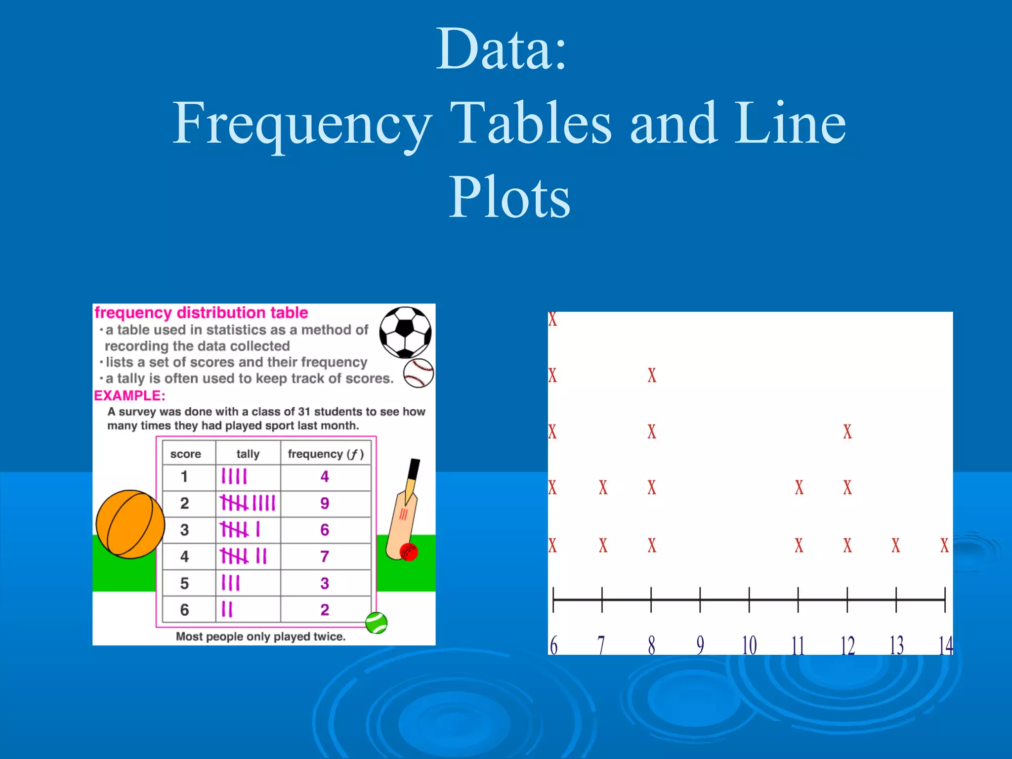
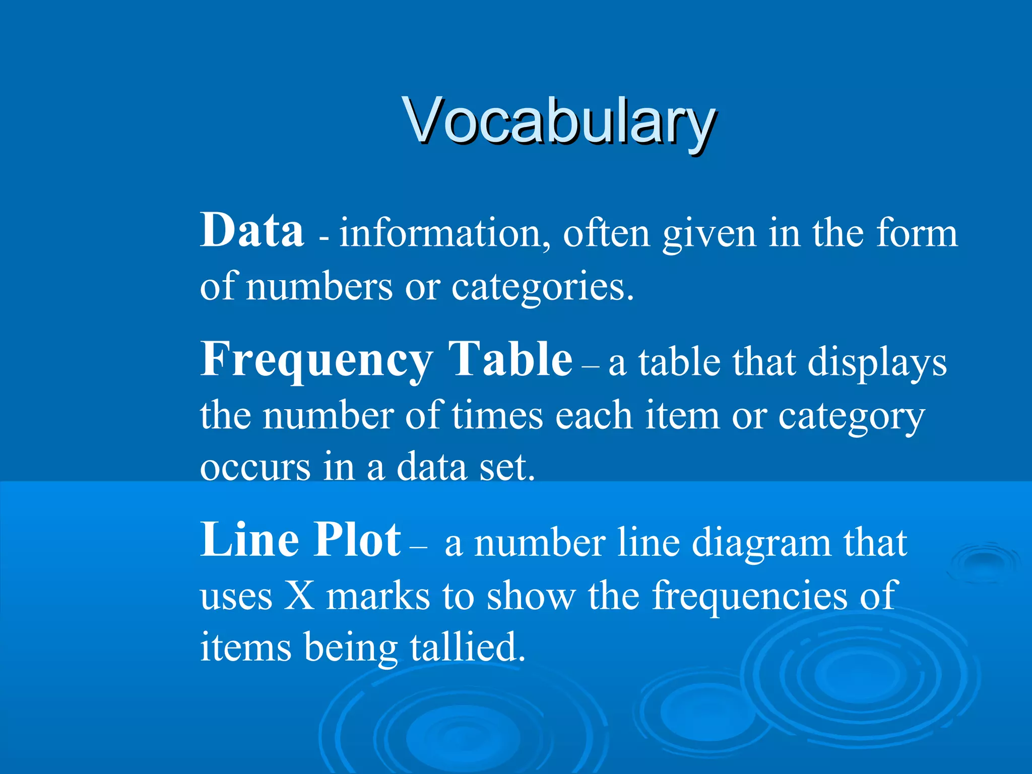
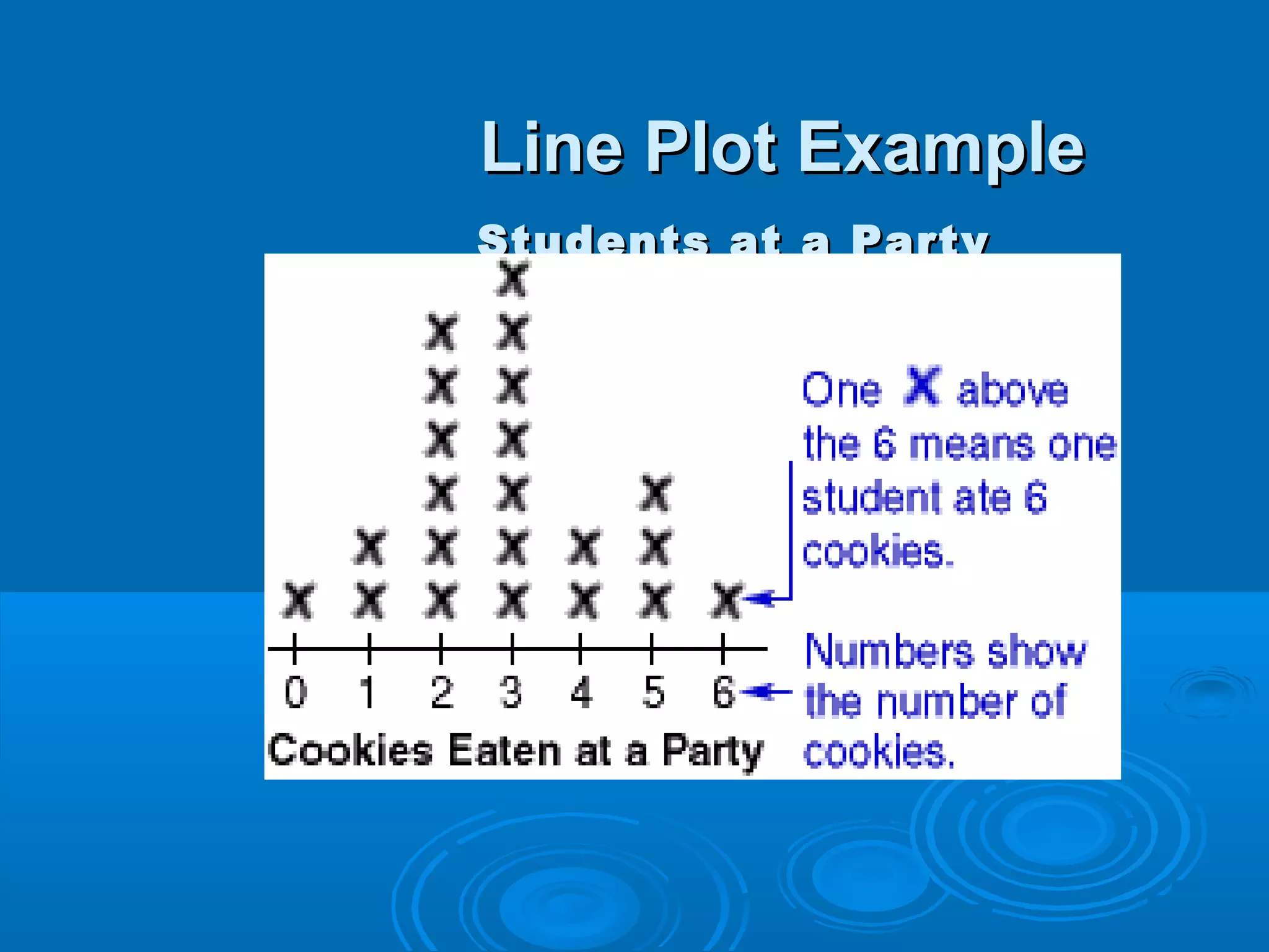
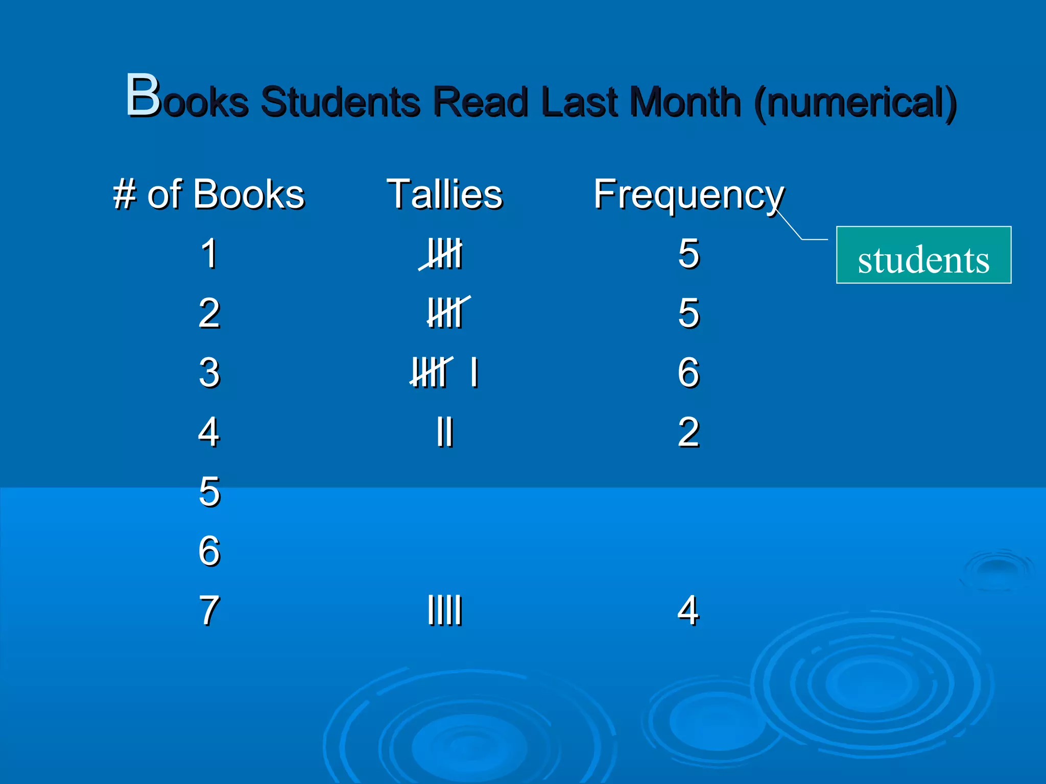
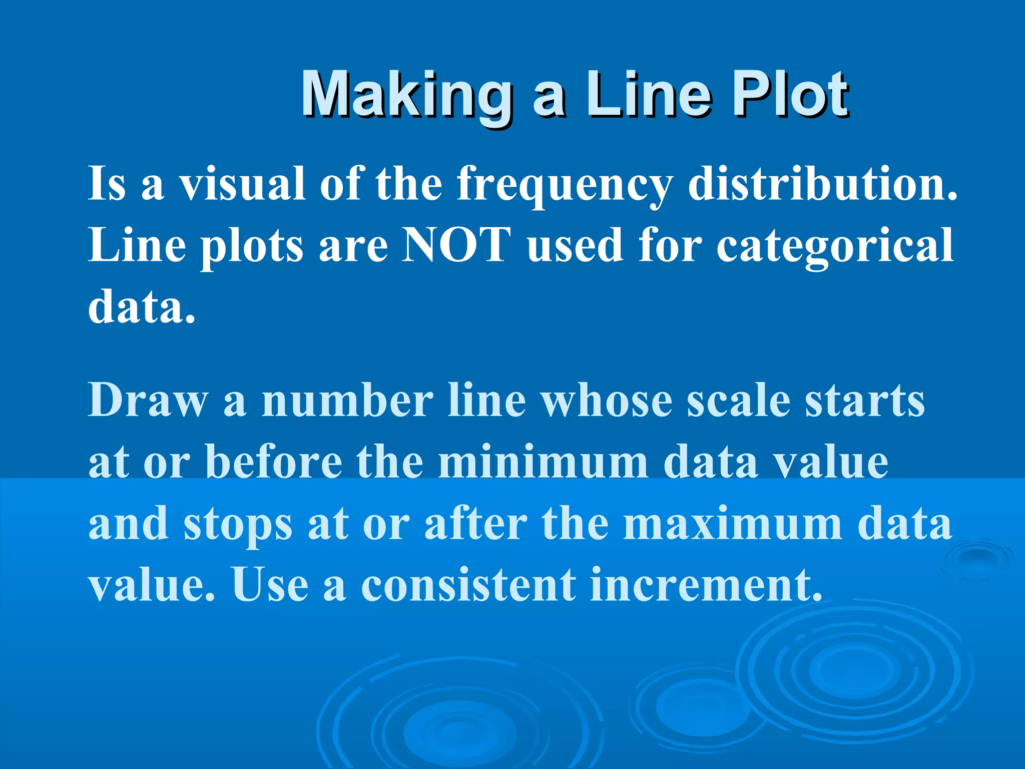
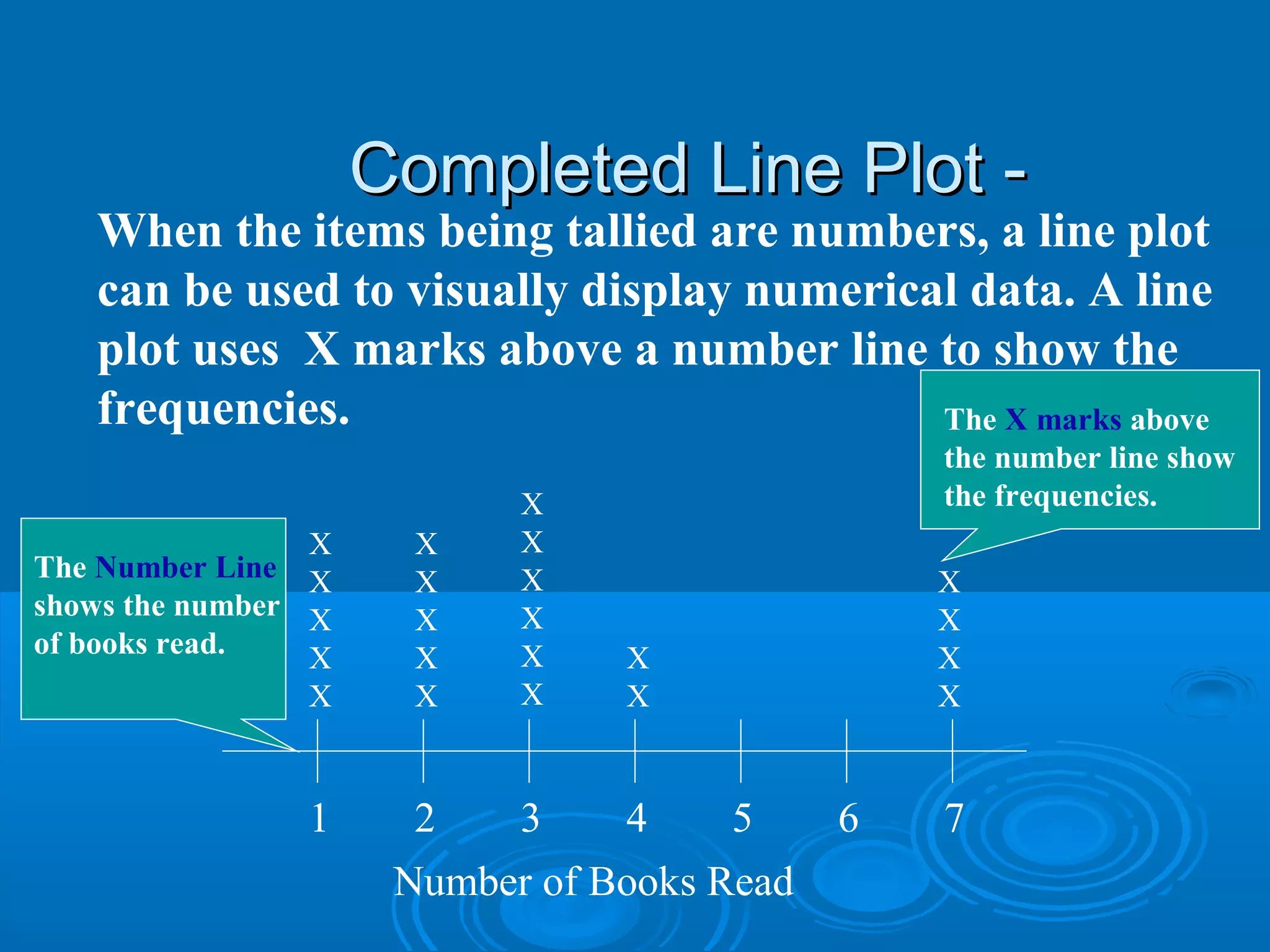
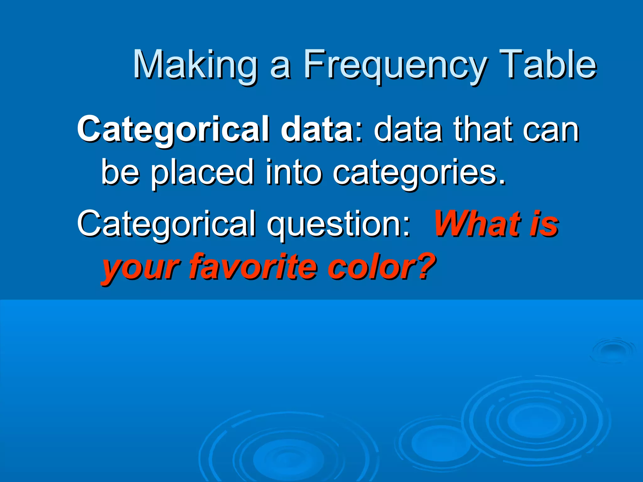
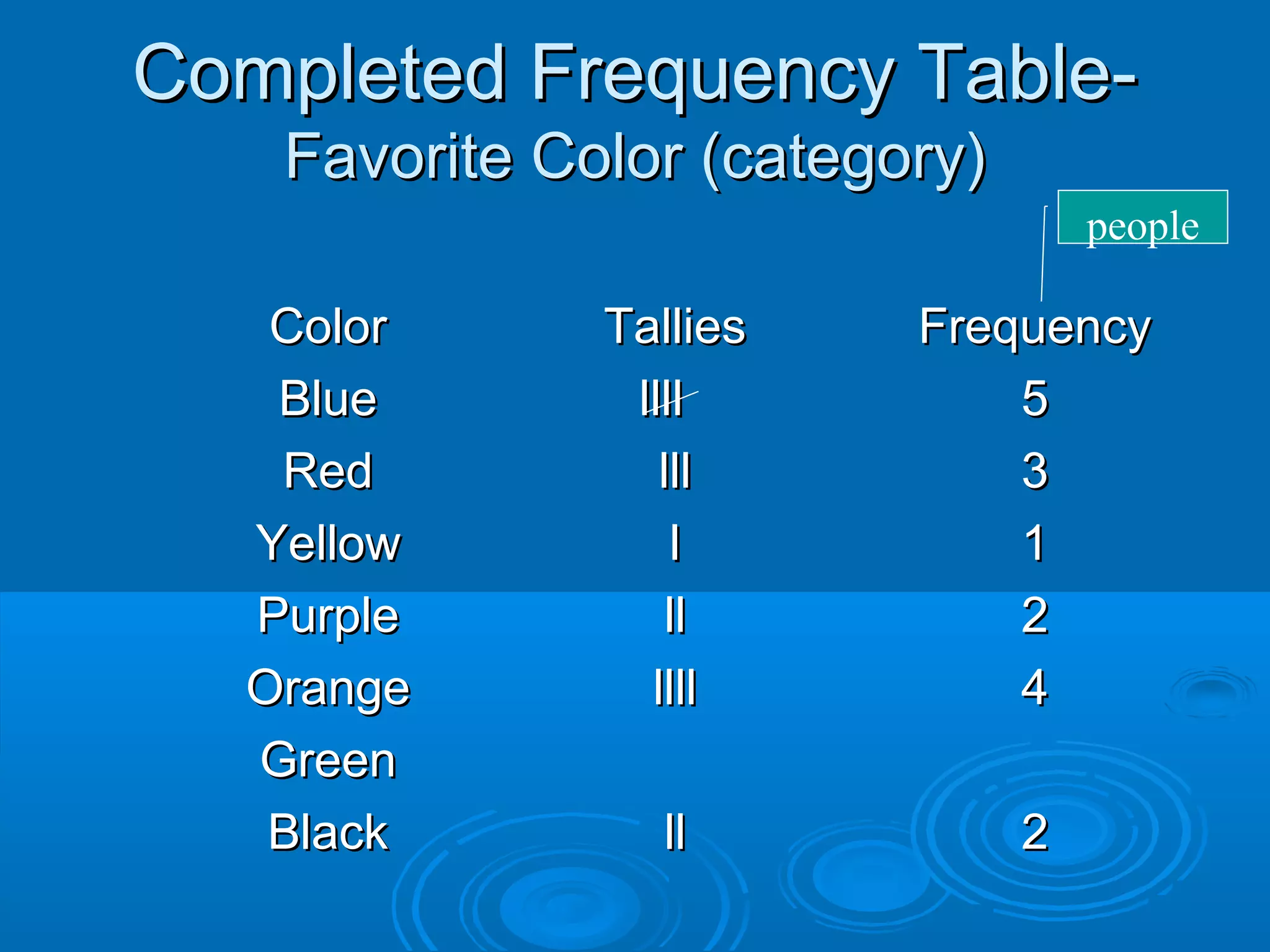


When the items being tallied are numbers, a line plot can be used to visually display numerical data. A line plot uses X marks above a number line to show the frequencies. For example, a line plot of the number of books students read shows the frequencies of students who read 1 book, 2 books, and so on up to 7 books. A frequency table organizes categorical data into categories and displays the frequency of each category. For example, a frequency table asking students' favorite color would have categories for different colors and show how many students chose each color. Analyzing frequency tables and line plots can identify outliers, clusters, or gaps in the data distributions.