1. Semiotic analysis.
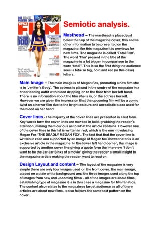
Masthead – The masthead is placed just
below the top of the magazine cover, this allows
other information to be presented on the
magazine, for this magazine it is previews for
new films. The magazine is called ‘Total Film’.
The word ‘film’ present in the title of the
magazine is a lot bigger in comparison to the
word ‘total’. This is so the first thing the audience
sees is total in big, bold and red (in this case)
letters.
Main Image – The main image is of Megan Fox, promoting a new film she
is in ‘Jenifer’s Body’. The actress is placed in the centre of the magazine in a
cheerleading outfit with blood dripping on to the floor from her left hand.
There is no information about the film she is in, or the actress herself.
However we are given the impression that the upcoming film will be a comic
twist on a horror film due to the bright colours and unrealistic blood used for
the blood on her hand.
Cover lines - The majority of the cover lines are presented in a list form.
Key words form the cover lines are marked in bold, grabbing the reader’s
attention, making them curious as to what the article contains. However one
of the cover lines in the list is written in red, which is the one introducing
Megan Fox ‘THE DEADLY MEGAN FOX’. The fact that that the cover line is
written in read and supported by an image of Megan fox shows that this is an
exclusive article in the magazine. In the lower left hand corner, the image is
supported by another cover line giving a quote form the interview ‘I don’t
want to be the Jar Jar Binks of a movie’ giving the reader a small insight to
the magazine article making the reader want to read on.
Design Layout and content – The layout of the magazine is very
simple there are only four images used on the front cover, the main image,
placed on a plain white background and the three images used along the top
of images from new and upcoming films – all of the images are about films,
establishing type of magazine it is in this case a magazine for film fanatics.
The content also relates to the magazines target audience as all of there
articles are about new films. It also follows the same text pattern on the
cover.
2. Use of colour – The colour scheme for this layout follows a very
simplistic colour scheme of red black and blue which all compliment each
other well and tie the overall look of the magazine together very nicely. The
use of colours does not really establish the gender in which the magazine is
trying to attract, there for shows that they have a very wide target audience
of both male and female.
Hierarchy of text – The masthead is the biggest text on the page
showing the word ‘film’ so the name of the magazine is obvious and
immediately tells the audience the magazine is about films. Some of the text
on the left hand side is written bigger, this is so that the key words are
highlighted in order to inform the audience of its content. However the text on
the right had side is all relatively small in comparison to the rest of the text
but still has the key words written in bold to highlight key features.