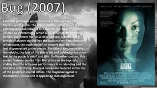
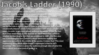
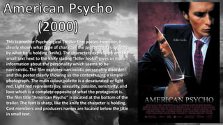
The document discusses three different movie posters:
1) A psychological thriller poster featuring a close-up of a female character with no emotion and quotes from critics.
2) A poster for a film about PTSD that features a blurred and difficult to read image of a terrified protagonist with an open mouth.
3) A poster for a film about narcissistic personality disorder clearly showing a protagonist holding a knife with the text "killer looks", exploring the disorder.
Difference Between Search & Browse Methods in Odoo 17
Film poster inspirations
1.
2. I like this particular poster because it links well with the
Psychological genre. The colour palette is blue which is a
calming yet a sad colour. I also like the overlapping of faces, it
creates an abstract look which suggests what the film could
be like. The poster itself is a close up type, a portrait of a
female character staring into the audience with no emotion
whatsoever, this could make the viewers trust her less and
feel disconnected to the person. The title of the poster is in
the middle, the font of the title is big and bold whereas other
text in the poster is small and thin. Unlike other posters, this
poster features quotes from film critics on the top right
stating that the actresses performance is outstanding and the
storyline is terrifying. The cast names are featured at the top
of the posters in capital letters. The magazine layout is
memorable, simple and it appears to look organised.
3. The poster is incredibly simple but it is quite memorizing. For example,
the main image is a blur of the protagonist’s face, however it portrays
mental illness (which in this case is PTSD) quite well. The face is
difficult to ‘read’ because most of it is merging with the darkness.
Other than that, the protagonist seems to be terrified since his mouth
appears to be open. Since the whole image lacks colour, using a vibrant
red for the title is a great idea in order to grab attention. Red is a very
emotionally intense colour, it has connotation with blood, passion and
anger. In order to get more target audience the poster states the fact
that it has been made by the director of “Fatal Attraction” which is
another thriller/drama film that was produced in 1987, this film also
has a psychological story (which is about obsessive stalking and
aggressive pursuit). In the middle of the poster, it states that “The most
frightening thing about Jacob Singer’s nightmare is that he isn’t
dreaming”. This sentence gives the audience a rough idea of what the
film is about and what kind of genre it is.
4. This is another Psychological Thriller film poster. However, it
clearly shows what type of character the protagonist is, judging
by what he is holding (knife). The characters expression and the
small text next to the knife stating “killer looks” gives us more
information about the personality which seems to be
narcissistic. The film explores narcissistic personality disorder
and this poster clearly showing us the context using a simple
photograph. The main colour palette is a desaturated or light
red. Light red represents joy, sexuality, passion, sensitivity, and
love which is a complete opposite of what the protagonist is.
The film title “American Psycho” is located at the bottom of the
trailer. The font is sharp, like the knife the character is holding.
Cast members and producers names are located below the title
in small text.
5. This poster is extremely recognisable and is quite unique. For example the
size ratio appears different than an average poster, it is quite longer
making the poster look elongated. The main focus in this image is the
moth that has a skull shape on its back. The moth is placed on top of this
person’s mouth. Moths have similar symbolisms as butterflies. The moth
symbolizes determination, attraction, psychic abilities, and faith.
However, since this one has a skull on it’s back, it doesn’t seem as positive
as it sounds. The person in the portrait has a similar facial expression to
the “Bug (2006)” poster making the viewers feel disconnected.
Additionally, the whole photograph looks grainy as if it’s a pencil painting,
not an image. The colour palette is simple, orange and blue which are
complimentary colours, the blue makes the moth, eyes and the main title
pop out of the poster, being more interesting overall. I’ve noticed that the
title is written without any capital letters, which is quite interesting. The
poster isn’t using any capital letters.