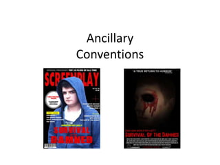
2. Ancillary Magazine Cover
Masthead:
The masthead used for the ancillary cover is
conventional to form. Typically conventional
to film magazines such as ‘EMPIRE’ and
‘TOTAL FILM’. The sans serif font used is also
highly conventional to both form and genre,
taking inspiration from ‘EMPIRE’ magazine.
The house style used on the cover takes
particular note from rock magazines (that
predominantly cover the horror genre) such
as ‘KERRANG’, these magazines typically use
colours such as red, black, white and yellow
for their connotations and meanings. For
instance, the colour red connotes power,
blood and fear, all of which are related to
horror.
Top Line:
The top line I have used for my cover is conventional for film magazines as well as
various other magazines. The use of font is also conventional for a film magazine as
it stands out amongst the rest of the cover and is clear to read. However, many top
lines are conventionally smaller and often consist of much more information. This
would be a point to consider in terms of improvement.
Cover Lines:
Along the left hand and right hand side of
the magazine cover there are various
cover lines, these are located in
conventional places for a magazine cover
and also further help in route of the eye,
a selling technique used to draw the
attention of the audience. Both are
conventional as they promote what can
be found within the magazine. The
typography used is conventional as it
stands out amongst the background and
the sans serif font is clear to read. By
adding ‘first look’ on a different
background colour I have used another
technique of drawing in the attention of
the audience known as a tag. The use of
another tag can also be seen on the left
hand side of the middle third in the form
of advertising posters. Posters are again
conventional of film magazines and are
seen to be a key selling point.
Main Image:
In terms of conventions, the location and sizing of
the image is appropriate for a film magazine as it
takes up the middle third of the page and covers
the bottom half of the masthead. The style of the
image is also conventional as it is a mid-shot, the
conventional shot type to be found on magazine
covers. However, the image itself could be
improved.
Main cover story:
The cover story is conventional for magazine covers. It is located predominantly in the
middle third of the bottom third of the page which is the commonplace for a main cover
story. The typography used is also conventional as (like many magazines) it relates to the
genre of the film, and due to the worn effect shown on the sans-serif text it relates to horror.
3. Ancillary Poster
Main Image:
The main image used is conventional of the
genre. The make-up used is appropriate as the
blood can be seen running down the face, and
the use of black face paint on the eye creates
the illusion that it is not there. Repulsing. The
use of shading on the main image is also
conventional, making the face appear paler
creates the impression of illness or perhaps
even death, the idea of death is further
suggested by the missing eye. The ideas of
death are common connotations in the horror
genre. The location of the image follows
conventions of form, being located in the
middle centre of the page. Other conventional
locations would be to the centre right or centre
left, these locations will often have a slogan
located to the side.
Billing Block:
On the bottom third of my poster there is a
billing block. Billing blocks are used as a way of
providing credit to the cast and crew involved
in filmmaking, as well as producers,
distributors and financier behind it. They are
also a legal requirement to be had on the
poster and can be located at the base or
around the edge of the poster.Slogan:
The slogan is a conventional addition to
posters used as a way of drawing in an
audience. The slogan I have used is basic but is
a good way of drawing in my audience as it
reads to them directly. ‘How long will you
survive?’ is direct, and will easily get the
attention of an audience as it will make them
question what it is that they have to survive.
This is an idea further directed by the main
image.
Quote:
A quote has been used in the top third of my poster, and is another technique used to
draw in an audience. This particular quote, ‘a true return to horror’ is attention-
grabbing as many recent horror films have given their audience a dated, lacklustre
experience. It thereby creates the idea of a ‘true return’ being something new that
would draw their attention. Beneath the quote I have included a source, the source
Logos:
The logos are placed in the bottom third of my poster. This is the conventional location.
Logos are used as a way of differentiating the companies associated with the product,
for instance, I have used Lionsgate and summit studios (a subsidiary of Lionsgate) as
well as created my own. I have used Lionsgate as my previous research showed that
they are a good example of a studio that would produce a product like my own.
used is from the magazine I created for the
second half of the ancillary products. I done
this as a way of linking the two together.
4. Film Trailer
The film trailer is effective
as it follows conventions of
form such as having short,
non-continuity shots. It
also shows a series of
narrative shots that provide
an insight to the story
without revealing
everything that happens.
This is conventional to
trailer form. This is done to
draw in the audience and
advertise the film.
The mise-en-scene used in the trailer is
conventional to an extent. The costume for a
zombie horror would be only what the people
wore at the time and in this sense it is
conventional, however the costume should have
been much more rugged and dirty. The use of
make-up could have been used better as each of
the characters would have appeared dirtier due
to the situation they are in. The use of lighting
and the weather in the trailer is also
conventional as it is conventional for the genre,
however some more shots would have been
better with the addition of darkness. The setting
used is also conventional for the genre as the
woodland provides constricted areas, creating a
claustrophobic feel to the footage.
Throughout my trailer I have used title
scenes as a way of grabbing the attention
of my audience. This is a conventional
implementation. However I could have
added more title screens such as approval
rating as well as studio logos to create
more of a trailer feel. As well as this I
think if I were to add an effect to the
background of the title screens it would
be much more eye-catching and appealing
to watch.
The use of music in my trailer is
conventional to the genre,
however there could be some
improvements. Although it does
follow and sync well with the
scenes as well as provide a certain
atmosphere, there could be much
more variation in order to make it
more appealing to an audience.
At the end of the trailer there is a tilt
shot that shows (to begin with) the
desperate look on the protagonists
face as he knows he is in mortal
danger. The shot then slowly tilts up
to reveal the antagonist standing
above him, only to fade out before
reaching his face and keeping his
identity unknown. This is
conventional of the genre as it
leaves the audience in a shroud of
mystery as to what will happen.
5. Magazine Comparison
Masthead:
As can be seen in both of these
products the mastheads do have
some similarities in terms of colour
and similar font style. However the
masthead on the cover of ‘EMPIRE’
magazine looks much more suited
as it fits the cover well. In
comparison, my cover has a
stretched masthead that does not
look suited to the cover due to the
length of the name.
Headline:
Between the two magazines there
are some similarities of the
headline. The location for both is
conventionally located in the
middle third of the cover, only
differing in level as the official
covers headline is located in the
middle third and my ancillary cover
is located in the bottom third of
the page. The headlines on both
have the most important
information (film titles) in a much
larger font size in comparison to
the rest of the text.
Inserts:
The inserts located around the
page are conventional on both
ancillary pieces. The locations of
mine are located in order to
encourage route of the eye, as are
the locations on the professional
ancillary. The information on mine
is also conventional to form as
magazines advertise stories as
well as films on their covers.
Topline:
The topline of my ancillary
in comparison to that of
the professional product
are quite similar. The
colours used are similar
and both are suitable for
the pages. The
Information is also
relative as it draws the
attention of the audience.
Main Image:
The main images used on the ancillary
products are very different to one another.
Although both are mid shots they are used
to show different things. The professional
products image is used to promote the
main lead of the film ‘Sherlock Holmes’
and the stance of the character used in the
image promotes the brains of the character
that he is known to have and the make-up
used shows that he also gets into
dangerous situations. The image I have
used is conventional as it is a mid shot. The
image has also been used to show off one
of the actors involved in the trailer, his
facial expressions, despite looking
uninterested are somewhat conventional
of the horror genre.
6. Poster Comparison
Slogan:
Above my title is the slogan. The location of the
slogan on my poster is in the lower third where as
on the professional poster it can be seen in the top
third. The professional posters slogan is located in a
much better place as the lower third does not look
congested, where as mine does. My slogan, much
like the professional poster is directed to the
audience, this is conventional to poster form. The
only point of change that I would make after looking
at the professional product is the typography. The
font that I have used does not seem appropriate for
a poster as it is more suited to a magazine due to
the informal look it gives.
Main Image:
The images used on both posters are
conventional of genre as well as form.
The location of my ancillary is
conventional to form as it is located in
the centre third of the page, this is also
a conventional location for close up
shots. The image of my ancillary is also
conventional to genre. The make-up
used creates the illusion that an eye is
missing from the character and this
relates it to the horror genre. The
shading used around my image also
looks similar to that of the professional
product as it removes the outside of the
image creating a conventionally
unnatural feel to the image.
Billing Block:
At the base of both ancillary is the billing
block. This is a vital part of posters as it
gives credit to the cast and crew
involved in filmmaking, as well as
producers, distributors and financier
behind it. They are also a legal
requirement to be had on the poster.
Having them located at the base of the
page is conventional to form but they
can also be located around the edges of
the page.
Quote:
The quote I have used is conventionally
located in the top third of the page,
keeping to the form of posters. The
quote ‘a true return to horror’ is
conventional and attention grabbing.
The professional poster has not used a
quote, this may be because the slogan
and main image are very intriguing and
therefore there is not as much need to
include a quote to grab an audience.
Logos:
At the base of both posters, beneath the
billing block there are studio logos.
These are conventional additions to any
poster as it shows the studios that have
been involved in developing/producing
the product.