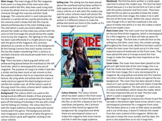
1. Main Image- The main image of this film magazine
front cover is a long shot of the main actor who
features within the film, they have used a long shot
to show the whole mise-en-scene and attitude of the
character through the costume and their body
language. The costume which is used indicates the
character is a pirate ad has a quirky personality, by
the costume used it shows that the film may be
adventure/fantasy due to the actor holding a gun.
The shot which is used uses direct address this
attracts the reader as they make eye contact with the
actor on the front page this would attract the reader
more to buy the magazine. The lighting on this image
has been used effectively it’s a bright picture to go
with the genre of the magazine, this connotes
adventure as a pirate as the sea is in the background.
By him having a serious face and a quirky costume
this has the readers wondering if he’s a serious or
laid back character and would persuade them to buy
the magazine.
Pug- There has been a black pug with white and
yellow writing placed below the masthead on the left
hand side, which is stereotypical for any sort of
magazine. The purpose of a pug is to make it look like
a sticker and has been stuck on last minute so that
the audience believes that its an important and new
feature. By using white and yellow text this makes it
really stand out against the black background so it
catches the readers eye, all of the colours used on
this pug match the colour scheme which makes the
magazine look more professional.
Background- The colours which are used on the
background are different shades of blue and green,
the shot which is used is an establishing shot which
gives off the feeling of traveling in the sea with a boat
and the feeling of a holiday. The colour blue fits in
with the target audience of young males who would
mainly watch this genre. The background and the
main image give a clear picture of what the genre is
and the colours work well together sticking to the
colour scheme.
Selling Line- The selling line has been placed
above the masthead and has been written in
bold uppercase font which links in with the
colour scheme so it will catch the readers eye
and the colour scheme match will attract the
right target audience. The selling line has been
written in 2 different colours to make the
yellow text stand out more to the reader as it’s
the ‘movies biggest year ever!’
Masthead- The font has been written in a bold upper
case font to attract the readers eye. This font has been
chosen because it is a less formal font so it ties in well
with the quirky character and front cover. They have
kept the font as plain as possible to keep the reader
attracted to the main image, this makes it tie in with
the rest of the front cover. Within the colour scheme
even though it fits in well the masthead is the only
piece of media text which is in red, this makes it stand
out to the reader more.
Main Cover Line- The main cover line has been placed
on the last third of the magazine, which is stereotypical
for a film magazine, so it does not take up space for
the main image. The font links in with the font on the
selling line and other cover lines, this creates synergy
throughout the front cover. Bold font has been used to
makes the main cover line stand out as it is the most
important piece of media text on the front cover. They
have placed the text so it wraps around the main
image to make the image the most important on the
front page.
Cover Lines- The cover lines have been placed on the
left and right hand side of the main image, this is so
that the media text doesn't’t take peoples eyes away
from the main image, this is very stereotypical for a
magazine. By using yellow and white text this matches
the colour scheme and also stands out against the sea
background. The cover lines has been placed in these
areas so it uses up the space well and makes it look like
a professional magazine. The text which is used varies
in colour and boldness, which shows the reader which
the most important bits are to read. The font style
which is used is targeted at a younger
Barcode- The magazine company has chosen to put the
barcode in the bottom right hand corner which is very
stereotypical convention for a magazine front cover.
This has been done as it uses as little space as possible
and is out of the way, it doesn't’t distract the reader
from the main content of the magazine. Within the
barcode it shows the issue number and the date, the
price is also stated here so its not in large font.
Colour Scheme- The colour scheme
which has been used on this front cover
has been chosen to match the genre of
the film, as the film is based at sea it has
used blues and greens, the 2 primary
colours to they stand out against the
background. By using black and white
these are stereotypical colours as it
makes the magazine look more mature
and link in with the target audience.
2. Header- A header has been placed on a black
background so it stands out across the
magazine front cover. The text has been
written in bold yellow and white font, this fits
in with the rest of the magazine front cover.
The text colours vary due to what is more
important as yellow is a colour which will catch
the readers eye more than the white text.
Masthead- The masthead has been written is a
bright white bold font along the top of the
magazine front cover below the header, the
colour white has been chosen as its an informal
colour this gives off the impression that the
magazine is targeting teenagers and young adults.
The font is also strong to show the importance of
the masthead. The colour for the masthead has
been chosen so it stands out against the
background and shows contrast. The word ‘total’
has been written in the top of the F on the
masthead in black this makes the masthead look
more interesting. The colour of the masthead
matches the colour scheme well.
Main Image- The main image is from the film The
Lord of The Rings’. Direct address has been used
which is a key feature to a magazine front cover
as it engages the reader and makes them want to
find out more about the characters. This main
image uses the rule of thirds, but unlike the
image just being in the middle third it goes over
all 3 as there are 3 people used as the main
image, so they have used all three thirds so the
main image isn't squashed and is spaced out.
Shadows have been used slightly behind the main
image, therefore this enables the main characters
to jump off the front cover which will catch the
eye of the target audience.
Sub Images- Sub images have been used on this
front cover to show what else features within the
film. These have been placed in the bottom right
hand corner of the front cover, usually things are
placed here which the editors of the magazines
don’t want to be that noticed, but due to them
being a contrast against the olive green
background and dark clothing on the main image
they are noticed as the white boarder shows even
more contrast as it white on brown which is a
dramatic difference.
Footer- A footer has been placed on a yellow
background o it stands out against the olive
green background. The font has been written
in a bold font so it fits in with the synergy of
the font used throughout the front cover. The
colour of the text also alternates between
black and red which makes it stand out and
seem important to the target audience . By it
running the whole way along the bottom of the
front cover it grabs the reader attention.
Date/Price- The date and price of the magazine has
been combined into the F of the masthead this has
been done so it doesn't take up important space on
the front cover. These conventions of a magazine
are normally put in the bottom right hand corner of
the front cover where the sub images have been
placed. They have been placed here so the price
doesn’t stand out but can also be spotted if looked
carefully by the viewers, if the price and date are to
hidden and cant be found easily then the audience
may not purchase the magazine as it may be
deemed as too expensive.
Cover Lines- Cover lines have been used in the
first third of the front cover, these cover lines state
people views on the film and a few added extras to
relate to the film. These cover lines have been
written in a bold yellow font to make it stand out
and all links in well with the colour scheme. Yellow
has been used as it’s a bright eye catching font.
Main Cover Line- The main cover line is also
written in the first third of the front cover. It has
been written in white bold font to appeal to the
target audience of young adults. The main cover
line reads ‘The Two Towers’ which is the title of the
movie which the audience will be able to make the
connection and know what the main feature of the
magazine is. Attached to the main cover like it says
‘exclusive’ so the audience feel that they are being
let into a key and new feature which not everyone
knows about, so this will stimulate the target
audience into buying the magazine to find out what
exclusive stuff has been happening with this film.
Colour Scheme- The colour scheme used on this
front cover are mainly greens, black, white, yellow
and red, these colours all go well together as many
are natural colours and the bright colours are used
where is important to make certain conventions
stand out to the target audience.
3. Date/Issue Number/Price- On this issue of
premiere magazine the date, issue number and
price has been placed above the masthead. This
is very stereotypical for a front cover of a film
magazine as its clear to the reader where they
have been placed so its easy for them to find.
The colour that it has been written in is white
which fits in well with the colour scheme.
Masthead- The masthead has been written across
the top of the magazine front cover in a bold old
fashioned font as it fits in with the film style. This
style of font has been chosen as it will attract the
target audience of young adult males. The font is
also a strong font to show the importance and
dominates of the masthead. By the name of the
magazine being ‘Premiere’ this gives off the view
that it’s a luxury magazine and therefore will
draw people in the buy it. The colour of the
masthead has been chosen because it fits in well
with the colour scheme and also the white stands
out against the red background.
Main Image- The main image is from the film
D’jango. The characters which are used in the
main image would be identified easily by the
target audience as they are well known due to
the build up of the film. The long shot is used to
catch the serious pose and to gain the full mise-
en-scene as we can see the props which are used,
e.g. a gun so it indicates to people that’s it’s a film
to do with criminals and violence. The rule of
thirds has been used here as they main focus of
the main image is in the middle of the magazine
(second third). Two of the three characters are
using direct address to show these are serious
characters and the reader feel drawn in, the third
character is looking at something out of the
readers sight so this makes them curious and
wants to find out more.
Plus- A plus has been used to show the the
audience what else will feature in the magazine
so instead of them having to flick through the
magazine they can see what features in the plus.
Barcode- The magazine company has chosen to
put the barcode in the bottom right hand corner.
This has been done because it uses up the space
well without distracting the reader from the front
cover, it enable enough room for the of the
conventions to be placed.
Web Address- The web address has been placed
along side vertically against the masthead, the
editing company have decided to do this so its
noticeable for the reader as it’s a key convention
and is normally placed here, and so it doesn't’t take
up too much space which is needed for the key
things.
Cover Lines- Cover lines have been sued on the left
and right hand side of the magazine. The heading
to these cover lines has been written in bold so it
catches the readers eye so they are due to read the
smaller bit of text underneath, so this will draw
them in and make them buy the magazine as they
will be interested. The colour of the bold font has
been chosen carefully as the white matches the
colour scheme and also it stands out the the
bleeding red to black background.
Main Cover Line- The main cover line starts in the
first third and crosses to the second covering the
main image. The main cover line has been written
in bigger and bolder font than the cover lines, this
is so that it catches the readers eye so it confirms
what film the magazine is based on and whether it
would appeal to them. The colour changes from
white to grey this is a contrast and makes the title
of the film stand out to the target audience. Within
the main cover line the words ‘interview’ and
‘exclusive’ have been used, this is cleverly put in by
the magazine producers because the reader feel
they are being let in to know something that not
everyone knows so they feel up to date on the
latest things happening in the film industry.
Colour Scheme- The colour scheme which has been
used is very dark colour on the background to
show the serious side of the film as the film is in
the action and gangster genre. The writing has all
been done in white and grey this is so it stands out
against the dark background, so the magazine isn't
seen has boring and catches the readers eye so
they are willing to buy it.
4. Comparisons
• From my experience of analysing different music
and film magazine covers there are clear
differences between them in order to suit the
genre of the magazine whether it is a fashion
magazine or an action film magazine.
• Horror and music magazines have many
differences mainly them being that music
magazines are brightly coloured to catch the
readers eye and seem like a fun magazine. Horror
film magazines are seen as dark and dreary and
attract just the target audience.