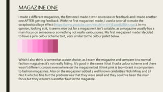
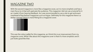
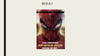
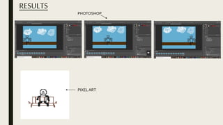
2. THE MAGAZINES
THE FIRST ONE I MADEWITH NO
FEEDBACK.
SECOND ONE,AFTER
RECEIVING FEEDBACK. AN OFFCIALVOGUE MAGAZINE
3. MAGAZINEONE
I made 2 different magazines, the first one I made it with no review or feedback and I made another
oneAFTER getting feedback. With the first magazine I made, I used a tutorial to make the
scrapbook/collage effect (https://www.youtube.com/watch?v=VrYjE2p0tU8&t=291s). In my
opinion, looking at it, it seems nice but for a magazine it isn’t suitable, as a magazine usually has a
main focus on someone or something not really various ones. My first magazine I made I decided
to have a pink colour scheme to it, very similar to the colour pallet below.
Which I also think is somewhat a poor choice, as I exam the magazine and compare it to normal
fashion magazines it’s not really fitting. It’s good in the sense I that I had a colour scheme and there
wasn’t different colours everywhere on the magazine but I think pink is too vibrant in comparison
to fashion magazines.Also on the magazine I added 2 well known celebrities Nicki Minaj and Lil
Naz X which is fine but the problem was that they were small and they could’ve been the main
focus but they weren’t is another fault in the magazine.
4. MAGAZINETWO
With the second magazine is more like a magazine cover, as it is more simplistic and has a
main focus to it that will captivate the audience.This magazine I did not use a tutorial for it
as I made it from hearing feedback. As I was recommended to use a site to get and exact
masthead of big fashion magazines such asVogue. Definitely for this magazine there is a
darker concept which is more fitting for a magazine cover.
This was the colour pallet for this magazine, as I think this is an improvement from my
magazine cover.What I like about this magazine cover is that it’s more simplistic and it
just looks good like that.
5. CONCLUSION
I think overall the second one is better than the first one, although I think my first attempt
of making a magazine looks terrible after doing the second, but without the first attempt I
wouldn’t had to come to the conclusion that less is better and which I am going to keep
that in mind when I make my actual magazine.Also this has helped discover site where I
can use the exact font that famous action films have used which I think is extremely useful
for me. I think with magazine I will do it first when I’m making my own magazine as it was
one of easiest projects to do.
7. MAKINGTHE SONG
I used beep box to make my sound, and ta first I did not know how to to use and I had to
figure it out and eventually I did then I made sound. And honestly it is not great but I tried
after that trail with beep box I have figured and I think this helped me have the idea where
I can make my own sounds but I think I am just going to use non copyrighted music.
And this is fault on my part but I did not take any photos while I was using beep box but I
do have the track I made here below so you can listen to what I made.
10. MAKING THE POSTER
Making the poster is much easier in the sense that is similar to making the magazine so overall I found
it better. And again I tried to use the website Dafont to get a similar font to a spider man font used in
their movie poster.And I font one and used it but it seem right in my opinion.And down below shows
the font because I didn’t take any photos of actually using in photoshop.
Instead of this font I decided to chose a font in photoshop, and it look really nice and I also decided to
use the eyedrop tool to get the exact/similar colour to the gold in the photoshoot. I also used the blur
tool to blur out the background so the spiderman is the main focus.Which I plan to use when I make
my own movie poster as I want a main focus to be on the model.
CHANGES I MADE AFTER COMPARING MY POSTER TO AN ACTUAL SPIDERMAN
POSTER
I at first wrote on the poster “THE SPIDER MAN, COMING OUT SOON”, very simplistic too simplistic in
my opinion then comparing to an actual poster I changed to the writing to “COMING SOON” at the top
of the poster then added “THE AMAZING SPIDERMAN MOVIE IN 3D”which I think is much better
improvement.
Overall I think with this poster it has helped realise that I want to have more simplistic movie poster
with a main focus.
13. THE PROCESS
I was actually surprised at how sort easy animating is, with animating of pixel art I had done a couple
times before I just didn’t take any pictures of others animation I made so the end product was better
than the rest but in the order I have done my work I think I would do this in the last as for me
personally it is quite simple but it takes some time to do it. I plan to do the work that tends to be
quicker first so I have time to do my animation last. I think the only thing I need improve on with
animation is drawing, I’m not good at drawing or anything but I think I can try definitely make my
characters and backgrounds of my animation more cartoon like.Another problem with the pencil
tool on photoshop when I would click on a colour I wanted it would come up with a coulour I had
previously chosen and I struggled because I wasn’t getting the colour I wanted but then I later
discovered and when click the mouse it changes the colour to ones you have previously chosen and
you have keep clicking till you find the colour you want.
15. VIDEO WITHAND WITHOUT SOUND
EFFECTS
WITHOUT SOUND EFFECTS WITH SOUND EFFECTS I MADE
With making the sound effects here I found not that hard as I did them at home in my house and at the park
near my house, yes there were I had to do the sound effects over again but overall doing this has me realise I
can make my own sound when it comes to my game. And I think with making sound effects I would do this
2nd to last when doing it for my project. But looking my end products I think it ok its not amazing but I think
some the sound effects were fairly accurate for example tripping the path I think that really good and also
opening the fridge.