UNIT 14 LEARNING
AIM B
Matthew Hackett
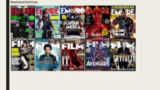
Mood board front Cover
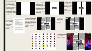
Mood board double page spread
My magazine purpose
My magazine is made to entertain and tell people about upcoming movies. It will be a print
magazine as I believe people who read my magazine will be teenagers and more interested in
having physical copies. My target audience will be male strugglers from the age 14+.They will be of
social gradeC2 and below
Primary Images
I don’t want to use these images as they are too dark and you
can see the lighting equipment: although it can easily removed
in Photoshop its still not very professional so I wont use these
images
I wont use these images as I don’t like the facial
expressions and it doesn't’t convey the tone I want to
I will use this image as both
models are giving the correct
facial expression. It is quite dark
but I will be able to edit this.
Secondary Images
https://www.freepik.com/free-
icon/avengers_810072.htm is
where I got this image. I wont use
this image as I don’t like how think
the lines are
https://www.etsy.com/ie/listing/608369
407/avengers-symbols-complete-set-
embroidery I wont use this image
as I don’t like the colour.
https://1000logos.net/avengers-
logo/ I believe this images colour is
too bold which is why I wont be
using it.
https://www.zedge.net/find/wallpa
pers/avengers%20logo I've decide
to not use this one because its too
dark
https://www.pinterest.com/pin/48273027228880
461/This is the image I will use. Its easy to edit so
it will fit my magazine.
It is ethical to use images from other companies as long as I have their
approval. If you don’t its unethical and can get you in trouble.When I
have approval i must give credit to these companies somewhere in the
magazine.
Article
I wrote my article in word so I
can check for any punctual
errors and know my word
count. I made my article talk
in a way that’s factual but also
written slightly informal to
appeal to the correct target
audience
Front cover plan
Dominant
image
For the dominate image It
will be a mid shot and
the two models will stand
back to back and I will use
mood lighting; red light
from one side, blue from
the other. Example.
Blackoak Std font for
text which isn't mast
head or main/sub title
Impact font
for
masthead
Running head
bigger font
than text.
Section of
magazine
Drop cap,
shows start of
magazine
Sub image,
logo
Running
head, movie
title
Page
number
Small text, a lot of text to
show its for an older
audience
Gutter line to
separate text
Shot of one model
in a long shot with
mood lighting
Shot of the other
(hotter model –
ben) model in a long
shot with mood
lighting
Double page spread plan
Process cover
1) First I made a
black background as
I had not taken the
photos yet. I used
the paint bucket tool
to do this. I then
used the text tool to
make my skyline and
bottom banner
2) I then
added the
mast head
and tag line
(in impact
font)
3) I added a
plug and
quotes in
different
colors
These
were
not my
images
4) I used tools to brighten my image. I
used the brightness tool, levels tool and
curves tools. I then pasted the image in
and used the paint tool to get rid of
parts of the image which were bright
when I didn't’t want them to be
5) I then put the
image in and
used the rubber
tool to make my
head overlap
the image
Process cover
7) I then deleted the background and
made it white
6) I then took this
image from
https://www.pinter
est.com/pin/482730
27228880461/
8) I then pasted the
logo into my front
cover
Front cover final Skyline with more movie titles
(magazine’s genre) in Blackoak
Std font
Mast head in bold white which
stands out from background.Also I
made a tagline for my magazine
which is slightly below in a smaller
case. Both in impact font. I used this
font for exclusively the mast head
and tagline
Yellow plug to stand out, the
models head is overlapping it
Main sell line is bad boys in the
ITC Machine Std font.This is the
same font the bad boys movies
use in posters for the title. I only
used this font for the main sell
line and the tagline for the film
below.
Bar code and issue
number
The models are looking directly into the camera,
this creates direct mode of address which
intrigues the audience. The lighting is mood
lighting, red is on Ben as his character in the film
is more angry, and blue is on Matthew as his
character is more calm. Blue and red also link to
the police and show the genre of movie. The
models are both male and will appeal to the
correct target audience.
I had to ask for Bens consent to take his image
with the knowledge id use the image for a
magazine
Sub headline under the main sell Line in
a different font and color. It still stands
out though. Also the punctuation of the
exclamation mark shows its important
and may persuade the reader to read
Bottom banner
Quote creates none direct
mode off address which creates
intrigue
I used these colors as they are
colors which stand out from the
dark background. Blue and red
link to genre and contrast which
is why I chose them.
I edited the logo to be white so it
stands out, it’s the avengers logo so it’s
a very well known and will attract fans.
This was an image I had taken from
online so it is secondary content. I
took the image from
https://www.pinterest.com/pin/482730
27228880461/ I edited the secondary
image so I believe its ethical to use it. I
will give credit for the image in my
contents page
Double page spread
1) I made a white
background with
black boarders. I did
this as at this point I
had not taken my
images so these
borders were meant
to temporally take the
images place
2) I then added the
headline in the
middle. I made sure
it was directly in the
middle and that the
tagline was even
wit the main title to
keep it neat
3) I then added
the gutter lines
so that my article
would be in the
correct place.
This is
temporary till
the article is in.
4) I created a
article on word,
this is so that I
know there will
be no spelling
grammar
mistakes in the
article.
5) I added the text and
formatted it around
the main headline. I
decided to not remove
the gutter lines as I
believed it looked
good
6) I added the
running head
and page
numbers
7) I did a photo shoot
and added the
dominate images.
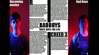
Double page spread final
Images
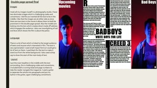
I took all my images myself in a photography studio. I have
two dominate images which is challenging codes and
conventions. I did this as I wanted all the text to be in the
middle. I like that the images are at either side as since
there are two stars in the movie it allows them to both be
prominent in the double page spread.Also the models are
looking into the lens which creates direct mode off address
which engages the audience. I also use moonlighting of rad
and blue which shows the film is about the police.
Layout
Language
There is a lot of text which is linked to the target audience
of teens and anyone who's interested in film.The text is
very opinionated. I used small impact font so I could get a
lot of text on there. I used black for the text to make it
stand out from the white background. I also used a drop
cap to show the start of the main body of text.
I put the main headline in the middle with the text
surrounding, this is challenging codes and conventions.
I included both a running head and page numbers to
help the reader navigate the magazine. I used a gutter
to separate the article into paragraphs and put my
byline in the gutter, again challenging conventions.
Peer feedback
My friends believed that my color palette was too dark and that made the blue in image not stand out as much as I wanted it too. I'm going to amend
this and create a second alterative design which will use more light in the photos. I am doing this as my target audience have given me suggestions and
it will be beneficial l to listen too their feedback.
Front cover progress
1) First I bighted the image
2) I then added the mast head and
made my models head go above it, I
did this by copying his head and
creating it as a new layer and put the
mast head layer below his head
layer. I also did my tag line this way
3) I then added the main sell line; like my last one
Badboys is in the ITC Machine Std font as it helps it
stand out. I also used the inner shadow tool. I also
added the films tag line this way
4) I then added
this sub sell
line
5) I then
added a
bottom
banner 6) I then added a plug 7) I then added another sell line
8) I used the stroke tool on the
mast head of film round
9) I added a pull quote 10) I then added the
information
Unit 14 b save final

Unit 14 b save final

  • 1.
    UNIT 14 LEARNING AIMB Matthew Hackett
  • 2.
  • 3.
    Mood board doublepage spread
  • 4.
    My magazine purpose Mymagazine is made to entertain and tell people about upcoming movies. It will be a print magazine as I believe people who read my magazine will be teenagers and more interested in having physical copies. My target audience will be male strugglers from the age 14+.They will be of social gradeC2 and below
  • 5.
    Primary Images I don’twant to use these images as they are too dark and you can see the lighting equipment: although it can easily removed in Photoshop its still not very professional so I wont use these images I wont use these images as I don’t like the facial expressions and it doesn't’t convey the tone I want to I will use this image as both models are giving the correct facial expression. It is quite dark but I will be able to edit this.
  • 6.
    Secondary Images https://www.freepik.com/free- icon/avengers_810072.htm is whereI got this image. I wont use this image as I don’t like how think the lines are https://www.etsy.com/ie/listing/608369 407/avengers-symbols-complete-set- embroidery I wont use this image as I don’t like the colour. https://1000logos.net/avengers- logo/ I believe this images colour is too bold which is why I wont be using it. https://www.zedge.net/find/wallpa pers/avengers%20logo I've decide to not use this one because its too dark https://www.pinterest.com/pin/48273027228880 461/This is the image I will use. Its easy to edit so it will fit my magazine. It is ethical to use images from other companies as long as I have their approval. If you don’t its unethical and can get you in trouble.When I have approval i must give credit to these companies somewhere in the magazine.
  • 7.
    Article I wrote myarticle in word so I can check for any punctual errors and know my word count. I made my article talk in a way that’s factual but also written slightly informal to appeal to the correct target audience
  • 8.
    Front cover plan Dominant image Forthe dominate image It will be a mid shot and the two models will stand back to back and I will use mood lighting; red light from one side, blue from the other. Example. Blackoak Std font for text which isn't mast head or main/sub title Impact font for masthead
  • 9.
    Running head bigger font thantext. Section of magazine Drop cap, shows start of magazine Sub image, logo Running head, movie title Page number Small text, a lot of text to show its for an older audience Gutter line to separate text Shot of one model in a long shot with mood lighting Shot of the other (hotter model – ben) model in a long shot with mood lighting Double page spread plan
  • 10.
    Process cover 1) FirstI made a black background as I had not taken the photos yet. I used the paint bucket tool to do this. I then used the text tool to make my skyline and bottom banner 2) I then added the mast head and tag line (in impact font) 3) I added a plug and quotes in different colors These were not my images 4) I used tools to brighten my image. I used the brightness tool, levels tool and curves tools. I then pasted the image in and used the paint tool to get rid of parts of the image which were bright when I didn't’t want them to be 5) I then put the image in and used the rubber tool to make my head overlap the image
  • 11.
    Process cover 7) Ithen deleted the background and made it white 6) I then took this image from https://www.pinter est.com/pin/482730 27228880461/ 8) I then pasted the logo into my front cover
  • 12.
    Front cover finalSkyline with more movie titles (magazine’s genre) in Blackoak Std font Mast head in bold white which stands out from background.Also I made a tagline for my magazine which is slightly below in a smaller case. Both in impact font. I used this font for exclusively the mast head and tagline Yellow plug to stand out, the models head is overlapping it Main sell line is bad boys in the ITC Machine Std font.This is the same font the bad boys movies use in posters for the title. I only used this font for the main sell line and the tagline for the film below. Bar code and issue number The models are looking directly into the camera, this creates direct mode of address which intrigues the audience. The lighting is mood lighting, red is on Ben as his character in the film is more angry, and blue is on Matthew as his character is more calm. Blue and red also link to the police and show the genre of movie. The models are both male and will appeal to the correct target audience. I had to ask for Bens consent to take his image with the knowledge id use the image for a magazine Sub headline under the main sell Line in a different font and color. It still stands out though. Also the punctuation of the exclamation mark shows its important and may persuade the reader to read Bottom banner Quote creates none direct mode off address which creates intrigue I used these colors as they are colors which stand out from the dark background. Blue and red link to genre and contrast which is why I chose them. I edited the logo to be white so it stands out, it’s the avengers logo so it’s a very well known and will attract fans. This was an image I had taken from online so it is secondary content. I took the image from https://www.pinterest.com/pin/482730 27228880461/ I edited the secondary image so I believe its ethical to use it. I will give credit for the image in my contents page
  • 14.
    Double page spread 1)I made a white background with black boarders. I did this as at this point I had not taken my images so these borders were meant to temporally take the images place 2) I then added the headline in the middle. I made sure it was directly in the middle and that the tagline was even wit the main title to keep it neat 3) I then added the gutter lines so that my article would be in the correct place. This is temporary till the article is in. 4) I created a article on word, this is so that I know there will be no spelling grammar mistakes in the article. 5) I added the text and formatted it around the main headline. I decided to not remove the gutter lines as I believed it looked good 6) I added the running head and page numbers 7) I did a photo shoot and added the dominate images.
  • 15.
    Double page spreadfinal Images I took all my images myself in a photography studio. I have two dominate images which is challenging codes and conventions. I did this as I wanted all the text to be in the middle. I like that the images are at either side as since there are two stars in the movie it allows them to both be prominent in the double page spread.Also the models are looking into the lens which creates direct mode off address which engages the audience. I also use moonlighting of rad and blue which shows the film is about the police. Layout Language There is a lot of text which is linked to the target audience of teens and anyone who's interested in film.The text is very opinionated. I used small impact font so I could get a lot of text on there. I used black for the text to make it stand out from the white background. I also used a drop cap to show the start of the main body of text. I put the main headline in the middle with the text surrounding, this is challenging codes and conventions. I included both a running head and page numbers to help the reader navigate the magazine. I used a gutter to separate the article into paragraphs and put my byline in the gutter, again challenging conventions.
  • 17.
    Peer feedback My friendsbelieved that my color palette was too dark and that made the blue in image not stand out as much as I wanted it too. I'm going to amend this and create a second alterative design which will use more light in the photos. I am doing this as my target audience have given me suggestions and it will be beneficial l to listen too their feedback.
  • 18.
    Front cover progress 1)First I bighted the image 2) I then added the mast head and made my models head go above it, I did this by copying his head and creating it as a new layer and put the mast head layer below his head layer. I also did my tag line this way 3) I then added the main sell line; like my last one Badboys is in the ITC Machine Std font as it helps it stand out. I also used the inner shadow tool. I also added the films tag line this way 4) I then added this sub sell line 5) I then added a bottom banner 6) I then added a plug 7) I then added another sell line 8) I used the stroke tool on the mast head of film round 9) I added a pull quote 10) I then added the information