Planning
Logo Design
LOGO 1 LOGO 2
The logo design is between these two logos I have drawn myself as the my idea for the logo for the magazine is a play on my last name
‘MOATSHE’, I've taken the first three words of my last name and both logos I've added a lipstick stain as that plays the double meaning as to
pronounce my name you have make ‘mwah’ sound when pronouncing my name so the lipstick stain is the double meaning to name of my
magazine, with the two logos I was conflicted on which one was going to be the logo as I like both of the ideas. With the first logo I really liked
the idea of having the lipstick stain as being the ‘O’ in MOA as I just it would look good and especially the first time you'll see the logo will be
on the front page of the magazine with Y2K theme I think the lipstick stain Is very fitting that certain and with the lipstick stain I was thinking
about having the lipstick sain colour be pink as that also fit into Y2K theme and would reach the target audience as the colour of lipstick will
be showing the essence of femininity of the magazine. But on the other hand Logo 2 is another logo idea that I really like with having the
lipstick stain across the writing of ‘MOA’ which Is another way I like the logo to look but overall with my final decision on the logo would be the
first logo with how there's more of an interesting aspect on the logo which I enjoy looking and I think my audience would like this logo a lot
than the second one I made.
Magazine Design
FRONT COVER: THE CHOSEN THEME -
Y2K
- My intentions for the front cover for my
magazine I decided one out of the three
themes/ concepts for my FMP would be the
Y2K and or called the early 2000s, the aspect
of the early I will be interpreting for the
magazine will the over saturation of colours
but mainly the colour pink, the “glitch core”
that consists of the 2000s windows tabs, the
2000s mouse pointer and using fonts and
symbols that would been used in the early
2000s. My decision on making the front cover
this specific theme is to link and capture my
target audience as my target audience is the
ages of 16-21 no specific gender I am
targeting but someone that enjoys the
feminine fashion, choosing the Y2K as a
concept and as the front cover Is very a
specific concept that most teenagers and
young adults would enjoy looking at.
Choosing the Y2K as the front cover is also
good visually pleasing concept to the target
audience as the majority of the target
audience would’ve not been able to
experience the 2000s fashion/ the Y2K and
aura of the 2000s In its prime as they were
too young to witness so with nostalgia of the
2000s is currently arising in 2022, content and
the fashion on the 2000s is highly liked and
watched so my plan to make my front cover
the Y2K concept will be Intriguing to the
viewers/ target audience.
CONTENTS PAGE -
- For my magazine there will not be a contents page as my
magazine will more of a photo based magazine, the placement
of a contents page in the magazine would be unnecessary as
there isn’t many articles in the magazine and there would a
repetition of what articles are included in the magazine which
would be not interested to the magazine and I would imagine
that being a viewer to my magazine or someone that is in the
target audience would want to see that, as it would be boring to
the audience but instead of a contents page there would be a
welcome pages as the design of the content page design I have
planned for would match the logo I have created for the
magazine, ‘MOA’ magazine has a double meaning with the
lipstick as the ‘O’ in ‘MOA’ and I am planning the double
meaning of the lipstick stain to paste lipstick stain in various or
possible just two colours around the a colourful background of
the colour pink or purple, It depends on which suits the lipstick
stains better and I would have the text in middle that says
“Welcome to MOA magazine” I think of using font that would
match with Y2K would be a suitable font to be in this as this
double page will be Y2K themed the font of choice for it would
be very suiting to the Y2K theme but also with the text I would
add a 4 arched symbol or shooting star across the text to make
the text stand out more and make the page look more
interesting but also to fit the Y2K. The font colour of the text
would just be white as I think that any instead would clash with
the overeat look the Welcome as I think with the lipstick going
around page and text, having the text In any colour would clash
with background colour of the double page or simply would
blend into the background which won’t great as It would be hard
to read from the little text that would be written In the magazine
which Is not ideal.
THE FIRST DOUBLE PAGE: CHOSEN THEME –
EUPHORIA
- The first of double of the actual magazine context will
be a euphoria introduction page as there will be a
visual introduction page for all themes/concepts, where
I will be altering images to match the aesthetic of each
themes, with the euphoria concept I am to do
something similar to the third experiment I had done
before with the image of altering it to create a
kaleidoscope effect on it, as doing a kaleidoscope
scope effect on the image would match the
aesthetic/concept of euphoria where the euphoria
concept of the show and the aesthetic in general
consists of drugs and showcases the after math of the
drug which usually is called a “trip” or “tripping out”. I
think with the introduction my idea to kind of match that
aesthetic without actually showing the use of drugs will
be creating the Kaleidoscope effect I had done for my
experiments as the that experiment showed a easier
way to created a blurred out effect where it could be
seen as trippy. Additionally, with creating the
kaleidoscope effect on the Images I would want to
increase the contrast and colours of the image which
would include pink purple and possibly blue as I think it
would increase and fit the into the trippy aesthetic I am
going for with the double page and lastly after altering
the image I will add across the double page that just
says ‘euphoria’ to keep It simple as there will be a lot
that will going on with the image so I think it would be
better to not have any text altercations, and with the
text I will be using a font very similar to the euphoria TV
show font have used their promotional posters for the
show.
Magazine Design
SCRAP BOOK PAGES- EUPHORIA & COTTAGE:
- In the magazine they will be a scrapbook pages for these two specific themes I will used them to separate the images they will be both A4 pages and with the euphoria
pages my intentions is to used numerous photos I get from the photoshoot and paste all of the page as I think it made the photos look and interesting
- With the cottage core page there will be one main image in the centre of the page but I will have images on top the image that will be overlapping of the same images
that I will chose from the photoshoot, and I will be planning to add the text thatll say ‘cottage core’ but it will be placed around the pages. To make the pages in theme I
will be adding flowers on the page I am not too where but I think the flowers would be a good addition to cottage core theme include spring flowers such as dandelions,
daisies, sunflowers and more.
INTRODUCTION PAGES- Y2K & COTTAGE CORE:
- The introduction page for the Y2K will be scrapbook effect again for the this double page as this is reasoning as to why the Y2K theme wont have a separation page as
I will be already using the scrapbook effect on the introduction page and ill have the text that says ‘Y2K’ and I will place in the middle or at the bottom of the page. With
the cottage core page this will be more on the simpler side as the one of the photos will be fill the whole page will have boxes/ section of colours that fit the cottage core
colour scheme and ill have the text that says ‘cottage core’ overlapping each other but with same colours used from the boxes I had made for the double page already.
ARTICLES- EUPHORIA. Y2K & COTTAGE CORE
Euphoria articles will be two double pages, as one of the double pages will formed where one of the images will cover the whole double page and the place two images
that were cut out on top the first image and the images will be edited with gradient map to the colours that matched with the euphoria theme or to what I think looks the
best for the page and there will be one of the texts that I chose for the Euphoria concept and have the text overlapping again and change the colours to fit the euphoria
concept. The second double of euphoria concept will involve with text altering with having the text saying ‘ The Impact of’ in the text warp section on Photoshop and I was
thinking of having the text says ‘EUPHORIA’ cover the eyes of the model, and have the actual on the right hand side of the double page. Y2K double pages for the ‘WHAT
IS Y2K’ page will involve the old windows that I may possibly have it overlapping and place images from the photoshoot on top and I place the another image of the right
hand side of the double page and have butterflies and hearts across the page that have to make it fit a lot more the Y2K theme and I would place my articles in the middle
of the double page. The next on the double page for Y2K will more of a typography page I don’t think there will be any images for this page but I will the text warp again
and edit ‘Y2K’ to sphere and place it one half of the double across that side of the page and then on the other side I would have the article for the impact of Y2K. Cottage
core double pages will consist as one of the double pages will be made to be a website-like page but for a floral website and it will expressing what the theme is about. And
other double page will be of a proper article where it is more older article presented page as if it is in Victorian magazine.
Magazine Colour
Schemes
These are the colours I will following around in my work for all of the concepts as the pink colour schemes will be
following the Y2K with the variations of pink and the purple and the dark blues in the colour scheme will matching
and be base on the Euphoria but lastly with the green colour scheme, the yellow colour scheme and the lighter
colour of blue will be apart of the Cottage Core concept. Although this Is not all the colour used in the magazine
and there will of course other colours used in my magazine but this Is the overall visual ideas of what colours I will
using and or having the Intentions of using.
Fonts
• The fonts above will the fonts I will be using for all four concepts as I thought that were matching to each concept in my magazine the
double pages I will be going for. The fonts I’ve chosen were based on existing products I was looking for inspiration for fonts to be used
In the magazine and these fonts are the ones will be mainly using for titles of different topics of each themes, as with changing the
colour of the fonts will make the text more fitting to each concept.
Cottage Core
Y2K & Streetwear
EUPHORIA
Models/Cr
ew
• My model for this FMP project is someone that I have used in my project before in
my first FMP but also have also used in my own personal projects, she wonderful
model that we both work efficiently and carefully together. Having her as my model
project that involves photography is nice as I haven’t done with her for almost two
years so when I was thinking and planning in my FMP to include my own photos
that I take I just thought it would be best to have someone that I’ve worked before
and knows how to model for a photoshoot, asking Sadie to be my model for three
concepts was best idea I had for the FMP, as Sadie would the perfect for fit for
three concepts as she is someone I have taken photos of in various concepts in
my own personal projects that I knew her versatility in modelling would be suitable
for my idea for FMP and she asking to be my model again for my project was a
success, she agrees in being part of my photoshoot. Which that is great but the
issue that lies was the planning the dates for the photoshoot as when we are in
college we both have conflicting dates where when I’m in college that’s when she
is off college but she is busy schedule after I come from college and when I’m not
at college that’s when she is at college and but I am also busy with own work
when she returns from college. The weekends weren’t that much possibility either
to do the photoshoot as we both work on weekends so with that in mind we
decided in the two that we are off on holiday we would take photos of some but I
am hoping we could do all the concepts as she comes over to my house and she
will stay overnight and we would do the photoshoot the next day. The date for the
photoshoot was Friday 22nd April but she will be over at my house the night before
as this Is the only two dates in the two weeks that we are both not busy and can
use the complete day to get much photos taken.
Costumes This is the board for Y2K wardrobe for the Y2K section of the MOA magazine,
as these are outfits that my models already had in her closet and after a
discussion on arranging dates for the interviews and we able to form outfits
for each theme, as outfit one for the Y2k concept will involve the denim mini
skirt with the pink butterfly Y2K slim fitted top additionally with the fluffy bucket
hat and heels. The choices for this outfits for the Y2K concepts were the
model Sadie and I discussing and looking at her clothing she had already had
and basing her clothing on inspiration photos of Y2K fashion and we analysed
that a lot of Y2K fashion involved a mini skirt and form of slim fitted top or crop
top and in various colours but the colour pink was the colour of top. And
looking at the clothes she had we thought her denim mini skirt was very
suitable and match really well to the concept and even the slim fitted butterfly
top was good match to the concept as there was such a emphasis of
butterflies in the early 2000s content such music videos and in fashion, that
this specific top was suitable to the fashion of the early 2000s. The white and
fluffy bucket hat and heels are both items use for two out of three outfits used
as we both thought that the additions of the two accessories would make the
outfits fit and match to the Y2K concept. The second outfit for the Y2K
Includes a beige flowy mini skirt with a white fitted crop top and adding the
two white fluffy accessories, the choices for this outfit are that this skirt would
another good item of clothing that Sadie had thought went well with Y2K
fashion using the two fluffy accessories again for this outfits again was the
same reasoning for the first outfit it makes the outfits match the concept and
makes the outfit stand out a lot more. Lastly the third outfit for the Y2K
concept is almost the same as the second outfit but instead of the beige mini
skirt we had switched them for low rise white cargo trousers she had and we
thought It nice outfit that could be fitting for the Y2K and especially with
increase of popularity of the low rise bottoms and fairly recently there is also
increase of popularity of cargo trousers we had thought the trousers is good
option for a third outfit for the Y2K but also with the fluffy accessories with the
outfits created an all white outfit but to bring contrast to the outfits the addition
pink sunglasses, I thought this was It good draw attention to the models face
and would match with possible make up look she will do this concept.
Costumes
• These are the outfits for the Euphoria concept there is only two outfits for the euphoria as we thought that enough for this
concept as the types of outfits are very fitting and we are basing off the models on what we thought that suitable for the specific
for the concept and the model didn’t much clothing that fitted the Euphoria concept but expect the two dresses above that I
thought were good matches to fit the euphoria concept, the dresses were going to be matched the black heels there as It
matched well with both dresses especially for the blue glittery dress we thought there was no need for anything type colour of
heel as the dress Is already colourful enough there isn’t a need to add anymore colour to the dress.
Costum
es
Again with the cottage Core concept there is only two dresses for them which in my opinion work really well for this concept and having two is good
as it’s better than just one, the two dresses in question for the Cottage core concept is the one on the left hand side where this is a green dress with
white flowers all over the dresses as I thought this would be a good for her to wear for the cottage core concept as it matched to a lot what you
would see when search up about cottage core, as cottage core aesthetic involves a lot of long, flowy and floral dresses I just thought looking at that
dress my model already had I thought it would very suiting to the concept mi trying to create. With the green dress I thought it was a good idea to
add a cardigan that models also had in her wardrobe as I think it gives more into the cottage core concept. The second chose of dress for the
cottage core concept was this white, button down, floral dress that is paired the straw hat and sheer white scarf, this outfit is the one I like the most
out of the two as I personally this outfits is the epitome of what cottage core aesthetic looks like, as there’s so many photos of existing photos of
what cottage core is on the Internet and I’ve seen the models have worn a dress very similar to the dress shown above. So I just think that this dress
outfit is the best and most suitable for cottage core.
Posing/ Visual
Inspiration
This is a visual prestation of what kind of poses of
what I would like my model to do but looking
images the posing for the Y2K and Euphoria are
quite similar in the sense that Euphoria does
sometime s have inclusion of he Y2K aesthetic in
their clothing and overall view of Euphoria as the
show is based on teenagers if current generation
but overall the posing I am wanting for the
photoshoot for my model to do Is really engage
into a ‘Sassy’ and ‘glam’ essence to the model and
it would it match to two of three of the concepts.
But the posing for the Cottage Core concept it a
lot more toned down with It, I would want my
model just to be more ‘laid back’, relaxed and look
like she is living freely to match the calm outlook
on the cottage core them and concept
Y2K EUPHORIA COTTAGE CORE
Make Up
Inspiration
• These are the makeup for each
concept I am aspiring for the
Makeup the model will have as I
think there Is need for importance
of makeup just as well of the
outfits for each theme.
Y2K makeup
Euphoria makeup
Cottage Core makeup
Locatio
n
COTTAGE CORE : Field
-A location that I think that would be suitable for the cottage core concept would be this field near my old high I’m not
quite sure of the name of the field but I thought this are would best area to take cottage core like photos as when I was
at high school this field in spring and summer would bloom this beautiful sunflowers and daises that I thought that would
be a good place to take the photos there and this area is local area no more than a 15 minute walk to the destination
from my house so there’s Isn’t much of a hustle of getting and this field isn’t owned by anyone so we wont stepping foot
in someone’s property.
EUPHORIA & Y2K : My House, Living Room
- The second location will be used the other two concepts as that will be an easier for the model and I to have the
photoshoot as we are working around our schedules to do this photoshoot and we both don’t have funds to go
somewhere else to go and take the photos there.
Equipmen
t
This is the equipment I will be using the for the photoshoots for the two themes which are Euphoria and the Y2K, 4 out of the five equipment here I
have recently bought for the magazine as I was having the photoshoots at my house which was decision I had made after the discussion with model
who is going to be in my magazine as having the photoshoots in my house was easier for the model to get to the destination for the photoshoot and
there wont be a struggle for each other to arrange time and place for to come around for the photoshoots as she is near by so for her carrying all the
clothing for photoshoot wont be a hustle to getting to my house. The purple tinsel will be used for the Euphoria concept as when research and
looking at already existing Euphoria concepts there was common theme of using a bright coloured tinsels as the background of the photoshoot and I
thought that it would be a good idea for me to do have a tinsel background for my own take Euphoria photoshoot and theme as it was also a good
idea to have this type of background has it will create the party image and theme and the photos will have connotations to the TV show Euphoria as
a lot scenes In show were at parties. The pink backdrop will be used for the Y2K theme as for my take on the Y2K theme my intentions will be
creating a pink based photoshoot with items clothing and the background so I thought the pink backdrop would be more suitable for the Y2K as it be
more of a Y2K pink essence to the images and the backdrop would match the outfits and also bring more of contrast to the outfits are more on the
plainer side of photoshoots such as the all white Y2K outfit that we had an idea for. The portable photography light is something I also bought for the
photoshoot as I thought It would really need for the Euphoria Theme as I wanted different colours of lighting specifically the colours of pink, blue and
purple as those are the main that fit the Euphoria theme with also looking at existing products of euphoria photoshoots so getting this portable light
was needed. The double sided cello tape will be use to stick the back drops on my wall In my living room. And lastly I will be using my own camera
that I've had for couple years now which Is the Canon 4000d.
MONEY SPENT £38.85
Production Schedule
Week One
DATE TASKS
WEDNESDAY Start on writing the 6 articles, I would start on the What is
(concept) for all three concepts.
Write In my Reflective Journal
THURSDAY Then either finish off writing the articles or start on the
impact of all three concepts.
Write In my Reflective Journal
FRIDAY Add more detail and finally finish off all 6 articles for the
magazine.
- Write In my Reflective Journal and in my Weekly journal
Production Schedule
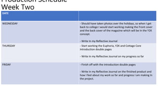
Week Two
DATE
WEDNESDAY - Should have taken photos over the holidays, so when I get
back to college I would start working making the Front cover
and the back cover of the magazine which will be In the Y2K
concept.
- Write In my Reflective Journal
THURSDAY - Start working the Euphoria, Y2K and Cottage Core
Introduction double pages
- Write In my Reflective Journal on my progress so far
FRIDAY - Finish off with the introduction double pages
- Write in my Reflective Journal on the finished product and
how I feel about my work so far and progress I am making In
the project.
Production Schedule
Week Three
DATE
WEDNESDAY - Start working on my article double pages. Firstly the
euphoria articles on what is euphoria and the impact of
Euphoria articles and If I finish early I could work on the other
concepts articles on Photoshop.
- Write In my Reflective Journal
THURSDAY - Either start or continue on the double page articles for the
Y2K concept on Photoshop, Making the What is Y2K and the
Impact of Y2K fashion and hopefully I finish off the pages 4
pages by Friday.
- Write In my Reflective Journal
FRIDAY And lastly finish off the last two article pages on Photoshop
which are the What is Cottage Core and The Impact of
Cottage page and I should be fully finished at the designs of
the of the articles pages
- Write In my Reflective Journal and in my Weekly journal
Production Schedule
Week Four
DATE
WEDNESDAY Put all the writing of the articles into each articles and export
the articles.
Also make adjustments to planning and or unfinished work for
FMP.
-Write In my Reflective Journal
THURSDAY - Possibly start on Evaluation if everything has been
completed but if not try on finishing off anything that hasn’t
been completed
- Write In my Reflective Journal
FRIDAY - Finish off on articles pages and export them and upload my
magazine on issuu.com by using PowerPoint section off the
double pages in halves and also but upload the A4 Pages
scrapbook and front cover for my magazine and save the
PowerPoint and close the PowerPoint and upload the
magazine to the Issue site.
- Write In my Reflective Journal and in my Weekly journal

PLANNING

  • 1.
  • 2.
    Logo Design LOGO 1LOGO 2 The logo design is between these two logos I have drawn myself as the my idea for the logo for the magazine is a play on my last name ‘MOATSHE’, I've taken the first three words of my last name and both logos I've added a lipstick stain as that plays the double meaning as to pronounce my name you have make ‘mwah’ sound when pronouncing my name so the lipstick stain is the double meaning to name of my magazine, with the two logos I was conflicted on which one was going to be the logo as I like both of the ideas. With the first logo I really liked the idea of having the lipstick stain as being the ‘O’ in MOA as I just it would look good and especially the first time you'll see the logo will be on the front page of the magazine with Y2K theme I think the lipstick stain Is very fitting that certain and with the lipstick stain I was thinking about having the lipstick sain colour be pink as that also fit into Y2K theme and would reach the target audience as the colour of lipstick will be showing the essence of femininity of the magazine. But on the other hand Logo 2 is another logo idea that I really like with having the lipstick stain across the writing of ‘MOA’ which Is another way I like the logo to look but overall with my final decision on the logo would be the first logo with how there's more of an interesting aspect on the logo which I enjoy looking and I think my audience would like this logo a lot than the second one I made.
  • 3.
    Magazine Design FRONT COVER:THE CHOSEN THEME - Y2K - My intentions for the front cover for my magazine I decided one out of the three themes/ concepts for my FMP would be the Y2K and or called the early 2000s, the aspect of the early I will be interpreting for the magazine will the over saturation of colours but mainly the colour pink, the “glitch core” that consists of the 2000s windows tabs, the 2000s mouse pointer and using fonts and symbols that would been used in the early 2000s. My decision on making the front cover this specific theme is to link and capture my target audience as my target audience is the ages of 16-21 no specific gender I am targeting but someone that enjoys the feminine fashion, choosing the Y2K as a concept and as the front cover Is very a specific concept that most teenagers and young adults would enjoy looking at. Choosing the Y2K as the front cover is also good visually pleasing concept to the target audience as the majority of the target audience would’ve not been able to experience the 2000s fashion/ the Y2K and aura of the 2000s In its prime as they were too young to witness so with nostalgia of the 2000s is currently arising in 2022, content and the fashion on the 2000s is highly liked and watched so my plan to make my front cover the Y2K concept will be Intriguing to the viewers/ target audience. CONTENTS PAGE - - For my magazine there will not be a contents page as my magazine will more of a photo based magazine, the placement of a contents page in the magazine would be unnecessary as there isn’t many articles in the magazine and there would a repetition of what articles are included in the magazine which would be not interested to the magazine and I would imagine that being a viewer to my magazine or someone that is in the target audience would want to see that, as it would be boring to the audience but instead of a contents page there would be a welcome pages as the design of the content page design I have planned for would match the logo I have created for the magazine, ‘MOA’ magazine has a double meaning with the lipstick as the ‘O’ in ‘MOA’ and I am planning the double meaning of the lipstick stain to paste lipstick stain in various or possible just two colours around the a colourful background of the colour pink or purple, It depends on which suits the lipstick stains better and I would have the text in middle that says “Welcome to MOA magazine” I think of using font that would match with Y2K would be a suitable font to be in this as this double page will be Y2K themed the font of choice for it would be very suiting to the Y2K theme but also with the text I would add a 4 arched symbol or shooting star across the text to make the text stand out more and make the page look more interesting but also to fit the Y2K. The font colour of the text would just be white as I think that any instead would clash with the overeat look the Welcome as I think with the lipstick going around page and text, having the text In any colour would clash with background colour of the double page or simply would blend into the background which won’t great as It would be hard to read from the little text that would be written In the magazine which Is not ideal. THE FIRST DOUBLE PAGE: CHOSEN THEME – EUPHORIA - The first of double of the actual magazine context will be a euphoria introduction page as there will be a visual introduction page for all themes/concepts, where I will be altering images to match the aesthetic of each themes, with the euphoria concept I am to do something similar to the third experiment I had done before with the image of altering it to create a kaleidoscope effect on it, as doing a kaleidoscope scope effect on the image would match the aesthetic/concept of euphoria where the euphoria concept of the show and the aesthetic in general consists of drugs and showcases the after math of the drug which usually is called a “trip” or “tripping out”. I think with the introduction my idea to kind of match that aesthetic without actually showing the use of drugs will be creating the Kaleidoscope effect I had done for my experiments as the that experiment showed a easier way to created a blurred out effect where it could be seen as trippy. Additionally, with creating the kaleidoscope effect on the Images I would want to increase the contrast and colours of the image which would include pink purple and possibly blue as I think it would increase and fit the into the trippy aesthetic I am going for with the double page and lastly after altering the image I will add across the double page that just says ‘euphoria’ to keep It simple as there will be a lot that will going on with the image so I think it would be better to not have any text altercations, and with the text I will be using a font very similar to the euphoria TV show font have used their promotional posters for the show.
  • 4.
    Magazine Design SCRAP BOOKPAGES- EUPHORIA & COTTAGE: - In the magazine they will be a scrapbook pages for these two specific themes I will used them to separate the images they will be both A4 pages and with the euphoria pages my intentions is to used numerous photos I get from the photoshoot and paste all of the page as I think it made the photos look and interesting - With the cottage core page there will be one main image in the centre of the page but I will have images on top the image that will be overlapping of the same images that I will chose from the photoshoot, and I will be planning to add the text thatll say ‘cottage core’ but it will be placed around the pages. To make the pages in theme I will be adding flowers on the page I am not too where but I think the flowers would be a good addition to cottage core theme include spring flowers such as dandelions, daisies, sunflowers and more. INTRODUCTION PAGES- Y2K & COTTAGE CORE: - The introduction page for the Y2K will be scrapbook effect again for the this double page as this is reasoning as to why the Y2K theme wont have a separation page as I will be already using the scrapbook effect on the introduction page and ill have the text that says ‘Y2K’ and I will place in the middle or at the bottom of the page. With the cottage core page this will be more on the simpler side as the one of the photos will be fill the whole page will have boxes/ section of colours that fit the cottage core colour scheme and ill have the text that says ‘cottage core’ overlapping each other but with same colours used from the boxes I had made for the double page already. ARTICLES- EUPHORIA. Y2K & COTTAGE CORE Euphoria articles will be two double pages, as one of the double pages will formed where one of the images will cover the whole double page and the place two images that were cut out on top the first image and the images will be edited with gradient map to the colours that matched with the euphoria theme or to what I think looks the best for the page and there will be one of the texts that I chose for the Euphoria concept and have the text overlapping again and change the colours to fit the euphoria concept. The second double of euphoria concept will involve with text altering with having the text saying ‘ The Impact of’ in the text warp section on Photoshop and I was thinking of having the text says ‘EUPHORIA’ cover the eyes of the model, and have the actual on the right hand side of the double page. Y2K double pages for the ‘WHAT IS Y2K’ page will involve the old windows that I may possibly have it overlapping and place images from the photoshoot on top and I place the another image of the right hand side of the double page and have butterflies and hearts across the page that have to make it fit a lot more the Y2K theme and I would place my articles in the middle of the double page. The next on the double page for Y2K will more of a typography page I don’t think there will be any images for this page but I will the text warp again and edit ‘Y2K’ to sphere and place it one half of the double across that side of the page and then on the other side I would have the article for the impact of Y2K. Cottage core double pages will consist as one of the double pages will be made to be a website-like page but for a floral website and it will expressing what the theme is about. And other double page will be of a proper article where it is more older article presented page as if it is in Victorian magazine.
  • 5.
    Magazine Colour Schemes These arethe colours I will following around in my work for all of the concepts as the pink colour schemes will be following the Y2K with the variations of pink and the purple and the dark blues in the colour scheme will matching and be base on the Euphoria but lastly with the green colour scheme, the yellow colour scheme and the lighter colour of blue will be apart of the Cottage Core concept. Although this Is not all the colour used in the magazine and there will of course other colours used in my magazine but this Is the overall visual ideas of what colours I will using and or having the Intentions of using.
  • 6.
    Fonts • The fontsabove will the fonts I will be using for all four concepts as I thought that were matching to each concept in my magazine the double pages I will be going for. The fonts I’ve chosen were based on existing products I was looking for inspiration for fonts to be used In the magazine and these fonts are the ones will be mainly using for titles of different topics of each themes, as with changing the colour of the fonts will make the text more fitting to each concept. Cottage Core Y2K & Streetwear EUPHORIA
  • 7.
    Models/Cr ew • My modelfor this FMP project is someone that I have used in my project before in my first FMP but also have also used in my own personal projects, she wonderful model that we both work efficiently and carefully together. Having her as my model project that involves photography is nice as I haven’t done with her for almost two years so when I was thinking and planning in my FMP to include my own photos that I take I just thought it would be best to have someone that I’ve worked before and knows how to model for a photoshoot, asking Sadie to be my model for three concepts was best idea I had for the FMP, as Sadie would the perfect for fit for three concepts as she is someone I have taken photos of in various concepts in my own personal projects that I knew her versatility in modelling would be suitable for my idea for FMP and she asking to be my model again for my project was a success, she agrees in being part of my photoshoot. Which that is great but the issue that lies was the planning the dates for the photoshoot as when we are in college we both have conflicting dates where when I’m in college that’s when she is off college but she is busy schedule after I come from college and when I’m not at college that’s when she is at college and but I am also busy with own work when she returns from college. The weekends weren’t that much possibility either to do the photoshoot as we both work on weekends so with that in mind we decided in the two that we are off on holiday we would take photos of some but I am hoping we could do all the concepts as she comes over to my house and she will stay overnight and we would do the photoshoot the next day. The date for the photoshoot was Friday 22nd April but she will be over at my house the night before as this Is the only two dates in the two weeks that we are both not busy and can use the complete day to get much photos taken.
  • 8.
    Costumes This isthe board for Y2K wardrobe for the Y2K section of the MOA magazine, as these are outfits that my models already had in her closet and after a discussion on arranging dates for the interviews and we able to form outfits for each theme, as outfit one for the Y2k concept will involve the denim mini skirt with the pink butterfly Y2K slim fitted top additionally with the fluffy bucket hat and heels. The choices for this outfits for the Y2K concepts were the model Sadie and I discussing and looking at her clothing she had already had and basing her clothing on inspiration photos of Y2K fashion and we analysed that a lot of Y2K fashion involved a mini skirt and form of slim fitted top or crop top and in various colours but the colour pink was the colour of top. And looking at the clothes she had we thought her denim mini skirt was very suitable and match really well to the concept and even the slim fitted butterfly top was good match to the concept as there was such a emphasis of butterflies in the early 2000s content such music videos and in fashion, that this specific top was suitable to the fashion of the early 2000s. The white and fluffy bucket hat and heels are both items use for two out of three outfits used as we both thought that the additions of the two accessories would make the outfits fit and match to the Y2K concept. The second outfit for the Y2K Includes a beige flowy mini skirt with a white fitted crop top and adding the two white fluffy accessories, the choices for this outfit are that this skirt would another good item of clothing that Sadie had thought went well with Y2K fashion using the two fluffy accessories again for this outfits again was the same reasoning for the first outfit it makes the outfits match the concept and makes the outfit stand out a lot more. Lastly the third outfit for the Y2K concept is almost the same as the second outfit but instead of the beige mini skirt we had switched them for low rise white cargo trousers she had and we thought It nice outfit that could be fitting for the Y2K and especially with increase of popularity of the low rise bottoms and fairly recently there is also increase of popularity of cargo trousers we had thought the trousers is good option for a third outfit for the Y2K but also with the fluffy accessories with the outfits created an all white outfit but to bring contrast to the outfits the addition pink sunglasses, I thought this was It good draw attention to the models face and would match with possible make up look she will do this concept.
  • 9.
    Costumes • These arethe outfits for the Euphoria concept there is only two outfits for the euphoria as we thought that enough for this concept as the types of outfits are very fitting and we are basing off the models on what we thought that suitable for the specific for the concept and the model didn’t much clothing that fitted the Euphoria concept but expect the two dresses above that I thought were good matches to fit the euphoria concept, the dresses were going to be matched the black heels there as It matched well with both dresses especially for the blue glittery dress we thought there was no need for anything type colour of heel as the dress Is already colourful enough there isn’t a need to add anymore colour to the dress.
  • 10.
    Costum es Again with thecottage Core concept there is only two dresses for them which in my opinion work really well for this concept and having two is good as it’s better than just one, the two dresses in question for the Cottage core concept is the one on the left hand side where this is a green dress with white flowers all over the dresses as I thought this would be a good for her to wear for the cottage core concept as it matched to a lot what you would see when search up about cottage core, as cottage core aesthetic involves a lot of long, flowy and floral dresses I just thought looking at that dress my model already had I thought it would very suiting to the concept mi trying to create. With the green dress I thought it was a good idea to add a cardigan that models also had in her wardrobe as I think it gives more into the cottage core concept. The second chose of dress for the cottage core concept was this white, button down, floral dress that is paired the straw hat and sheer white scarf, this outfit is the one I like the most out of the two as I personally this outfits is the epitome of what cottage core aesthetic looks like, as there’s so many photos of existing photos of what cottage core is on the Internet and I’ve seen the models have worn a dress very similar to the dress shown above. So I just think that this dress outfit is the best and most suitable for cottage core.
  • 11.
    Posing/ Visual Inspiration This isa visual prestation of what kind of poses of what I would like my model to do but looking images the posing for the Y2K and Euphoria are quite similar in the sense that Euphoria does sometime s have inclusion of he Y2K aesthetic in their clothing and overall view of Euphoria as the show is based on teenagers if current generation but overall the posing I am wanting for the photoshoot for my model to do Is really engage into a ‘Sassy’ and ‘glam’ essence to the model and it would it match to two of three of the concepts. But the posing for the Cottage Core concept it a lot more toned down with It, I would want my model just to be more ‘laid back’, relaxed and look like she is living freely to match the calm outlook on the cottage core them and concept Y2K EUPHORIA COTTAGE CORE
  • 12.
    Make Up Inspiration • Theseare the makeup for each concept I am aspiring for the Makeup the model will have as I think there Is need for importance of makeup just as well of the outfits for each theme. Y2K makeup Euphoria makeup Cottage Core makeup
  • 13.
    Locatio n COTTAGE CORE :Field -A location that I think that would be suitable for the cottage core concept would be this field near my old high I’m not quite sure of the name of the field but I thought this are would best area to take cottage core like photos as when I was at high school this field in spring and summer would bloom this beautiful sunflowers and daises that I thought that would be a good place to take the photos there and this area is local area no more than a 15 minute walk to the destination from my house so there’s Isn’t much of a hustle of getting and this field isn’t owned by anyone so we wont stepping foot in someone’s property. EUPHORIA & Y2K : My House, Living Room - The second location will be used the other two concepts as that will be an easier for the model and I to have the photoshoot as we are working around our schedules to do this photoshoot and we both don’t have funds to go somewhere else to go and take the photos there.
  • 14.
    Equipmen t This is theequipment I will be using the for the photoshoots for the two themes which are Euphoria and the Y2K, 4 out of the five equipment here I have recently bought for the magazine as I was having the photoshoots at my house which was decision I had made after the discussion with model who is going to be in my magazine as having the photoshoots in my house was easier for the model to get to the destination for the photoshoot and there wont be a struggle for each other to arrange time and place for to come around for the photoshoots as she is near by so for her carrying all the clothing for photoshoot wont be a hustle to getting to my house. The purple tinsel will be used for the Euphoria concept as when research and looking at already existing Euphoria concepts there was common theme of using a bright coloured tinsels as the background of the photoshoot and I thought that it would be a good idea for me to do have a tinsel background for my own take Euphoria photoshoot and theme as it was also a good idea to have this type of background has it will create the party image and theme and the photos will have connotations to the TV show Euphoria as a lot scenes In show were at parties. The pink backdrop will be used for the Y2K theme as for my take on the Y2K theme my intentions will be creating a pink based photoshoot with items clothing and the background so I thought the pink backdrop would be more suitable for the Y2K as it be more of a Y2K pink essence to the images and the backdrop would match the outfits and also bring more of contrast to the outfits are more on the plainer side of photoshoots such as the all white Y2K outfit that we had an idea for. The portable photography light is something I also bought for the photoshoot as I thought It would really need for the Euphoria Theme as I wanted different colours of lighting specifically the colours of pink, blue and purple as those are the main that fit the Euphoria theme with also looking at existing products of euphoria photoshoots so getting this portable light was needed. The double sided cello tape will be use to stick the back drops on my wall In my living room. And lastly I will be using my own camera that I've had for couple years now which Is the Canon 4000d. MONEY SPENT £38.85
  • 15.
    Production Schedule Week One DATETASKS WEDNESDAY Start on writing the 6 articles, I would start on the What is (concept) for all three concepts. Write In my Reflective Journal THURSDAY Then either finish off writing the articles or start on the impact of all three concepts. Write In my Reflective Journal FRIDAY Add more detail and finally finish off all 6 articles for the magazine. - Write In my Reflective Journal and in my Weekly journal
  • 16.
    Production Schedule Week Two DATE WEDNESDAY- Should have taken photos over the holidays, so when I get back to college I would start working making the Front cover and the back cover of the magazine which will be In the Y2K concept. - Write In my Reflective Journal THURSDAY - Start working the Euphoria, Y2K and Cottage Core Introduction double pages - Write In my Reflective Journal on my progress so far FRIDAY - Finish off with the introduction double pages - Write in my Reflective Journal on the finished product and how I feel about my work so far and progress I am making In the project.
  • 17.
    Production Schedule Week Three DATE WEDNESDAY- Start working on my article double pages. Firstly the euphoria articles on what is euphoria and the impact of Euphoria articles and If I finish early I could work on the other concepts articles on Photoshop. - Write In my Reflective Journal THURSDAY - Either start or continue on the double page articles for the Y2K concept on Photoshop, Making the What is Y2K and the Impact of Y2K fashion and hopefully I finish off the pages 4 pages by Friday. - Write In my Reflective Journal FRIDAY And lastly finish off the last two article pages on Photoshop which are the What is Cottage Core and The Impact of Cottage page and I should be fully finished at the designs of the of the articles pages - Write In my Reflective Journal and in my Weekly journal
  • 18.
    Production Schedule Week Four DATE WEDNESDAYPut all the writing of the articles into each articles and export the articles. Also make adjustments to planning and or unfinished work for FMP. -Write In my Reflective Journal THURSDAY - Possibly start on Evaluation if everything has been completed but if not try on finishing off anything that hasn’t been completed - Write In my Reflective Journal FRIDAY - Finish off on articles pages and export them and upload my magazine on issuu.com by using PowerPoint section off the double pages in halves and also but upload the A4 Pages scrapbook and front cover for my magazine and save the PowerPoint and close the PowerPoint and upload the magazine to the Issue site. - Write In my Reflective Journal and in my Weekly journal