SlideShare a Scribd company logo
1 of 8
Poster
Analysis
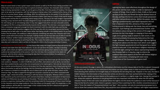
This film poster promotes the remake one of the most well-known slasher horror films released in the year 1984,
with the film itself being re-released in the year 2010. The front cover of this poster has the ability to grab the
audiences direct attention as it features ‘Freddy Krueger’- a well known and well feared fictional character. Freddy
Krueger remains as a source of brand recognition as he can be easily recognised by those who have seen the film
when it was released years back in the 1980’s. I felt like analysing this poster as it links with the subgenre of horror
I am working with, and through this analysis it will allow me to have a deeper understanding on what to include
on the design of my poster and what not. Additionally to this, I will be able to briefly understand the likes and
preferences of the target audience and will give me extra advice and knowledge on what to do to make it
attractive to the general public.
Title & tagline
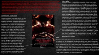
The poster itself of ‘A nightmare on Elm Street’ follows many of the
general conventions that fall under the Horror genre and the slasher
sub-genre. One of the many conventions that the poster follows is the
typeface of the title, as it is seen to be the biggest font within the frame.
The purpose to which why the title is enlarged is because it’s the next
thing that easily grabs the audience’s attention after the main image,
therefore the size tends to indicate that this is the title of the film and
allows the audience to focus on it. The way the typeface is arranged is
unique as the word ‘Nightmare’ is emphasised more compared to the
rest of the title. This suggests its importance and briefly gives of the idea
that the theme of the film has a link with ‘nightmares’. Also ‘Elm Street’
are the next set of words that are used in a larger font, this may be
done, so the target audience can identify the main location where the
film is set and where the killer will possibly be lurking. The tagline also
states “Welcome to your worst nightmare” which confirms the theme of
the film and gives off an impression that it is making direct address to
the audience. The smudged blood effect on the title ‘A nightmare on
Elm Street’ represents the idea of murder, death and danger, it also
syncs in appropriately with the genre of the film as it revolves around
such crimes and killings. ‘Welcome to your worst nightmare’ as a tagline
has been used very effectively as it keeps the audience on the edge of
their seats to find out what the real nightmare is and what the true
meaning is behind these words, which therefore makes them want to
watch the film to find out.
INSTITUTIONAL INFORMATION
Several institutional information such as the film
credits which includes information about the
producers and people involved in the production
of this film have been placed at the bottom of
the bottom of the poster. The production logo
displayed makes the loyal target audience want
to go and watch the film solely as they are
aware it is a big budget, high quality and must
see film. Although this piece of information is
important, it’s not as important as the film title,
release date and tagline, so therefore the
bottom of the poster was the most convenient
and suitable position for this to be placed with
the additional use of a smaller font compared to
the rest highlights is lack of importance. Not
only the size gives of the ‘not-so important’
impression, the colour grey/black used to
display this text is involved in it as well, as it is
lighter than the other text on the page which
therefore portrays its weakness. Whereas, much
more a dominant colour (i.e red) was used to
attract the audience to the important parts of
the poster, for example the title, date etc.
Date
The release date of the film has been placed beneath the credits as it is the last thing
the audience will see on the poster, so therefore they are most likely to stay in their
minds. It follows the same colour scheme as the rest of the font on the page through
the use of the colour red and it being slightly larger than the institutional information
which suggests that, it is more important and attractive than the rest of the text on the
page. Additionally to this, it fits in with the general layout of the poster, which suggest
the idea that they are all aimed at one purpose. The date has been spread out evenly,
in order to enable the audience to read It clearly, whereas if it was close together it has
a lower chance of grabbing the audience’s attention.
Title & tagline
When compared to the font used to display the
title of the film, the tagline seems to be
written in sans serif in a smaller font so it
doesn’t divert the audience’s attention away
from the main title. However, it has been
written in the colour white so it stands out
from the title and the use of plain, serious font
reflects the seriously brutal intentions of the
villain. With the tagline being placed above the
main title, it can be easily spotted by audience
and this further anchors the image, by giving a
further insight to the narrative of the film
without giving away too much information.
Just like the poster of ‘Friday the 13th’, the title
has been written in the colour Red and also
has a couple of words that are enlarged in
order to emphasise its importance. The use of
the colour red on the title is conventional to
horror films as many posters use it, not only
because It stand out amongst the other colours
but because the colour connotes blood/death,
which therefore helps the audience identify
what genre the poster is for. As you can see,
below the title, the release date of the film has
been included in a smaller font to prevent the
audience directing their attention away from
the main image and title but at the same time
inform them about when its coming out.
MAIN IMAGE
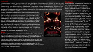
The main image on the poster features a medium close up of the antagonist; Freddy Kreuger, which dominates the frame and allows
the audience to see aspects of the costume as well as parts of villains face. From this it enables the audience to have a good view of
the killer himself before watching the film so they know what to expect and be scared of. Using a medium shot to capture the main
image is very effective as it conveys the villain’s inhuman characteristics, which is therefore conventional to horror film posters. The
general mise-en-scene is another factor that makes the poster stand out to the target audience and enables them to identify that
the film that it is promoting is a slasher.
The first thing that will catch the audience’s eye is Freddy’s mask and costume as
the woollen jumper and hat that he is wearing looks old and torn which juxtaposes
with his monstrous inhuman appearance and adds an extra horror effect to the
horror theme. As well as his casual attire, the mask of the villain is something that
the audience will be curious about, because on the poster it is seen to be Freddy
with his head down hiding his face and doesn’t reveal his full appearance. Deposit
it having a human like effect to an extent, it looks as if he has been burnt all over
face masking his identity which therefore adds suspense to poster as well as the
film, as the audience may want to find out how this happened to him and the only
way to do so is by watching the film. The mask is one of the main items of clothing
that signifies the genre, as mask are conventional to slasher films, as it creates an
additional impact to the horror, and displaying the mask on the poster will most
likely scare the audience even before watching the film.
Colour
As we can see, the main focus on the poster is on Freddie in the back lighting, similar to
other horror film posters the antagonist tends to be the most eye-drawing factor. The way
in which this is presented is through the light casting coming from the window, which
makes the majority of Freddie’s body visible, yet concealed in the shadowy atmosphere.
The main colours used throughout this poster are dark colours such as red, black, dark
brown and a yellowish tint. Red connotes blood, death and symbolises the killings that
Freddy has carried out. The sweater itself used to be brown in colour but not it is torn and
trashy exposing his skin and revealing the fact that he has gone through a lot. The
involvement of black represents death and darkness and makes it have secrecy or more of
a story than what people know about it.
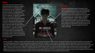
In this section I will be analysing the film poster of ‘Insidious’- a classic horror film released in 2010 and directed
by James Wan. This is a film based on the Parents of a household who take drastic measures when it seems
there new home is haunted and their son who is in a coma is possessed by a malevolent entity. Therefore, by
analysing this poster I will be able to gain some insight into what the different codes and conventions of the
horror genre and the possession sub-genre are used in a multitude of features which are found on a poster.
There are many different conventions applied on the poster ranging from its
general layout to the colours and texts used throughout. The layout of this
poster is very typical of many other posters since it features the main image,
quite possibly the main character in the film, filling the frame while the title
is positioned in the bottom centre of the page. The tagline is placed beneath
the title following the institutional information. Usually horror film posters
tend to feature the names of the actors at the top of the page, however the
names are placed below the tagline on this poster which is very
unconventional.
Main Image
From the poster, the main image is most probably the most important and
conventional part of the poster since it fills its frame whilst giving the ‘main actor’
direct address to the target audience. The main image is taken use a mid-shot which
allows the viewer to pick up the characters importance in the film and capture their
emotions up close and making the actor give direct address enables the audience to
feel like the poster is directed towards them, making them feel more welcome and
therefore leading them to pay more attention towards it. The main image plays a
vital role on the poster itself as it helps create the overall look, style, mood and feel
of the overall design; allowing the audience to identify what type of genre the film is
promoting while enticing them to watch the film. Looking at the poster itself, it is
able to provide the audience with in an insight into the film as it hints the setting,
atmosphere and many others. The use of lighting and Mise en Scene adds an extra
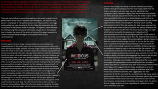
impact to the design. As you can see from the poster, the main image features a
sinister looking boy, possibly in his childhood standing in front of a big yet old
house. This idea is very conventional to the horror film as such films are captured in
big buildings such as houses, schools etc. However, the boy goes against the
average codes and conventions as young boys are perceived as being ‘good’ which
could therefore this could draw the audience into the film as they may want to
know why the young boy is different to other boys within his age group. A shallow
focus is used on the main image- with the house out of focus and the boy in focus.
Main Image
From the main image, the setting of the film is hinted to the target
audience through the background of the main image. Other than the
sinister looking boy, we see a large yet quite old house in the
background, which therefore suggests that the character may possibly
live there. Since we only see this one house in the poster, it gives of the
impression that the film is set in an isolated location and there is no
human life around it which means the characters cannot get any outside
help from the evil that is haunting them. Not only is such a setting
conventional to horror films but keeping the main house separate from
the outside world creates an extra suspense and tension drawing in the
audience much more into the film. This house is shot using a low angle
which lads on to unsettle the audience as it makes them fell
disorientated and the use of low-key lighting and dark clouds makes it
clear the poster is promoting a horror film. The idea that dark clouds are
placed above the house suggest that something bad is going to happen as
darkness usually connotes danger and evil. As you can see the colour
blue is used around the edge of the windows in order to provide the
house with a more chilling, cold and haunted effect and a dark gloomy
atmosphere is created in order to set the mood for the audience. This
colour also has a direct link with the location of the film as they both
represent isolation and loneliness; which is quite common in horror films.
As well as setting, the colours also exaggerate the theme of the film and
the detached mood of the main character; hence his blank facial
expression. Although, we see hedges and trees around the house which
encourages the low population surrounding the location, this idea is
broken since there is a pavement to be seen near to the pavement of the
main image, which suggests that the house possibly sits on a street
where there could be other houses nearby or otherwise, what’s the
reason of a pavement to be there. This suggests that the main
importance of the film is aimed at the boy and not the big house, which is
quite unusual in horror films as most horror films take place in big houses
which therefore makes sense if the house was more focused over the
boy. However, an advantage to this editing technique is that, it is able to
draw in a bigger audience as they may believe it is different to other
horror films they have seen.
Lighting
Lighting has been used effectively throughout the design of
this poster and the main image in order to represent a
number of things. One of which is that, it tells us that some
sections of the films are filmed during the darkest hours of
the day, perhaps the horror scenes that include possession
and other extraordinary activity. Within the poster, low key
lighting is predominantly used which represents the evil
that is featured in the film, almost as if this evil spirit
lurking around is taking over the house, boy and everything
around it. Such feelings are promoted even further, with
the darkest colours being in the corners of the page which
portrays the fact that danger is creeping in from every
angle and is getting ready to attack its next victim; in this
case most probably the young boy featured as the main
image. However, there seems to be slight high key lighting
shining from above onto the boy’s hair which could suggest
the fight between good and evil and that good has a better
chance to win over. It can also have a religious meaning to
it, with the light coming from above representing heaven in
the Christian faith or it may be a sign to inform the
audience that some aspects of the film will involve religious
imagery and actions, complying with even more
conventions of the Possession sub-genre itself.
Mise-en-scene
Mise-en-scene tends to have a great impact on the poster as well as the film that is being promoted. One
of the main mise-en-scene factors that is a typical convention costume- the characters attire and how
they are being represented in order to suit the genre of the film. From the poster of ‘Insidious’ the boy is
seen to be wearing red pyjamas, with the red being an intense colour that is relative to the theme of the
film as it connotes blood, danger and killings. With the red being used on this poster, it has the ability to
grab the audience’ immediate attention and stimulate a faster heart beat as a result of the overall design
of the poster and the film it’s promoting; hence being a horror. The boy in the main image is represented
wearing a stripy red shirt which has been designed in a way to look North American and especially with
the shirt being such an intimidating colour it may also suggest that all the evil and vulnerable activity
throughout the film is acting predominantly towards him or around. The shirt has a very typical design
that is commonly recognised amongst the North American’s with the collar bent over and the top
buttons undone, which therefore suggests the child uses the shirt for casual wear around the house,
showing that he feels safer in his own home rather than being outside in the isolated world. As you look
further into the poster, the audience is able to discover something new about the character each time,
which is quite weird and unusual. For example, looking closely into the boys eyes you’re able to see the
words ‘Insidious’ written inside it portraying the supernaturalism within the boy and pushing the
audience more into wanting to watching the film. This makes the audience scared since they have no
idea why such a demonic code is written on the eye of a child in the first place and what it means.
Facial expressions and body language is a key factor that makes the target audience that will attract the
audience and make them feel more welcome. As you can see form the poster, the boy is standing
upright, with a blank yet slightly scared looking facial expression giving direct address to the target
audience by looking directly at the camera. From this mid-shot, the is presented to be weak and
innocent, with the direct address connoting the idea that he is scared of either the audience or
something directly in front of him.
A wide range of colours have been used on this page to produce the horror look yet still attracting the
main audience. However, in order to fulfil this aim and effect, dull colours such as white, red and blue
have been predominantly used as they are conventional to the typical genre. Not only do colours bring
out a creative and professional finish to the product but they also represent many things by giving hints
about the location as well as the feelings that the characters are experiencing. The fact that the film is
set in America is hinted to us through the use of colours such as red, white and blue; colours of the
American Flag. This idea is supported through the characters costume as red is often associated with
danger, anger, blood and anxiety, all linking in with the Horror iconography. Whereas white is a colour
that represents purity and innocence, with contrast of dull blue creating an atmosphere of depression,
sadness and lifelessness by just looking at the poster. The dull colour surrounds the house in order to
produce a suspicious-looking effect and that something inside the house giving off these mixed feelings
to the characters and the target audience. From the colours on the poster itself, the viewership i.e. the
target audience, will be able to a brief image in their minds of what the film is about and its general
theme though what each colour connotes.
Institutional Information
At the very bottom the page is where the institutional information and the release data of the film is placed. Compared
to the other text, the date and the institutional information are kept hidden away in order to prevent the audience
from directing their attention to it straight away as it should be the last thing they see. However in this case, the date Is
hidden between the information of the production artists and directors who have worked behind the making of the
film but, the date stands out more clearer to the audience as it is written in a slightly larger font. Having this contrast in
size, draws the audience’ attention in size giving them that very important information for when the film will be
released. Names of the main actors are placed below the tagline and this draws the audience in even further because if
they are the fan of a certain actor, there is a greater chance of them watching the film. Another conventional piece of
text is "From the makers of 'Paranormal Activity' and 'Saw'", this is written not only for promotional purposes but to
also to show that someone liked these film, they would be more inclined to watch ‘Insidious’ with higher expectations.
Positioning
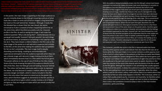
The overall positioning and layout of the poster is very
important and conventional as it can make the design look
more professional and easy to read. In this case the poster
has been laid out in a way the audience can read the
information clearly and also embrace the true horror within
the film through the use of suitable colours, iconography
and readable typography. ‘Insidious’ follows the many
positioning conventions in order to create an effective
poster that will clearly display clear and important evidence
for the audience. Having the young boy placed in the centre
frame emphasises his importance in the film and the use of
mid-shot makes him stand out amongst the rest of the
images on the page.
Tagline
"It's not the house that's haunted", are the
words presented on the poster as the tagline
to promote the film. The tagline has been
placed beneath the title in a smaller font
compared to the rest of the text on the page to
prevent the audience from being diverted
away from the important information i.e. the
title, main image etc. So therefore, placing the
tagline in such a location will allow the
audience to read both the title and the tagline
at the same time. Since the tagline is short, it
increases the likelihood that the audience will
remember it, and at the same time have a
slight curiosity and confusion about what the
words really mean; ‘If it’s not the house that’s
haunted what is?”. It also ties in with the
typical horror conventions as many people
tend to believe that houses/building can be
haunted but ‘Insidious’ breaks this convention
by drawing the viewers’ attention to the young
boy featured in the poster, as he seems like the
one to be possessed.
Title
The title of the film – ‘Insidious’ is placed near the bottom which is a very conventional location for Horror posters. This has been done In order to allow the audience to clearly view the
main image followed by the title, or even both the title and image at the same time. ‘Insidious’ is a term to define "proceeding in a gradual, subtle way, but with very harmful effects"
according to Oxford Dictionaries. Therefore, negative connotations that surround this word grants the audience insight into what the film is about and the genre that it is within. This could
suggest that the evil spirit or even in the boy that is featured in the film is being insidious, which can result in the audience having various assumptions about what will happen in each
scene. Unlike Many other film poster, ‘Insidious’ has displayed their film title in a unique way, as a plus point to attract the audience. Other than the simple yet bold typography, the
highlight of the title is the colour contrast of red and white, with the red only being on the letters ‘S’ and ‘I’. This colours scheme connotes the idea that evil and danger is within the purity
of the young boy featured on the main image of the poster; he loos innocent on the outside, but he is cold-hearted and evil on the inside.
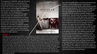
I have chosen to analyse the main poster from a 2012 British-American supernatural horror film directed by Scott
Derrickson; ‘Sinister’. I believe this film posters expresses the true nature of the genre through the use of many
effective codes and conventions. By analysing this poster I will be able to have a clear understanding on the
conventions followed up by supernatural horror’s compared to those on Slasher, which will therefore allow me to
have an idea of what to and not-to include on the poster design of my horror trailer.
In this poster, the main image is appealing to the target audience as
you are instantly drawn to the little girl smearing a picture of what
looks like a clown or some sort of horror imagery using blood from
her hand on the wall behind her. However. Although, it looks like
the blooded face is drawn from her own blood, she seems
entranced as if she is unaware of what I happening behind her at
the same time, which therefore accurately suits her character
profile in the film. As well as seeing this image, it will make the
audience question ‘Why is she doing this?’ , mainly because she is a
young girl and usually ‘innocent’ little girls wouldn’t do such things
by personal choice, so someone or something in this case has made
her do it. They have chosen a child to feature in the film and on the
main image of the poster as it will add extra suspense and curiosity
to the film, at the same time making the audience feel sympathetic
for her as she’s vulnerable. The main image itself is equally
disturbing and terrifying, creating an uncomfortable and
supernatural atmosphere for the audience especially when they can
see a bloody image with demonic images looking directly at them,
which immediately declares that it is a film within the horror genre.
This poster adheres to the use of rule of thirds as the title crosses
three of the thirds drawing the eyes of the audience directly to the
title of the film, then the little girl and evil looking character behind
her. The colour red has been obviously used in order to represent
the blood, not only because it creates a realistic effect but it also
connotes danger and death, which is clearly included in this film.
Red is the only colour that seems to stand out on the poster the
most, which therefore suggests its dominance in the film and fits in
with the overall horror genre which usually involves a lot of blood
and gore as they are key genre tropes which you would usually find
in such films.
With the audience being immediately drawn into this little girl, whose hand leaves
a blooded trail behind her makes the poster look more daunting as it connotes to
the audience that this child must of painted this demons face which could
therefore further suggests that some sort of evil spirit has possessed her into
drawing such an image. Another key feature is the use of a damaged film strip
below the face which depicts how the antagonist secretes have been destroyed
by him as this connotes the evil spirit has been filmed, discovered and released
into the outside world through the bearing of the video tape. This is conventional
to supernatural horror films as they tend to feature a found video tape or some
sort of possessed objects, where the evil spirit then gets absorbed onto the
person who gets hands on it. One typical convention of the horror is that there
are no prominent faces of the actor shown on this poster which, therefore gives
the audience to relate to an unknown character and emphasise with the feelings
and emotions expressed by the little ‘innocent’ girl. Her hand followed by a trail
of blood hints the narrative and gives of the impression that the child maybe evil,
but in this sense its also used in order to further symbolise the genre. Trails of
blood are usually conventional in horror films, as it conveys the leading up to a
killing or an attack, therefore allowing the audience to view this on this poster
and associate it with one of their favourite or previously seen horror films.
The character, possibly the victim in the film is featured within the frame
wearing white pyjamas which could indicate that idea that the film was set at
home while the child was in bed or at a mental institute as white pyjamas tend
to be a form of uniform given to the patients so that they are easily identifiable.
Pyjamas are suitable for posters designed for films within the horror genre such
as ‘Sinister’ as it follows the code and conventions of night time and horror films
are usually set in the dark and much more scarier to watch, therefore in this
case the costume of the victim links directly with the theme of the film as well
as the film genre. Although the costume is not something that usually appears
on the front of the poster, it allows the audience to question themselves about
the film persuading them more into watching it. Especially, when the colour
white is used for the victim’s attire, it will confuse them to an extent where they
would like to find out what really happens in the film. This is because, white is a
colour that usually projects purity, innocence and neutrality. So therefore when
such a colour is used in a horror film, people will start to think to themselves
how a colour that symbolises innocence plays a role in a film that involves
possession, spirits and killings.
One focal point of this poster is its bold and dominant title
– ‘Sinister’, which already presents a supernatural
impression not only to the specific target audience but also
those who view the poster. The title has been designed in a
way to define the film as threatening, foreshadowing evil
and tragic developments therefore giving an overall
impression that the narrative surrounds a dangerous or
harmful event. The title of the film is typical of the genre as
it gives of what the film is really about and is presented
using a simple serif style font, which can therefore be seen
as conventional to supernatural horror films and posters.
When compared to other text on the page, the title is
obviously the largest and most predominate piece of
writing on the poster- this has been done in order to make
it stand out and catch the audience’s attention in order to
let them know what is being promoted. The use of colour
on the design of this title is very effective especially with
the bold shadowing effect putting an emphasis on the
overall film itself and the genre it’s originated within. The
shadow reflection around the letters of the title, produces
a spooky and scary effect and it also connotes that there
might be a lot of blood, death and killing involved which
just already makes the film look frightening than it already
is. Although the title is made up of simple dark colours, it
tends to depict a lot of different meanings for example, the
use of grey and black could indicate the dark and shadowy
nature of the film and its overall theme.
The typography of ‘SINISTER’ makes the title stand
out to the audience as it is really obvious and
noticeable positioned on the centre of the poster,
as well as this, the dark colour used on the title of
the film contrasts with the lighter background.
This font used, is typically creepy and plays on the
title ‘Sinister’, as it already presents a
supernatural impression and draws the target
audience further into watching the film. The
simple serif style font has be laid out in a unique
way as each letter tends to have a sharp point at
the end, which connotes the likely hood of sharp
weapons used such as knives, machetes,
chainsaws etc. The letters of ‘SINISTER’ has been
separated uniquely, and this therefore makes the
masthead look very clear to the viewer and this
shows that it is sending out some sort of message
to beware of might approach.
The tagline is placed beneath the title which is very significant as it creates the context for the narrative, which also
links in heavily with the main image. From this it suggests that disequilibrium could occur in the movie because if
anyone saw ‘him’ everything was normal in life but once after seeing ‘him’ everything turned bad and there was
nothing that could be done to get back onto the previous equilibrium before he was seen. This however, connotes
that once you see the supernatural figure or being, they will pursue you which adds suspense to the film and makes it
more eerie and spine chilling for the audience. In order to maintain the consistency of the poster, the same font has
been used for both the title and tagline as this also has an impact on the overall layout and design of the page. For
example, if two different fonts and colours were used that contradict each other, this will most likely make the poster
look less attractive and has less influence on the target audience to go and each the full film itself. However, the
tagline appears to be the smallest piece of text on the page as it may be used to reinforce a sense of mystery as the
audience search the poster to a clear explanation to why the young girl is drawing, what looks like a demonic figure,
on the walls with blood.
Tagline

More Related Content

What's hot

Film poster codes and conventions
Film poster codes and conventionsFilm poster codes and conventions
Film poster codes and conventionsNnadinee
 
Film poster analysis
Film poster analysisFilm poster analysis
Film poster analysislstafford97
 
Codes and conventions of film posters
Codes and conventions of film postersCodes and conventions of film posters
Codes and conventions of film postersRhiannonTole
 
Film poster terminology and features
Film poster terminology and featuresFilm poster terminology and features
Film poster terminology and featuresmillieoconnor12
 
Magaziine analysis
Magaziine analysisMagaziine analysis
Magaziine analysismollietaylor
 
Film poster analysis (A2 media studies)
Film poster analysis (A2 media studies) Film poster analysis (A2 media studies)
Film poster analysis (A2 media studies) Pablo Ortiz
 
Film Poster Research & Analysis
Film Poster Research & AnalysisFilm Poster Research & Analysis
Film Poster Research & AnalysisAmelia Eguchi-Wale
 
Poster analysis friday the 13th
Poster analysis friday the 13thPoster analysis friday the 13th
Poster analysis friday the 13thShauna-Mullen
 
Film Poster Analysis
Film Poster Analysis Film Poster Analysis
Film Poster Analysis ambersmith96
 
The conjuring – semiotic analysis of movie poster
The conjuring – semiotic analysis of movie posterThe conjuring – semiotic analysis of movie poster
The conjuring – semiotic analysis of movie posterrsheeres
 
Inception poster analysis
Inception poster analysisInception poster analysis
Inception poster analysisSophie Mcgrath
 
Film Poster Analysis
Film Poster AnalysisFilm Poster Analysis
Film Poster AnalysisVicky Squires
 
Media Semiotic Film Poster Analysis
Media Semiotic Film Poster AnalysisMedia Semiotic Film Poster Analysis
Media Semiotic Film Poster AnalysisAshton Parker
 
Horror Film Poster Research & Analysis
Horror Film Poster Research & AnalysisHorror Film Poster Research & Analysis
Horror Film Poster Research & Analysismeganltill96
 
Ancillary task research
Ancillary task researchAncillary task research
Ancillary task researchyannisjoseph95
 

What's hot (20)

Film poster codes and conventions
Film poster codes and conventionsFilm poster codes and conventions
Film poster codes and conventions
 
Film poster analysis
Film poster analysisFilm poster analysis
Film poster analysis
 
Blog task 2
Blog task 2Blog task 2
Blog task 2
 
Question 1
Question 1Question 1
Question 1
 
Codes and conventions of film posters
Codes and conventions of film postersCodes and conventions of film posters
Codes and conventions of film posters
 
Film poster terminology and features
Film poster terminology and featuresFilm poster terminology and features
Film poster terminology and features
 
Poster Analysis
Poster AnalysisPoster Analysis
Poster Analysis
 
Magaziine analysis
Magaziine analysisMagaziine analysis
Magaziine analysis
 
Magazine analysis
Magazine analysisMagazine analysis
Magazine analysis
 
Research Into Film Posters
Research Into Film PostersResearch Into Film Posters
Research Into Film Posters
 
Film poster analysis (A2 media studies)
Film poster analysis (A2 media studies) Film poster analysis (A2 media studies)
Film poster analysis (A2 media studies)
 
Film Poster Research & Analysis
Film Poster Research & AnalysisFilm Poster Research & Analysis
Film Poster Research & Analysis
 
Poster analysis friday the 13th
Poster analysis friday the 13thPoster analysis friday the 13th
Poster analysis friday the 13th
 
Film Poster Analysis
Film Poster Analysis Film Poster Analysis
Film Poster Analysis
 
The conjuring – semiotic analysis of movie poster
The conjuring – semiotic analysis of movie posterThe conjuring – semiotic analysis of movie poster
The conjuring – semiotic analysis of movie poster
 
Inception poster analysis
Inception poster analysisInception poster analysis
Inception poster analysis
 
Film Poster Analysis
Film Poster AnalysisFilm Poster Analysis
Film Poster Analysis
 
Media Semiotic Film Poster Analysis
Media Semiotic Film Poster AnalysisMedia Semiotic Film Poster Analysis
Media Semiotic Film Poster Analysis
 
Horror Film Poster Research & Analysis
Horror Film Poster Research & AnalysisHorror Film Poster Research & Analysis
Horror Film Poster Research & Analysis
 
Ancillary task research
Ancillary task researchAncillary task research
Ancillary task research
 

Viewers also liked

символы и знаки урок№1 солнце
символы и знаки урок№1 солнцесимволы и знаки урок№1 солнце
символы и знаки урок№1 солнцеborbatelena
 
Quarry business Plan
Quarry business PlanQuarry business Plan
Quarry business PlanAbdi Hussein
 
Intern under Sameer mathur app marketing idea
Intern under Sameer mathur app marketing ideaIntern under Sameer mathur app marketing idea
Intern under Sameer mathur app marketing ideaPranjal Mundra
 
Nigeria Hofstede -olaolu onibonoje
Nigeria Hofstede -olaolu onibonojeNigeria Hofstede -olaolu onibonoje
Nigeria Hofstede -olaolu onibonojeOlaolu Onibonoje
 
What is the current landscape for the demand of data science in Hong Kong?
What is the current landscape for the demand of data science in Hong Kong?What is the current landscape for the demand of data science in Hong Kong?
What is the current landscape for the demand of data science in Hong Kong?Leroy Yau
 

Viewers also liked (6)

Ficha anamnese idoso ok
Ficha anamnese idoso okFicha anamnese idoso ok
Ficha anamnese idoso ok
 
символы и знаки урок№1 солнце
символы и знаки урок№1 солнцесимволы и знаки урок№1 солнце
символы и знаки урок№1 солнце
 
Quarry business Plan
Quarry business PlanQuarry business Plan
Quarry business Plan
 
Intern under Sameer mathur app marketing idea
Intern under Sameer mathur app marketing ideaIntern under Sameer mathur app marketing idea
Intern under Sameer mathur app marketing idea
 
Nigeria Hofstede -olaolu onibonoje
Nigeria Hofstede -olaolu onibonojeNigeria Hofstede -olaolu onibonoje
Nigeria Hofstede -olaolu onibonoje
 
What is the current landscape for the demand of data science in Hong Kong?
What is the current landscape for the demand of data science in Hong Kong?What is the current landscape for the demand of data science in Hong Kong?
What is the current landscape for the demand of data science in Hong Kong?
 

Similar to Poster Analysis - Friday the 13th

Analysis of film posters
Analysis of film postersAnalysis of film posters
Analysis of film postersJosh Wright
 
Horror poster analysis
Horror poster analysisHorror poster analysis
Horror poster analysisamiie666
 
Horror poster analysis
Horror poster analysisHorror poster analysis
Horror poster analysiskatie_li
 
Poster analysis a nightmare on elm street
Poster analysis a nightmare on elm streetPoster analysis a nightmare on elm street
Poster analysis a nightmare on elm streetShauna-Mullen
 
Movie Poster Codes and Conventions
Movie Poster Codes and ConventionsMovie Poster Codes and Conventions
Movie Poster Codes and ConventionsAoife Reilly
 
Horror Movies Posters Analysis
Horror Movies Posters AnalysisHorror Movies Posters Analysis
Horror Movies Posters Analysisoshin34
 
Conventions of horror
Conventions of horrorConventions of horror
Conventions of horrorelbzzboii123_
 
Film Poster Analysis - A Nightmare on Elm Street
Film Poster Analysis - A Nightmare on Elm StreetFilm Poster Analysis - A Nightmare on Elm Street
Film Poster Analysis - A Nightmare on Elm Streetrachaeldrake_
 
Film poster analysis
Film poster analysisFilm poster analysis
Film poster analysisshakelamayxo
 
Red riding hood film poster analysis
Red riding hood film poster analysisRed riding hood film poster analysis
Red riding hood film poster analysisleahwatts
 
Film poster analysis new
Film poster analysis newFilm poster analysis new
Film poster analysis newlizzymcdonald1
 
Horror poster analysis
Horror poster analysisHorror poster analysis
Horror poster analysisNathan Edser
 
Media film poster research
Media film poster researchMedia film poster research
Media film poster researchRyanThurgood
 
Poster Analysis 2
Poster Analysis 2Poster Analysis 2
Poster Analysis 2Kalgani
 
21.Poster Analysis 2
21.Poster Analysis 221.Poster Analysis 2
21.Poster Analysis 2Bradley22
 
Horror Poster Analysis- Prom Night
Horror Poster Analysis- Prom NightHorror Poster Analysis- Prom Night
Horror Poster Analysis- Prom NightPaige
 
Movie poster analysis- last house on the left
Movie poster analysis-  last house on the leftMovie poster analysis-  last house on the left
Movie poster analysis- last house on the leftrpatel35
 

Similar to Poster Analysis - Friday the 13th (20)

Analysis of film posters
Analysis of film postersAnalysis of film posters
Analysis of film posters
 
Horror poster analysis
Horror poster analysisHorror poster analysis
Horror poster analysis
 
Horror poster analysis
Horror poster analysisHorror poster analysis
Horror poster analysis
 
Poster analysis a nightmare on elm street
Poster analysis a nightmare on elm streetPoster analysis a nightmare on elm street
Poster analysis a nightmare on elm street
 
Movie Poster Codes and Conventions
Movie Poster Codes and ConventionsMovie Poster Codes and Conventions
Movie Poster Codes and Conventions
 
Poster analysis 3
Poster analysis 3Poster analysis 3
Poster analysis 3
 
Horror Movies Posters Analysis
Horror Movies Posters AnalysisHorror Movies Posters Analysis
Horror Movies Posters Analysis
 
Conventions of horror
Conventions of horrorConventions of horror
Conventions of horror
 
Film Poster Analysis - A Nightmare on Elm Street
Film Poster Analysis - A Nightmare on Elm StreetFilm Poster Analysis - A Nightmare on Elm Street
Film Poster Analysis - A Nightmare on Elm Street
 
Film poster analysis
Film poster analysisFilm poster analysis
Film poster analysis
 
Poster Analysis Two
Poster Analysis TwoPoster Analysis Two
Poster Analysis Two
 
Red riding hood film poster analysis
Red riding hood film poster analysisRed riding hood film poster analysis
Red riding hood film poster analysis
 
Film poster analysis new
Film poster analysis newFilm poster analysis new
Film poster analysis new
 
Horror poster analysis
Horror poster analysisHorror poster analysis
Horror poster analysis
 
Media film poster research
Media film poster researchMedia film poster research
Media film poster research
 
Question 1
Question 1Question 1
Question 1
 
Poster Analysis 2
Poster Analysis 2Poster Analysis 2
Poster Analysis 2
 
21.Poster Analysis 2
21.Poster Analysis 221.Poster Analysis 2
21.Poster Analysis 2
 
Horror Poster Analysis- Prom Night
Horror Poster Analysis- Prom NightHorror Poster Analysis- Prom Night
Horror Poster Analysis- Prom Night
 
Movie poster analysis- last house on the left
Movie poster analysis-  last house on the leftMovie poster analysis-  last house on the left
Movie poster analysis- last house on the left
 

Recently uploaded

Keppel Ltd. 1Q 2024 Business Update Presentation Slides
Keppel Ltd. 1Q 2024 Business Update  Presentation SlidesKeppel Ltd. 1Q 2024 Business Update  Presentation Slides
Keppel Ltd. 1Q 2024 Business Update Presentation SlidesKeppelCorporation
 
Lowrate Call Girls In Sector 18 Noida ❤️8860477959 Escorts 100% Genuine Servi...
Lowrate Call Girls In Sector 18 Noida ❤️8860477959 Escorts 100% Genuine Servi...Lowrate Call Girls In Sector 18 Noida ❤️8860477959 Escorts 100% Genuine Servi...
Lowrate Call Girls In Sector 18 Noida ❤️8860477959 Escorts 100% Genuine Servi...lizamodels9
 
Marketing Management Business Plan_My Sweet Creations
Marketing Management Business Plan_My Sweet CreationsMarketing Management Business Plan_My Sweet Creations
Marketing Management Business Plan_My Sweet Creationsnakalysalcedo61
 
Investment analysis and portfolio management
Investment analysis and portfolio managementInvestment analysis and portfolio management
Investment analysis and portfolio managementJunaidKhan750825
 
Call Girls Miyapur 7001305949 all area service COD available Any Time
Call Girls Miyapur 7001305949 all area service COD available Any TimeCall Girls Miyapur 7001305949 all area service COD available Any Time
Call Girls Miyapur 7001305949 all area service COD available Any Timedelhimodelshub1
 
rishikeshgirls.in- Rishikesh call girl.pdf
rishikeshgirls.in- Rishikesh call girl.pdfrishikeshgirls.in- Rishikesh call girl.pdf
rishikeshgirls.in- Rishikesh call girl.pdfmuskan1121w
 
Tech Startup Growth Hacking 101 - Basics on Growth Marketing
Tech Startup Growth Hacking 101  - Basics on Growth MarketingTech Startup Growth Hacking 101  - Basics on Growth Marketing
Tech Startup Growth Hacking 101 - Basics on Growth MarketingShawn Pang
 
Call Girls in Mehrauli Delhi 💯Call Us 🔝8264348440🔝
Call Girls in Mehrauli Delhi 💯Call Us 🔝8264348440🔝Call Girls in Mehrauli Delhi 💯Call Us 🔝8264348440🔝
Call Girls in Mehrauli Delhi 💯Call Us 🔝8264348440🔝soniya singh
 
VIP Kolkata Call Girl Howrah 👉 8250192130 Available With Room
VIP Kolkata Call Girl Howrah 👉 8250192130  Available With RoomVIP Kolkata Call Girl Howrah 👉 8250192130  Available With Room
VIP Kolkata Call Girl Howrah 👉 8250192130 Available With Roomdivyansh0kumar0
 
A.I. Bot Summit 3 Opening Keynote - Perry Belcher
A.I. Bot Summit 3 Opening Keynote - Perry BelcherA.I. Bot Summit 3 Opening Keynote - Perry Belcher
A.I. Bot Summit 3 Opening Keynote - Perry BelcherPerry Belcher
 
/:Call Girls In Indirapuram Ghaziabad ➥9990211544 Independent Best Escorts In...
/:Call Girls In Indirapuram Ghaziabad ➥9990211544 Independent Best Escorts In.../:Call Girls In Indirapuram Ghaziabad ➥9990211544 Independent Best Escorts In...
/:Call Girls In Indirapuram Ghaziabad ➥9990211544 Independent Best Escorts In...lizamodels9
 
FULL ENJOY - 9953040155 Call Girls in Chhatarpur | Delhi
FULL ENJOY - 9953040155 Call Girls in Chhatarpur | DelhiFULL ENJOY - 9953040155 Call Girls in Chhatarpur | Delhi
FULL ENJOY - 9953040155 Call Girls in Chhatarpur | DelhiMalviyaNagarCallGirl
 
VIP Call Girl Jamshedpur Aashi 8250192130 Independent Escort Service Jamshedpur
VIP Call Girl Jamshedpur Aashi 8250192130 Independent Escort Service JamshedpurVIP Call Girl Jamshedpur Aashi 8250192130 Independent Escort Service Jamshedpur
VIP Call Girl Jamshedpur Aashi 8250192130 Independent Escort Service JamshedpurSuhani Kapoor
 
Islamabad Escorts | Call 03274100048 | Escort Service in Islamabad
Islamabad Escorts | Call 03274100048 | Escort Service in IslamabadIslamabad Escorts | Call 03274100048 | Escort Service in Islamabad
Islamabad Escorts | Call 03274100048 | Escort Service in IslamabadAyesha Khan
 
Banana Powder Manufacturing Plant Project Report 2024 Edition.pptx
Banana Powder Manufacturing Plant Project Report 2024 Edition.pptxBanana Powder Manufacturing Plant Project Report 2024 Edition.pptx
Banana Powder Manufacturing Plant Project Report 2024 Edition.pptxgeorgebrinton95
 
Intro to BCG's Carbon Emissions Benchmark_vF.pdf
Intro to BCG's Carbon Emissions Benchmark_vF.pdfIntro to BCG's Carbon Emissions Benchmark_vF.pdf
Intro to BCG's Carbon Emissions Benchmark_vF.pdfpollardmorgan
 
Catalogue ONG NƯỚC uPVC - HDPE DE NHAT.pdf
Catalogue ONG NƯỚC uPVC - HDPE DE NHAT.pdfCatalogue ONG NƯỚC uPVC - HDPE DE NHAT.pdf
Catalogue ONG NƯỚC uPVC - HDPE DE NHAT.pdfOrient Homes
 
(8264348440) 🔝 Call Girls In Mahipalpur 🔝 Delhi NCR
(8264348440) 🔝 Call Girls In Mahipalpur 🔝 Delhi NCR(8264348440) 🔝 Call Girls In Mahipalpur 🔝 Delhi NCR
(8264348440) 🔝 Call Girls In Mahipalpur 🔝 Delhi NCRsoniya singh
 
Call Girls In Kishangarh Delhi ❤️8860477959 Good Looking Escorts In 24/7 Delh...
Call Girls In Kishangarh Delhi ❤️8860477959 Good Looking Escorts In 24/7 Delh...Call Girls In Kishangarh Delhi ❤️8860477959 Good Looking Escorts In 24/7 Delh...
Call Girls In Kishangarh Delhi ❤️8860477959 Good Looking Escorts In 24/7 Delh...lizamodels9
 
Cash Payment 9602870969 Escort Service in Udaipur Call Girls
Cash Payment 9602870969 Escort Service in Udaipur Call GirlsCash Payment 9602870969 Escort Service in Udaipur Call Girls
Cash Payment 9602870969 Escort Service in Udaipur Call GirlsApsara Of India
 

Recently uploaded (20)

Keppel Ltd. 1Q 2024 Business Update Presentation Slides
Keppel Ltd. 1Q 2024 Business Update  Presentation SlidesKeppel Ltd. 1Q 2024 Business Update  Presentation Slides
Keppel Ltd. 1Q 2024 Business Update Presentation Slides
 
Lowrate Call Girls In Sector 18 Noida ❤️8860477959 Escorts 100% Genuine Servi...
Lowrate Call Girls In Sector 18 Noida ❤️8860477959 Escorts 100% Genuine Servi...Lowrate Call Girls In Sector 18 Noida ❤️8860477959 Escorts 100% Genuine Servi...
Lowrate Call Girls In Sector 18 Noida ❤️8860477959 Escorts 100% Genuine Servi...
 
Marketing Management Business Plan_My Sweet Creations
Marketing Management Business Plan_My Sweet CreationsMarketing Management Business Plan_My Sweet Creations
Marketing Management Business Plan_My Sweet Creations
 
Investment analysis and portfolio management
Investment analysis and portfolio managementInvestment analysis and portfolio management
Investment analysis and portfolio management
 
Call Girls Miyapur 7001305949 all area service COD available Any Time
Call Girls Miyapur 7001305949 all area service COD available Any TimeCall Girls Miyapur 7001305949 all area service COD available Any Time
Call Girls Miyapur 7001305949 all area service COD available Any Time
 
rishikeshgirls.in- Rishikesh call girl.pdf
rishikeshgirls.in- Rishikesh call girl.pdfrishikeshgirls.in- Rishikesh call girl.pdf
rishikeshgirls.in- Rishikesh call girl.pdf
 
Tech Startup Growth Hacking 101 - Basics on Growth Marketing
Tech Startup Growth Hacking 101  - Basics on Growth MarketingTech Startup Growth Hacking 101  - Basics on Growth Marketing
Tech Startup Growth Hacking 101 - Basics on Growth Marketing
 
Call Girls in Mehrauli Delhi 💯Call Us 🔝8264348440🔝
Call Girls in Mehrauli Delhi 💯Call Us 🔝8264348440🔝Call Girls in Mehrauli Delhi 💯Call Us 🔝8264348440🔝
Call Girls in Mehrauli Delhi 💯Call Us 🔝8264348440🔝
 
VIP Kolkata Call Girl Howrah 👉 8250192130 Available With Room
VIP Kolkata Call Girl Howrah 👉 8250192130  Available With RoomVIP Kolkata Call Girl Howrah 👉 8250192130  Available With Room
VIP Kolkata Call Girl Howrah 👉 8250192130 Available With Room
 
A.I. Bot Summit 3 Opening Keynote - Perry Belcher
A.I. Bot Summit 3 Opening Keynote - Perry BelcherA.I. Bot Summit 3 Opening Keynote - Perry Belcher
A.I. Bot Summit 3 Opening Keynote - Perry Belcher
 
/:Call Girls In Indirapuram Ghaziabad ➥9990211544 Independent Best Escorts In...
/:Call Girls In Indirapuram Ghaziabad ➥9990211544 Independent Best Escorts In.../:Call Girls In Indirapuram Ghaziabad ➥9990211544 Independent Best Escorts In...
/:Call Girls In Indirapuram Ghaziabad ➥9990211544 Independent Best Escorts In...
 
FULL ENJOY - 9953040155 Call Girls in Chhatarpur | Delhi
FULL ENJOY - 9953040155 Call Girls in Chhatarpur | DelhiFULL ENJOY - 9953040155 Call Girls in Chhatarpur | Delhi
FULL ENJOY - 9953040155 Call Girls in Chhatarpur | Delhi
 
VIP Call Girl Jamshedpur Aashi 8250192130 Independent Escort Service Jamshedpur
VIP Call Girl Jamshedpur Aashi 8250192130 Independent Escort Service JamshedpurVIP Call Girl Jamshedpur Aashi 8250192130 Independent Escort Service Jamshedpur
VIP Call Girl Jamshedpur Aashi 8250192130 Independent Escort Service Jamshedpur
 
Islamabad Escorts | Call 03274100048 | Escort Service in Islamabad
Islamabad Escorts | Call 03274100048 | Escort Service in IslamabadIslamabad Escorts | Call 03274100048 | Escort Service in Islamabad
Islamabad Escorts | Call 03274100048 | Escort Service in Islamabad
 
Banana Powder Manufacturing Plant Project Report 2024 Edition.pptx
Banana Powder Manufacturing Plant Project Report 2024 Edition.pptxBanana Powder Manufacturing Plant Project Report 2024 Edition.pptx
Banana Powder Manufacturing Plant Project Report 2024 Edition.pptx
 
Intro to BCG's Carbon Emissions Benchmark_vF.pdf
Intro to BCG's Carbon Emissions Benchmark_vF.pdfIntro to BCG's Carbon Emissions Benchmark_vF.pdf
Intro to BCG's Carbon Emissions Benchmark_vF.pdf
 
Catalogue ONG NƯỚC uPVC - HDPE DE NHAT.pdf
Catalogue ONG NƯỚC uPVC - HDPE DE NHAT.pdfCatalogue ONG NƯỚC uPVC - HDPE DE NHAT.pdf
Catalogue ONG NƯỚC uPVC - HDPE DE NHAT.pdf
 
(8264348440) 🔝 Call Girls In Mahipalpur 🔝 Delhi NCR
(8264348440) 🔝 Call Girls In Mahipalpur 🔝 Delhi NCR(8264348440) 🔝 Call Girls In Mahipalpur 🔝 Delhi NCR
(8264348440) 🔝 Call Girls In Mahipalpur 🔝 Delhi NCR
 
Call Girls In Kishangarh Delhi ❤️8860477959 Good Looking Escorts In 24/7 Delh...
Call Girls In Kishangarh Delhi ❤️8860477959 Good Looking Escorts In 24/7 Delh...Call Girls In Kishangarh Delhi ❤️8860477959 Good Looking Escorts In 24/7 Delh...
Call Girls In Kishangarh Delhi ❤️8860477959 Good Looking Escorts In 24/7 Delh...
 
Cash Payment 9602870969 Escort Service in Udaipur Call Girls
Cash Payment 9602870969 Escort Service in Udaipur Call GirlsCash Payment 9602870969 Escort Service in Udaipur Call Girls
Cash Payment 9602870969 Escort Service in Udaipur Call Girls
 

Poster Analysis - Friday the 13th

  • 2. This film poster promotes the remake one of the most well-known slasher horror films released in the year 1984, with the film itself being re-released in the year 2010. The front cover of this poster has the ability to grab the audiences direct attention as it features ‘Freddy Krueger’- a well known and well feared fictional character. Freddy Krueger remains as a source of brand recognition as he can be easily recognised by those who have seen the film when it was released years back in the 1980’s. I felt like analysing this poster as it links with the subgenre of horror I am working with, and through this analysis it will allow me to have a deeper understanding on what to include on the design of my poster and what not. Additionally to this, I will be able to briefly understand the likes and preferences of the target audience and will give me extra advice and knowledge on what to do to make it attractive to the general public. Title & tagline The poster itself of ‘A nightmare on Elm Street’ follows many of the general conventions that fall under the Horror genre and the slasher sub-genre. One of the many conventions that the poster follows is the typeface of the title, as it is seen to be the biggest font within the frame. The purpose to which why the title is enlarged is because it’s the next thing that easily grabs the audience’s attention after the main image, therefore the size tends to indicate that this is the title of the film and allows the audience to focus on it. The way the typeface is arranged is unique as the word ‘Nightmare’ is emphasised more compared to the rest of the title. This suggests its importance and briefly gives of the idea that the theme of the film has a link with ‘nightmares’. Also ‘Elm Street’ are the next set of words that are used in a larger font, this may be done, so the target audience can identify the main location where the film is set and where the killer will possibly be lurking. The tagline also states “Welcome to your worst nightmare” which confirms the theme of the film and gives off an impression that it is making direct address to the audience. The smudged blood effect on the title ‘A nightmare on Elm Street’ represents the idea of murder, death and danger, it also syncs in appropriately with the genre of the film as it revolves around such crimes and killings. ‘Welcome to your worst nightmare’ as a tagline has been used very effectively as it keeps the audience on the edge of their seats to find out what the real nightmare is and what the true meaning is behind these words, which therefore makes them want to watch the film to find out. INSTITUTIONAL INFORMATION Several institutional information such as the film credits which includes information about the producers and people involved in the production of this film have been placed at the bottom of the bottom of the poster. The production logo displayed makes the loyal target audience want to go and watch the film solely as they are aware it is a big budget, high quality and must see film. Although this piece of information is important, it’s not as important as the film title, release date and tagline, so therefore the bottom of the poster was the most convenient and suitable position for this to be placed with the additional use of a smaller font compared to the rest highlights is lack of importance. Not only the size gives of the ‘not-so important’ impression, the colour grey/black used to display this text is involved in it as well, as it is lighter than the other text on the page which therefore portrays its weakness. Whereas, much more a dominant colour (i.e red) was used to attract the audience to the important parts of the poster, for example the title, date etc. Date The release date of the film has been placed beneath the credits as it is the last thing the audience will see on the poster, so therefore they are most likely to stay in their minds. It follows the same colour scheme as the rest of the font on the page through the use of the colour red and it being slightly larger than the institutional information which suggests that, it is more important and attractive than the rest of the text on the page. Additionally to this, it fits in with the general layout of the poster, which suggest the idea that they are all aimed at one purpose. The date has been spread out evenly, in order to enable the audience to read It clearly, whereas if it was close together it has a lower chance of grabbing the audience’s attention.
  • 3. Title & tagline When compared to the font used to display the title of the film, the tagline seems to be written in sans serif in a smaller font so it doesn’t divert the audience’s attention away from the main title. However, it has been written in the colour white so it stands out from the title and the use of plain, serious font reflects the seriously brutal intentions of the villain. With the tagline being placed above the main title, it can be easily spotted by audience and this further anchors the image, by giving a further insight to the narrative of the film without giving away too much information. Just like the poster of ‘Friday the 13th’, the title has been written in the colour Red and also has a couple of words that are enlarged in order to emphasise its importance. The use of the colour red on the title is conventional to horror films as many posters use it, not only because It stand out amongst the other colours but because the colour connotes blood/death, which therefore helps the audience identify what genre the poster is for. As you can see, below the title, the release date of the film has been included in a smaller font to prevent the audience directing their attention away from the main image and title but at the same time inform them about when its coming out. MAIN IMAGE The main image on the poster features a medium close up of the antagonist; Freddy Kreuger, which dominates the frame and allows the audience to see aspects of the costume as well as parts of villains face. From this it enables the audience to have a good view of the killer himself before watching the film so they know what to expect and be scared of. Using a medium shot to capture the main image is very effective as it conveys the villain’s inhuman characteristics, which is therefore conventional to horror film posters. The general mise-en-scene is another factor that makes the poster stand out to the target audience and enables them to identify that the film that it is promoting is a slasher. The first thing that will catch the audience’s eye is Freddy’s mask and costume as the woollen jumper and hat that he is wearing looks old and torn which juxtaposes with his monstrous inhuman appearance and adds an extra horror effect to the horror theme. As well as his casual attire, the mask of the villain is something that the audience will be curious about, because on the poster it is seen to be Freddy with his head down hiding his face and doesn’t reveal his full appearance. Deposit it having a human like effect to an extent, it looks as if he has been burnt all over face masking his identity which therefore adds suspense to poster as well as the film, as the audience may want to find out how this happened to him and the only way to do so is by watching the film. The mask is one of the main items of clothing that signifies the genre, as mask are conventional to slasher films, as it creates an additional impact to the horror, and displaying the mask on the poster will most likely scare the audience even before watching the film. Colour As we can see, the main focus on the poster is on Freddie in the back lighting, similar to other horror film posters the antagonist tends to be the most eye-drawing factor. The way in which this is presented is through the light casting coming from the window, which makes the majority of Freddie’s body visible, yet concealed in the shadowy atmosphere. The main colours used throughout this poster are dark colours such as red, black, dark brown and a yellowish tint. Red connotes blood, death and symbolises the killings that Freddy has carried out. The sweater itself used to be brown in colour but not it is torn and trashy exposing his skin and revealing the fact that he has gone through a lot. The involvement of black represents death and darkness and makes it have secrecy or more of a story than what people know about it.
  • 4. In this section I will be analysing the film poster of ‘Insidious’- a classic horror film released in 2010 and directed by James Wan. This is a film based on the Parents of a household who take drastic measures when it seems there new home is haunted and their son who is in a coma is possessed by a malevolent entity. Therefore, by analysing this poster I will be able to gain some insight into what the different codes and conventions of the horror genre and the possession sub-genre are used in a multitude of features which are found on a poster. There are many different conventions applied on the poster ranging from its general layout to the colours and texts used throughout. The layout of this poster is very typical of many other posters since it features the main image, quite possibly the main character in the film, filling the frame while the title is positioned in the bottom centre of the page. The tagline is placed beneath the title following the institutional information. Usually horror film posters tend to feature the names of the actors at the top of the page, however the names are placed below the tagline on this poster which is very unconventional. Main Image From the poster, the main image is most probably the most important and conventional part of the poster since it fills its frame whilst giving the ‘main actor’ direct address to the target audience. The main image is taken use a mid-shot which allows the viewer to pick up the characters importance in the film and capture their emotions up close and making the actor give direct address enables the audience to feel like the poster is directed towards them, making them feel more welcome and therefore leading them to pay more attention towards it. The main image plays a vital role on the poster itself as it helps create the overall look, style, mood and feel of the overall design; allowing the audience to identify what type of genre the film is promoting while enticing them to watch the film. Looking at the poster itself, it is able to provide the audience with in an insight into the film as it hints the setting, atmosphere and many others. The use of lighting and Mise en Scene adds an extra impact to the design. As you can see from the poster, the main image features a sinister looking boy, possibly in his childhood standing in front of a big yet old house. This idea is very conventional to the horror film as such films are captured in big buildings such as houses, schools etc. However, the boy goes against the average codes and conventions as young boys are perceived as being ‘good’ which could therefore this could draw the audience into the film as they may want to know why the young boy is different to other boys within his age group. A shallow focus is used on the main image- with the house out of focus and the boy in focus. Main Image From the main image, the setting of the film is hinted to the target audience through the background of the main image. Other than the sinister looking boy, we see a large yet quite old house in the background, which therefore suggests that the character may possibly live there. Since we only see this one house in the poster, it gives of the impression that the film is set in an isolated location and there is no human life around it which means the characters cannot get any outside help from the evil that is haunting them. Not only is such a setting conventional to horror films but keeping the main house separate from the outside world creates an extra suspense and tension drawing in the audience much more into the film. This house is shot using a low angle which lads on to unsettle the audience as it makes them fell disorientated and the use of low-key lighting and dark clouds makes it clear the poster is promoting a horror film. The idea that dark clouds are placed above the house suggest that something bad is going to happen as darkness usually connotes danger and evil. As you can see the colour blue is used around the edge of the windows in order to provide the house with a more chilling, cold and haunted effect and a dark gloomy atmosphere is created in order to set the mood for the audience. This colour also has a direct link with the location of the film as they both represent isolation and loneliness; which is quite common in horror films. As well as setting, the colours also exaggerate the theme of the film and the detached mood of the main character; hence his blank facial expression. Although, we see hedges and trees around the house which encourages the low population surrounding the location, this idea is broken since there is a pavement to be seen near to the pavement of the main image, which suggests that the house possibly sits on a street where there could be other houses nearby or otherwise, what’s the reason of a pavement to be there. This suggests that the main importance of the film is aimed at the boy and not the big house, which is quite unusual in horror films as most horror films take place in big houses which therefore makes sense if the house was more focused over the boy. However, an advantage to this editing technique is that, it is able to draw in a bigger audience as they may believe it is different to other horror films they have seen.
  • 5. Lighting Lighting has been used effectively throughout the design of this poster and the main image in order to represent a number of things. One of which is that, it tells us that some sections of the films are filmed during the darkest hours of the day, perhaps the horror scenes that include possession and other extraordinary activity. Within the poster, low key lighting is predominantly used which represents the evil that is featured in the film, almost as if this evil spirit lurking around is taking over the house, boy and everything around it. Such feelings are promoted even further, with the darkest colours being in the corners of the page which portrays the fact that danger is creeping in from every angle and is getting ready to attack its next victim; in this case most probably the young boy featured as the main image. However, there seems to be slight high key lighting shining from above onto the boy’s hair which could suggest the fight between good and evil and that good has a better chance to win over. It can also have a religious meaning to it, with the light coming from above representing heaven in the Christian faith or it may be a sign to inform the audience that some aspects of the film will involve religious imagery and actions, complying with even more conventions of the Possession sub-genre itself. Mise-en-scene Mise-en-scene tends to have a great impact on the poster as well as the film that is being promoted. One of the main mise-en-scene factors that is a typical convention costume- the characters attire and how they are being represented in order to suit the genre of the film. From the poster of ‘Insidious’ the boy is seen to be wearing red pyjamas, with the red being an intense colour that is relative to the theme of the film as it connotes blood, danger and killings. With the red being used on this poster, it has the ability to grab the audience’ immediate attention and stimulate a faster heart beat as a result of the overall design of the poster and the film it’s promoting; hence being a horror. The boy in the main image is represented wearing a stripy red shirt which has been designed in a way to look North American and especially with the shirt being such an intimidating colour it may also suggest that all the evil and vulnerable activity throughout the film is acting predominantly towards him or around. The shirt has a very typical design that is commonly recognised amongst the North American’s with the collar bent over and the top buttons undone, which therefore suggests the child uses the shirt for casual wear around the house, showing that he feels safer in his own home rather than being outside in the isolated world. As you look further into the poster, the audience is able to discover something new about the character each time, which is quite weird and unusual. For example, looking closely into the boys eyes you’re able to see the words ‘Insidious’ written inside it portraying the supernaturalism within the boy and pushing the audience more into wanting to watching the film. This makes the audience scared since they have no idea why such a demonic code is written on the eye of a child in the first place and what it means. Facial expressions and body language is a key factor that makes the target audience that will attract the audience and make them feel more welcome. As you can see form the poster, the boy is standing upright, with a blank yet slightly scared looking facial expression giving direct address to the target audience by looking directly at the camera. From this mid-shot, the is presented to be weak and innocent, with the direct address connoting the idea that he is scared of either the audience or something directly in front of him. A wide range of colours have been used on this page to produce the horror look yet still attracting the main audience. However, in order to fulfil this aim and effect, dull colours such as white, red and blue have been predominantly used as they are conventional to the typical genre. Not only do colours bring out a creative and professional finish to the product but they also represent many things by giving hints about the location as well as the feelings that the characters are experiencing. The fact that the film is set in America is hinted to us through the use of colours such as red, white and blue; colours of the American Flag. This idea is supported through the characters costume as red is often associated with danger, anger, blood and anxiety, all linking in with the Horror iconography. Whereas white is a colour that represents purity and innocence, with contrast of dull blue creating an atmosphere of depression, sadness and lifelessness by just looking at the poster. The dull colour surrounds the house in order to produce a suspicious-looking effect and that something inside the house giving off these mixed feelings to the characters and the target audience. From the colours on the poster itself, the viewership i.e. the target audience, will be able to a brief image in their minds of what the film is about and its general theme though what each colour connotes. Institutional Information At the very bottom the page is where the institutional information and the release data of the film is placed. Compared to the other text, the date and the institutional information are kept hidden away in order to prevent the audience from directing their attention to it straight away as it should be the last thing they see. However in this case, the date Is hidden between the information of the production artists and directors who have worked behind the making of the film but, the date stands out more clearer to the audience as it is written in a slightly larger font. Having this contrast in size, draws the audience’ attention in size giving them that very important information for when the film will be released. Names of the main actors are placed below the tagline and this draws the audience in even further because if they are the fan of a certain actor, there is a greater chance of them watching the film. Another conventional piece of text is "From the makers of 'Paranormal Activity' and 'Saw'", this is written not only for promotional purposes but to also to show that someone liked these film, they would be more inclined to watch ‘Insidious’ with higher expectations.
  • 6. Positioning The overall positioning and layout of the poster is very important and conventional as it can make the design look more professional and easy to read. In this case the poster has been laid out in a way the audience can read the information clearly and also embrace the true horror within the film through the use of suitable colours, iconography and readable typography. ‘Insidious’ follows the many positioning conventions in order to create an effective poster that will clearly display clear and important evidence for the audience. Having the young boy placed in the centre frame emphasises his importance in the film and the use of mid-shot makes him stand out amongst the rest of the images on the page. Tagline "It's not the house that's haunted", are the words presented on the poster as the tagline to promote the film. The tagline has been placed beneath the title in a smaller font compared to the rest of the text on the page to prevent the audience from being diverted away from the important information i.e. the title, main image etc. So therefore, placing the tagline in such a location will allow the audience to read both the title and the tagline at the same time. Since the tagline is short, it increases the likelihood that the audience will remember it, and at the same time have a slight curiosity and confusion about what the words really mean; ‘If it’s not the house that’s haunted what is?”. It also ties in with the typical horror conventions as many people tend to believe that houses/building can be haunted but ‘Insidious’ breaks this convention by drawing the viewers’ attention to the young boy featured in the poster, as he seems like the one to be possessed. Title The title of the film – ‘Insidious’ is placed near the bottom which is a very conventional location for Horror posters. This has been done In order to allow the audience to clearly view the main image followed by the title, or even both the title and image at the same time. ‘Insidious’ is a term to define "proceeding in a gradual, subtle way, but with very harmful effects" according to Oxford Dictionaries. Therefore, negative connotations that surround this word grants the audience insight into what the film is about and the genre that it is within. This could suggest that the evil spirit or even in the boy that is featured in the film is being insidious, which can result in the audience having various assumptions about what will happen in each scene. Unlike Many other film poster, ‘Insidious’ has displayed their film title in a unique way, as a plus point to attract the audience. Other than the simple yet bold typography, the highlight of the title is the colour contrast of red and white, with the red only being on the letters ‘S’ and ‘I’. This colours scheme connotes the idea that evil and danger is within the purity of the young boy featured on the main image of the poster; he loos innocent on the outside, but he is cold-hearted and evil on the inside.
  • 7. I have chosen to analyse the main poster from a 2012 British-American supernatural horror film directed by Scott Derrickson; ‘Sinister’. I believe this film posters expresses the true nature of the genre through the use of many effective codes and conventions. By analysing this poster I will be able to have a clear understanding on the conventions followed up by supernatural horror’s compared to those on Slasher, which will therefore allow me to have an idea of what to and not-to include on the poster design of my horror trailer. In this poster, the main image is appealing to the target audience as you are instantly drawn to the little girl smearing a picture of what looks like a clown or some sort of horror imagery using blood from her hand on the wall behind her. However. Although, it looks like the blooded face is drawn from her own blood, she seems entranced as if she is unaware of what I happening behind her at the same time, which therefore accurately suits her character profile in the film. As well as seeing this image, it will make the audience question ‘Why is she doing this?’ , mainly because she is a young girl and usually ‘innocent’ little girls wouldn’t do such things by personal choice, so someone or something in this case has made her do it. They have chosen a child to feature in the film and on the main image of the poster as it will add extra suspense and curiosity to the film, at the same time making the audience feel sympathetic for her as she’s vulnerable. The main image itself is equally disturbing and terrifying, creating an uncomfortable and supernatural atmosphere for the audience especially when they can see a bloody image with demonic images looking directly at them, which immediately declares that it is a film within the horror genre. This poster adheres to the use of rule of thirds as the title crosses three of the thirds drawing the eyes of the audience directly to the title of the film, then the little girl and evil looking character behind her. The colour red has been obviously used in order to represent the blood, not only because it creates a realistic effect but it also connotes danger and death, which is clearly included in this film. Red is the only colour that seems to stand out on the poster the most, which therefore suggests its dominance in the film and fits in with the overall horror genre which usually involves a lot of blood and gore as they are key genre tropes which you would usually find in such films. With the audience being immediately drawn into this little girl, whose hand leaves a blooded trail behind her makes the poster look more daunting as it connotes to the audience that this child must of painted this demons face which could therefore further suggests that some sort of evil spirit has possessed her into drawing such an image. Another key feature is the use of a damaged film strip below the face which depicts how the antagonist secretes have been destroyed by him as this connotes the evil spirit has been filmed, discovered and released into the outside world through the bearing of the video tape. This is conventional to supernatural horror films as they tend to feature a found video tape or some sort of possessed objects, where the evil spirit then gets absorbed onto the person who gets hands on it. One typical convention of the horror is that there are no prominent faces of the actor shown on this poster which, therefore gives the audience to relate to an unknown character and emphasise with the feelings and emotions expressed by the little ‘innocent’ girl. Her hand followed by a trail of blood hints the narrative and gives of the impression that the child maybe evil, but in this sense its also used in order to further symbolise the genre. Trails of blood are usually conventional in horror films, as it conveys the leading up to a killing or an attack, therefore allowing the audience to view this on this poster and associate it with one of their favourite or previously seen horror films. The character, possibly the victim in the film is featured within the frame wearing white pyjamas which could indicate that idea that the film was set at home while the child was in bed or at a mental institute as white pyjamas tend to be a form of uniform given to the patients so that they are easily identifiable. Pyjamas are suitable for posters designed for films within the horror genre such as ‘Sinister’ as it follows the code and conventions of night time and horror films are usually set in the dark and much more scarier to watch, therefore in this case the costume of the victim links directly with the theme of the film as well as the film genre. Although the costume is not something that usually appears on the front of the poster, it allows the audience to question themselves about the film persuading them more into watching it. Especially, when the colour white is used for the victim’s attire, it will confuse them to an extent where they would like to find out what really happens in the film. This is because, white is a colour that usually projects purity, innocence and neutrality. So therefore when such a colour is used in a horror film, people will start to think to themselves how a colour that symbolises innocence plays a role in a film that involves possession, spirits and killings.
  • 8. One focal point of this poster is its bold and dominant title – ‘Sinister’, which already presents a supernatural impression not only to the specific target audience but also those who view the poster. The title has been designed in a way to define the film as threatening, foreshadowing evil and tragic developments therefore giving an overall impression that the narrative surrounds a dangerous or harmful event. The title of the film is typical of the genre as it gives of what the film is really about and is presented using a simple serif style font, which can therefore be seen as conventional to supernatural horror films and posters. When compared to other text on the page, the title is obviously the largest and most predominate piece of writing on the poster- this has been done in order to make it stand out and catch the audience’s attention in order to let them know what is being promoted. The use of colour on the design of this title is very effective especially with the bold shadowing effect putting an emphasis on the overall film itself and the genre it’s originated within. The shadow reflection around the letters of the title, produces a spooky and scary effect and it also connotes that there might be a lot of blood, death and killing involved which just already makes the film look frightening than it already is. Although the title is made up of simple dark colours, it tends to depict a lot of different meanings for example, the use of grey and black could indicate the dark and shadowy nature of the film and its overall theme. The typography of ‘SINISTER’ makes the title stand out to the audience as it is really obvious and noticeable positioned on the centre of the poster, as well as this, the dark colour used on the title of the film contrasts with the lighter background. This font used, is typically creepy and plays on the title ‘Sinister’, as it already presents a supernatural impression and draws the target audience further into watching the film. The simple serif style font has be laid out in a unique way as each letter tends to have a sharp point at the end, which connotes the likely hood of sharp weapons used such as knives, machetes, chainsaws etc. The letters of ‘SINISTER’ has been separated uniquely, and this therefore makes the masthead look very clear to the viewer and this shows that it is sending out some sort of message to beware of might approach. The tagline is placed beneath the title which is very significant as it creates the context for the narrative, which also links in heavily with the main image. From this it suggests that disequilibrium could occur in the movie because if anyone saw ‘him’ everything was normal in life but once after seeing ‘him’ everything turned bad and there was nothing that could be done to get back onto the previous equilibrium before he was seen. This however, connotes that once you see the supernatural figure or being, they will pursue you which adds suspense to the film and makes it more eerie and spine chilling for the audience. In order to maintain the consistency of the poster, the same font has been used for both the title and tagline as this also has an impact on the overall layout and design of the page. For example, if two different fonts and colours were used that contradict each other, this will most likely make the poster look less attractive and has less influence on the target audience to go and each the full film itself. However, the tagline appears to be the smallest piece of text on the page as it may be used to reinforce a sense of mystery as the audience search the poster to a clear explanation to why the young girl is drawing, what looks like a demonic figure, on the walls with blood. Tagline