Charbagh / best call girls in Lucknow - Book 🥤 8923113531 🪗 Call Girls Availa...
Editing my magazine front cover
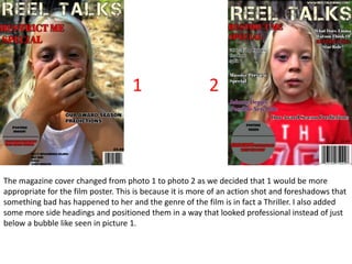
1. The magazine cover changed from photo 1 to photo 2 as we decided that 1 would be more
appropriate for the film poster. This is because it is more of an action shot and foreshadows that
something bad has happened to her and the genre of the film is in fact a Thriller. I also added
some more side headings and positioned them in a way that looked professional instead of just
below a bubble like seen in picture 1.
1 2
2. Feedback from our teacher was that it would look really good with the Magazines Title behind
the main photo. With the software that we were using, ‘BeFunky’ this was a complicated task.
What I had to do was cut out the full picture of Cerys, this took a while as I had to zoom in and
back out to make sure that even the tiniest parts of her were still there. This then took out the
background of trees around Cerys. I then put the new edit and the old photo together so that I
could put the ‘REEL TALKS’ tile behind her head. But while the background looked really cool it
was way too bright meaning not many colours would go onto the poster and stand out. So I
edited the photo so that the background was blurry around her, putting the focus on the main
character and played with the lighting.
3 4 5
3. You can already tell that this is a lot more detailed than the photos 1 and 2. I really thought on
what should be the secondary headings. I went with Emma Watson as at this time she is the
main actress that every body is talking about, due to ‘Beauty and the Beast’ she also stared in
Harry Potter, these films got very dark and twisted as the years went on, meaning she would
have experience in the sort of role. So I tied two secondary headings together for synergy, using
different colours for the film names, the colours used for their actual titles.
These versions of the magazine front covers also have extra stuff such as; barcode, price,
website and an issue date.
6 7
4. I started over as I realised that the ‘Restrict me’ Special
should be in the same font as in the film poster. This
meant starting again with the blank poster and re adding
everything.
8
5. This is the final poster. I really like it and
it has clearly come a long way I a couple
of weeks. For synergy I made the titles
‘Split’ and ‘Get Out’ also in yellow with a
black outline so that the colours for the
whole front cover really tied together.
Over all, I think that this front cover is
really good and links very well with out
trailer and mine and Sophie's friends all
said that this would entice them to pick
it up and buy it.