9953330565 Low Rate Call Girls In Rohini Delhi NCR
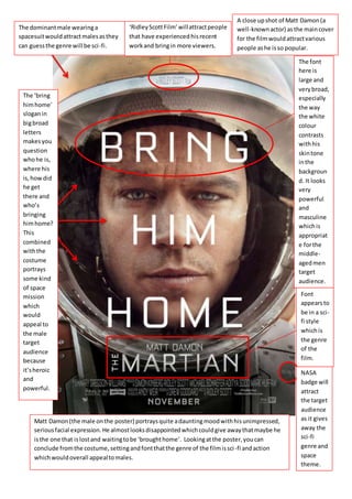
Bring Him Home
1. The font
here is
large and
verybroad,
especially
the way
the white
colour
contrasts
withhis
skintone
inthe
backgroun
d. It looks
very
powerful
and
masculine
whichis
appropriat
e forthe
middle-
agedmen
target
audience.
Font
appearsto
be in a sci-
fi style
whichis
the genre
of the
film.
The dominantmale wearinga
spacesuitwouldattractmalesasthey
can guessthe genre will be sci-fi.
A close upshot of Matt Damon(a
well-knownactor) asthe maincover
for the filmwouldattractvarious
people ashe isso popular.
NASA
badge will
attract
the target
audience
as it gives
away the
sci-fi
genre and
space
theme.
The ‘bring
himhome’
sloganin
bigbroad
letters
makesyou
question
whohe is,
where his
is,howdid
he get
there and
who’s
bringing
himhome?
This
combined
withthe
costume
portrays
some kind
of space
mission
which
would
appeal to
the male
target
audience
because
it’sheroic
and
powerful.
Matt Damon(the male onthe poster) portraysquite adauntingmoodwithhisunimpressed,
seriousfacial expression.He almostlooksdisappointedwhichcouldgive awaythatmaybe he
isthe one that islostand waitingtobe ‘broughthome’. Lookingatthe poster,youcan
conclude fromthe costume,settingandfontthatthe genre of the filmissci-fi andaction
whichwouldoverall appealtomales.
‘RidleyScottFilm’ willattractpeople
that have experiencedhisrecent
workand bringin more viewers.
2. Here is one of the posters made to advertise the film ‘The Martian’. As you can
see I have pointed out and explained the main key points on the poster to
promote the sci-fi/action genre film to the target audience of middle aged
men.
The most obvious subject is the actual man on the poster, Matt Damon. He is
well known for his previous work in other films that have experienced great
popularity such as ‘The Bourne’ series set; so the fact Matt Damon will already
have a large fan basefromprevious work will help attract more viewers.
Especially considering he is a good looking young man, he always helps to
attract the ladies bringing in a wider range audience; even though the target
audience for the film is middle aged males.
Another dominantaspect of the poster is the large font. The most noticeable
text being ‘bring me home’ spread across thephotograph which would make
the audience wonder whatis going to happen and wonder who needs bringing
home and who is going to bring who home? From looking at the poster on a
whole, concluding the spaceoutfit with the NASA badge and the way you can
see all the rocks in the reflection of his helmet as if Matt Damon is on another
planet; my instinct was that he is the one perhaps stuck on another planet
after a space mission and others are going up to bring him home. The next text
you notice besides the stars name is the title of the film ‘The Martian’. The
word Martian associates with planet Mars which is a giveaway that this could
be the setting of the film. All of the text is in a bold, sci-fithemed fontwhich
would appeal to the middle aged men because it appears very strong and
powerful.
The colours on the poster are bland and dull. You can see moredark browns
and blacks which could set a daunting mood representing that it could be a
dark journey, things could go wrong… But then there is the orangey red glow
reflecting from the helmet which are the main colours to represent mars.
Although this stops it frombeing more eye-catching as there are no bold
distinctive colours, I think this could appeal to middle aged men as it helps to
conclude the theme and genre of the film so they would know it’s based
around sci-fiand action.
3. You can see on the helmet it says ‘A Ridley Scott film’. Besides this film already
being mainstream meaning it will appeal to mostpeople and create a trend,
Ridley Scott will bring in even more people as he has produced and directed
over a hundred other amazing films such as Prometheus, Alien and Gladiator
which all ended up being big hits.
This poster would be classed as direct as you have Matt Damon’s eyes glaring
at you as soon as you look at the poster so it makes you feel like he is looking
at you and talking to you; this makes it more personalfor the audience. I would
also say the poster is formal due to the layout of the text on the image and the
type of font that has been used – it appears very neat and well arranged.