
Recommended
More Related Content
What's hot
What's hot (20)
Viewers also liked
Viewers also liked (20)
Similar to Film Poster Codes and Conventions Explained
Similar to Film Poster Codes and Conventions Explained (20)
Recently uploaded
Recently uploaded (20)
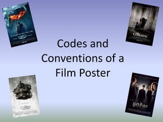
Film Poster Codes and Conventions Explained
- 1. Codes and Conventions of a Film Poster
- 2. ImagesThe main aspect of any film poster will be the main image. It will usually be a large image which represents, either a certain point in the film, or is a separate image of the main protagonists. Although some film posters do not have an image of their main characters, and might perhaps only have the logo i.e. the Jurassic Park film poster, usually without an image, the poster is less attractive and is less likely to gain an interested audience. This particular poster I have chosen, which I think shows the use of an image on the front well, is ‘New Moon’ from the Twilight Saga. Although it could be argued that the main protagonist is the female character shown here (Bella), throughout the rest of the films we begin to see that there is more emphasis on the lives of three characters, of which the story line revolves around. Therefore, this would be why the film company have chosen to include an image where all three of the characters are present, instead of it just being the female character. Not only does this make it more interesting, but it also helps to clarify who the main actors are, which for some people, would be the main interest Also, the image which has been chosen for this particular poster, is also very important as it helps to highlight the type of genre that the film is.
- 3. Typography When looking at codes and conventions of film posters, it is clear that typography is a key aspect. Not only does it help to give a reasonable amount of information of what the film might actually be about, but it is also enable to entice the audience in, especially if what is written is of interest to them. With this particular film poster to the right, we can see that it is from one of the Harry Potter films. As the Harry Potter films are such a widely known and popular film/book series, not a lot of information would need to be added, as people are more likely to know about the details of the film anyway. However, the clearest bit of typography present is ‘The Rebellion Begins’. This almost symbolises the start of a whole new drama within the Harry Potter series, which looks interesting through this writing used. Furthermore, the fact that it is a simple piece of writing also adds to the dramatic effect that the poster gives, as it is almost suggesting that there is nothing more to say, and the only way to find out what happens, is to see the film- a good piece of advertising.
- 4. Camera Shots Camera shots- which links into the images used- are also very important when it comes to creating a film poster. From research, typically a film poster will usually have a close up, or mid shot of the main protagonist. As you can see from the ‘Shutter Island’ poster, a close up of Leonardo Dicaprio is used. The close up of his face, is quite menacing and filled with mystery, which could also symbolise what the film might be about. By using this type of camera shot on the front of a movie poster, it entices the audience in even further, as it makes it more appealing and attractive to the eye. This is particularly true when a famous actor is used on the front of a poster. Dicaprio for example, is an incredibly well known and popular Hollywood actor, therefore, by using him on the front of the poster, fans of his will be more inclined to see it, as they are able to see that he is being portrayed as the main character. On the other hand, shots, such as those you can see on the Avengers poster to the left, are typically going against conventions of the types of camera shots used. Although having said this, this type of shot is becoming highly used when it comes to action films, where more than one character is wanted to be highlighted. This is particularly so for the Avengers film, as it is a film where all of the great and well loved Avengers characters come together within one film.
- 5. Lighting/ Colour Scheme On any poster, the lighting used by the editing crew, will be highly worked upon, until the precise lighting has been found to accurately represent the film. In particular, the film 127 hours, which is displayed on the left, is a film about a man who is rock climbing on his own, and falls into dangerous trouble, whereby his arm becomes caught between a rock and a cave wall. Like the film title suggests, the character was stuck there for 127 hours. Consequently, the lighting used on this particular poster complements the story line very well, as it looks to be a sunset/sunrise, which represents the amount of time he was there for. Therefore, without the appropriate lighting and colour scheme, a film might be very hard to advertise and sell. The colours and lighting need to be appropriate for the genre of the film being shown, as other wise it effects the audiences perception of the film. For example, a typical convention of a horror film poster, will be that the lighting and colours used, will be very dark and gothic, symbolising danger and mystery. On the other hand, a romance film poster, will most likely include light colours, typically red and pink which symbolise love and romance.
- 6. Witten Language & Title Written language and the title on a poster are also possibly the most stereotypical conventions used on a film poster. They provide extra information about the film company, more than the film being advertised. For example, this written language will usually, if not always include, the directors name, the producers name, all of the main cast and also the production and distribution company that has been used. There may of course be some other information used as well, but this is the generic information most likely to be present. The most important convention of a film poster, will probably be the title of the film. This is such an important aspect, as otherwise it would be very confusing to an interested audience, as they would not realise what film is being advertised. Not only this, but it is also a name/title that will appear on all media products to do with this film, meaning that it is very important in the advertisement of the film. Furthermore, the title of the film, will most likely be incorporated into the genre or story line of the film. Within Harry Potter for example, the title is written as if it were a lightening bolt (the same lightening scar that the main protagonist is born with on his head). Within Inception, there is a strong element of danger, which is why the title is in red, as this is what it connotes the most.