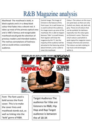
1. Colour– The colours on this issue
are quite basic as there are only
4 which are; black, red, dark red,
grey. These are all colours that
can be symbolic for darkness
especially red, the colour goes
on Eminem’s name. There are
only 4 colours used which is
quite typical for magazine covers
it keeps it formal and common.
The colours are dark relating to
rap music and stereotypes
within it.
Masthead- The masthead is bold, in
block capitals and is in a deep black
colour that fades into a vibrant red. It
takes up most of the primary optical area
and is VIBE’s famous and recognisable
masthead would grab the attention of
previous readers and intended readers.
The red has connotations of liveliness
and so could entice a secondary
audience.
Central Image- The image of
Eminem is the feature of this
front cover, he is well known so
is used to attract the audience,
his image covers up some of the
masthead, this is able to happen
because ‘Vibe’ is so well known,
that regulars will know the
magazine by the ‘V’, but the
majority of the audience will be
attracted to the featuring article
about Eminem, so he is able to
cover the masthead.
Font- The font used is
bold across the front
cover. This is to make
the cover lines and
masthead stands out, as
well as linking into the
‘bold’ genre of R&B.
Target Audience The
audience for Vibe are
listeners to R&B, Hip
Hop and Rap Target
audience is between
the of 18-34