2. Double Page Spread Analysis #1
General Layout
Both sides of the double page spread follow the convention that a quote is written in a larger font, as a ‘tease’ in order fo r the audience to see it and want to buy it so they
can read about the story the artists are presenting. This overall entices the a udience to purchase the magazine. The use of photographs are used in order to interest the
reader and highlight the fact that the article is in fact about that particular artist(s). In this case – although it is a double page spread it is made up of only two members of
One Direction; Zayn and Harry, the article does continue onto the next page though as it says “Louie and Niall’s school secre ts are over the page”. The use of Zayn being
partly on the other side of the page allows the audience to understand that the articles are in fact interlinked. The use of puff’s with more text inside it breaks it down
more and gives more information about the article that the readers would see and would make them want to read it even more.
The fact that the two articles are similar in content reassures the audience that it is a double page spread, there is a clear continuation between the two pages in colour
scheme, general theme, font and design.
Title
On this particular double page spread there is no direct title. I believe this is because the boys are split up on to three different double page spreads and the title is on
another page.
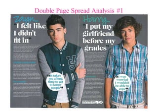
The headline on one half of the article is Zayn’s written in a sans serif font, similar to handwriting in a blue font, lookin g as i f he wrote it himself. This is followed by the
quote “I felt like I didn’t fit in” in a bigger and bolder white font with black speech marks - taking on a title role despite there not being one. The content of the title
suggests that the article is going to be about Zayn feeling like an outsider at school and how he didn't "fit in" which is encouraging to the reader as they cou ld be going
through something similar.
On the other side of the double page spread, the article has Harry's name written in the s ame way as Zayn's, looking as if he had written it himself - making it more
personal and direct to the reader. The only difference being that it is written in a greeny colour instead of blue like Zayn' s. The colour green can represent Harry himself as
green can represent being "restful" and "learning, growth and harmony". Harry's his name is followed by the quote "I put my girlf riend before my grades". Which is written
in a bigger and bolder white font with black speech marks. It suggests that Harry is spea king about his regrets in not putting his education first and how important
education actually is. Which brings the point back to the colour of green as his mistakes have made him learn and grow as a p erson.
Images
3. Double Page Spread Analysis #1
The first image presented is Zayn. His body composition consists of him standing up straight with one arm down next to his side with the other arm going across his body
clutching onto his upper arm - just above the elbow. This portrays his shy and fragileness and represents the theme of the article - that he didn't fit in. Overall, this shows
Zayn's more sensitive side, which appeals more to the readers emotions, whereby they connect with Zayn on a deeper level.
Costume wise, Zayn is wearing dark beige chinos, a plain white t-shirt and a green, grey and white baseball jacket. This is typical of him, as him and the rest of the boys in
One Direction often wear baseball jackets. His hair is done in his 'signature hairstyle' - a quiff - popular with boys in this generation as well as those in the pop industry
(iconography).
The image of Zayn is placed on the right hand side of the article about him. The image itself is large. This will instantly d raw the audience in as the image stand out more
than the text does. It will be the first thing they see - and if they are huge One Direction fans, or just like Zayn in particular, they will be drawn in by the image and will be
more convinced to read the article.
Placed on top of the image is a white circle starburst. Inside the starburst is the text… “It takes me a long time to get to know people” in black speech marks, in blue text,
the same colour his name is written in, in the same font the title is written in. The quote itself links back to the title of the article.
The second image is of Harry. His body composition consists of him standing up straight with one hand in his pocket and the other down by his side. This por trays him in
quite a cool and relaxed manner - which reflects the article itself as it is about him putting his girlfriend before s chool - and therefore wasn’t taking it seriously, which
therefore could reflect his composure.
Costume wise - Harry is wearing a blue, black, grey and yellow, checkered shirt, rolled up on the sleeves - from long sleeve to the elbow. Harry often wears checkered shirts
and is therefore a typical costume choice for him! His hair is as curly as ever - making him stand out from the other boys, giving him his individuality.
The image of Harry is placed on the right side of the article about him. The image itself is large. This will instantly draw the audience in as the image stands out more than
the text does. It will be the first thing - other than the photograph of Zayn. However, seeing both of them both on the page, will attract the audience more as it is not just
one member of the band.
Placed on top of the image is a white circle shaped starburst, inside the starburst is the text… “I was worried I wouldn’t be able to cope” in black speech marks, in a green
text, the same colour his name is written in, in the same font the title is written in. This quote itself interlinks with the title and gives the audience about more insigh t as to
what Harry is feeling so they can understand and him on a deeper level in order to empathise with him.
4. Double Page Spread Analysis #1
Body Copy
The body copy consists of two different articles - one relating to Zayn and the other relating to Harry. Both of the articles are in relation to the boys when the was at school .
This is clever of the magazine as those reading it are also still in school, s o they can relate to it.
On both articles, the articles are in paragraphs, separated by different headlines, breaking the article up. Aswell as separa ting the text up so it does not look as full on. If it
was one complete block of text, it could be off putting for the reader as it would look long and perhaps boring to read.
Both Harry and Zayn are being presented in a way which would hopefully deter young children from doing the same. Both boys ar e role models for the younger generation,
so if they are speaking about their regrets and issues when they was in school, hopefully others can relate to it and get through it without looking back and wishing they
handled the situation better - which is what the boys are reminiscing on.
Colours
The colours grey, white, blue and green dominate the double page spread. It is not the same in every double page spread that ‘We Love Pop’ p roduce. Making each one
stand out. However, the colours green and blue are popular throughout the magazine. Although, if it was a double page spread on the girls from Little Mix, colours such as
pink and yellow would be more likely to feature. The colours themselves represent the artists.
It could be said that the colours are being used in order to maintain brand identity as the colours used in this particular double page spread do feature widely across ‘We
Love Pop’ magazine. Just like the colours black, white and red feature in ‘KERRANG!’ and ‘NME’.
Fonts and Typeface
ask miss cross for help.