HMCS Max Bernays Pre-Deployment Brief (May 2024).pptx
Clash front cover
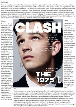
1. Main Image
The main image hasbeenusedforthe whole backgroundof the magazine,thismakesthe wholefrontcoverstandoutand show
the readerinstantlywhatthe issue ispredominantlyabout.The manincludedonthe frontcoveristhe leadsingerfromthe 1975,
the 1975 are a huge upcomingbandthat has a lot of popularityall aroundthe world,whichmakespeople interestedandexcited
aboutthe issue,makingthembuyit.There isn’talotof textinvolvedonlytitlesof people oralbums,makingthe covermore
simple andnotclutteredwithtoomuchinformation,alsoleavingmore roomforthe main image inthe backgroundtostand out.
Mostlymatt ( the leadsingerfromThe 1975) isseenin tatteredandbaggy clothes butinthispicture he isseenwearingawhite
shirtwitha black jumper/jacket.Thisshowsthe readersthatmaybe The 1975’s new musicis more formal andcivilized,alsohe is
lookingupandpast the camera, showinghisstandardsandaimsare set highforThe 1975.
Colours
There are onlytwo
coloursusedwithin
the whole front
cover,blackand
white.Thismakesthe
whole coverseem
veryformal which
goeswithwhatMatt
iswearing.The only
blackcolouris seen
on matt withhis
jumper/jacketand
alsohishair colour.
Thiscouldshowthat
deepdownMatt may
have a darker side to
himbut the
magazinescolours
are onlywhite,
presentinghimwitha
lighterside.The
white textmakesthe
titlesandsubtitles
standout againstthe
backgroundso that
itseasyfor readersto
readthe text. Using
onlytwocoloursalso
goesagainstthe
normal codesand
conventionsof a
musicmagazine
showingusthat the
magazine ismore
independentandnot
ownedbybig
producingcompanies
such as Bauermedia
groupas theyaim
there products
towardsmass
audiences,whereas
Clashaimsit at a
specificaudience,
wholike simplicity.
Layout
The layoutof the
frontcover is
extremely
simplisticwiththe
whole mainimage
as the whole
backgroundand
only some texton
the page,but the
waythe texthas
beenlaidoutis
extremelydifferent
to any othermusic
magazine.Clash
are maybe
targetingtheir
magazinesata
completely
differentaudience
to othermagazines
such as Q. The
headlinesof the
magazine are laid
out directly
underneaththe
title whichisa
strange place to
place them.This
makesthe
magazine stand
out to the
audience because
of the diversityof
the magazine and
howdifferentit
looks.Font
The fontsusedare verysimple butfairlyuniquealso.The mainheadline isablockfontwhichisboldand
standsout a lot,alsowitha simple designincludedwiththe L,andthe A.Thisgivesthe magazine title more
of an identity,ratherthanbeinganormal blockfont,whichconveysthe magazine assimple butalsogoing
out of its wayto be differentandstandoutagainstthe othermusicmagazinesmade byproduction
companies.Evenwithinthe smallerheadlines underneaththe mastheadthere isadistinct style withthe
spacesbeingslightlylargerthanwhatwouldnormallybe seenonamusicmagazine,creatingavery
differentandunique style.The headline ‘The 1975’is ina veryboldand3D font,whichgoesslightly
upwardstowardsthe left,facingthe same wayas Matt the leadsinger.Thiscouldrepresentthatnotonlyis
matt lookingtoachieve highthingsbutsoisthe band itself.