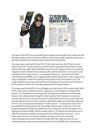
1. The layout of the DPS is very conventional of a magazine because the main image covers the
left page and the article is in columns. NME do most of their articles, especially interviews, in
this layout, therefore, this double-page spread carries brand identity.
They have used a pull quote for their title: “It’s the only mag I buy, even if there’s a knob
head on the front”. The fact that such a well-known and respected indie rock star is saying
that he ONLY buys NME, shows how NME is the best music magazine. Also, if Liam buys the
magazine, his fans will want to buy it because they want to be like him. Liam’s quote is very
conventional of an indie rock star – it’s arrogant and stuck-up – almost a back handed
compliment towards NME, as he’s suggesting they feature ‘knob heads’ in their magazine. By
using a pull quote, it draws the audience as they want to find out more about Liam. The
mode of address is very casual, almost like Liam is talking to a friend. The font and colour is
block and black, which is very masculine, appealing to the target audience.
The image used for the DPS if of Liam Gallagher, an indie rock star from a band called ‘Oasis’.
He isn’t making direct address as he has sunglasses on, even though he’s looking at the
camera – this represents him as arrogant and rude again; he’s detached from the reader,
however, this is balanced out through the direct address in the interview. His costume is
conventional of an indie rock star because he’s wearing black and it’s very casual. Indie rock
stars typically don’t care too much about their appearance, they would never wear designer.
His hair’s also as very typical hairstyle for an indie rock star – it’s long and un-kept. It has a
retro aesthetic as many people in the 50s and 60s had this style. Young men in this time
period were known for being very rebellious, which is how Liam may want to appear. He is
holding an old issue of NME, with his younger self on it. This shows Liam has been a fan of
NME for a long time, and NME have featured Liam and his band for many years – he’s a
classic indie rock icon. The fact he’s holding it so close to the camera shows he’s
recommending it to the reader. Below the image, NME have made a fact file of Liam,
including his name, when he was first featured on the front of NME, how many times he’s
2. been an NME cover star and facts about him. The ‘did you know?’ is a method to draw in the
reader, and makes them feel closer to Liam. The fact they included the fact file shows that
Liam is so well-respected. He’s been featured in their 60th
anniversary issue, because NME
know the reader will know him. Both the fact file and the fact he’s been chosen to be in the
60th
anniversary, shows NME and Liam’s loyalty to each other. His facial expression is very
serious – conventional of an indie rock star as they often look serious and expressionless, as
they are very self-important. The main image of Liam is the only image on the DPS because
he’s the focus – it keeps all the attention on him.
Fir this DPS, the main body copy is an interview with Liam. It starts with a short description of
who Liam is and how he’s always liked being on the cover of NME, showing how much
respect he has for NME. This part is in gold making it separate and stand out. Gold is used to
represent the 60th
anniversary. A pull quote is used to entice the reader and draw their
attention to the main body of text. It’s another arrogant pull quote, showing how he’s
unapologetically rude. He’s bashing another popular indie rock band, ‘Blur’ which will create
drama and a feud so the reader will want to be involved. The first question asked is “Was
getting the NME seal of approval important for you when Oasis first started?” – this quote
implies that if you haven’t been featured in NME, you haven’t ‘made it’ as an indie rock star.
his reply: “Yeah man, it’s the f***in’ magazine, innit!” – this shows that he has a lot of loyalty
oi NME. The mode of address if very informal, which is evident through the slang he’s sed.
The fact he claims he’s made and meant for being on the cover of magazines, shows his
cockiness – he knows he’s talented and boasts about it.
The colour scheme for this DPS is very simple – white, black and gold. Gold is used because
its NME’s 60th
anniversary issue, and gold connotes success – representing the 60 years of
success NME have had, gold is also an expensive colour, used for awards – if you’ve got gold,
you’ve won. The gold also suggests Liam is the best – he’s well-respectedand comes from
one of the most successful indie rock bands of all time. the DPS still has a very masculine
colour scheme, to suit the male demographic. There’s not too many colours, suiting the TA,
because they prefer a simplistic colour palette. Furthermore, the simple colours maintain
brand identity.
3. The layout of this DPS is also conventional because they’ve used the same layout as their
other DP, reinforcing the magazine’s brand identity. However, they have used a girl on the
front which is unconventional.
For the title, they’ve used ‘USA got the love’. This is a quote from one of her most famous
songs ‘You’ve got the love’; any fans will immediately identify the reference. It’s also a
convention of female indie rock stars – they’re represented as being overly-emotional and
loving. The font used is also very feminine, even though Florence isn’t a feminine role model.
Furthermore, USA is a part of the background. Immediately catching the audiences eye.
For th DPS on Florence Welch from ‘Florence and the Machine’s’, they only use one image
for the whole DPS. The image is of Florence and the image covers both pages. The
representation of her that’s created is that she’s overly feminine and sexualised. She’s sat on
a red and white seat, but she’s just wearing black. The use of red, which is also the colour of
her hair, connotes love and passion, which is included in the title and a stereotype of women
is that they’re all about love. In addition, the article is also about the USA, and the piece of
cloth has been made to resemble the American flag. The fact she’s sat on the ‘flag’, shows
she’s taken over America with her music. NME have use a long shot of her because it shows
of her assets. Along with this, she’s positioned so she’s showing off her figure – this is over
sexualising her for the male audience. Her outfit is also provocative – accentuating her
breasts and legs. The all black, outfit and heels, further sexualises her. The fact they’ve over
sexualised her is conventional because the target audience is young, heterosexual males.
There’s no caption for the image which is unconventional because they normally write about
the image. It leaves it up to the reader imagination.
The main body of text for Florence’s DPS is an article about her visit with NME. This DPS also
has a small introduction, saying how she’s 2009’s biggest success. This will make the reader
4. want to read on and find out more, especially if they’re aspiring indie rock artists and want to
find a few tips. Within the text, her name has been highlighted blue, making it stand out to
the reader. By using blue, it enforces the colours of the British flag, along with the red and
white that is also a current theme. The mode of address for the article is very informal
because the target audience is young. Young people will find informality more interesting
and friendly. NME us element of humour when they’re describing Florence. The font used is
very classic and simple so it doesn’t take away from the information.
The colour scheme is conventional for an article with a woman as he focus. They have used
mainly black, greys and white, suiting the male TA, as, as said before, they prefer simple
colours. Also, those three colours are quite masculine. However, they also have subtle
elements of red, which I associated with femininity. It’s also a very passionate colour, often
associated with sex. This represents Florence as a sexual icon and over-sexualises her. The
colour scheme of the page is the same as most NME magazines: red and monochrome
colours. House style is used commonly in indie rock magazines, so I will consider including it
as well.