1. Salford City College
Eccles Centre
AS Media Studies
Foundation Portfolio
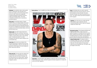
Masthead- The masthead is bold, in block capitals
and is in a deep black colour that fades into a
vibrant red. It takes up most of the primary optical
area and is VIBE’s famous and recognisable
masthead would grab the attention of previous
readers and intended readers. The red has
connotations of liveliness and so could entice a
secondary audience.
Target audience: Fans of rap/R&B music, Male and female aged 15-30
Typefaces -The cover lines are in a bold, thick font,
which provides a good combination with the
masthead being bold and thick. It gives the magazine
a upbeat and modern style.
Main image- The full bleed image is of rapper
Eminem. His eyes are looking straight at the camera
with an intense stare and his eyes are based in the
primary optical area and the strong fallow field area.
The area isn’t completely busy and packed. Eminem is
wearing a chain and has two tattoo sleeves; this ties in
with the theme of rap.
Photography Lighting- The photography lighting used
is high key, which creates a bright, vibrant and
upbeat atmosphere to correspond with the rap/ R&B
theme created by the other features of the magazine.
The lighting enhances his tattoo’s and along with the
way he is stood, this shows status and importance.
Model credit- The model includes artists like Lil
Wayne, Kanye West, Jay-z and Drake. These are all
globally known rappers; this may entice a secondary
audience. As well as these, there is a eye-catching
quote “I literally almost died” this creates
anticipation and makes the reader intrigued to find
out the whole story.
Design Principles Used?- The design principle of
Gutenberg’s design rule is used. The masthead goes
from the primary optical area across to the strong
fallow area. The main stories are in the primary
optical area and strong fallow area. The reader’s eyes
go straight to these areas.
Cover lines- Most cover lines are based in the
terminal area because it’s placed at the end of the
readers viewing pattern. They are in red, black and
grey which contrasts against the white background
which makes them stand out.
Main cover line- The main cover line is based in the
primary optical area, in bold black and red block
capitals, these carry the theme of liveliness. The
first main cover line is an intense quote “I literally
almost died” makes the reader panic but also be
intrigued to read on.
Colour-Contrasting colours are used to make the
magazine and the main cover line stand out. The red
has connotations of pace and power, this could
represent the power and impact associated with rap
music. This creates a vibrant and intense atmosphere
for the magazine.
House Style- The house style for vibe magazine is usually the colours red, black and grey.
These are bold colours. Vibe’s masthead is popular and easily recognised as it is always the
same on all of their magazines.