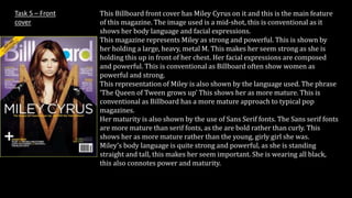
1. This Billboard front cover has Miley Cyrus on it and this is the main feature
of this magazine. The image used is a mid-shot, this is conventional as it
shows her body language and facial expressions.
This magazine represents Miley as strong and powerful. This is shown by
her holding a large, heavy, metal M. This makes her seem strong as she is
holding this up in front of her chest. Her facial expressions are composed
and powerful. This is conventional as Billboard often show women as
powerful and strong.
This representation of Miley is also shown by the language used. The phrase
‘The Queen of Tween grows up’ This shows her as more mature. This is
conventional as Billboard has a more mature approach to typical pop
magazines.
Her maturity is also shown by the use of Sans Serif fonts. The Sans serif fonts
are more mature than serif fonts, as the are bold rather than curly. This
shows her as more mature rather than the young, girly girl she was.
Miley’s body language is quite strong and powerful, as she is standing
straight and tall, this makes her seem important. She is wearing all black,
this also connotes power and maturity.
Task 5 – Front
cover
2. Task 5 – Contents
page
The language used on the contents page is conventional. One
example is the words ‘influential’ and ‘symphonic’. This is
conventional as it uses more mature language than typical pop
magazines to attract the older target audience. The main image is a
mid-shot of a man, this shows his body language and facial
expressions.
His body language is quite laid back as he has his hands in his
pockets. This makes the image more inviting. The image is in black
and white, this is conventional for Billboard magazine as there is no
use of bright colours like other typical pop magazines making the
overall image more sophisticated and mature.
The main colours used area black, white, blue and grey. The
background is white, making the blue text stand out as it is
contrasting. The Billboard magazine is also represented as being
more mature and sophisticated by the use of Sans Serif fonts as
appose to Serif fonts used more stereotypically in pop magazines.
3. Task 5 – Double
page spread
The language on the double page spread is informal. One
example of this is the phrase ‘ How the hell…’. This is
conventional because it doesn’t need to be formal, as people
read it in their spare time and the informal language makes it
easy to read.
The images on the double page spread are natural. This
represents Bruno Mars as more mature as he is not posing he
is just doing what he is good at. This is conventional as
Billboard mainly represents pop music as more sophisticated
than typical pop magazines.
The colours used are mainly black and white. This is
conventional as it represents the magazine as more mature, by
not needing bright colours to make it look interesting. The
representation is also shown through the use of Sans Serif
fonts. This represents pop music as more mature as other
typical pop magazines use mainly serif fonts. The Sans Serif
fonts attracts an older target audience.