
Recommended
More Related Content
What's hot
What's hot (19)
Viewers also liked
Viewers also liked (8)
Similar to Media front cover Analyse
Similar to Media front cover Analyse (20)
Recently uploaded
Recently uploaded (20)
Media front cover Analyse
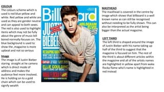
- 1. COLOUR The colours scheme which is used is red blue yellow and white. Red yellow and white are used as they are gender neutral and can appeal to both sexes. The red is also used to highlight items which may not be fully about the genre of music bill bored normally focuses on. The blue background is used to show the ,magazine is more upbeat and not so serious MASTHEAD The masthead is covered in the centre by image which shows that billboard is a well known name as can still be recognised without needing to be fully shown. This can also be interpreted as the artist being bigger than the actual magazine. Image The image is of Justin Bieber staring straight at he camera which is direct mode of address and makes the audience feel more involved. He is holding on to a gold chain which can be used to signify wealth LEFT THIRD The left third is shaped around the image of Justin Bieber with his name taking up half of the third to suggest that the magazine is focused on him. The rest of the third is about different articles within the magazine and all of the artists names are highlighted in yellow apart from waka flocka flame who’s name is highlighted in red instead
- 2. Masthead The masthead is covered by the image which suggests that the magazine is easily recognisable and can afford to be covered partially by the main image the uses of red white and yellow suggests the magazine is gender neutral and can appeal to both men and women but women's music above suggests that this edition is specialised towards women Image The image is of Beyoncé standing in a partially seductive pose but it can also show that she is powerful and strong with the white suggesting innocence the image also has her looking straight at the camera as a direct mode of address. The background of the image is Left third The left third is divided into two sections by Beyoncé's elbow with the top half focusing on other artist and the bottom bit mostly on Beyoncé. The fact she is called women of the year will also make people want to buy the magazine to see what has made her the women of the year Colour The main colour scheme of the magazine is black and white which would also make it look more sophisticated and also it attracts the eye to the more brighter places with the use of a black background . Beyoncé's name also is more clear as it changes from white when on the background to blue on top of her dress
- 3. Masthead The masthead is covered by the image of Kanye west which represents that the magazine is well known without the need to have the masthead on full display and it also shows that it wants people to focus more on the artist than the masthead it can also be used to represent that the artist is bigger than the magazine. Image The image is of Kanye west is of him looking straight at the camera which is a direct mode of address and can be used to attract the audience as it is a more personal approach Left third The left third of this magazine is only focused on Kanye west only as it is just about his article as all other articles are on the other side. This suggests that the magazine just wants to publicise Kanye west as if it is displayed with only the left third showing then you would only see Kanye west and no other articles titles Colour The colour scheme used is blue black ,violet and white. The blue is used to highlight the masthead and other key artist on the front cover the blue is also used to highlight the quote by Kanye
- 4. Masthead The masthead is located in the comer of the page so it also shares the page with the main image instead of needing to be covered by it this could indicate that Q is advertising Florence and she is also advertising the magazine by having them both share the page Image The image is a close up of Florence’s face and it haves her looking straight at the camera which is direct mode of address there is no background in this image as Florence’s hair takes up the main part of the image and it acts as the background for the image Left third The left third is partially take up by the masthead as the main article takes up the space which would normally be where the masthead is but there are still other articles placed on the left third to do with other featured articles the magazine also has names of different artists from different genres as this allows them to attract a larger audience if they span different genres Colour The main colour scheme of the magazine is white as all the text is white but this allows them to be visible on the background which is Florence’s ginger hair