
Recommended
More Related Content
What's hot
What's hot (14)
Viewers also liked
Viewers also liked (17)
Similar to Articles
Similar to Articles (20)
Recently uploaded
Recently uploaded (20)
Articles
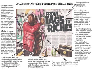
- 1. ANALYSIS OF ARTICLES- DOUBLE PAGE SPREAD 1 NME Mise en scene created by graffiti wall background shows dizzies background as graffiti is usually associated with under class kids, stereotypically people who live in council houses, normally very poor in gangs. Usually very hard to get out of that life style, From tags to riches. fits in with the main heading Main Image in the main image we see Dizzee rascal, graffiti. This shows his past life, before he was famous and probably still part of gangs from his childhood. Dizzee is also looking over his shoulder , this is like him looking out for the police also looking back at his old life style, this relates to the article as its about his story, Dizzee going from tags to riches Page number, NME title, Date these are there to tell the audience which page that are on the issue it is and the magazine so people know which magazine this is By-line gives credit to author and photographer . Sub heading sums up what the article is about in a sentence or two. Highlights Dizzee rascal’s name making him even more important. Main heading , is the second biggest thing on the page, so draws readers eye to it , the heading says from tags to riches, it gives a small idea of what the article is about. Uses the same style of text as the rest of the article There are only four columns this due to the style of the magazine, as there audience wont want to read long paragraphs instead 4 sort snappy paragraphs. The columns are wrapped around the radio to make the columns blend it as if they are apart of the imagery Second image used is of a stereo and beer bottles, this is a representation of his life, the wild life he lives making music drinking and partying Text begins with A large letter Y using Drops Cap, so that the audience eye is drawn to the text
- 2. Analysis of written article The article itself is basically about Dizzee Rascals life in 2009 the story of his rise to fame. The style of the article is sort snappy and stylish, this is to tell the audience what they want to know, with out having to read lots of text as audience are most likely 16 – 24 music lovers who are to busy to sit down and read long articles it is written in 4 columns each around 75-100 words The main heading/headline is quite dramatic this is to interest the audience ‘from tags to riches’ makes it sound like it happened over night very much like a story in a movie, makes his life sound better, even more exciting.