History Class XII Ch. 3 Kinship, Caste and Class (1).pptx
Task 4
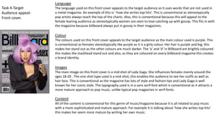
1. Task 4-Target
Audience appeal-
Front cover.
Language
The language used on this front cover appeals to the target audience as it uses words that are not used in
a metal magazine. An example of this is ‘ how she writes top hits’. This is conventional as stereotypically
pop artists always reach the top of the charts. Also, this is conventional because this will appeal to the
female leaning audience as stereotypically women are seen to love catching up with gossip. This fits in with
the magazine because billboard always put in gossip in their magazines.
Colour
The colours used on this front cover appeals to the target audience as the main colour used is purple. This
is conventional as females stereotypically like purple as it is a girly colour. Her hair is purple and big, this
makes her stand out as the other colours are much darker. The ‘a’ and ‘d’ in Billboard are brightly coloured
this makes the masthead stand out and also, as they are coloured on every billboard magazine this creates
a brand identity.
Images
The main image on this front cover is a mid shot of Lady Gaga. She influences females mainly around the
ages 18-20 . The one shot type used is a mid-shot, this enables the audience to see her outfit as well as
hair face. This is conventional as the magazine has lots of style and fashion tips and Lady Gaga is well
known for her iconic style. The typography used is in a sans serif font which is conventional as it attracts a
more mature approach to pop music, unlike typical pop magazines in serif fonts.
Content
All of the content is conventional for this genre of music/magazine because it is all related to pop music
with a more sophisticated and mature approach. For example it is talking about ‘how she writes top hits’
this makes her seem more mature by writing her own music.
2. Task 4-Target
Audience appeal-
Content page.
Language
The content page uses simple language, making the contents page more informal, which portrays
the younger target audience. This then makes it more accessible and easier for a younger audience
to read the magazine, therefore creating more readers of the magazine. This is conventional
because content pages normally are not read as much as other sections in the magazine therefore
there will be no point using formal language.
Colour
The colours used on the contents page are quite neutral. For example, the light blue is gender
neutral so therefore widens the target audience. The white background contrasts the black and
blue writing, making the writing more accessible to read. The chart section of the contents page
goes with the colour scheme of Billboard front cover.
Images
The images on the contents page are both midshots and close-ups. The three images along the top
are in-between midshots and close-ups. This ensures the reader can see both their facial
expressions and part of their outfit. The main image is a mid-shot. The top images portray the men
as masculine, by them both wearing black leather jackets. The main image shows her as strong and
independent. This is conventional for the magazine, billboard mostly portrays women as strong
and independent as this appeals to the female-leaning audience, however by showing the men as
masculine this attracts a male audience too.
Content
All of the content is conventional for the magazine, as it is related to pop music. Also, the charts
down the side attract readers so they can catch up with charts and if there is anyone they haven’t
heard about, they may buy the magazine to find out about new and upcoming artists.
3. Task 4-Target Audience
appeal- Double page
spread
Language
The language used on the double page spread is conventional. One example of this is
the use of the word ‘Gospel’. This is conventional because it links to Nicki Minaj’s
ethnicity.
Colour
The background of the double page spread is pink, this connotes femininity, youth and
beauty. This is conventional as it appeals to the female-leaning audience. The other
colour used is black. This makes parts stand out such as the quote ‘The gospel
according to’. This is also written in a serif font unlike the rest of the spread, making it
stand out.
Image
The image used is a mid-shot of Nicki Minaj, so you can see both her facial expression
and her outfit. This is conventional as she is known for her fashion, therefore readers
like to see what the artist is wearing. She is wearing a ring with ‘icon on it’ this
portrays her as self-confident as she sees herself as an icon.
Content
The content of this double page spread is conventional as it’s a modern approach to
pop music. This is conventional as it appeals to the target audience and attracts her
fans to buy the magazine.