
Recommended
More Related Content
What's hot
What's hot (19)
Similar to Music magazine double page spread 4
Similar to Music magazine double page spread 4 (20)
Recently uploaded
Recently uploaded (20)
Music magazine double page spread 4
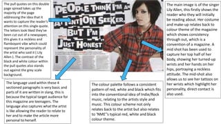
- 1. The pull quotes on this double page spread takes up the majority of the page addressing the idea that it wants to capture the reader’s attention on this single quote. The letters look liked they’ve been cut out of a newspaper, this gives it a reckless and flamboyant vibe which could represent the personality of the artist who said it ( Lily Allen ). The contrast of the black and white colour within the pull quotes also stands out against the grey scale background. The language used within these 4 sectioned paragraphs is very basic and parts of it are written in slang, this is because the typical target audience for this magazine are teenagers. The language also captures what the artist is like allowing the reader to relate to her and to make the article more personal to herself. The colour palette follows a consistent pattern of red, white and black which fits into the conventional idea of Indie/Rock music, relating to the artists style and music. This colour scheme not only relates back to the artist but also relates to ‘NME’’s typical red, white and black colour theme. The main image is of the singer Lily Allen, this firstly shows the reader who they will initially be reading about. Her costume and make-up relates back to colour theme of the magazine which shows consistency through out, which is a convention of a magazine. A mid shot has been used to capture her top half of her body, showing her turned-up wrists and her hands on her hips, portraying a reckless attitude. The mid-shot also allows us to see her tattoos on her wrists which highlight her personality, direct contact is also used.