
Recommended
More Related Content
What's hot
What's hot (18)
Viewers also liked
Similar to Music magazine conventions
Similar to Music magazine conventions (20)
More from Stashnaklov
Recently uploaded
Recently uploaded (20)
Music magazine conventions
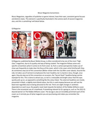
- 1. Music Magazine Conventions Music Magazines, regardless of publisher or genre interest, have their own, consistent genre focuses and distinct styles. This element is specifically illustrated in the camera work of several magazines also, and this is something I will detail below. Q Magazine Q Magazine, published by Bauer Media Group, is often considered to be one of the more “high class” magazines, due to its quality and way of being created. The magazine follows some very specific conventions when it comes to its front cover. Q, from a camera perspective makes use of close ups frequently to make clear the focus of the cover, which is the cover artist him/herself; they do sometimes step out of this convention (Better shown with the Lily Allen cover above). Around the side, Q makes use of red text to emphasize the main headline, be it a band or story, though, once again, they do step out of this convention on occasion, the “Secret Stash” headline being a prime example for this. This is done to attract you, as red is a noticeable and bright colour that the eyes quickly pick up on, as opposed to something like the colour black. The external headlines are mostly presented in black, a slightly more bland colour, but this is used anyway because you will see the black text regardless due to being attracted to the red. There are slight changes in aesthetic dependent on each issue, the graphic novel style towards the bottom of the Robbie Williams cover. There is the occasional use of a masthead, if something relevant to Q is going on, such as The 2013 Q Awards banner on The Robbie Williams cover. The Q Logo is also an incredibly prominent part of the covers as it reminds you of what magazine you are purchasing and makes you remember the magazine.
- 2. NME NME is different to Q in the fact that while Q maintains a frequently consistent tone and style, NME exhibits a more experimental and slightly more creative style when it comes to its colour palette. It makes use of colours that interest the reader and catch the eye, which can mostly be seen in the Kasabian cover above, which makes use of a contrast of red and white. The other covers, namely the Lennon cover, make use of this idea; albeit to a lesser extent, with the contrast of yellow and black/white. The headlines and other relevant information are also displayed in a different way; while the title stays in the traditional top left of the corner of the magazine as with most music magazines, it only undergoes a colour change, however, the rest of the cover dynamically changes, focusing on one or multiple subjects (see the Kasabian cover above), frequently spreading it’s titles around the entire page (Kasabian) or keeping them tight and simple (Lennon). They also make use of mast heads occasionally (Dave Grohl and Lennon), though there are also times where they do not (Kasabian). Like Q, text can be emphasized in importance by the use of colour, this is most prominent in both the titles (Black NME, Yellow NME, Blue NME), but also in the text which in some cases (Kasabian and Lennon) mixed both the title colour and headlines to related them.