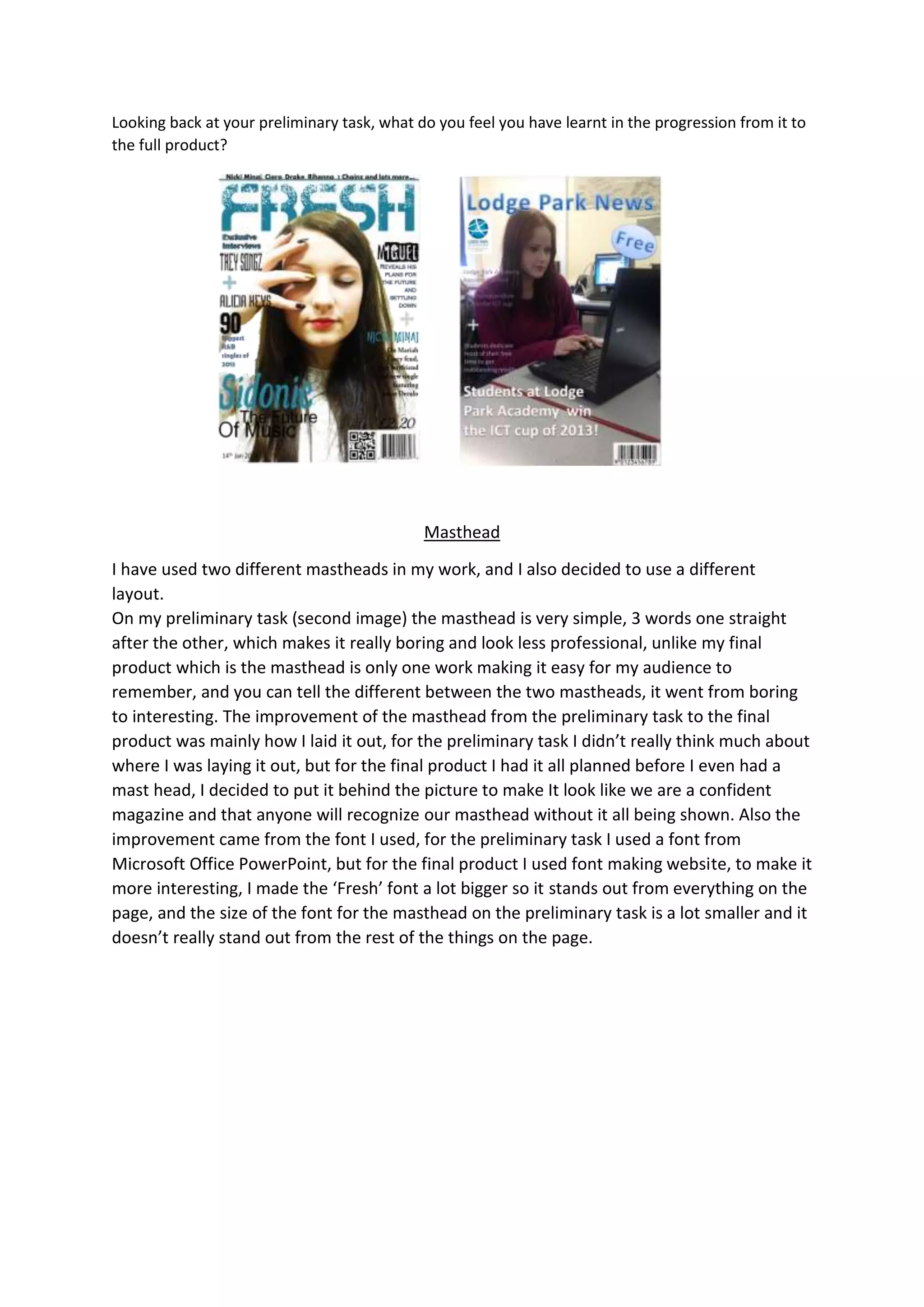
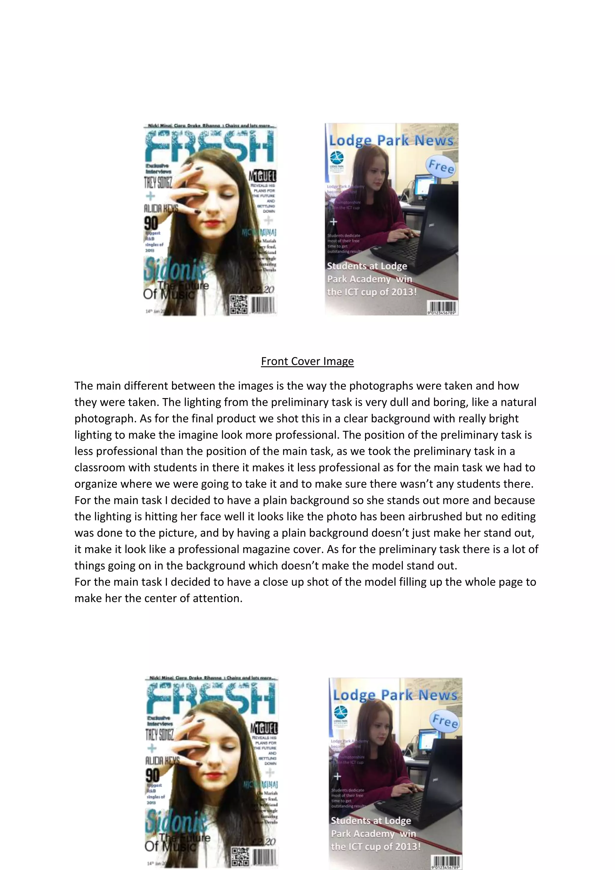
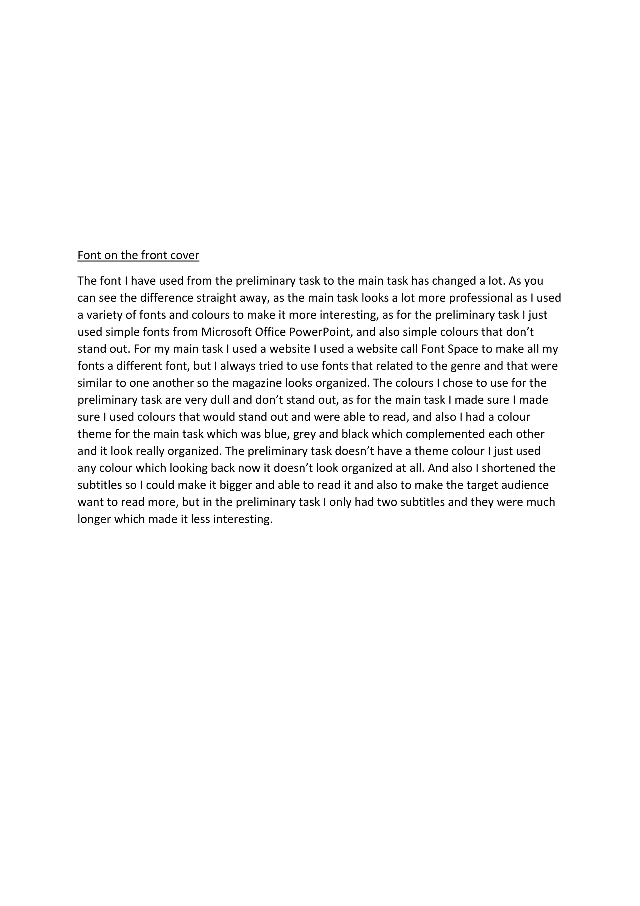
The document summarizes the improvements made from the preliminary task to the final product. For the masthead, the preliminary version used a simple three-word layout while the final used a single distinguishing word in a more planned out location. The front cover image was improved by better lighting, positioning, and cropping to make the model the clear focus. Font choices were also improved, using varied fonts from a website rather than PowerPoint defaults and establishing a color theme to make the final product more professional, organized and interesting.


