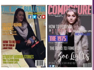
EVALUATION
QUESTION 7
LOOKING BACK AT YOUR PRELIMINARY TASK,
WHAT DO YOU FEEL YOU HAVE LEARNT IN THE
PROGRESSION FROM IT TO THE FULL PRODUCT?
PHOTOGRAPHY
On my preliminary task the images weren’t of a high quality. This
is because the images were taken on an IPhone as opposed to a
professional DSLR camera, like my final product images. This
does not conform to the typical main image convention on a
professional magazine as you often find images being high quality
and captured in a studio. However my images weren't taken in a
professional place either. I did not understand that you need to
have a appropriate background for your images or else this could
cause issues later on in the creation process. On top of this,
lighting was an issue during the day of photography for my
preliminary task. With taking these images in college there was
very little natural light. This meant that I was left with dull grainy
looking images therefore giving a slightly rushed and
unprofessional look. During my preliminary task I did not make
sure that I had a range of images this then resulted in a large
amount of the images being a long shot. With this in mind I took
extra time to prepare my photographs for my final product.
PHOTOGRAPHY
PROGRESSION
From my preliminary task I have become more aware on how
to take an image suitable for a professional looking
magazine. Not only that but I have become more aware on
how important images are to a magazine. They attract the
audiences eye and keep them interested throughout. In order
to have the best possible image I booked out a photography
studio at my local university which also provided a camera
and lighting. Here I was able to seek help and guidance on
how to use different light settings. By using a studio I not
only achieved professional looking images but it also
allowed me to create different moods and feelings in each
image. This will be more appealing to my target audience as
the low key lighting that I decided to use in my photograph
can connote mystery and being clam. These are positive
connotations therefore resulting in higher sales of my
magazine.
Preliminary Final Product
FONTS
In my Preliminary task, I used minimal fonts. Once having got
feedback and looking back at my cover and contents I decided that
this looks plain and doesn’t grab the readers attention the way that I
would like it to. In addition to this, the font that I used was also
bland and isn't particularly easy to use. I used the same program as
I did in my final product (Dafont) however I did not know what fonts
would match each magazine. The colours that I used seem to be
slightly over powering and takes away from the sell lines and image
itself.
In my final product I made sure to use a variation of fonts to
highlight different words and draw attention to something specific.
This is a method used by various magazines, especially in music.
During my final product I was more aware of how a specific font
could change my entire theme. In addition to this I had to
experiment with what fonts suited my magazine. This is because I
have a main image with various textures so some fonts do not show
up. I did not find this happened in my preliminary task. In addition to
this, I set the colours of the font to my house theme, making the
four main colours stand out and represent my brand.
EDITING
For both my preliminary and final product I used Photoshop
to edit these magazines. I could use the software when I was
creating the preliminary task however I was slow and didn’t
have a large understanding on how to use it. For example, I
would not name my layers. During the creation process of my
final product I spent a lot of time practicing this allowed me
to progress resulting in a more professional looking
magazine.
LAYOUT AND STYLE
On my preliminary task my lay out was very basic. I didn’t take
into consideration that certain conventions needed spaces on a
page. For example, my sell lines on my front cover seemed to
take over the image and therefore seemed to be cluttered and
messy looking. However, in my final product, I have more
information on the front cover but it doesn’t seem to look
cluttered. This is because of the way I placed all my sell lines, I
made sure there was enough space between each and that
nothing was taking up too much space.
On top of this I have discovered the importance of alignment.
On my contents page my numbers are placed in various placed
on a page as opposed to being lined up as they are in my final
product. This would make it difficult for a reader to quickly find
a specific article and therefore put off readers. I made sure that I
had all my text on my contents page within my final product. I
would not have known the importance If I hadnt made this
mistake in my preliminary task. I personally feel that this has
been a massive progression in making my magazine look more
professional.
LANGUAGE
As both of these magazines had a similar target audience, I
found it was appropriate to use similar language in both of
them in order to directly contact the target audience.
However one of the magazines was a slightly more
professional format so I felt like the language needed toning
down slightly. Despite this, the preliminary task still allowed
me to prepare what styles of language I could feature within
my final product. In both magazines I use personal pronouns
in order to directly address the target audience.
CONCLUSION
Overall, I feel as though I have progressed massively from
my preliminary task to my final product. My knowledge of
conventions, photography, language and layouts has
developed and helped me create the most professional
looking music magazine that I could. I tried to use as many
featured that I had learned about throughout the process.
Through trial and error I have discovered what each
convention consists of or requires in order to look
professional. I have used the feedback that I received from
my preliminary task to better my creation techniques.

Evaluation Question 7

  • 1.
    EVALUATION QUESTION 7 LOOKING BACKAT YOUR PRELIMINARY TASK, WHAT DO YOU FEEL YOU HAVE LEARNT IN THE PROGRESSION FROM IT TO THE FULL PRODUCT?
  • 2.
    PHOTOGRAPHY On my preliminarytask the images weren’t of a high quality. This is because the images were taken on an IPhone as opposed to a professional DSLR camera, like my final product images. This does not conform to the typical main image convention on a professional magazine as you often find images being high quality and captured in a studio. However my images weren't taken in a professional place either. I did not understand that you need to have a appropriate background for your images or else this could cause issues later on in the creation process. On top of this, lighting was an issue during the day of photography for my preliminary task. With taking these images in college there was very little natural light. This meant that I was left with dull grainy looking images therefore giving a slightly rushed and unprofessional look. During my preliminary task I did not make sure that I had a range of images this then resulted in a large amount of the images being a long shot. With this in mind I took extra time to prepare my photographs for my final product.
  • 3.
    PHOTOGRAPHY PROGRESSION From my preliminarytask I have become more aware on how to take an image suitable for a professional looking magazine. Not only that but I have become more aware on how important images are to a magazine. They attract the audiences eye and keep them interested throughout. In order to have the best possible image I booked out a photography studio at my local university which also provided a camera and lighting. Here I was able to seek help and guidance on how to use different light settings. By using a studio I not only achieved professional looking images but it also allowed me to create different moods and feelings in each image. This will be more appealing to my target audience as the low key lighting that I decided to use in my photograph can connote mystery and being clam. These are positive connotations therefore resulting in higher sales of my magazine.
  • 4.
  • 5.
    FONTS In my Preliminarytask, I used minimal fonts. Once having got feedback and looking back at my cover and contents I decided that this looks plain and doesn’t grab the readers attention the way that I would like it to. In addition to this, the font that I used was also bland and isn't particularly easy to use. I used the same program as I did in my final product (Dafont) however I did not know what fonts would match each magazine. The colours that I used seem to be slightly over powering and takes away from the sell lines and image itself. In my final product I made sure to use a variation of fonts to highlight different words and draw attention to something specific. This is a method used by various magazines, especially in music. During my final product I was more aware of how a specific font could change my entire theme. In addition to this I had to experiment with what fonts suited my magazine. This is because I have a main image with various textures so some fonts do not show up. I did not find this happened in my preliminary task. In addition to this, I set the colours of the font to my house theme, making the four main colours stand out and represent my brand.
  • 7.
    EDITING For both mypreliminary and final product I used Photoshop to edit these magazines. I could use the software when I was creating the preliminary task however I was slow and didn’t have a large understanding on how to use it. For example, I would not name my layers. During the creation process of my final product I spent a lot of time practicing this allowed me to progress resulting in a more professional looking magazine.
  • 8.
    LAYOUT AND STYLE Onmy preliminary task my lay out was very basic. I didn’t take into consideration that certain conventions needed spaces on a page. For example, my sell lines on my front cover seemed to take over the image and therefore seemed to be cluttered and messy looking. However, in my final product, I have more information on the front cover but it doesn’t seem to look cluttered. This is because of the way I placed all my sell lines, I made sure there was enough space between each and that nothing was taking up too much space. On top of this I have discovered the importance of alignment. On my contents page my numbers are placed in various placed on a page as opposed to being lined up as they are in my final product. This would make it difficult for a reader to quickly find a specific article and therefore put off readers. I made sure that I had all my text on my contents page within my final product. I would not have known the importance If I hadnt made this mistake in my preliminary task. I personally feel that this has been a massive progression in making my magazine look more professional.
  • 11.
    LANGUAGE As both ofthese magazines had a similar target audience, I found it was appropriate to use similar language in both of them in order to directly contact the target audience. However one of the magazines was a slightly more professional format so I felt like the language needed toning down slightly. Despite this, the preliminary task still allowed me to prepare what styles of language I could feature within my final product. In both magazines I use personal pronouns in order to directly address the target audience.
  • 12.
    CONCLUSION Overall, I feelas though I have progressed massively from my preliminary task to my final product. My knowledge of conventions, photography, language and layouts has developed and helped me create the most professional looking music magazine that I could. I tried to use as many featured that I had learned about throughout the process. Through trial and error I have discovered what each convention consists of or requires in order to look professional. I have used the feedback that I received from my preliminary task to better my creation techniques.