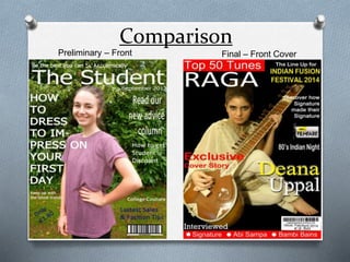
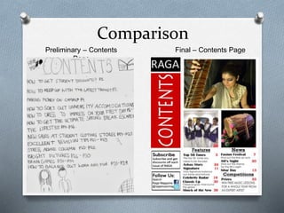
Looking back at your
Preliminary Task, what do
you feel you have learnt in
the progression from it to
the full product?
Comparison
Preliminary – Front
Cover
Final – Front Cover
Comparing the front cover of the preliminary task I did compared to my
final front cover I believe, shows that I have learnt a lot from the
construction of this media product and along the way I learnt many
skills whilst constructing my media product.
O I learnt that the Masthead needs to be bold and should stand out
from the rest of the writing that is on the front cover. It needs to be
seen clearly and the header should be just above it. Whether the
Masthead be, the header should be roughly aligned with it. This is
seen in my final magazine. I made sure the header was roughly
aligned with the masthead, otherwise it will look out of place as seen
in my preliminary task.
O Another thing I learnt was that there shouldn’t be too much writing
on both sides of the magazines. All the main writing should be in the
rule of thirds column on the left hand side and on other brief pieces
of writing can go on the right hand side. However, I challenged this
Stereotype and did it the other way round. But the majority of the
writing should be in the rule of thirds column.
O The distinct use of Photoshop makes my image on the final front
cover look more professional by using tools such as the brightness
and contrast tool. I learnt that the front image has to grab the
attention of the audience straight away. The artist on the preliminary
task looks quite innocent and doesn’t really grab your attention.
However, I made sure on my final magazine the main image did grab
the audiences attention and I have followed this as the artist is giving
and intimidating look to the camera which is very captivating.
O The barcode shouldn’t be placed randomly anywhere on the page,
it should be placed usually in the bottom corners of the front cover
or near the bottom somewhere, but it should be touching the
border of the page.
O The text should also be aligned with each other as it looks more
professional when all the text starts at the point and ends and
same point. In the preliminary task none of the text on my front
cover is aligned which makes the magazine look extremely
messy. Compared to my actual magazine cover; all the text is
aligned with each other. The text starts at the point and ends at the
same point.
O I also learnt the spacing between the words or sentences should
be spaced out correctly. The spacing between the words and
sentences should be even as seen in my final front cover.
O The shouldn’t be any hyphens on the front cover of your magazine
in between words as the magazine looks quite armature. I used
the hyphen tool to get rid of any hyphens that would have been in
the text of my actual front cover. As seen compared to the
preliminary task, there is a hyphen between a sentence which
makes the text look tacky.
Comparison
Preliminary – Contents
Page
Final – Contents Page
Comparing the contents page of the preliminary task I did
compared to my final contents page, I believe, shows that I have
learnt a lot from the construction of this media product. I did not
actually construct a contents page on photo shop, I did a mock up
of one instead.
O The layout of preliminary task in comparison to the layout of the
contents page in my actual magazine I believe is much better as
it looks more proficient because everything is in its own columns
for e.g. all the pictures and text are together.
O The most important thing is how to use the white space
effectively. In my preliminary task there is a lot of white space
around and there is no structure to the design as its all over the
place. Whereas, in my final music magazine the space has been
used effectively with very small and equal white spacing.
O I have made sure that the colours on my final magazine are
consistent the whole of my magazine. However, I do believe that
if I did get the chance to create a contents page on Adobe
Photoshop, I wouldn’t have kept the colours consistent as I
wouldn’t have known to do it.
O Another skill I learnt was the contents page images
should be easily seen and clear. In the preliminary task I
did the images are at the bottoms and extremely small
which look quite dull. However, in my actual magazine
the images take up about 3/5ths of the page which makes
the magazine appeal more to audiences as its looks
colourful and eye catching.
O I also learnt that the text should be seen vividly, and this
is done by the font style and size you use. The front style
in my preliminary task was very bland and had no edge
to it. However, in my final magazine the font style is very
appealing and stands out to a lot of people the most ( I
discovered this through research ). The font size in my
contents page varies through a variety of different sizes. I
made sure the font wasn’t too small so it couldn’t be
readable but also that it wasn’t too big that it was in your
face, so I had to make it a decent size i.e. that it was big
and stood out but not too big.
Comparison
Preliminary – Double Page
Spread
Final – Double Page
Spread
Comparing the double page spread of the preliminary task I did
compared to my final double page spread, I believe, shows that I
have learnt a lot from the construction of this media product. I did
not actually construct a double page spread on Photoshop or
Publisher, I did a mock up of one instead. I believe I have leant
how and understood how to develop something into a real life
product judging from the difference of my mock up for the
preliminary student college magazine task compared to my final
double page spread for my music magazine.
O I have learnt how to structure a double page spread article and
the typical conventions of one for e.g. a drop cap or a large
title. The use of Publisher enabled me to add a drop cap to the
beginning of the article which draws in the attention of
audience as it looks interesting and too make sure I caught the
attention of audiences to my double page spread; I changed
the drop cap colour from black to blood red so it stands out
from the rest of the magazine as the article is the main content
on the double page spread.
O I learnt that the images on the double page spread should
either be one big image or a few images here and there and
not small images everywhere as it can look tacky. I did this for
my college
Magazine so I tried to prevent it completely when creating my
double page spread for my final music magazine. I chose to use
one big image for my double page spread as I believed it was
sophisticated for my target audience and I saw this in many
magazines which were similar to my genre; therefore I tried to
follow the typical design and layout of a classical music magazine
as I wanted my magazine to be close to a real life product as
possible.
O Another thing I learnt was to make sure the article on the
double page spread wasn’t too long to read. I wanted to make it
short and snappy. I made sure that there wasn’t too much text
included in the article.
O I made sure that the colours I used were consistent with the
colour scheme throughout the whole of the magazine. Again,
like the contents page I do believe that if I did create a double
page spread on Adobe Photoshop or Publisher for the
preliminary task, I wouldn’t have kept the colours on it
consistent like I did do for my final magazine.
The Double Page Spread for my final music magazine was the
most challenging page to make out of all the three pages as it
required a lot of work due to the complexity of it. But, I do have
faith in it and I believe that is one of the strongest pages of my
music magazine.

Question 7 - final evaluation

  • 1.
    Looking back atyour Preliminary Task, what do you feel you have learnt in the progression from it to the full product?
  • 2.
  • 3.
    Comparing the frontcover of the preliminary task I did compared to my final front cover I believe, shows that I have learnt a lot from the construction of this media product and along the way I learnt many skills whilst constructing my media product. O I learnt that the Masthead needs to be bold and should stand out from the rest of the writing that is on the front cover. It needs to be seen clearly and the header should be just above it. Whether the Masthead be, the header should be roughly aligned with it. This is seen in my final magazine. I made sure the header was roughly aligned with the masthead, otherwise it will look out of place as seen in my preliminary task. O Another thing I learnt was that there shouldn’t be too much writing on both sides of the magazines. All the main writing should be in the rule of thirds column on the left hand side and on other brief pieces of writing can go on the right hand side. However, I challenged this Stereotype and did it the other way round. But the majority of the writing should be in the rule of thirds column. O The distinct use of Photoshop makes my image on the final front cover look more professional by using tools such as the brightness and contrast tool. I learnt that the front image has to grab the attention of the audience straight away. The artist on the preliminary task looks quite innocent and doesn’t really grab your attention.
  • 4.
    However, I madesure on my final magazine the main image did grab the audiences attention and I have followed this as the artist is giving and intimidating look to the camera which is very captivating. O The barcode shouldn’t be placed randomly anywhere on the page, it should be placed usually in the bottom corners of the front cover or near the bottom somewhere, but it should be touching the border of the page. O The text should also be aligned with each other as it looks more professional when all the text starts at the point and ends and same point. In the preliminary task none of the text on my front cover is aligned which makes the magazine look extremely messy. Compared to my actual magazine cover; all the text is aligned with each other. The text starts at the point and ends at the same point. O I also learnt the spacing between the words or sentences should be spaced out correctly. The spacing between the words and sentences should be even as seen in my final front cover. O The shouldn’t be any hyphens on the front cover of your magazine in between words as the magazine looks quite armature. I used the hyphen tool to get rid of any hyphens that would have been in the text of my actual front cover. As seen compared to the preliminary task, there is a hyphen between a sentence which makes the text look tacky.
  • 5.
  • 6.
    Comparing the contentspage of the preliminary task I did compared to my final contents page, I believe, shows that I have learnt a lot from the construction of this media product. I did not actually construct a contents page on photo shop, I did a mock up of one instead. O The layout of preliminary task in comparison to the layout of the contents page in my actual magazine I believe is much better as it looks more proficient because everything is in its own columns for e.g. all the pictures and text are together. O The most important thing is how to use the white space effectively. In my preliminary task there is a lot of white space around and there is no structure to the design as its all over the place. Whereas, in my final music magazine the space has been used effectively with very small and equal white spacing. O I have made sure that the colours on my final magazine are consistent the whole of my magazine. However, I do believe that if I did get the chance to create a contents page on Adobe Photoshop, I wouldn’t have kept the colours consistent as I wouldn’t have known to do it.
  • 7.
    O Another skillI learnt was the contents page images should be easily seen and clear. In the preliminary task I did the images are at the bottoms and extremely small which look quite dull. However, in my actual magazine the images take up about 3/5ths of the page which makes the magazine appeal more to audiences as its looks colourful and eye catching. O I also learnt that the text should be seen vividly, and this is done by the font style and size you use. The front style in my preliminary task was very bland and had no edge to it. However, in my final magazine the font style is very appealing and stands out to a lot of people the most ( I discovered this through research ). The font size in my contents page varies through a variety of different sizes. I made sure the font wasn’t too small so it couldn’t be readable but also that it wasn’t too big that it was in your face, so I had to make it a decent size i.e. that it was big and stood out but not too big.
  • 8.
    Comparison Preliminary – DoublePage Spread Final – Double Page Spread
  • 9.
    Comparing the doublepage spread of the preliminary task I did compared to my final double page spread, I believe, shows that I have learnt a lot from the construction of this media product. I did not actually construct a double page spread on Photoshop or Publisher, I did a mock up of one instead. I believe I have leant how and understood how to develop something into a real life product judging from the difference of my mock up for the preliminary student college magazine task compared to my final double page spread for my music magazine. O I have learnt how to structure a double page spread article and the typical conventions of one for e.g. a drop cap or a large title. The use of Publisher enabled me to add a drop cap to the beginning of the article which draws in the attention of audience as it looks interesting and too make sure I caught the attention of audiences to my double page spread; I changed the drop cap colour from black to blood red so it stands out from the rest of the magazine as the article is the main content on the double page spread. O I learnt that the images on the double page spread should either be one big image or a few images here and there and not small images everywhere as it can look tacky. I did this for my college
  • 10.
    Magazine so Itried to prevent it completely when creating my double page spread for my final music magazine. I chose to use one big image for my double page spread as I believed it was sophisticated for my target audience and I saw this in many magazines which were similar to my genre; therefore I tried to follow the typical design and layout of a classical music magazine as I wanted my magazine to be close to a real life product as possible. O Another thing I learnt was to make sure the article on the double page spread wasn’t too long to read. I wanted to make it short and snappy. I made sure that there wasn’t too much text included in the article. O I made sure that the colours I used were consistent with the colour scheme throughout the whole of the magazine. Again, like the contents page I do believe that if I did create a double page spread on Adobe Photoshop or Publisher for the preliminary task, I wouldn’t have kept the colours on it consistent like I did do for my final magazine. The Double Page Spread for my final music magazine was the most challenging page to make out of all the three pages as it required a lot of work due to the complexity of it. But, I do have faith in it and I believe that is one of the strongest pages of my music magazine.