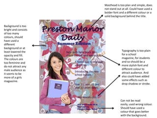
SlideShare a Scribd company logo
Looking back at your preliminary task, what do you feel you have learnt in the progression from it to the full product?
Front Cover BEFORE AFTER
Looking back at your preliminary task, what do you feel you have learnt in the progression from it to the full product? I first made a preliminary task magazine consisting of the front page and contents page, I did this before going on to doing my final product in order to get a view of what it’s like and to get used to the different Photoshop skills rather than getting straight into the final product as it would have not looked very professional without any practise. I learnt many new skills, using tools I had not used before and learnt how to better construct and lay out my page.  From looking at my preliminary work it does not look professional at all because of many reasons. Firstly the typography looks of very low standards against the background I have used, because the background is very bright and consists of many different colours the typography I used was wrong as it was simple and small which can not be seen well enough to be read easily, the colours I used for the typography (black and blue) were also wrong as they can not be read against such a bright background, whereas the typography I used on my main front page is bold and stands out very well against the background and the large image as I have used bold fonts and added strokes to the writing that needed to stand out more. The masthead on my preliminary task also does not look professional as it looks too plain for a masthead because the masthead is meant to be the largest, boldest and most eye catching whereas my one looks very dull and simple, on my final front cover however the masthead stand out the most as it should do and I have added a solid background behind the title to make it even bolder. The image I used for my preliminary task was one I got from Google images and not one I took myself  which I could not do for my final front cover as I have to take the image myself, I used the magnetic lasso tool to cut out the images for both the preliminary task and for my final task, I did this well in both tasks as they are both cropped out properly although it took me a lot longer to do so in my preliminary task as I was not very great with Photoshop then and did not have the skills to do things quickly and properly.  Whilst making my preliminary task I learnt new skills and improved my Photoshopping in order to be ready to create my final outcome and learnt how to use tools I had not used before and how to make images look more professional. I applied what I had learnt into my final front cover which firstly was cutting out my main image using the magnetic lasso tool, this time having done it a lot quicker and I found it a lot easier than the previous time. The way I laid out my preliminary front cover was a mess, the additional cover lines seem to just be scattered as I did not think carefully where to place them because I still did not have the skills and the knowledge of creating a well laid out page whereas in my final front cover my additional cover lines look a lot better well laid out and neater as I learnt about the grid/ruler tool which helped me construct my page well and equally, being able to get the text more accurate rather than just scattered on the page. I also used different font sizes in my final front cover, having the more important information in larger fonts and the less important in smaller fonts , I also used different colours for certain words that I wanted to stand out more or for those that were more important whereas on my preliminary the text is all of the same font and same colour. Looking at my preliminary it seems to appeal more to girls and does not seem to appeal to guys much so guys would not be attracted to the magazine and would not really want to be seen holding a magazine that’s more for girls whereas my final front cover looks like it is well suites for both genders and appeals to both males and females as I have used colours that appeal to both (black, white and blue) I learnt this from looking at other existing magazines and found out that these colours appeal to both. Also in my preliminary work I have not attracted much audience as I have mostly only included information for the higher years for example prom dates for year 11, 12 & 13 and the new sixth form block. If I had added some cell lines that concern the lower year for example year 7, 8 and 9 sports day winners I would have had a wider range of audience as it would concern everyone in the school, I learnt from this and used it towards my final front cover as for my final rather than just including the main artist I also included other artists that will be included inside the magazine, by doing this I have attracted a wider range of audience as there will be more fans if I add more artists meaning more audience and a better success of my magazine. I also did not add a barcode and a price for my preliminary as I did for my final which made it look more professional and realistic. Another thing I did not add in my preliminary was a puff as I still did not have that much knowledge then, later when I researched into other existing magazines I noticed they include puffs and so I did too for my final front cover.  My preliminary does not suit its purpose very well as it is a school magazine it does not really seem like a school magazine because of the background, fonts and colours I had use due to the lack of experience I had in Photoshop whereas for my final front cover I believe it suits its purpose a lot better as it is a music magazine of the genre R&B/Hip-Hop and definitely suits the genre and target audience a lot better than my previous work. When working on my preliminary task I did not look at other examples of existing magazines or do any research at all whereas when creating my final front cover I looked back at existing music magazines of my genre such as Vibe, Blender and XXL to get an idea of how it should look and what it should consist of which helped me a lot in creating a more professional and realistic magazine.
Masthead is too plan and simple, does not stand out at all. Could have used a bolder font and a different colour or a solid background behind the title. Background is too bright and consists of too many colours, should have used a different background or at least lowered the opacity and fill. The colours are too feminine and do not attract any male audience as it seems to be more of a girls magaazine. Typography is too plain for a school magazine, for students and so should be a more stylish font and different colour to attract audience. And also could have added some effects such as drop shadow or stroke. Can not be read easily, used wrong colour. Should have used a colour that goes better with the background.
BEFORE AFTER
From looking at my preliminary contents page it also looks of low standards as it look extremely plain and simple and does not look anywhere near professional. Firstly the background looks slightly blurry as it is an image I took of Google and enlarged it and therefore does not look professional, the typography also looks dull, although here I have used a different font that is more stylish it still looks pretty plain as I have only used one colour and have not added any effects to it to make it stand out a little more. On my final contents page I have used black and white for the typography rather than keeping it all one colour, using black for the subheadings and white for the main text, I have also added a solid colour (blue) behind the text to make it stand out better and seem more bold. Although I have used a more stylish font in my preliminary work, the font again is feminine and only appeals to girls as guys would not want a magazine that is written in a very feminine font as they will feel it is not for them, that is somewhere I think I went very wrong because the school magazine is meant to be for all students, both guys and girls, but I have made it seem as though it is for girls only as everything I have used is feminine including the colours, fonts and background, especially as the background has images of butterflies and flowers on it. From making this mistake I learnt how to make my final contents page suit both genders as my music magazine is of the genre R&B/Hip-Hop which is for both males and females so I made sure to use colours the appeal to both, images that appeal to both and fonts that appeal to both which I think I have done so successfully. On my preliminary contents page I have not used any images and only used a bit of text which makes it look very plain and dull, especially for the audience as they are school students they would prefer a magazine that consists of some images rather than just text, I learnt this when researching existing magazines and so I made sure to add pictures into my final contents page especially as the audience is of a young age bracket (14-19) they would prefer a magazine with images rather than just text as they would find that rather dull. On my final outcome I also included an editors note with the editors signature as I had noticed many other magazines do so when researching existing magazines, and so by doing this I have made my magazine seem more professional and realistic. I also added a Tie-In at the bottom of the contents page were audience can subscribe to Slant and get exclusive information and get Slant delivered to their door with every months new edition, by using this I have again made my magazine seem more professional which I did not do with my preliminary contents page as I had done no research into existing magazines and so did not know what magazines should consist of and what makes them look professional.
Plain and simple font, could have livened it up a little by adding more colour, adding effect such as drop shadow to make it stand out more. Background is slightly blurry and too feminine, could have used a background that appeals to both guys a girls. Used the same font and size throughout  could have used different font sizes instead of keeping it all the same size to make it look more professional  Page numbers are of the same size and font, look too dull, not appealing, could have added an effect to the numbers e.g. stroke.
conclusion Overall, I have developed many skills whilst improving  my music magazine and came across tools and technologies I have never used before which I now am familiar with and can use for future purposes. Skills I developed where Photoshop skills, computer skills, researching skills, listening skills when listening to my audience feedback and taking in their comments on how to improve my magazine, I have also learnt to use new technologies I have never come across before such as Edirol, Adobe Audition, Microsoft Excel, Making a blog , Professional camera and many more. From making the music magazine I had to do a lot of research on existing music magazines before starting on my final magazine, this helped me to identify what the magazine elements are and what every magazine should contain in order for it to look professional and realistic for example a subheading, masthead, cell lines, puff, main image, floating quotes, issue number and so on. I gathered everything i learnt and used it to create my music magazine and tried to make it look as professional as possible.  I also learnt that it is crucial to know your target audience before making any magazine as everything you add into the magazine has to appeal to the audience otherwise the magazine will not work, the font, font size, colours, images, language etc. All need to appeal to the target audience for it to work. I have also learnt that it is important to structure the layout of a page professionally by using tools such as the grid/ruler tool so that the audience can easily read and access information they are looking for easily using page numbers and sub heading, It is also important to make sure that everything is not messy and all over the place as this will put the audience off wanting to buy the magazine in the first place as they want something that is simple and straight forward.  Finally, I believe I have achieved a lot and developed many different skills in such a short period of time, which allowed me to produce my final music magazine up to high standards and as professionally as I could.

More Related Content

What's hot

Q7
Q7Q7
Eval 7
Eval 7Eval 7
Eval 7
5835amir
 
7. evaluation(2) powerpoint
7. evaluation(2) powerpoint7. evaluation(2) powerpoint
7. evaluation(2) powerpoint
thomasmoore143
 
Reflective Diaries
Reflective DiariesReflective Diaries
Reflective Diaries
Simran Jabbal
 
Evaluation Question 7
Evaluation Question 7Evaluation Question 7
Evaluation Question 7JuliaMP
 
Preliminary Task
Preliminary Task Preliminary Task
Preliminary Task
10reyaar
 
Contents image choices
Contents image choicesContents image choices
Contents image choices
HollyRosa98
 
Evaluation q7
Evaluation q7Evaluation q7
Evaluation q7
Daisy Raine-Ellerker
 
Schedule
ScheduleSchedule
Schedule
judemunday_3092
 
Question 7 - Evalutation
Question 7 - EvalutationQuestion 7 - Evalutation
Question 7 - EvalutationShivani_Mohan
 
Question 7 - final evaluation
Question 7 - final evaluationQuestion 7 - final evaluation
Question 7 - final evaluationShivani_Mohan
 
Music magazine construction
Music magazine constructionMusic magazine construction
Music magazine constructionbenjichandra
 
inkijfdmlcx
inkijfdmlcxinkijfdmlcx
inkijfdmlcx
sofiahowarth22
 
Q7 powerpoint
Q7 powerpointQ7 powerpoint
Q7 powerpoint
emilyvaughan2000
 
Evaluation
EvaluationEvaluation
Evaluation
Simran Jabbal
 
7. evaluation (fmp)
7. evaluation (fmp)7. evaluation (fmp)
7. evaluation (fmp)
jessicacrosland
 

What's hot (20)

Q7
Q7Q7
Q7
 
Eval 7
Eval 7Eval 7
Eval 7
 
7. evaluation(2) powerpoint
7. evaluation(2) powerpoint7. evaluation(2) powerpoint
7. evaluation(2) powerpoint
 
Reflective Diaries
Reflective DiariesReflective Diaries
Reflective Diaries
 
Media Evaluation
Media EvaluationMedia Evaluation
Media Evaluation
 
Evaluation Question 7
Evaluation Question 7Evaluation Question 7
Evaluation Question 7
 
Preliminary Task
Preliminary Task Preliminary Task
Preliminary Task
 
Evaluation
EvaluationEvaluation
Evaluation
 
Contents image choices
Contents image choicesContents image choices
Contents image choices
 
Evaluation q7
Evaluation q7Evaluation q7
Evaluation q7
 
Magazine Evaluation PowerPoint
Magazine Evaluation PowerPointMagazine Evaluation PowerPoint
Magazine Evaluation PowerPoint
 
Schedule
ScheduleSchedule
Schedule
 
Question 7 - Evalutation
Question 7 - EvalutationQuestion 7 - Evalutation
Question 7 - Evalutation
 
Question 7 - final evaluation
Question 7 - final evaluationQuestion 7 - final evaluation
Question 7 - final evaluation
 
Music magazine construction
Music magazine constructionMusic magazine construction
Music magazine construction
 
inkijfdmlcx
inkijfdmlcxinkijfdmlcx
inkijfdmlcx
 
Q7 powerpoint
Q7 powerpointQ7 powerpoint
Q7 powerpoint
 
Evaluation
EvaluationEvaluation
Evaluation
 
Evaluation
EvaluationEvaluation
Evaluation
 
7. evaluation (fmp)
7. evaluation (fmp)7. evaluation (fmp)
7. evaluation (fmp)
 

Viewers also liked

Evaluation - Question 1
Evaluation - Question 1Evaluation - Question 1
Evaluation - Question 1YasmeenAl
 
Progression for main article
Progression for main articleProgression for main article
Progression for main articleYasmeenAl
 
Progression of front page
Progression of front pageProgression of front page
Progression of front pageYasmeenAl
 
Present simple or continuous
Present simple or continuousPresent simple or continuous
Present simple or continuousvalydan
 
Hoteles Am Resort
Hoteles Am ResortHoteles Am Resort
Hoteles Am Resortchasma
 
Malmheim
MalmheimMalmheim
MalmheimDonfee
 
Evaluation q 3
Evaluation q 3Evaluation q 3
Evaluation q 3YasmeenAl
 
Evaluation q 2
Evaluation q 2Evaluation q 2
Evaluation q 2YasmeenAl
 
Evaluation q 2
Evaluation q 2Evaluation q 2
Evaluation q 2YasmeenAl
 
Rainforest Expeditions Powerpoint
Rainforest Expeditions PowerpointRainforest Expeditions Powerpoint
Rainforest Expeditions Powerpoint
kbunting
 
Illustration-Photography-Design
Illustration-Photography-DesignIllustration-Photography-Design
Illustration-Photography-DesignLanceDietrich
 
Kpmg In Belgium Ifrs Training Brochure
Kpmg In Belgium   Ifrs Training BrochureKpmg In Belgium   Ifrs Training Brochure
Kpmg In Belgium Ifrs Training Brochure
Frederic_Vertenten
 
Variety Hollywood Tech Summit 2013
Variety Hollywood Tech Summit 2013Variety Hollywood Tech Summit 2013
Variety Hollywood Tech Summit 2013Tony Edwards
 
Avans leeds-2011-jukebox-slideshare
Avans leeds-2011-jukebox-slideshareAvans leeds-2011-jukebox-slideshare
Avans leeds-2011-jukebox-slideshare
Rick Dijs
 
Progression of contents page
Progression of contents pageProgression of contents page
Progression of contents pageYasmeenAl
 
Rejected images
Rejected imagesRejected images
Rejected imagesYasmeenAl
 
Evaluation - Question 2
Evaluation - Question 2Evaluation - Question 2
Evaluation - Question 2YasmeenAl
 
Evaluation q 1
Evaluation q 1Evaluation q 1
Evaluation q 1YasmeenAl
 

Viewers also liked (20)

Evaluation - Question 1
Evaluation - Question 1Evaluation - Question 1
Evaluation - Question 1
 
Progression for main article
Progression for main articleProgression for main article
Progression for main article
 
Progression of front page
Progression of front pageProgression of front page
Progression of front page
 
Present simple or continuous
Present simple or continuousPresent simple or continuous
Present simple or continuous
 
Hoteles Am Resort
Hoteles Am ResortHoteles Am Resort
Hoteles Am Resort
 
Malmheim
MalmheimMalmheim
Malmheim
 
Evaluation q 3
Evaluation q 3Evaluation q 3
Evaluation q 3
 
Evaluation q 2
Evaluation q 2Evaluation q 2
Evaluation q 2
 
Evaluation q 2
Evaluation q 2Evaluation q 2
Evaluation q 2
 
Rainforest Expeditions Powerpoint
Rainforest Expeditions PowerpointRainforest Expeditions Powerpoint
Rainforest Expeditions Powerpoint
 
Illustration-Photography-Design
Illustration-Photography-DesignIllustration-Photography-Design
Illustration-Photography-Design
 
Kpmg In Belgium Ifrs Training Brochure
Kpmg In Belgium   Ifrs Training BrochureKpmg In Belgium   Ifrs Training Brochure
Kpmg In Belgium Ifrs Training Brochure
 
Variety Hollywood Tech Summit 2013
Variety Hollywood Tech Summit 2013Variety Hollywood Tech Summit 2013
Variety Hollywood Tech Summit 2013
 
Avans leeds-2011-jukebox-slideshare
Avans leeds-2011-jukebox-slideshareAvans leeds-2011-jukebox-slideshare
Avans leeds-2011-jukebox-slideshare
 
Progression of contents page
Progression of contents pageProgression of contents page
Progression of contents page
 
Question 5
Question 5Question 5
Question 5
 
Question 6
Question 6Question 6
Question 6
 
Rejected images
Rejected imagesRejected images
Rejected images
 
Evaluation - Question 2
Evaluation - Question 2Evaluation - Question 2
Evaluation - Question 2
 
Evaluation q 1
Evaluation q 1Evaluation q 1
Evaluation q 1
 

Similar to Question 7

Evaluation Question 7
Evaluation Question 7Evaluation Question 7
Evaluation Question 7
HollyRosa98
 
Evaluation question 7
Evaluation  question 7Evaluation  question 7
Evaluation question 7Anitahoxha
 
Evaluation question 7
Evaluation question 7Evaluation question 7
Evaluation question 7
048454
 
Bethanyr Evaluation
Bethanyr EvaluationBethanyr Evaluation
Bethanyr Evaluationguesta3f059
 
Evaluation Question Seven
Evaluation Question Seven Evaluation Question Seven
Evaluation Question Seven
felicityputman
 
Evaluation question 7
Evaluation question 7Evaluation question 7
Evaluation question 7harmooo_
 
Question 7
Question 7Question 7
Question 7trup17
 
Question 7
Question 7Question 7
Evaluation ...
Evaluation ...Evaluation ...
Evaluation ...
ryanb1994
 
Question seven
Question sevenQuestion seven
Question sevenLongmark12
 
question 7
question 7question 7
question 7sumayaaa
 
Question seven
Question sevenQuestion seven
Question sevenLongmark12
 

Similar to Question 7 (20)

Evaluation Question 7
Evaluation Question 7Evaluation Question 7
Evaluation Question 7
 
Evaluation question 7
Evaluation  question 7Evaluation  question 7
Evaluation question 7
 
Evaluation question 7
Evaluation question 7Evaluation question 7
Evaluation question 7
 
Bethanyr Evaluation
Bethanyr EvaluationBethanyr Evaluation
Bethanyr Evaluation
 
Evaluation Question Seven
Evaluation Question Seven Evaluation Question Seven
Evaluation Question Seven
 
Evaluation 7
Evaluation 7Evaluation 7
Evaluation 7
 
Evaluation question 7
Evaluation question 7Evaluation question 7
Evaluation question 7
 
Question 7
Question 7Question 7
Question 7
 
Question 7
Question 7Question 7
Question 7
 
Evaluation ...
Evaluation ...Evaluation ...
Evaluation ...
 
Question7
Question7Question7
Question7
 
Question7
Question7Question7
Question7
 
Question 7
Question 7Question 7
Question 7
 
Media Eval - Q7
Media Eval - Q7Media Eval - Q7
Media Eval - Q7
 
Q7
Q7Q7
Q7
 
Question seven
Question sevenQuestion seven
Question seven
 
question 7
question 7question 7
question 7
 
Question 7
Question 7Question 7
Question 7
 
Question seven
Question sevenQuestion seven
Question seven
 
q7
q7q7
q7
 

More from YasmeenAl

Evaluation q 4.
Evaluation q 4.Evaluation q 4.
Evaluation q 4.YasmeenAl
 
Magazine development
Magazine developmentMagazine development
Magazine developmentYasmeenAl
 
Development of front album cover
Development of front album coverDevelopment of front album cover
Development of front album coverYasmeenAl
 
Inlay step by step
Inlay step by stepInlay step by step
Inlay step by stepYasmeenAl
 
Back cover step by step
Back cover step by stepBack cover step by step
Back cover step by stepYasmeenAl
 
Adele through the years presentation
Adele through the years presentationAdele through the years presentation
Adele through the years presentationYasmeenAl
 
Title progression
Title progressionTitle progression
Title progressionYasmeenAl
 

More from YasmeenAl (13)

Evaluation q 4.
Evaluation q 4.Evaluation q 4.
Evaluation q 4.
 
Yas1
Yas1Yas1
Yas1
 
Yas1
Yas1Yas1
Yas1
 
Yas1
Yas1Yas1
Yas1
 
Magazine development
Magazine developmentMagazine development
Magazine development
 
Development of front album cover
Development of front album coverDevelopment of front album cover
Development of front album cover
 
Inlay step by step
Inlay step by stepInlay step by step
Inlay step by step
 
Back cover step by step
Back cover step by stepBack cover step by step
Back cover step by step
 
Adele through the years presentation
Adele through the years presentationAdele through the years presentation
Adele through the years presentation
 
Title progression
Title progressionTitle progression
Title progression
 
Question 6
Question 6Question 6
Question 6
 
Question 5
Question 5Question 5
Question 5
 
Question 3
Question 3Question 3
Question 3
 

Recently uploaded

Honest Reviews of Tim Han LMA Course Program.pptx
Honest Reviews of Tim Han LMA Course Program.pptxHonest Reviews of Tim Han LMA Course Program.pptx
Honest Reviews of Tim Han LMA Course Program.pptx
timhan337
 
Thesis Statement for students diagnonsed withADHD.ppt
Thesis Statement for students diagnonsed withADHD.pptThesis Statement for students diagnonsed withADHD.ppt
Thesis Statement for students diagnonsed withADHD.ppt
EverAndrsGuerraGuerr
 
Acetabularia Information For Class 9 .docx
Acetabularia Information For Class 9  .docxAcetabularia Information For Class 9  .docx
Acetabularia Information For Class 9 .docx
vaibhavrinwa19
 
CACJapan - GROUP Presentation 1- Wk 4.pdf
CACJapan - GROUP Presentation 1- Wk 4.pdfCACJapan - GROUP Presentation 1- Wk 4.pdf
CACJapan - GROUP Presentation 1- Wk 4.pdf
camakaiclarkmusic
 
The Challenger.pdf DNHS Official Publication
The Challenger.pdf DNHS Official PublicationThe Challenger.pdf DNHS Official Publication
The Challenger.pdf DNHS Official Publication
Delapenabediema
 
2024.06.01 Introducing a competency framework for languag learning materials ...
2024.06.01 Introducing a competency framework for languag learning materials ...2024.06.01 Introducing a competency framework for languag learning materials ...
2024.06.01 Introducing a competency framework for languag learning materials ...
Sandy Millin
 
Synthetic Fiber Construction in lab .pptx
Synthetic Fiber Construction in lab .pptxSynthetic Fiber Construction in lab .pptx
Synthetic Fiber Construction in lab .pptx
Pavel ( NSTU)
 
Overview on Edible Vaccine: Pros & Cons with Mechanism
Overview on Edible Vaccine: Pros & Cons with MechanismOverview on Edible Vaccine: Pros & Cons with Mechanism
Overview on Edible Vaccine: Pros & Cons with Mechanism
DeeptiGupta154
 
CLASS 11 CBSE B.St Project AIDS TO TRADE - INSURANCE
CLASS 11 CBSE B.St Project AIDS TO TRADE - INSURANCECLASS 11 CBSE B.St Project AIDS TO TRADE - INSURANCE
CLASS 11 CBSE B.St Project AIDS TO TRADE - INSURANCE
BhavyaRajput3
 
Guidance_and_Counselling.pdf B.Ed. 4th Semester
Guidance_and_Counselling.pdf B.Ed. 4th SemesterGuidance_and_Counselling.pdf B.Ed. 4th Semester
Guidance_and_Counselling.pdf B.Ed. 4th Semester
Atul Kumar Singh
 
special B.ed 2nd year old paper_20240531.pdf
special B.ed 2nd year old paper_20240531.pdfspecial B.ed 2nd year old paper_20240531.pdf
special B.ed 2nd year old paper_20240531.pdf
Special education needs
 
June 3, 2024 Anti-Semitism Letter Sent to MIT President Kornbluth and MIT Cor...
June 3, 2024 Anti-Semitism Letter Sent to MIT President Kornbluth and MIT Cor...June 3, 2024 Anti-Semitism Letter Sent to MIT President Kornbluth and MIT Cor...
June 3, 2024 Anti-Semitism Letter Sent to MIT President Kornbluth and MIT Cor...
Levi Shapiro
 
"Protectable subject matters, Protection in biotechnology, Protection of othe...
"Protectable subject matters, Protection in biotechnology, Protection of othe..."Protectable subject matters, Protection in biotechnology, Protection of othe...
"Protectable subject matters, Protection in biotechnology, Protection of othe...
SACHIN R KONDAGURI
 
Introduction to AI for Nonprofits with Tapp Network
Introduction to AI for Nonprofits with Tapp NetworkIntroduction to AI for Nonprofits with Tapp Network
Introduction to AI for Nonprofits with Tapp Network
TechSoup
 
The Accursed House by Émile Gaboriau.pptx
The Accursed House by Émile Gaboriau.pptxThe Accursed House by Émile Gaboriau.pptx
The Accursed House by Émile Gaboriau.pptx
DhatriParmar
 
Additional Benefits for Employee Website.pdf
Additional Benefits for Employee Website.pdfAdditional Benefits for Employee Website.pdf
Additional Benefits for Employee Website.pdf
joachimlavalley1
 
Polish students' mobility in the Czech Republic
Polish students' mobility in the Czech RepublicPolish students' mobility in the Czech Republic
Polish students' mobility in the Czech Republic
Anna Sz.
 
Chapter 3 - Islamic Banking Products and Services.pptx
Chapter 3 - Islamic Banking Products and Services.pptxChapter 3 - Islamic Banking Products and Services.pptx
Chapter 3 - Islamic Banking Products and Services.pptx
Mohd Adib Abd Muin, Senior Lecturer at Universiti Utara Malaysia
 
Embracing GenAI - A Strategic Imperative
Embracing GenAI - A Strategic ImperativeEmbracing GenAI - A Strategic Imperative
Embracing GenAI - A Strategic Imperative
Peter Windle
 
TESDA TM1 REVIEWER FOR NATIONAL ASSESSMENT WRITTEN AND ORAL QUESTIONS WITH A...
TESDA TM1 REVIEWER  FOR NATIONAL ASSESSMENT WRITTEN AND ORAL QUESTIONS WITH A...TESDA TM1 REVIEWER  FOR NATIONAL ASSESSMENT WRITTEN AND ORAL QUESTIONS WITH A...
TESDA TM1 REVIEWER FOR NATIONAL ASSESSMENT WRITTEN AND ORAL QUESTIONS WITH A...
EugeneSaldivar
 

Recently uploaded (20)

Honest Reviews of Tim Han LMA Course Program.pptx
Honest Reviews of Tim Han LMA Course Program.pptxHonest Reviews of Tim Han LMA Course Program.pptx
Honest Reviews of Tim Han LMA Course Program.pptx
 
Thesis Statement for students diagnonsed withADHD.ppt
Thesis Statement for students diagnonsed withADHD.pptThesis Statement for students diagnonsed withADHD.ppt
Thesis Statement for students diagnonsed withADHD.ppt
 
Acetabularia Information For Class 9 .docx
Acetabularia Information For Class 9  .docxAcetabularia Information For Class 9  .docx
Acetabularia Information For Class 9 .docx
 
CACJapan - GROUP Presentation 1- Wk 4.pdf
CACJapan - GROUP Presentation 1- Wk 4.pdfCACJapan - GROUP Presentation 1- Wk 4.pdf
CACJapan - GROUP Presentation 1- Wk 4.pdf
 
The Challenger.pdf DNHS Official Publication
The Challenger.pdf DNHS Official PublicationThe Challenger.pdf DNHS Official Publication
The Challenger.pdf DNHS Official Publication
 
2024.06.01 Introducing a competency framework for languag learning materials ...
2024.06.01 Introducing a competency framework for languag learning materials ...2024.06.01 Introducing a competency framework for languag learning materials ...
2024.06.01 Introducing a competency framework for languag learning materials ...
 
Synthetic Fiber Construction in lab .pptx
Synthetic Fiber Construction in lab .pptxSynthetic Fiber Construction in lab .pptx
Synthetic Fiber Construction in lab .pptx
 
Overview on Edible Vaccine: Pros & Cons with Mechanism
Overview on Edible Vaccine: Pros & Cons with MechanismOverview on Edible Vaccine: Pros & Cons with Mechanism
Overview on Edible Vaccine: Pros & Cons with Mechanism
 
CLASS 11 CBSE B.St Project AIDS TO TRADE - INSURANCE
CLASS 11 CBSE B.St Project AIDS TO TRADE - INSURANCECLASS 11 CBSE B.St Project AIDS TO TRADE - INSURANCE
CLASS 11 CBSE B.St Project AIDS TO TRADE - INSURANCE
 
Guidance_and_Counselling.pdf B.Ed. 4th Semester
Guidance_and_Counselling.pdf B.Ed. 4th SemesterGuidance_and_Counselling.pdf B.Ed. 4th Semester
Guidance_and_Counselling.pdf B.Ed. 4th Semester
 
special B.ed 2nd year old paper_20240531.pdf
special B.ed 2nd year old paper_20240531.pdfspecial B.ed 2nd year old paper_20240531.pdf
special B.ed 2nd year old paper_20240531.pdf
 
June 3, 2024 Anti-Semitism Letter Sent to MIT President Kornbluth and MIT Cor...
June 3, 2024 Anti-Semitism Letter Sent to MIT President Kornbluth and MIT Cor...June 3, 2024 Anti-Semitism Letter Sent to MIT President Kornbluth and MIT Cor...
June 3, 2024 Anti-Semitism Letter Sent to MIT President Kornbluth and MIT Cor...
 
"Protectable subject matters, Protection in biotechnology, Protection of othe...
"Protectable subject matters, Protection in biotechnology, Protection of othe..."Protectable subject matters, Protection in biotechnology, Protection of othe...
"Protectable subject matters, Protection in biotechnology, Protection of othe...
 
Introduction to AI for Nonprofits with Tapp Network
Introduction to AI for Nonprofits with Tapp NetworkIntroduction to AI for Nonprofits with Tapp Network
Introduction to AI for Nonprofits with Tapp Network
 
The Accursed House by Émile Gaboriau.pptx
The Accursed House by Émile Gaboriau.pptxThe Accursed House by Émile Gaboriau.pptx
The Accursed House by Émile Gaboriau.pptx
 
Additional Benefits for Employee Website.pdf
Additional Benefits for Employee Website.pdfAdditional Benefits for Employee Website.pdf
Additional Benefits for Employee Website.pdf
 
Polish students' mobility in the Czech Republic
Polish students' mobility in the Czech RepublicPolish students' mobility in the Czech Republic
Polish students' mobility in the Czech Republic
 
Chapter 3 - Islamic Banking Products and Services.pptx
Chapter 3 - Islamic Banking Products and Services.pptxChapter 3 - Islamic Banking Products and Services.pptx
Chapter 3 - Islamic Banking Products and Services.pptx
 
Embracing GenAI - A Strategic Imperative
Embracing GenAI - A Strategic ImperativeEmbracing GenAI - A Strategic Imperative
Embracing GenAI - A Strategic Imperative
 
TESDA TM1 REVIEWER FOR NATIONAL ASSESSMENT WRITTEN AND ORAL QUESTIONS WITH A...
TESDA TM1 REVIEWER  FOR NATIONAL ASSESSMENT WRITTEN AND ORAL QUESTIONS WITH A...TESDA TM1 REVIEWER  FOR NATIONAL ASSESSMENT WRITTEN AND ORAL QUESTIONS WITH A...
TESDA TM1 REVIEWER FOR NATIONAL ASSESSMENT WRITTEN AND ORAL QUESTIONS WITH A...
 

Question 7

  • 1. Looking back at your preliminary task, what do you feel you have learnt in the progression from it to the full product?
  • 3. Looking back at your preliminary task, what do you feel you have learnt in the progression from it to the full product? I first made a preliminary task magazine consisting of the front page and contents page, I did this before going on to doing my final product in order to get a view of what it’s like and to get used to the different Photoshop skills rather than getting straight into the final product as it would have not looked very professional without any practise. I learnt many new skills, using tools I had not used before and learnt how to better construct and lay out my page. From looking at my preliminary work it does not look professional at all because of many reasons. Firstly the typography looks of very low standards against the background I have used, because the background is very bright and consists of many different colours the typography I used was wrong as it was simple and small which can not be seen well enough to be read easily, the colours I used for the typography (black and blue) were also wrong as they can not be read against such a bright background, whereas the typography I used on my main front page is bold and stands out very well against the background and the large image as I have used bold fonts and added strokes to the writing that needed to stand out more. The masthead on my preliminary task also does not look professional as it looks too plain for a masthead because the masthead is meant to be the largest, boldest and most eye catching whereas my one looks very dull and simple, on my final front cover however the masthead stand out the most as it should do and I have added a solid background behind the title to make it even bolder. The image I used for my preliminary task was one I got from Google images and not one I took myself which I could not do for my final front cover as I have to take the image myself, I used the magnetic lasso tool to cut out the images for both the preliminary task and for my final task, I did this well in both tasks as they are both cropped out properly although it took me a lot longer to do so in my preliminary task as I was not very great with Photoshop then and did not have the skills to do things quickly and properly. Whilst making my preliminary task I learnt new skills and improved my Photoshopping in order to be ready to create my final outcome and learnt how to use tools I had not used before and how to make images look more professional. I applied what I had learnt into my final front cover which firstly was cutting out my main image using the magnetic lasso tool, this time having done it a lot quicker and I found it a lot easier than the previous time. The way I laid out my preliminary front cover was a mess, the additional cover lines seem to just be scattered as I did not think carefully where to place them because I still did not have the skills and the knowledge of creating a well laid out page whereas in my final front cover my additional cover lines look a lot better well laid out and neater as I learnt about the grid/ruler tool which helped me construct my page well and equally, being able to get the text more accurate rather than just scattered on the page. I also used different font sizes in my final front cover, having the more important information in larger fonts and the less important in smaller fonts , I also used different colours for certain words that I wanted to stand out more or for those that were more important whereas on my preliminary the text is all of the same font and same colour. Looking at my preliminary it seems to appeal more to girls and does not seem to appeal to guys much so guys would not be attracted to the magazine and would not really want to be seen holding a magazine that’s more for girls whereas my final front cover looks like it is well suites for both genders and appeals to both males and females as I have used colours that appeal to both (black, white and blue) I learnt this from looking at other existing magazines and found out that these colours appeal to both. Also in my preliminary work I have not attracted much audience as I have mostly only included information for the higher years for example prom dates for year 11, 12 & 13 and the new sixth form block. If I had added some cell lines that concern the lower year for example year 7, 8 and 9 sports day winners I would have had a wider range of audience as it would concern everyone in the school, I learnt from this and used it towards my final front cover as for my final rather than just including the main artist I also included other artists that will be included inside the magazine, by doing this I have attracted a wider range of audience as there will be more fans if I add more artists meaning more audience and a better success of my magazine. I also did not add a barcode and a price for my preliminary as I did for my final which made it look more professional and realistic. Another thing I did not add in my preliminary was a puff as I still did not have that much knowledge then, later when I researched into other existing magazines I noticed they include puffs and so I did too for my final front cover. My preliminary does not suit its purpose very well as it is a school magazine it does not really seem like a school magazine because of the background, fonts and colours I had use due to the lack of experience I had in Photoshop whereas for my final front cover I believe it suits its purpose a lot better as it is a music magazine of the genre R&B/Hip-Hop and definitely suits the genre and target audience a lot better than my previous work. When working on my preliminary task I did not look at other examples of existing magazines or do any research at all whereas when creating my final front cover I looked back at existing music magazines of my genre such as Vibe, Blender and XXL to get an idea of how it should look and what it should consist of which helped me a lot in creating a more professional and realistic magazine.
  • 4. Masthead is too plan and simple, does not stand out at all. Could have used a bolder font and a different colour or a solid background behind the title. Background is too bright and consists of too many colours, should have used a different background or at least lowered the opacity and fill. The colours are too feminine and do not attract any male audience as it seems to be more of a girls magaazine. Typography is too plain for a school magazine, for students and so should be a more stylish font and different colour to attract audience. And also could have added some effects such as drop shadow or stroke. Can not be read easily, used wrong colour. Should have used a colour that goes better with the background.
  • 6. From looking at my preliminary contents page it also looks of low standards as it look extremely plain and simple and does not look anywhere near professional. Firstly the background looks slightly blurry as it is an image I took of Google and enlarged it and therefore does not look professional, the typography also looks dull, although here I have used a different font that is more stylish it still looks pretty plain as I have only used one colour and have not added any effects to it to make it stand out a little more. On my final contents page I have used black and white for the typography rather than keeping it all one colour, using black for the subheadings and white for the main text, I have also added a solid colour (blue) behind the text to make it stand out better and seem more bold. Although I have used a more stylish font in my preliminary work, the font again is feminine and only appeals to girls as guys would not want a magazine that is written in a very feminine font as they will feel it is not for them, that is somewhere I think I went very wrong because the school magazine is meant to be for all students, both guys and girls, but I have made it seem as though it is for girls only as everything I have used is feminine including the colours, fonts and background, especially as the background has images of butterflies and flowers on it. From making this mistake I learnt how to make my final contents page suit both genders as my music magazine is of the genre R&B/Hip-Hop which is for both males and females so I made sure to use colours the appeal to both, images that appeal to both and fonts that appeal to both which I think I have done so successfully. On my preliminary contents page I have not used any images and only used a bit of text which makes it look very plain and dull, especially for the audience as they are school students they would prefer a magazine that consists of some images rather than just text, I learnt this when researching existing magazines and so I made sure to add pictures into my final contents page especially as the audience is of a young age bracket (14-19) they would prefer a magazine with images rather than just text as they would find that rather dull. On my final outcome I also included an editors note with the editors signature as I had noticed many other magazines do so when researching existing magazines, and so by doing this I have made my magazine seem more professional and realistic. I also added a Tie-In at the bottom of the contents page were audience can subscribe to Slant and get exclusive information and get Slant delivered to their door with every months new edition, by using this I have again made my magazine seem more professional which I did not do with my preliminary contents page as I had done no research into existing magazines and so did not know what magazines should consist of and what makes them look professional.
  • 7. Plain and simple font, could have livened it up a little by adding more colour, adding effect such as drop shadow to make it stand out more. Background is slightly blurry and too feminine, could have used a background that appeals to both guys a girls. Used the same font and size throughout could have used different font sizes instead of keeping it all the same size to make it look more professional Page numbers are of the same size and font, look too dull, not appealing, could have added an effect to the numbers e.g. stroke.
  • 8.
  • 9. conclusion Overall, I have developed many skills whilst improving my music magazine and came across tools and technologies I have never used before which I now am familiar with and can use for future purposes. Skills I developed where Photoshop skills, computer skills, researching skills, listening skills when listening to my audience feedback and taking in their comments on how to improve my magazine, I have also learnt to use new technologies I have never come across before such as Edirol, Adobe Audition, Microsoft Excel, Making a blog , Professional camera and many more. From making the music magazine I had to do a lot of research on existing music magazines before starting on my final magazine, this helped me to identify what the magazine elements are and what every magazine should contain in order for it to look professional and realistic for example a subheading, masthead, cell lines, puff, main image, floating quotes, issue number and so on. I gathered everything i learnt and used it to create my music magazine and tried to make it look as professional as possible. I also learnt that it is crucial to know your target audience before making any magazine as everything you add into the magazine has to appeal to the audience otherwise the magazine will not work, the font, font size, colours, images, language etc. All need to appeal to the target audience for it to work. I have also learnt that it is important to structure the layout of a page professionally by using tools such as the grid/ruler tool so that the audience can easily read and access information they are looking for easily using page numbers and sub heading, It is also important to make sure that everything is not messy and all over the place as this will put the audience off wanting to buy the magazine in the first place as they want something that is simple and straight forward. Finally, I believe I have achieved a lot and developed many different skills in such a short period of time, which allowed me to produce my final music magazine up to high standards and as professionally as I could.