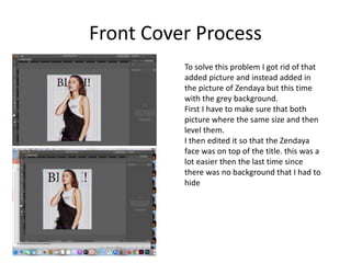
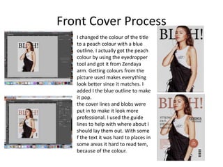
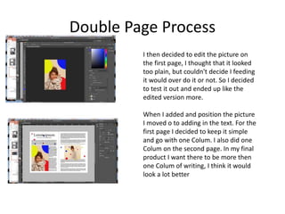
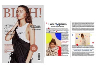
Experiments
Your Name
Front Cover Process
I wanted to go for a vogue or bazaar style
cover. This meant that there had to be a
celebrity on the front cover. I chose
Zendaya.
I named my experiment magazine
“BLAH!”.
I wanted my picture on Zendaya to be in
front of the title. Instead of editing it in
photo shop I decided to add in the same
picture of just her face and add it
overtop.
However this didn't work well as in the
second picture I had added there was a
white background to it was hard to not
show the background and at the same
time cover the title
Front Cover Process
To solve this problem I got rid of that
added picture and instead added in
the picture of Zendaya but this time
with the grey background.
First I have to make sure that both
picture where the same size and then
level them.
I then edited it so that the Zendaya
face was on top of the title. this was a
lot easier then the last time since
there was no background that I had to
hide
Front Cover Process
I changed the colour of the title
to a peach colour with a blue
outline. I actually got the peach
colour by using the eyedropper
tool and got it from Zendaya
arm. Getting colours from the
picture used makes everything
look better since it matches. I
added I the blue outline to make
it pop.
the cover lines and blobs were
put in to make it look more
professional. I used the guide
lines to help with where about I
should lay them out. With some
f the text it was hard to places in
some areas it hard to read tem,
because of the colour.
Reflection
• What elements of your experiments will you
include in your final product?
– I liked the colour scheme I chose. In my final
product I want the colours to go together and look
good.
– I also liked having the title behind to model.
– I don't think I will include cove lines, as I want my
cover to look clean and minimalistic.
Double Page Process
I wasn't sure on how I should start with the
double page spread. So I put in the Lorem
Ipsum. I think this was a mistake. Instead next
time I want to sketch out how I want my
double page spread to look and go from there.
I also used the grids to help my layout look
better. This really helped me and made my
page look overall more professional/clean
I then went into Photoshop and edited a
picture of Zendaya. I wanted there to be a
theme to the double page spread instead of it
being boring. I decided to add in different
coloured dots in the photo which really
popped against the neutral background
Double Page Process
Here I added in the picture I edited and
included a title. To make the double page
spread look better I decided to link the
two pages by putting the same colourful
dots on the other page. This makes the
double page spread look a little more put
together.
Using the grids as guidelines helped me
to position the picture right. This was
really useful as it made the pages look a
lot more professional.
Double Page Process
I then decided to edit the picture on
the first page, I thought that it looked
too plain, but couldn't decide I feeding
it would over do it or not. So I decided
to test it out and ended up like the
edited version more.
When I added and position the picture
I moved o to adding in the text. For the
first page I decided to keep it simple
and go with one Colum. I also did one
Colum on the second page. In my final
product I want there to be more then
one Colum of writing, I think it would
look a lot better
Double Page Process
I then added in some pull
quote’s. I made them
bigger add colour then the
same colours as the dots
so it followed the
theme/colour scheme.
This would grab the
attention of the readers,
its something that I
defiantly want to include
in my magazine.
Reflection
• What elements of your experiments will you include in
your final product?
– I really liked including pull quotes and colouring them to
stand out.
– I like the idea of having different layouts on pages
– Something I would like to include would be to have some
pages with just a picture
– Having a theme or a certain style i the layout and
background of the pages is also something id like to
include.
– Having the guides/grids was a massive help and made my
work look a lot more neater and as a result more
professional

3. production experiments

  • 1.
  • 2.
    Front Cover Process Iwanted to go for a vogue or bazaar style cover. This meant that there had to be a celebrity on the front cover. I chose Zendaya. I named my experiment magazine “BLAH!”. I wanted my picture on Zendaya to be in front of the title. Instead of editing it in photo shop I decided to add in the same picture of just her face and add it overtop. However this didn't work well as in the second picture I had added there was a white background to it was hard to not show the background and at the same time cover the title
  • 3.
    Front Cover Process Tosolve this problem I got rid of that added picture and instead added in the picture of Zendaya but this time with the grey background. First I have to make sure that both picture where the same size and then level them. I then edited it so that the Zendaya face was on top of the title. this was a lot easier then the last time since there was no background that I had to hide
  • 4.
    Front Cover Process Ichanged the colour of the title to a peach colour with a blue outline. I actually got the peach colour by using the eyedropper tool and got it from Zendaya arm. Getting colours from the picture used makes everything look better since it matches. I added I the blue outline to make it pop. the cover lines and blobs were put in to make it look more professional. I used the guide lines to help with where about I should lay them out. With some f the text it was hard to places in some areas it hard to read tem, because of the colour.
  • 5.
    Reflection • What elementsof your experiments will you include in your final product? – I liked the colour scheme I chose. In my final product I want the colours to go together and look good. – I also liked having the title behind to model. – I don't think I will include cove lines, as I want my cover to look clean and minimalistic.
  • 6.
    Double Page Process Iwasn't sure on how I should start with the double page spread. So I put in the Lorem Ipsum. I think this was a mistake. Instead next time I want to sketch out how I want my double page spread to look and go from there. I also used the grids to help my layout look better. This really helped me and made my page look overall more professional/clean I then went into Photoshop and edited a picture of Zendaya. I wanted there to be a theme to the double page spread instead of it being boring. I decided to add in different coloured dots in the photo which really popped against the neutral background
  • 7.
    Double Page Process HereI added in the picture I edited and included a title. To make the double page spread look better I decided to link the two pages by putting the same colourful dots on the other page. This makes the double page spread look a little more put together. Using the grids as guidelines helped me to position the picture right. This was really useful as it made the pages look a lot more professional.
  • 8.
    Double Page Process Ithen decided to edit the picture on the first page, I thought that it looked too plain, but couldn't decide I feeding it would over do it or not. So I decided to test it out and ended up like the edited version more. When I added and position the picture I moved o to adding in the text. For the first page I decided to keep it simple and go with one Colum. I also did one Colum on the second page. In my final product I want there to be more then one Colum of writing, I think it would look a lot better
  • 9.
    Double Page Process Ithen added in some pull quote’s. I made them bigger add colour then the same colours as the dots so it followed the theme/colour scheme. This would grab the attention of the readers, its something that I defiantly want to include in my magazine.
  • 11.
    Reflection • What elementsof your experiments will you include in your final product? – I really liked including pull quotes and colouring them to stand out. – I like the idea of having different layouts on pages – Something I would like to include would be to have some pages with just a picture – Having a theme or a certain style i the layout and background of the pages is also something id like to include. – Having the guides/grids was a massive help and made my work look a lot more neater and as a result more professional

Editor's Notes

  • #3 Discuss the tools and processes used in your experiments
  • #4 Discuss the tools and processes used in your experiments
  • #5 Discuss the tools and processes used in your experiments
  • #7 Discuss the tools and processes used in your experiments
  • #8 Discuss the tools and processes used in your experiments
  • #9 Discuss the tools and processes used in your experiments
  • #10 Discuss the tools and processes used in your experiments
  • #11 Discuss the tools and processes used in your experiments