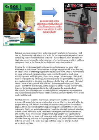
1. 3752850-657225-904875-657225<br />Looking back at my preliminary task, what do I feel I have learnt in the progression from it to the full product?<br />Being an amateur media creator and using readily available technologies, I feel that my Preliminary task was vital in order for me to gain some experience with the editing and document creation software I planned to use. Also, it helped me to pick up on any strengths and weaknesses of my preliminary products and how to improve them in the future, for my full music magazine products. <br />Creating the preliminary task front cover in particular gave me some vital knowledge in how to use Photoshop and InDesign alongside each other, but only on a basic level. In order to progress into my final products, I had to experiment a lot more with a wide range of editing tools, in order to create a much more visually dynamic and high quality front cover image. In both images I feel that I have used props to my advantage, to instantly imply the genre of the magazines and create more interesting and posed images. In the final task image, I decided to use a neutral background, which I didn’t do for my preliminary task front cover. I learnt from this mistake, as the image was a little visually overcrowded, however the setting was suitable to the college genre the magazine had. <br />The use of a neutral background in the full product image shows a progression and places more successful impact on the audience, as it directs their focus to the model and the text. <br />Another element I learnt to improve as a progression was the use of colour schemes. Although I did have a rough colour scheme of green, blue and white for my preliminary task, I found that other colours were merged into the contents page and front cover, making them appear less professional to the eye. In order to improve this in my main task products, I made sure to stick to the strict colour scheme of red, white and black, in order to create good, continuous aesthetics and create a more professional image overall. Typography was a particularly important focus for my main task piece, and so by using knowledge of fonts and WordArt from my previous use in the preliminary task, I was able to create many different versions of the same title logo and then carry out a target market survey with my class<br />The preliminary task allowed me to experiment with the computer programs available to me and also to become more confident with their controls and tools. For example, InDesign was a brand new program to me and through using basic tools in my preliminary task, I was much more confident when it came to creating the main task products. I was able to use text boxes more confidently and also be aware of special effects I could use such as drop shadows, offset angles and colouring. In terms of Photoshop skills, the colour and lighting levels tool was particularly useful to me in both tasks, as I was able to initially experiment with it for my preliminary task college photos to improve their quality. Then when it came to editing the music-related photos for my main task, I was able to use the Levels tool easily and know exactly the effects it would have on my photos. Despite this previous knowledge, I also learnt new skills through editing my main task photos, for example, I was introduced to more special effects such as spotlights and lens flare, which I consequently used to improve the aesthetics of my front cover picture and also modernize it.<br />In terms of page layout, I was able to improve my awareness of negative space and visual aesthetics for the main task, after receiving constructive feedback on my preliminary task products. In particular, I worked on creating a more interesting layout for my final contents page. I felt that the preliminary contents page was a little overcrowded and the coverline placement wasn’t very professional. So in order to avoid this problem with my final contents page, I used offset angles for the text and also made sure that the type face was stylish but also fully readable and also I used less images, to create a minimalistic and professional visual appearance. The font I used in my preliminary task for the coverlines and title, I decided to use for parts of my main task contents page and front cover, as I really liked the aesthetics of it and how some of the characters were specialized. The practice with using this font made the main task creation process much easier.<br />-647700107950<br />2133600109855<br />Given that the genre of music I had chosen was a wide scope of many different modern types of music, I was able to really experiment with typefaces, image effects, shadowing, background colour gradients and such like in order to appeal to the target teenage readership. Whereas in my preliminary task, I felt that I was more restricted in terms of the visual aspects of the magazine, as the genre focus was a college informative magazine. However, from creating the more basic layouts and use of graphics during my preliminary task, I was able to be more creative and confident during the planning and creation of my main task.<br />Existing magazine research played a big part in the planning stages of both tasks, however I felt that I paid more detailed attention to it for my main task. I collated a lot of annotated magazine covers and detailed media company research which helped me to decide on how to fit my magazine into the existing market and also create its own unique attributes in order for it to appeal to audiences. Overall, I believe that my preliminary task helped me to create a much more visually professional and high quality music magazine. It gave me useful experience with an Apple Mac computer and Adobe software and helped me to learn the conventions and styles required for a magazine to be successful. <br />