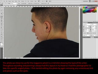
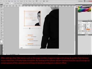
The photo we chose to use for the magazine advert is a mid shot showing the back of the artist.
Throughout recording and planning I always had this layout in my head so I had the photographer to
take this specific angled photo. I first started editing the photo by again removing any unnecessary bits
and pieces such as the spots.
At first I wasn't too sure about applying the black & white effect on the photo, but after completing the
DVD cover and seeing how effective it is and how it merges well I decide to apply it to this photo. This also
shows a link between the DVD cover and the magazine advertisement. As again, this photo did not require
any work as myself and team believe that it already has the professional appearance.
I also decided to use the same font as the DVD cover as it again shows a link between the two. I then
placed the photo and text in layout that is shown in my planning. I did experiment with the colour of the
‘no regrets’ but orange seemed to be the most effective and provided a more professional look.
I then added the front cover off the DVD cover but decided to cut off the lower half as it gives it more
room. I also had to but an orange border around the DVD cover as the both backgrounds merged
together as they are the same colour so I thought it would help separate them but it also gives of a
creative look.
After adding a few little extras such as the page number, magazine logo and ratings & quotes from famous
music industries, it finally looks complete. By looking at the photo above I believe that the use of orange on
certain pieces of the advertisement helps it stand out and gives a vibrant effect.
Magazine Poster Construction

Magazine Poster Construction

  • 2.
    The photo wechose to use for the magazine advert is a mid shot showing the back of the artist. Throughout recording and planning I always had this layout in my head so I had the photographer to take this specific angled photo. I first started editing the photo by again removing any unnecessary bits and pieces such as the spots.
  • 3.
    At first Iwasn't too sure about applying the black & white effect on the photo, but after completing the DVD cover and seeing how effective it is and how it merges well I decide to apply it to this photo. This also shows a link between the DVD cover and the magazine advertisement. As again, this photo did not require any work as myself and team believe that it already has the professional appearance.
  • 4.
    I also decidedto use the same font as the DVD cover as it again shows a link between the two. I then placed the photo and text in layout that is shown in my planning. I did experiment with the colour of the ‘no regrets’ but orange seemed to be the most effective and provided a more professional look.
  • 5.
    I then addedthe front cover off the DVD cover but decided to cut off the lower half as it gives it more room. I also had to but an orange border around the DVD cover as the both backgrounds merged together as they are the same colour so I thought it would help separate them but it also gives of a creative look.
  • 6.
    After adding afew little extras such as the page number, magazine logo and ratings & quotes from famous music industries, it finally looks complete. By looking at the photo above I believe that the use of orange on certain pieces of the advertisement helps it stand out and gives a vibrant effect.