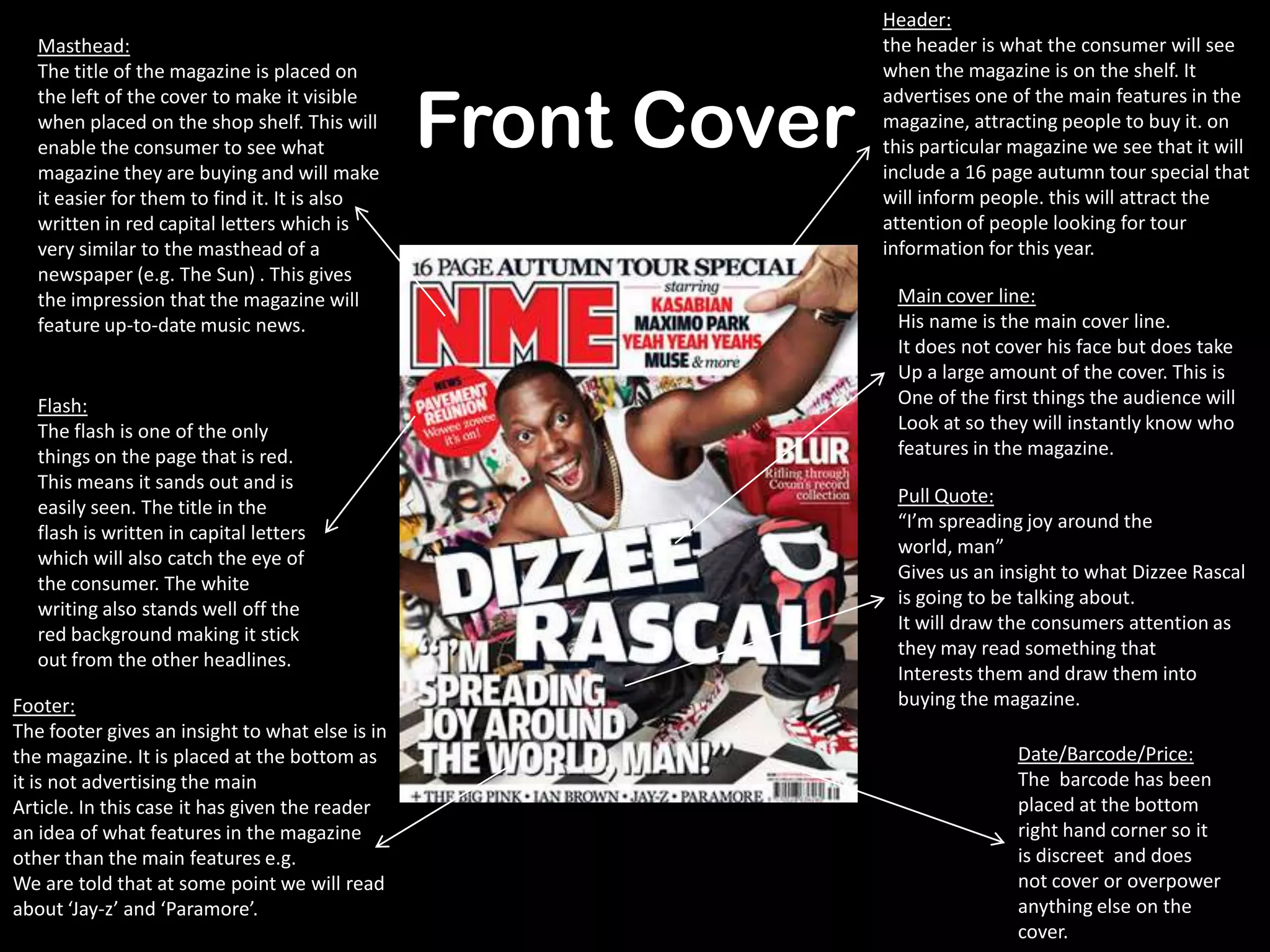
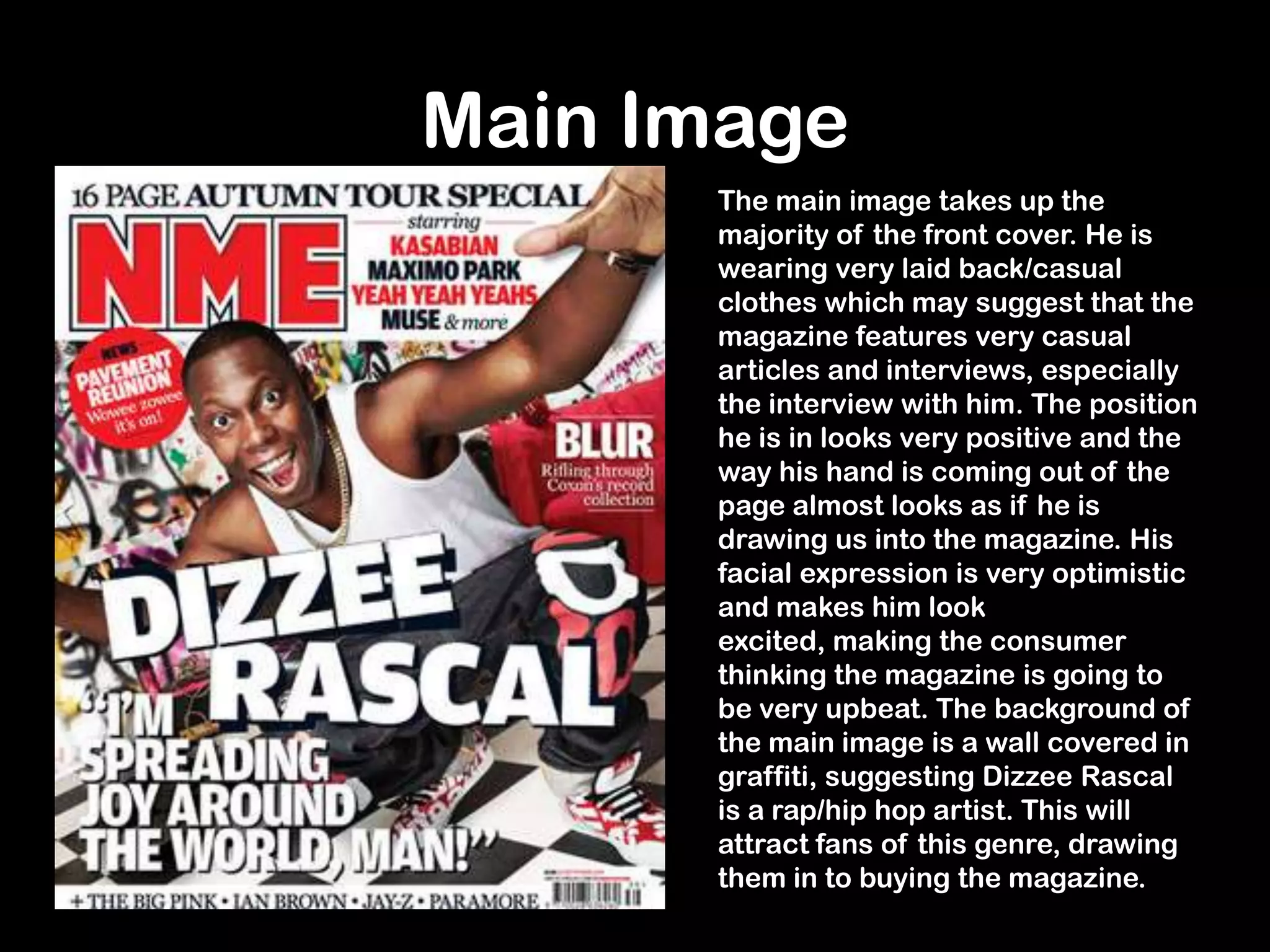
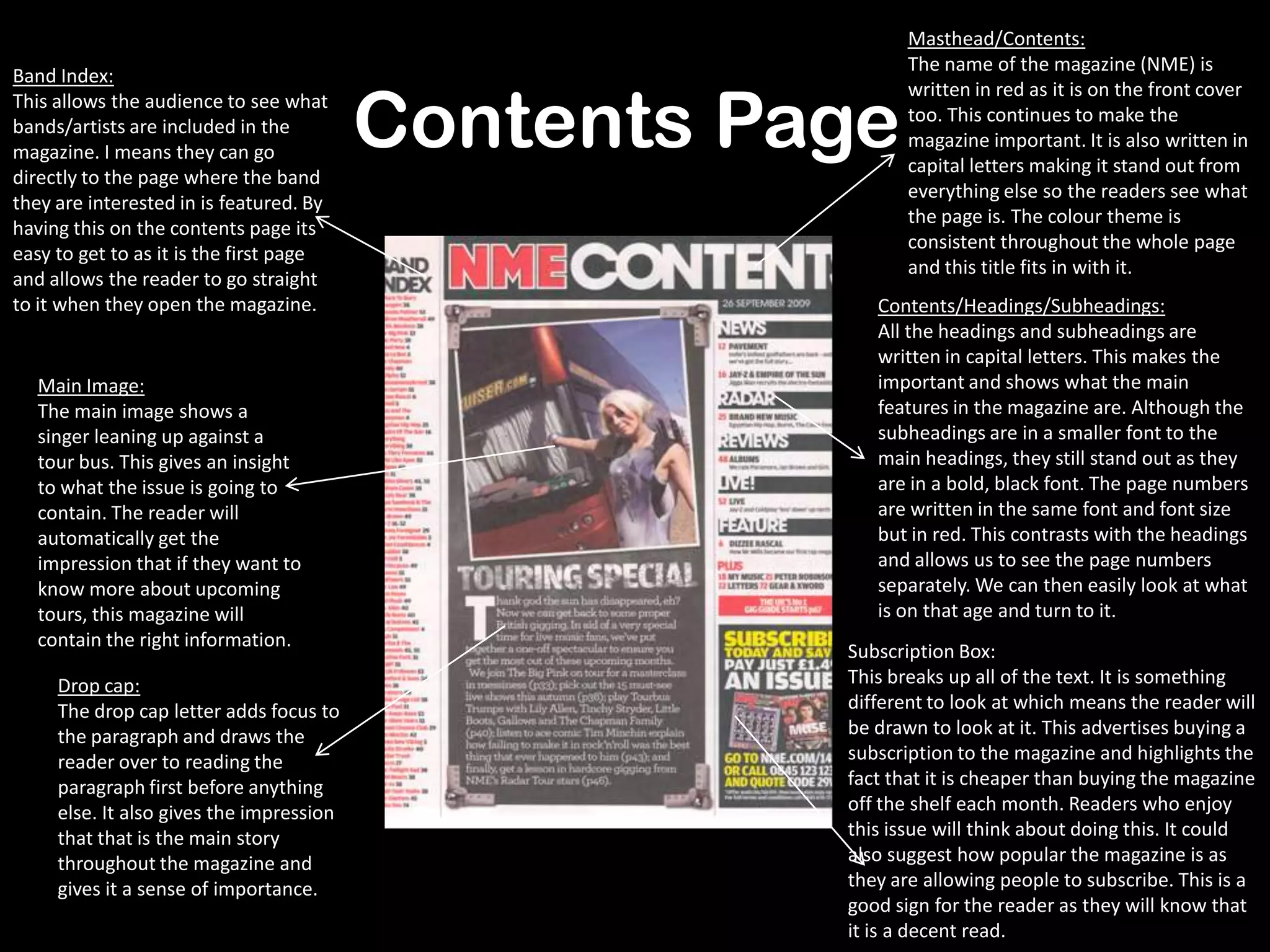
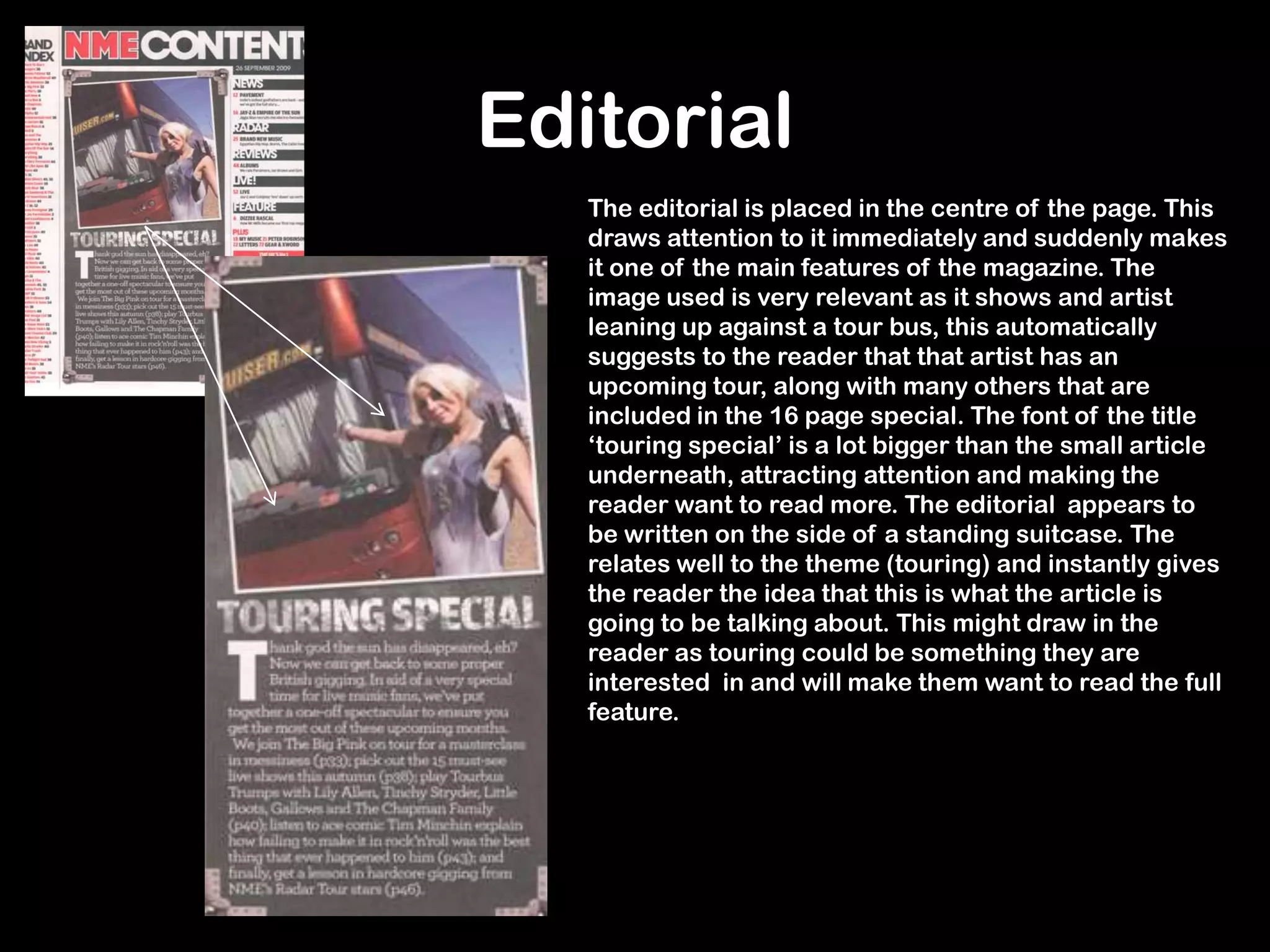
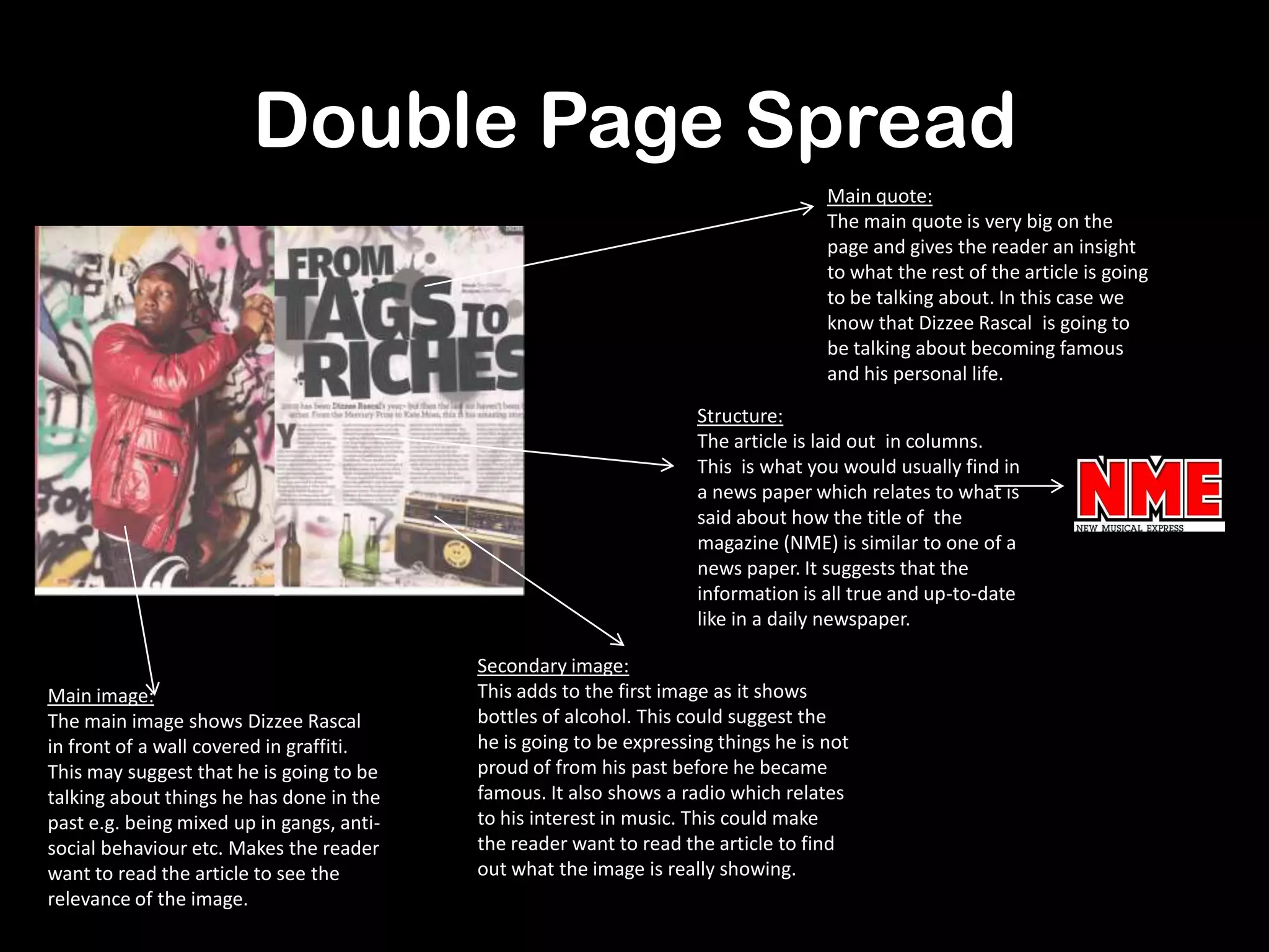
Analysis Of
Music
Magazine: NME
Dizzee Rascal
Edition.
Front Cover
Flash:
The flash is one of the only
things on the page that is red.
This means it sands out and is
easily seen. The title in the
flash is written in capital letters
which will also catch the eye of
the consumer. The white
writing also stands well off the
red background making it stick
out from the other headlines.
Masthead:
The title of the magazine is placed on
the left of the cover to make it visible
when placed on the shop shelf. This will
enable the consumer to see what
magazine they are buying and will make
it easier for them to find it. It is also
written in red capital letters which is
very similar to the masthead of a
newspaper (e.g. The Sun) . This gives
the impression that the magazine will
feature up-to-date music news.
Main cover line:
His name is the main cover line.
It does not cover his face but does take
Up a large amount of the cover. This is
One of the first things the audience will
Look at so they will instantly know who
features in the magazine.
Pull Quote:
“I’m spreading joy around the
world, man”
Gives us an insight to what Dizzee Rascal
is going to be talking about.
It will draw the consumers attention as
they may read something that
Interests them and draw them into
buying the magazine.
Date/Barcode/Price:
The barcode has been
placed at the bottom
right hand corner so it
is discreet and does
not cover or overpower
anything else on the
cover.
Footer:
The footer gives an insight to what else is in
the magazine. It is placed at the bottom as
it is not advertising the main
Article. In this case it has given the reader
an idea of what features in the magazine
other than the main features e.g.
We are told that at some point we will read
about ‘Jay-z’ and ‘Paramore’.
Header:
the header is what the consumer will see
when the magazine is on the shelf. It
advertises one of the main features in the
magazine, attracting people to buy it. on
this particular magazine we see that it will
include a 16 page autumn tour special that
will inform people. this will attract the
attention of people looking for tour
information for this year.
Main Image
The main image takes up the
majority of the front cover. He is
wearing very laid back/casual
clothes which may suggest that the
magazine features very casual
articles and interviews, especially
the interview with him. The position
he is in looks very positive and the
way his hand is coming out of the
page almost looks as if he is
drawing us into the magazine. His
facial expression is very optimistic
and makes him look
excited, making the consumer
thinking the magazine is going to
be very upbeat. The background of
the main image is a wall covered in
graffiti, suggesting Dizzee Rascal
is a rap/hip hop artist. This will
attract fans of this genre, drawing
them in to buying the magazine.
Contents Page
Masthead/Contents:
The name of the magazine (NME) is
written in red as it is on the front cover
too. This continues to make the
magazine important. It is also written in
capital letters making it stand out from
everything else so the readers see what
the page is. The colour theme is
consistent throughout the whole page
and this title fits in with it.
Band Index:
This allows the audience to see what
bands/artists are included in the
magazine. I means they can go
directly to the page where the band
they are interested in is featured. By
having this on the contents page its
easy to get to as it is the first page
and allows the reader to go straight
to it when they open the magazine.
Main Image:
The main image shows a
singer leaning up against a
tour bus. This gives an insight
to what the issue is going to
contain. The reader will
automatically get the
impression that if they want to
know more about upcoming
tours, this magazine will
contain the right information.
Subscription Box:
This breaks up all of the text. It is something
different to look at which means the reader will
be drawn to look at it. This advertises buying a
subscription to the magazine and highlights the
fact that it is cheaper than buying the magazine
off the shelf each month. Readers who enjoy
this issue will think about doing this. It could
also suggest how popular the magazine is as
they are allowing people to subscribe. This is a
good sign for the reader as they will know that
it is a decent read.
Contents/Headings/Subheadings:
All the headings and subheadings are
written in capital letters. This makes the
important and shows what the main
features in the magazine are. Although the
subheadings are in a smaller font to the
main headings, they still stand out as they
are in a bold, black font. The page numbers
are written in the same font and font size
but in red. This contrasts with the headings
and allows us to see the page numbers
separately. We can then easily look at what
is on that age and turn to it.
Drop cap:
The drop cap letter adds focus to
the paragraph and draws the
reader over to reading the
paragraph first before anything
else. It also gives the impression
that that is the main story
throughout the magazine and
gives it a sense of importance.
Editorial
The editorial is placed in the centre of the page. This
draws attention to it immediately and suddenly makes
it one of the main features of the magazine. The
image used is very relevant as it shows and artist
leaning up against a tour bus, this automatically
suggests to the reader that that artist has an
upcoming tour, along with many others that are
included in the 16 page special. The font of the title
‘touring special’ is a lot bigger than the small article
underneath, attracting attention and making the
reader want to read more. The editorial appears to
be written on the side of a standing suitcase. The
relates well to the theme (touring) and instantly gives
the reader the idea that this is what the article is
going to be talking about. This might draw in the
reader as touring could be something they are
interested in and will make them want to read the full
feature.
Double Page Spread
Main quote:
The main quote is very big on the
page and gives the reader an insight
to what the rest of the article is going
to be talking about. In this case we
know that Dizzee Rascal is going to
be talking about becoming famous
and his personal life.
Main image:
The main image shows Dizzee Rascal
in front of a wall covered in graffiti.
This may suggest that he is going to be
talking about things he has done in the
past e.g. being mixed up in gangs, anti-
social behaviour etc. Makes the reader
want to read the article to see the
relevance of the image.
Secondary image:
This adds to the first image as it shows
bottles of alcohol. This could suggest the
he is going to be expressing things he is not
proud of from his past before he became
famous. It also shows a radio which relates
to his interest in music. This could make
the reader want to read the article to find
out what the image is really showing.
Structure:
The article is laid out in columns.
This is what you would usually find in
a news paper which relates to what is
said about how the title of the
magazine (NME) is similar to one of a
news paper. It suggests that the
information is all true and up-to-date
like in a daily newspaper.
Audience
• NME is aimed at people who have an interest in different aspects of indie
music e.g. indie pop, indie rock etc. there are also many cross overs in the
magazine. In this particular issue Dizzee Rascal features on the front cover. He
fits in to a variety of genres including rap and hip-hop. This means that Dizzee
Rascal’s fans will buy the magazine as well as indie fans.
• The magazine would attract people that are well educated when it comes to
music as it is very up-to-date when it comes to the music industry. Many of the
people that feature on the front cover of NME are up and coming artists who
are trying to widen their fan base.
• The front cover shows many features of the magazine and the barcode/price is
printed very small. This takes the attention off of the price and puts it on the
contents of the magazine. Whereas cheaper magazines use their cheap prices
as a way to draw people into buying it, NME uses its features as a technique to
entice customers.
Background History of NME
‘NME’ stands for
‘New Musical
Express’.
It has been
published weekly
since March 1952.
It was originally
intended as a
music newspaper
but then changed
to a magazine
format in the
1980’s.
It is published by
ICP Media.
NME created the
first UK singles
chart (the top 12 uk
singles).
The online version
of the magazine
was created in
1996, with over 7
million viewers
every month.
It is now closely
associated with
punk rock after
being associated
with self-involved
reporting.
In 2002 NME reprinted
past archives. These
featured artists such as
Nirvana and The
Beatles.
Connecting Elements
To make a magazine interesting and enticing editors and journalists use:
Different fonts:
A variety of fonts
make the magazine
eye catching for the
audience and
emphasises certain
parts of the
magazine.
Colours:
The magazine seems to use a
theme colour (red) especially
on the front cover and
contents page. This almost
seems to ‘brand’ the magazine
as it will be automatically seen
as the colour of NME. Other
colours are used including
black and white to emphasise
certain fonts and headlines. It
also means the colours
contrast so the writing stands
out over the images.
Images:
the images let the
reader see who and
what are going to
be featured in the
magazine. The
image of Dizzee
Rascal clearly shows
that he is the main
feature of this issue
so that his fans will
be drawn into
buying it.
Headlines:
This entices people into
buying the magazine, even if
there is just one headline
that attracts them. They may
see the name of just one
artist that they like and go
ahead and buy the full
magazine, this shows how
useful it is for the magazine
to have a headline.
Header:
“16 page autumn tour special”. This highlights
something that the audience may be very
interested in. people might be wanting to
know about up coming tours and concerts
that they may want to go to and buy the
magazine to find out more. If the header
wasn’t there they may not buy the magazine
as nothing else on the cover interests them.

Nme analysis

  • 1.
  • 2.
    Front Cover Flash: The flashis one of the only things on the page that is red. This means it sands out and is easily seen. The title in the flash is written in capital letters which will also catch the eye of the consumer. The white writing also stands well off the red background making it stick out from the other headlines. Masthead: The title of the magazine is placed on the left of the cover to make it visible when placed on the shop shelf. This will enable the consumer to see what magazine they are buying and will make it easier for them to find it. It is also written in red capital letters which is very similar to the masthead of a newspaper (e.g. The Sun) . This gives the impression that the magazine will feature up-to-date music news. Main cover line: His name is the main cover line. It does not cover his face but does take Up a large amount of the cover. This is One of the first things the audience will Look at so they will instantly know who features in the magazine. Pull Quote: “I’m spreading joy around the world, man” Gives us an insight to what Dizzee Rascal is going to be talking about. It will draw the consumers attention as they may read something that Interests them and draw them into buying the magazine. Date/Barcode/Price: The barcode has been placed at the bottom right hand corner so it is discreet and does not cover or overpower anything else on the cover. Footer: The footer gives an insight to what else is in the magazine. It is placed at the bottom as it is not advertising the main Article. In this case it has given the reader an idea of what features in the magazine other than the main features e.g. We are told that at some point we will read about ‘Jay-z’ and ‘Paramore’. Header: the header is what the consumer will see when the magazine is on the shelf. It advertises one of the main features in the magazine, attracting people to buy it. on this particular magazine we see that it will include a 16 page autumn tour special that will inform people. this will attract the attention of people looking for tour information for this year.
  • 3.
    Main Image The mainimage takes up the majority of the front cover. He is wearing very laid back/casual clothes which may suggest that the magazine features very casual articles and interviews, especially the interview with him. The position he is in looks very positive and the way his hand is coming out of the page almost looks as if he is drawing us into the magazine. His facial expression is very optimistic and makes him look excited, making the consumer thinking the magazine is going to be very upbeat. The background of the main image is a wall covered in graffiti, suggesting Dizzee Rascal is a rap/hip hop artist. This will attract fans of this genre, drawing them in to buying the magazine.
  • 4.
    Contents Page Masthead/Contents: The nameof the magazine (NME) is written in red as it is on the front cover too. This continues to make the magazine important. It is also written in capital letters making it stand out from everything else so the readers see what the page is. The colour theme is consistent throughout the whole page and this title fits in with it. Band Index: This allows the audience to see what bands/artists are included in the magazine. I means they can go directly to the page where the band they are interested in is featured. By having this on the contents page its easy to get to as it is the first page and allows the reader to go straight to it when they open the magazine. Main Image: The main image shows a singer leaning up against a tour bus. This gives an insight to what the issue is going to contain. The reader will automatically get the impression that if they want to know more about upcoming tours, this magazine will contain the right information. Subscription Box: This breaks up all of the text. It is something different to look at which means the reader will be drawn to look at it. This advertises buying a subscription to the magazine and highlights the fact that it is cheaper than buying the magazine off the shelf each month. Readers who enjoy this issue will think about doing this. It could also suggest how popular the magazine is as they are allowing people to subscribe. This is a good sign for the reader as they will know that it is a decent read. Contents/Headings/Subheadings: All the headings and subheadings are written in capital letters. This makes the important and shows what the main features in the magazine are. Although the subheadings are in a smaller font to the main headings, they still stand out as they are in a bold, black font. The page numbers are written in the same font and font size but in red. This contrasts with the headings and allows us to see the page numbers separately. We can then easily look at what is on that age and turn to it. Drop cap: The drop cap letter adds focus to the paragraph and draws the reader over to reading the paragraph first before anything else. It also gives the impression that that is the main story throughout the magazine and gives it a sense of importance.
  • 5.
    Editorial The editorial isplaced in the centre of the page. This draws attention to it immediately and suddenly makes it one of the main features of the magazine. The image used is very relevant as it shows and artist leaning up against a tour bus, this automatically suggests to the reader that that artist has an upcoming tour, along with many others that are included in the 16 page special. The font of the title ‘touring special’ is a lot bigger than the small article underneath, attracting attention and making the reader want to read more. The editorial appears to be written on the side of a standing suitcase. The relates well to the theme (touring) and instantly gives the reader the idea that this is what the article is going to be talking about. This might draw in the reader as touring could be something they are interested in and will make them want to read the full feature.
  • 6.
    Double Page Spread Mainquote: The main quote is very big on the page and gives the reader an insight to what the rest of the article is going to be talking about. In this case we know that Dizzee Rascal is going to be talking about becoming famous and his personal life. Main image: The main image shows Dizzee Rascal in front of a wall covered in graffiti. This may suggest that he is going to be talking about things he has done in the past e.g. being mixed up in gangs, anti- social behaviour etc. Makes the reader want to read the article to see the relevance of the image. Secondary image: This adds to the first image as it shows bottles of alcohol. This could suggest the he is going to be expressing things he is not proud of from his past before he became famous. It also shows a radio which relates to his interest in music. This could make the reader want to read the article to find out what the image is really showing. Structure: The article is laid out in columns. This is what you would usually find in a news paper which relates to what is said about how the title of the magazine (NME) is similar to one of a news paper. It suggests that the information is all true and up-to-date like in a daily newspaper.
  • 7.
    Audience • NME isaimed at people who have an interest in different aspects of indie music e.g. indie pop, indie rock etc. there are also many cross overs in the magazine. In this particular issue Dizzee Rascal features on the front cover. He fits in to a variety of genres including rap and hip-hop. This means that Dizzee Rascal’s fans will buy the magazine as well as indie fans. • The magazine would attract people that are well educated when it comes to music as it is very up-to-date when it comes to the music industry. Many of the people that feature on the front cover of NME are up and coming artists who are trying to widen their fan base. • The front cover shows many features of the magazine and the barcode/price is printed very small. This takes the attention off of the price and puts it on the contents of the magazine. Whereas cheaper magazines use their cheap prices as a way to draw people into buying it, NME uses its features as a technique to entice customers.
  • 8.
    Background History ofNME ‘NME’ stands for ‘New Musical Express’. It has been published weekly since March 1952. It was originally intended as a music newspaper but then changed to a magazine format in the 1980’s. It is published by ICP Media. NME created the first UK singles chart (the top 12 uk singles). The online version of the magazine was created in 1996, with over 7 million viewers every month. It is now closely associated with punk rock after being associated with self-involved reporting. In 2002 NME reprinted past archives. These featured artists such as Nirvana and The Beatles.
  • 9.
    Connecting Elements To makea magazine interesting and enticing editors and journalists use: Different fonts: A variety of fonts make the magazine eye catching for the audience and emphasises certain parts of the magazine. Colours: The magazine seems to use a theme colour (red) especially on the front cover and contents page. This almost seems to ‘brand’ the magazine as it will be automatically seen as the colour of NME. Other colours are used including black and white to emphasise certain fonts and headlines. It also means the colours contrast so the writing stands out over the images. Images: the images let the reader see who and what are going to be featured in the magazine. The image of Dizzee Rascal clearly shows that he is the main feature of this issue so that his fans will be drawn into buying it. Headlines: This entices people into buying the magazine, even if there is just one headline that attracts them. They may see the name of just one artist that they like and go ahead and buy the full magazine, this shows how useful it is for the magazine to have a headline. Header: “16 page autumn tour special”. This highlights something that the audience may be very interested in. people might be wanting to know about up coming tours and concerts that they may want to go to and buy the magazine to find out more. If the header wasn’t there they may not buy the magazine as nothing else on the cover interests them.