Masthead 
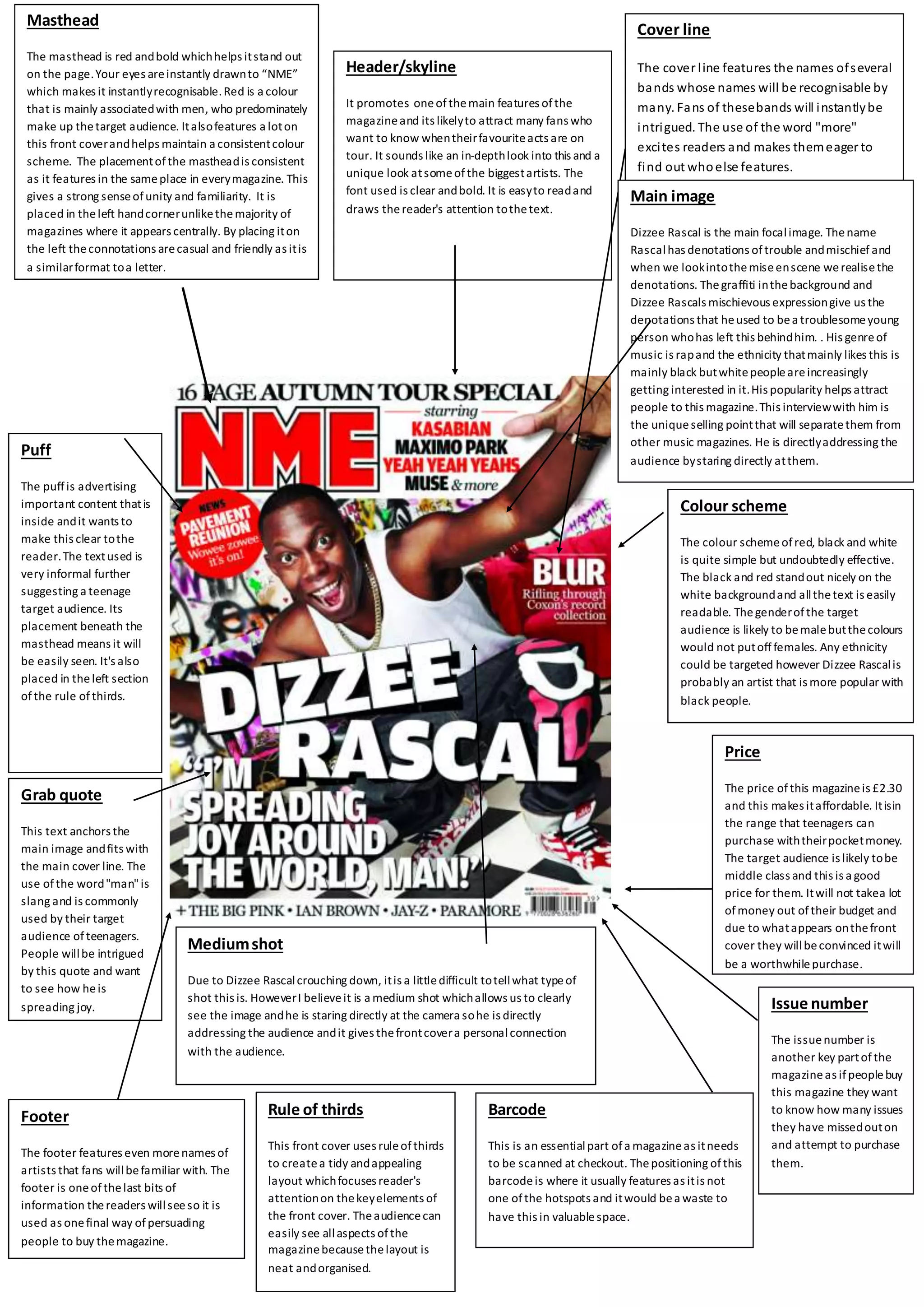
The masthead is red and bold which helps it stand out 
on the page. Your eyes are instantly drawn to “NME” 
which makes it instantly recognisable. Red is a colour 
that is mainly associated with men, who predominately 
make up the target audience. It also features a lot on 
this front cover and helps maintain a consistent colour 
scheme. The placement of the masthead is consistent 
as it features in the same place in every magazine. This 
gives a strong sense of unity and familiarity. It is 
placed in the left hand corner unlike the majority of 
magazines where it appears centrally. By placing it on 
the left the connotations are casual and friendly as it is 
a similar format to a letter. 
Puff 
The puff is advertising 
important content that is 
inside and it wants to 
make this clear to the 
reader. The text used is 
very informal further 
suggesting a teenage 
target audience. Its 
placement beneath the 
masthead means it will 
be easily seen. It's also 
placed in the left section 
of the rule of thirds. 
Footer 
Medium shot 
Due to Dizzee Rascal crouching down, it is a little difficult to tell what type of 
shot this is. However I believe it is a medium shot which allows us to clearly 
see the image and he is staring directly at the camera so he is directly 
addressing the audience and it gives the front cover a personal connection 
with the audience. 
The footer features even more names of 
artists that fans will be familiar with. The 
footer is one of the last bits of 
information the readers will see so it is 
used as one final way of persuading 
people to buy the magazine. 
Header/skyline 
It promotes one of the main features of the 
magazine and its likely to attract many fans who 
want to know when their favourite acts are on 
tour. It sounds like an in-depth look into this and a 
unique look at some of the biggest artists. The 
font used is clear and bold. It is easy to read and 
draws the reader's attention to the text. 
Cover line 
The cover l ine features the names of several 
bands whose names will be recognisable by 
many. Fans of these bands will instantly be 
intrigued. The use of the word "more" 
excites readers and makes them eager to 
find out who else features. 
Barcode 
This is an essential part of a magazine as it needs 
to be scanned at checkout. The positioning of this 
barcode is where it usually features as it is not 
one of the hotspots and it would be a waste to 
have this in valuable space. 
Issue number 
The issue number is 
another key part of the 
magazine as if people buy 
this magazine they want 
to know how many issues 
they have missed out on 
and attempt to purchase 
them. 
Grab quote 
This text anchors the 
main image and fits with 
the main cover line. The 
use of the word "man" is 
slang and is commonly 
used by their target 
audience of teenagers. 
People will be intrigued 
by this quote and want 
to see how he is 
spreading joy. 
Main image 
Dizzee Rascal is the main focal image. The name 
Rascal has denotations of trouble and mischief and 
when we look into the mise en scene we realise the 
denotations. The graffiti in the background and 
Dizzee Rascals mischievous expression give us the 
denotations that he used to be a troublesome young 
person who has left this behind him. . His genre of 
music is rap and the ethnicity that mainly likes this is 
mainly black but white people are increasingly 
getting interested in it. His popularity helps attract 
people to this magazine. This interview with him is 
the unique selling point that will separate them from 
other music magazines. He is directly addressing the 
audience by staring directly at them. 
Colour scheme 
The colour scheme of red, black and white 
is quite simple but undoubtedly effective. 
The black and red stand out nicely on the 
white background and all the text is easily 
readable. The gender of the target 
audience is likely to be male but the colours 
would not put off females. Any ethnicity 
could be targeted however Dizzee Rascal is 
probably an artist that is more popular with 
black people. 
Price 
The price of this magazine is £2.30 
and this makes it affordable. It is in 
the range that teenagers can 
purchase with their pocket money. 
The target audience is likely to be 
middle class and this is a good 
price for them. It will not take a lot 
of money out of their budget and 
due to what appears on the front 
cover they will be convinced it will 
be a worthwhile purchase. 
Rule of thirds 
This front cover uses rule of thirds 
to create a tidy and appealing 
layout which focuses reader's 
attention on the key elements of 
the front cover. The audience can 
easily see all aspects of the 
magazine because the layout is 
neat and organised.
Main image 
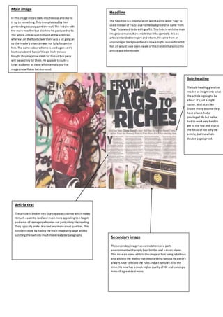
In this image Dizzee looks mischievous and like he 
is up to something. This is emphasised by him 
pretending to spray paint the wall. This links in with 
the main headline but also how his past used to be. 
The whole article is on him and all the attention 
whereas on the front cover there was a lot going on 
so the reader's attention was not fully focused on 
him. The same colour scheme is used again so it's 
kept consistent. Fans of his are likely to have 
bought this magazine solely for him so this piece 
will be exciting for them. He appeals to quite a 
large audience so those who normally buy the 
magazine will also be interested. 
Headline 
The headline is a clever play on words as the word "tags" is 
used instead of "rags" due to the background he came from. 
"Tags" is a word to do with graffiti. This links in with the main 
image and makes it an article that links up nicely. It is an 
article intended to inspire and inform. He came from an 
unprivileged background and is now a highly successful artist. 
Not all would have been aware of this transformation so the 
article will inform them. 
Sub-heading 
The sub-heading gives the 
reader an insight into what 
the article is going to be 
about. It's just a slight 
taster. With stars like 
Dizzee many assume they 
have always had a 
privileged life but he has 
had to work very hard to 
get to the top and that is 
the focus of not only the 
article, but the whole 
double page spread. 
Secondary image 
The secondary image has connotations of a party 
environment with empty beer bottles and a music player. 
This mise en scene adds to the image of him being rebellious 
and adds to the feeling that despite being famous he doesn’t 
always have to follow the rules and act sensibly all of the 
time. He now has a much higher quality of life and can enjoy 
himself a great deal more. 
Article text 
The article is broken into four separate columns which makes 
it much easier to read and much more appealing to a target 
audience of teenagers who may not particularly like reading. 
They typically prefer less text and more visual qualities. This 
has been done by having the main image very large and by 
splitting the text into much more readable paragraphs.
The Masthead 
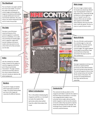
The masthead is once again used but 
this time much smaller. It is one of 
the codes and conventions of 
content pages and helps give the 
magazine consistency and branding 
as people will become more and 
more familiar with them. The same 
colours are used to help build on this 
and to create a house style. 
Contents list 
Main image 
The main image is relates to what 
the header was advertising. Below it 
says "touring special" to show it is 
dedicated to this. It feels like this will 
not feature in all the magazines so 
this is a "special" one off. It is a 
medium shot so we can see both 
what appears to be the MNE 
editor/reporter and a tour bus that 
links in with the special. The bus is a 
prop so is part of mise en scene. 
The contents list tells you what is in the 
magazine and makes it easier for the reader to 
find what they are interested in. It is broken 
into categories which makes it more 
attractive. Some readers will just read the 
whole magazine so will not use the contents 
list but for others they may want to read the 
Dizzee Rascal feature first for example. The 
headings are put in bold to make the reader 
excited to read the features. 
Index 
Like the contents list, the index 
makes it easier for the readers to 
read the magazine and find the 
parts they are particularly 
interested in. The page numbers 
and bands are written clearly in 
the colour scheme of black and 
red and it stands out clearly on the 
white background. 
Rule of thirds 
The rule of thirds is used to present 
this contents page in a clear and 
appealing way. The three columns 
are a code and convention of 
contents pages. The target audience 
of teenagers are put off by a huge 
quantity of text so they have 
presented it this way to cater for 
their preferences. 
Offer 
Teenagers typically do not have a lot 
of money to spend and their 
purchases are often determined by 
how much pocket money they have. 
This deal will appeal to them as they 
will be saving money and receiving 
all the issues in the process. The 
prospect of it being delivered to 
their door will also be very 
appealing, 
Editor's introduction 
Thi s is the editor introducing the 
magazine and this is a nice touch 
to make the readers feel 
welcome and to also outline 
how the editor feels about the 
i s sue. 
The Date 
The date is one of the least 
important features of this 
contents page but is a welcome 
features nonetheless. It is a code 
and convention of contents pages 
and it is good for readers who 
may be reading an old issue or 
readers who may want to try to 
collect them all as they can easily 
see the date. 
Borders 
Around the images are borders 
which leave space around the 
image. This artistic feature draws 
your eye to the image and 
separates the different features.

Dizee rascal analysis finished

  • 1.
    Masthead The mastheadis red and bold which helps it stand out on the page. Your eyes are instantly drawn to “NME” which makes it instantly recognisable. Red is a colour that is mainly associated with men, who predominately make up the target audience. It also features a lot on this front cover and helps maintain a consistent colour scheme. The placement of the masthead is consistent as it features in the same place in every magazine. This gives a strong sense of unity and familiarity. It is placed in the left hand corner unlike the majority of magazines where it appears centrally. By placing it on the left the connotations are casual and friendly as it is a similar format to a letter. Puff The puff is advertising important content that is inside and it wants to make this clear to the reader. The text used is very informal further suggesting a teenage target audience. Its placement beneath the masthead means it will be easily seen. It's also placed in the left section of the rule of thirds. Footer Medium shot Due to Dizzee Rascal crouching down, it is a little difficult to tell what type of shot this is. However I believe it is a medium shot which allows us to clearly see the image and he is staring directly at the camera so he is directly addressing the audience and it gives the front cover a personal connection with the audience. The footer features even more names of artists that fans will be familiar with. The footer is one of the last bits of information the readers will see so it is used as one final way of persuading people to buy the magazine. Header/skyline It promotes one of the main features of the magazine and its likely to attract many fans who want to know when their favourite acts are on tour. It sounds like an in-depth look into this and a unique look at some of the biggest artists. The font used is clear and bold. It is easy to read and draws the reader's attention to the text. Cover line The cover l ine features the names of several bands whose names will be recognisable by many. Fans of these bands will instantly be intrigued. The use of the word "more" excites readers and makes them eager to find out who else features. Barcode This is an essential part of a magazine as it needs to be scanned at checkout. The positioning of this barcode is where it usually features as it is not one of the hotspots and it would be a waste to have this in valuable space. Issue number The issue number is another key part of the magazine as if people buy this magazine they want to know how many issues they have missed out on and attempt to purchase them. Grab quote This text anchors the main image and fits with the main cover line. The use of the word "man" is slang and is commonly used by their target audience of teenagers. People will be intrigued by this quote and want to see how he is spreading joy. Main image Dizzee Rascal is the main focal image. The name Rascal has denotations of trouble and mischief and when we look into the mise en scene we realise the denotations. The graffiti in the background and Dizzee Rascals mischievous expression give us the denotations that he used to be a troublesome young person who has left this behind him. . His genre of music is rap and the ethnicity that mainly likes this is mainly black but white people are increasingly getting interested in it. His popularity helps attract people to this magazine. This interview with him is the unique selling point that will separate them from other music magazines. He is directly addressing the audience by staring directly at them. Colour scheme The colour scheme of red, black and white is quite simple but undoubtedly effective. The black and red stand out nicely on the white background and all the text is easily readable. The gender of the target audience is likely to be male but the colours would not put off females. Any ethnicity could be targeted however Dizzee Rascal is probably an artist that is more popular with black people. Price The price of this magazine is £2.30 and this makes it affordable. It is in the range that teenagers can purchase with their pocket money. The target audience is likely to be middle class and this is a good price for them. It will not take a lot of money out of their budget and due to what appears on the front cover they will be convinced it will be a worthwhile purchase. Rule of thirds This front cover uses rule of thirds to create a tidy and appealing layout which focuses reader's attention on the key elements of the front cover. The audience can easily see all aspects of the magazine because the layout is neat and organised.
  • 2.
    Main image Inthis image Dizzee looks mischievous and like he is up to something. This is emphasised by him pretending to spray paint the wall. This links in with the main headline but also how his past used to be. The whole article is on him and all the attention whereas on the front cover there was a lot going on so the reader's attention was not fully focused on him. The same colour scheme is used again so it's kept consistent. Fans of his are likely to have bought this magazine solely for him so this piece will be exciting for them. He appeals to quite a large audience so those who normally buy the magazine will also be interested. Headline The headline is a clever play on words as the word "tags" is used instead of "rags" due to the background he came from. "Tags" is a word to do with graffiti. This links in with the main image and makes it an article that links up nicely. It is an article intended to inspire and inform. He came from an unprivileged background and is now a highly successful artist. Not all would have been aware of this transformation so the article will inform them. Sub-heading The sub-heading gives the reader an insight into what the article is going to be about. It's just a slight taster. With stars like Dizzee many assume they have always had a privileged life but he has had to work very hard to get to the top and that is the focus of not only the article, but the whole double page spread. Secondary image The secondary image has connotations of a party environment with empty beer bottles and a music player. This mise en scene adds to the image of him being rebellious and adds to the feeling that despite being famous he doesn’t always have to follow the rules and act sensibly all of the time. He now has a much higher quality of life and can enjoy himself a great deal more. Article text The article is broken into four separate columns which makes it much easier to read and much more appealing to a target audience of teenagers who may not particularly like reading. They typically prefer less text and more visual qualities. This has been done by having the main image very large and by splitting the text into much more readable paragraphs.
  • 3.
    The Masthead Themasthead is once again used but this time much smaller. It is one of the codes and conventions of content pages and helps give the magazine consistency and branding as people will become more and more familiar with them. The same colours are used to help build on this and to create a house style. Contents list Main image The main image is relates to what the header was advertising. Below it says "touring special" to show it is dedicated to this. It feels like this will not feature in all the magazines so this is a "special" one off. It is a medium shot so we can see both what appears to be the MNE editor/reporter and a tour bus that links in with the special. The bus is a prop so is part of mise en scene. The contents list tells you what is in the magazine and makes it easier for the reader to find what they are interested in. It is broken into categories which makes it more attractive. Some readers will just read the whole magazine so will not use the contents list but for others they may want to read the Dizzee Rascal feature first for example. The headings are put in bold to make the reader excited to read the features. Index Like the contents list, the index makes it easier for the readers to read the magazine and find the parts they are particularly interested in. The page numbers and bands are written clearly in the colour scheme of black and red and it stands out clearly on the white background. Rule of thirds The rule of thirds is used to present this contents page in a clear and appealing way. The three columns are a code and convention of contents pages. The target audience of teenagers are put off by a huge quantity of text so they have presented it this way to cater for their preferences. Offer Teenagers typically do not have a lot of money to spend and their purchases are often determined by how much pocket money they have. This deal will appeal to them as they will be saving money and receiving all the issues in the process. The prospect of it being delivered to their door will also be very appealing, Editor's introduction Thi s is the editor introducing the magazine and this is a nice touch to make the readers feel welcome and to also outline how the editor feels about the i s sue. The Date The date is one of the least important features of this contents page but is a welcome features nonetheless. It is a code and convention of contents pages and it is good for readers who may be reading an old issue or readers who may want to try to collect them all as they can easily see the date. Borders Around the images are borders which leave space around the image. This artistic feature draws your eye to the image and separates the different features.