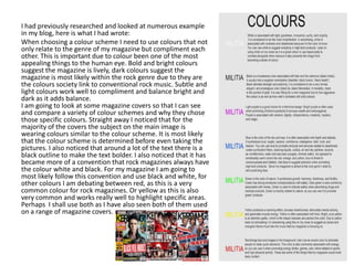
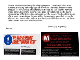
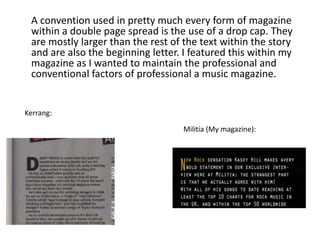
Throughout the document, the author discusses how their media product, a music magazine, uses and develops conventions from real music magazines like Kerrang and Rock Sound. The author chose conventional colors like black, red, white and yellow for the magazine's color scheme. Fonts, mastheads, barcodes, pull quotes, and other design elements were modeled after examples from existing magazines. While conforming to typical magazine conventions, the author also made some unconventional changes like removing a puff piece and adjusting colors and sizes. The goal was to create a realistic magazine that would appeal to readers while also developing the conventions in minor ways.