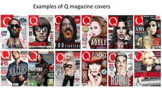
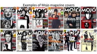
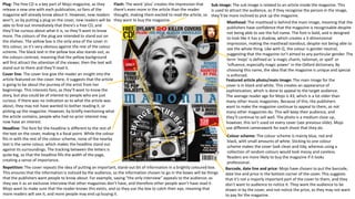
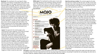
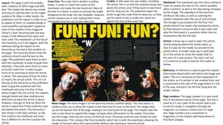
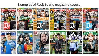
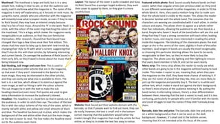
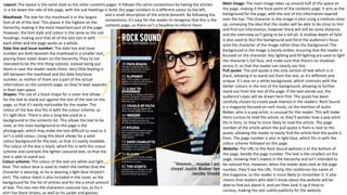
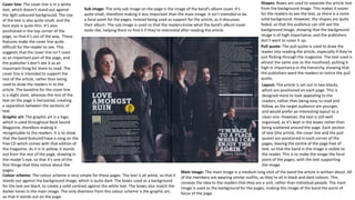
The document analyzes the design elements of magazine covers for Q magazine and Mojo magazine. For Q, the red masthead stands out to attract readers' attention. Photos use medium close-ups to feel personal. Pull quotes and headlines entice readers to learn more inside. Mojo also uses bold design and photos to attract readers. A free CD inclusion and cover details on articles aim to increase interest and sales. Both magazines employ consistent color schemes and layouts to build recognizability.